Method 1 – Format Data Series to Adjust Clustered Column Chart Spacing in Excel
STEPS:
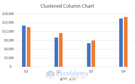
- Select the range B4:D8.
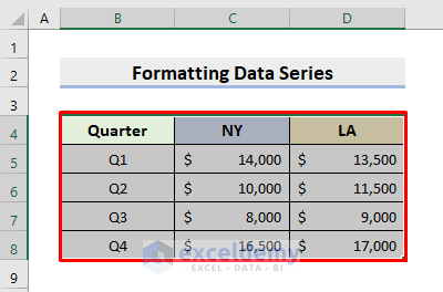
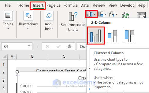
- Go to the Insert tab and click the Insert Column or Bar Chart drop-down icon.
- Choose the 2-D Clustered Column.
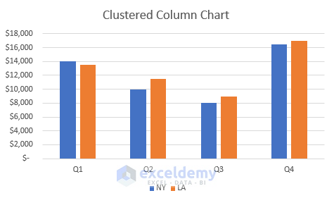
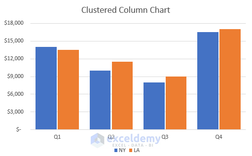
- The desired clustered column chart will appear in the Excel worksheet.
- See the below figure.
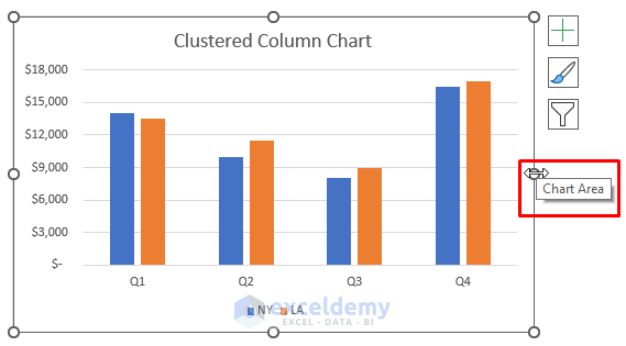
- Right-click any of the columns in the chart.
- Press Format Data Series in the pop-out Context menu.
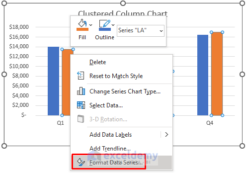
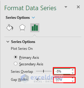
- The Format Data Series pane will emerge on the left side.
- Modify the Series Overlap and the Gap Width according to your requirements.
- The Series Overlap is between the sales of each quarter in 2 cities.
- The Gap Width is between the quarters.
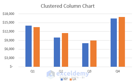
- Type -5% for Series Overlap and 50% for Gap Width to reduce the spacing between the columns for convenience in comparison.
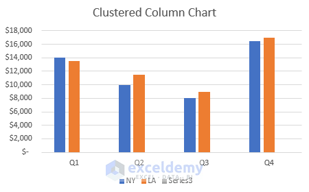
- It’ll return the chart as shown below.
- This makes it better to compare visually.
Method 2 – Adjust Excel Clustered Column Chart Spacing by Adding Legend
STEPS:
- Create the chart by following the steps in the previous example.
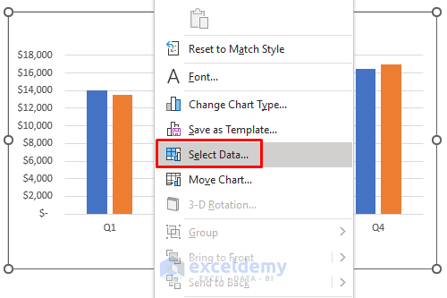
- Right-click the chart.
- Press the Select Data option from the context menu.
- The Select Data Source dialog box will pop out.
- Click Add.
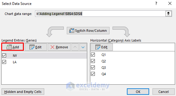
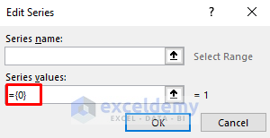
- The Edit Series box will appear.
- Input ={0} in the Series Values field.
- Press OK.
- Get the desired spacing between the columns in the clustered column chart.
Method 3 – Modify Dataset for Changing Column Chart Spacing in Excel
STEPS:
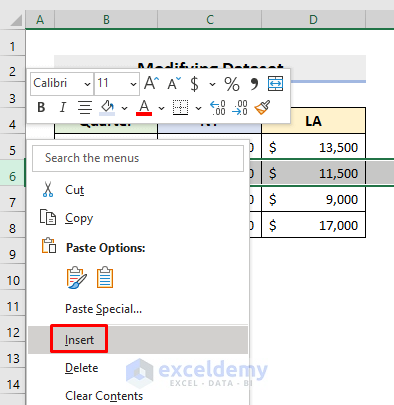
- Right-click on the row header of the Q2 row.
- Select Insert from the pop-up context menu.
- Repeat the step after every quarter.
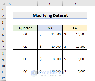
- IModify your dataset.
- Look at the following picture for a better understating of our output.
- Select the range B4:D11.
- Go to Insert and choose 2-D Clustered Column chart.
- You’ll get extra spacing between the columns in the chart.
Method 4 – Drag Clustered Column Chart Area to Adjust Spacing
STEPS:
- Insert the chart following the steps in the 1st example.
- Click the chart and place the cursor on the midpoint in the right or left side edge of the chart.
- See the change in your cursor, and the Chart Area writing will appear.
- Click on the mouse and drag the chart area to adjust the spacing.
- See the below figure which is our outcome after modifying the chart area.
Download Practice Workbook
Download the following workbook to practice by yourself.
Related Articles
- How to Insert a Clustered Column Chart in Excel
- How to Create a Stacked Column Chart in Excel
- How to Make a 100% Stacked Column Chart in Excel
<< Go Back To Column Chart in Excel | Excel Charts | Learn Excel
Get FREE Advanced Excel Exercises with Solutions!
