In this tutorial, I am going to show you step-by-step procedures to create a comparison column chart in Excel. You can use these steps even in large datasets to create simple column charts to compare various data categories. Throughout this tutorial, you will also learn some important Excel tools and techniques that will be very useful in any Excel-related task.
What Is a Comparison Chart in Excel?
A comparison chart in Excel is a 2D plot where we can combine different categories of data which we can compare based on a specific parameter. For example, comparing sales values of a particular product for multiple regions. In this case, only tabular data is not enough to get insights. So we use comparison charts in this situation.
How to Create a Comparison Column Chart in Excel: Step-by-Step Procedures
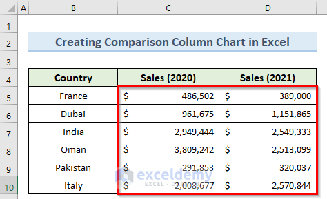
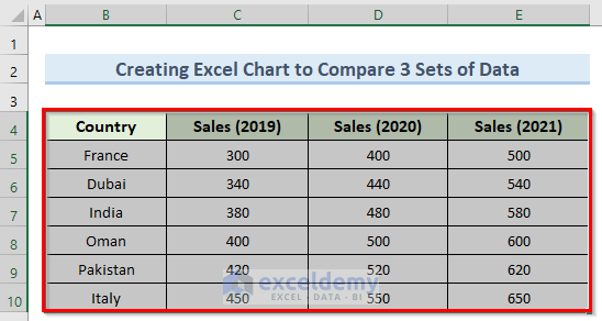
We have taken a concise dataset to explain the steps clearly. The dataset has approximately 7 rows and 3 columns. Initially, we formatted all the cells containing dollar values in Accounting format. Below is the initial view of the dataset that we will be using. All of the other sections also have the same format except for different parameters.
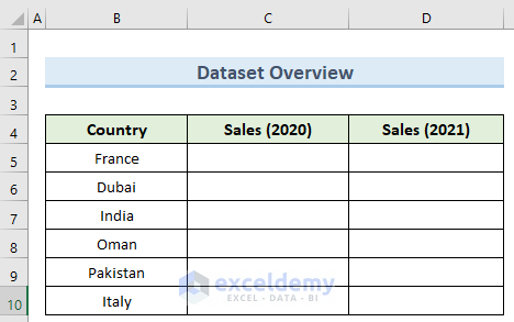
Step 1: Creating Dataset to Compare
In this first step, we will create the initial dataset to generate the comparison column chart in Excel.
- First, type all the necessary Country parameters and insert the respective sales values in Accounting format.
Read More: Examples of Column Chart in Excel
Step 2: Inserting Column Chart Layout
Let us now insert an empty Excel chart layout where we will generate our comparison column chart.
- To begin with, go to the Insert tab, and under the Insert Column dropdown, select 2D Clustered Columns.
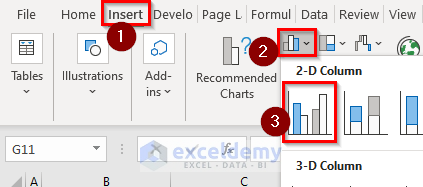
- As a result, this will generate an empty chart layout.

Read More: How to Create a Variable Width Column Chart in Excel
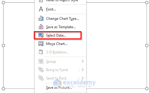
Step 3: Adding Data to Chart
To generate the comparison column chart, we need to tell Excel where our data reside in the worksheet. Let us see how to do this.
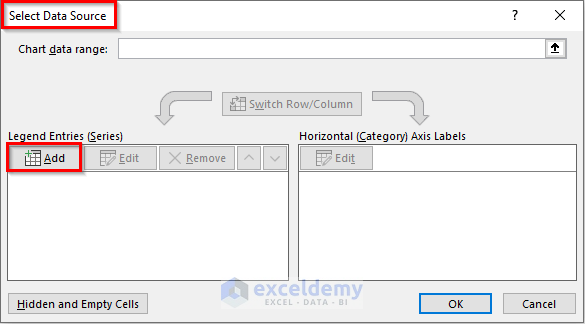
- To begin this step, right-click on the blank chart and click Select Data.
- Next, in the new window, click on Add.
- Now, in the Edit Series window, type the following formula in the Series name box:
=Sheet1!$C$4- Then, type the below formula in the Series values box and click OK.
=Sheet1!$C$5:$C$10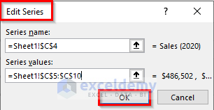
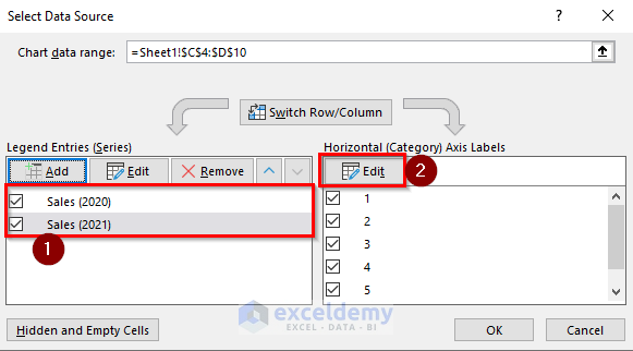
- Similarly, add the data series for the Sales(2021) values as well.
- After that, click on Edit.
- Here, enter the following formula inside the Axis label range and click OK.
=Sheet1!$B$5:$B$10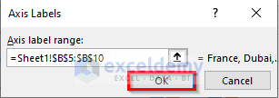
Read More: How to Change Width of Column in Excel Chart
Step 4: Formatting Column Chart
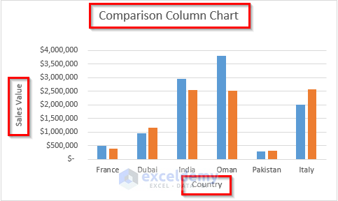
Once we have generated the comparison column chart in Excel, now we need to format this so that we can easily compare the data.
- For this step, click on the + icon beside the chart and check the Axis Titles and Chart Title boxes under Chart Elements.
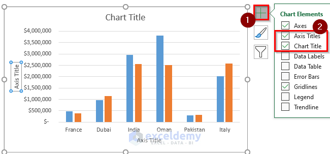
- Finally, type in the chart title and axis values to finish formatting the chart.
Read More: How to Sort Column Chart in Descending Order in Excel
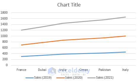
How to Create an Excel Chart to Compare 3 Sets of Data
In Excel charts, there is the option to input multiple data sets to produce a single plot which can help compare them more effectively. Follow the steps below to do this.
Steps:
- To start with, select all the cells from B4 to E10.
- Next, navigate to the Insert tab, and under Insert Line or Area Chart option, select Stacked Line.
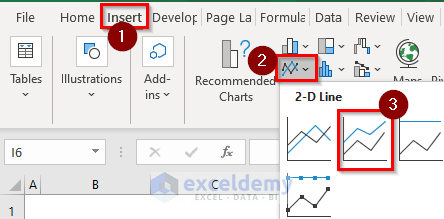
- Consequently, this will plot a line chart comparing the 3 data sets.
Read More: How to Create Graphs in Excel with Multiple Columns
How to Create an Excel Chart to Show the Difference Between Two Series
In many cases, if the data set is a bit complex, we can not easily differentiate between them and draw insights. For this, we can use a specific type of Excel chart to plot those data sets. Let us see how to use this.
Steps:
- First, go to cell E5 and type the following formula:
=C5-D5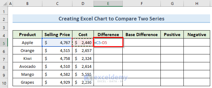
- Then, press Enter and copy this formula to the cells below using Fill Handle.
- Next, type the below formula in cell F5.
=MIN(C5,D5)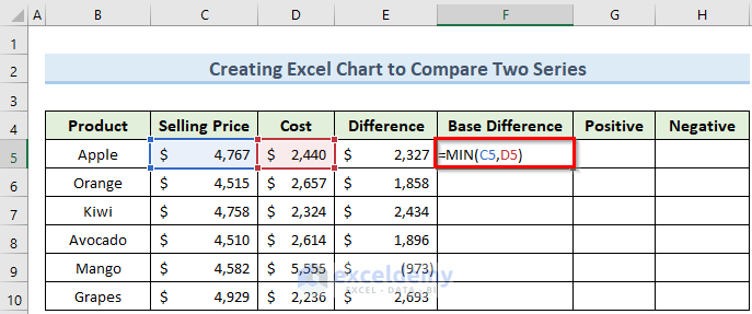
- Now, press Enter to confirm and copy this formula as well in column F.
- After that navigate to cell G5 and insert this formula:
=IF(E5>0,E5,"")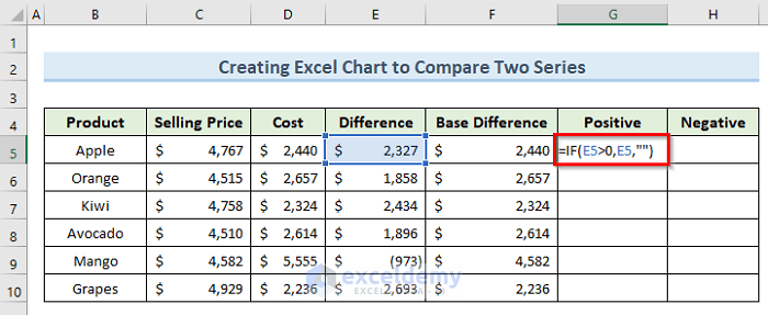
- Then, press Enter and drag the Fill Handle to copy this formula down.
- Here, type in the following formula in cell H5.
=IF(E5<0,ABS(E5),"")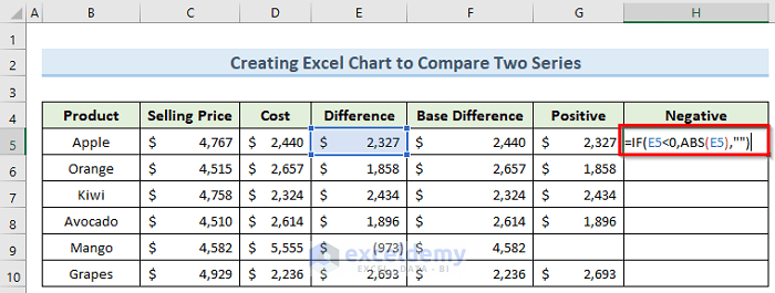
- Again, press Enter.
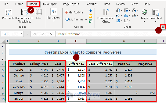
- Next, select the cells from B4 to D10 and F4 to H10.
- Now, go to the Insert tab and click on the arrow icon in the lower-right corner of the charts section.
- Now, click on All Charts and select Bar from the Recommended Charts.
- Under this option, click on Stacked Bar and click OK.
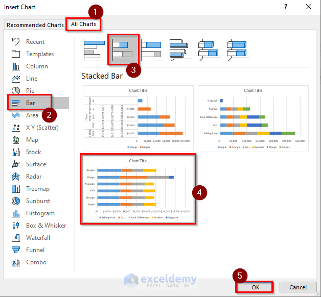
- Immediately, this will generate a bar chart.
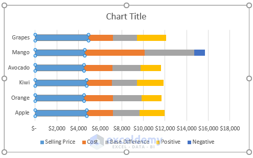
- Now, right-click on the blue color bar and select Change Series Chart Type.
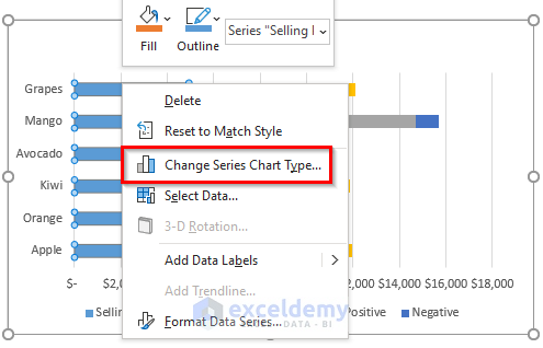
- Next, in the new window, click Combo and set the Chart Type as Clustered Bar.
- Here, also check the Secondary Axis boxes for both series and click OK.
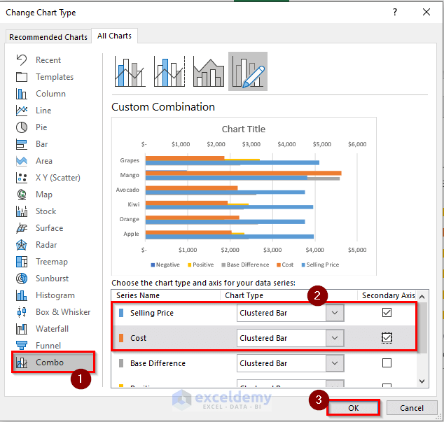
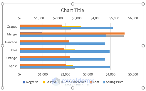
- Finally, this will create a bar chart showing the difference between the two data series.
 Read More: How to Create a Column Chart in Excel
Download Practice Workbook
You can download the practice workbook from here.
Conclusion
I hope that you were able to apply the methods that I showed in this tutorial on how to create a comparison column chart in Excel. As you can see, there are quite a few steps to achieve this. So carefully follow them to achieve the same result as we have produced here. If you get stuck in any of the steps, I recommend going through them a few times to clear up any confusion.
<< Go Back To Column Chart in Excel | Excel Charts | Learn Excel
Get FREE Advanced Excel Exercises with Solutions!
