A Power BI report that looks great on a desktop may become difficult to use on a phone. Charts can become too small, slicers may take up too much space, and wide tables often require excessive scrolling. Power BI solves this problem with Mobile layout, which lets you create a separate phone-optimized arrangement of the same report page. The desktop report remains unchanged, while mobile users get a layout designed specifically for smaller screens.
In this tutorial, we will show how to design reports that actually work on a phone in Power BI Mobile. We will optimize the following sales dashboard for mobile viewing.
Step 1: Decide Which Dashboard Visuals Matter on Mobile
Before opening the Mobile layout, decide what a phone user actually needs. Suppose your desktop dashboard contains multiple KPI cards across the top, several charts, slicers, a gauge, and a detailed salesperson table.
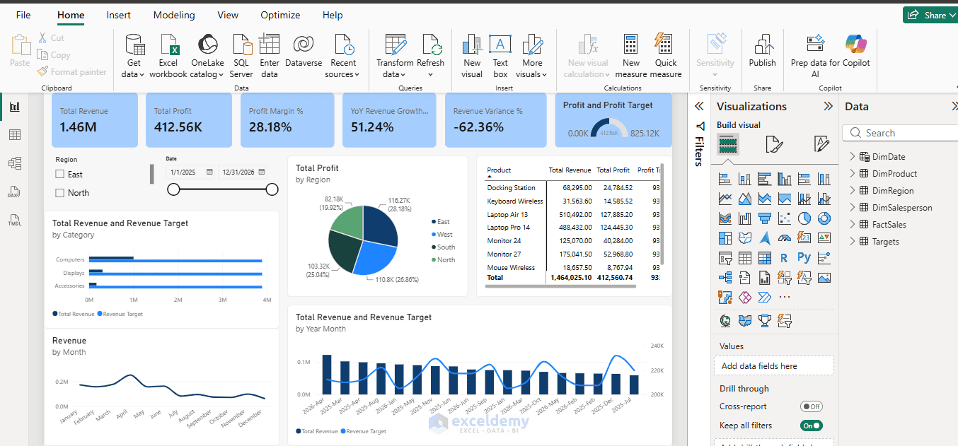
This arrangement works perfectly on a desktop. However, trying to reproduce the exact desktop layout on a phone would result in a crowded report.
For this dashboard, the most important information is:
Total Revenue → Total Profit → Profit Margin → Revenue Growth → Revenue Variance →
Filters → Monthly Performance → Regional Performance → Quarterly Trend → Details
It is recommended in Power BI to include only significant and regularly used visuals in the mobile layout. Less important visuals can simply be left out.
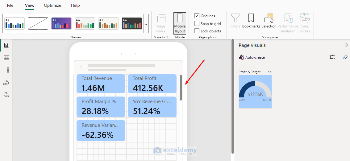
For example, the Profit and Profit Target gauge and Revenue and Revenue Target by Year Month take up considerable space. Because Total Profit is already shown in a KPI card, I would leave the gauge out of the initial mobile layout unless comparing profit with its target is particularly important to your users.
Tip: Removing a visual from the Mobile layout does not remove it from your desktop report.
Step 2: Open the Mobile Layout
To create the phone version:
- Open your report in Power BI Desktop
- Go to the View tab >> select Mobile layout
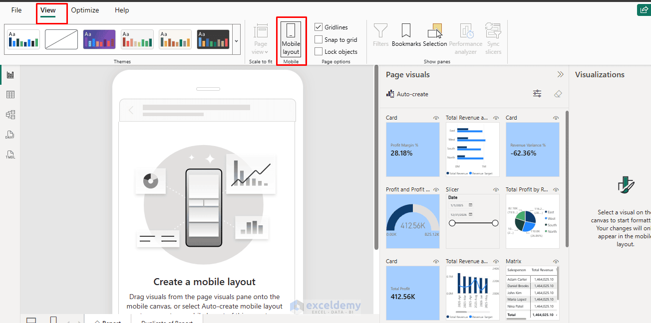
You can also use the layout switcher at the bottom of the report canvas to switch between the Web and Mobile layouts. Power BI will display a narrow phone-shaped canvas.
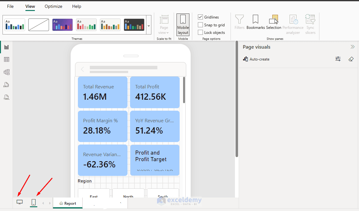
The Page visuals pane contains the visuals from your normal report page. You can now decide which ones should appear on the phone.
Step 3: Use Auto-Create as a Starting Point
Instead of manually placing every visual, you can let Power BI create an initial mobile layout. If you have an existing dashboard with many visuals, Auto-create is a good starting point.
- Go to the Page visuals pane >> click Auto-create
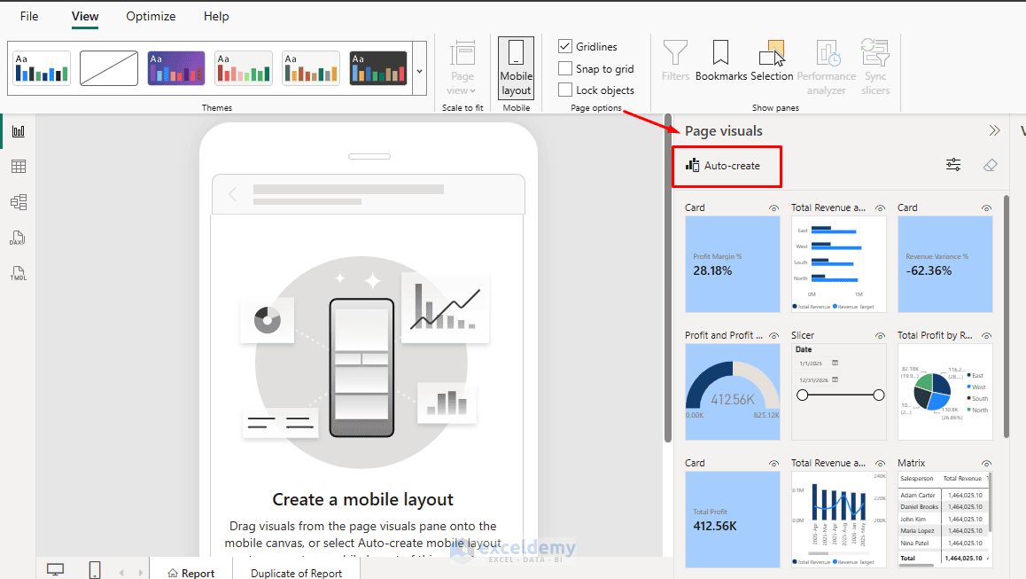
Power BI automatically places the report visuals on the mobile canvas based on the existing desktop layout.
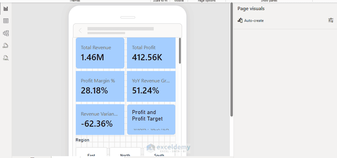
Power BI analyzes the position, size, type, and order of visuals in the desktop report and creates an initial mobile arrangement. However, Auto-create is only a starting point; you should still reorganize the result for your users.
Tip: If Auto-create produces a crowded layout, remove the unnecessary visuals instead of trying to squeeze everything onto the phone screen.
Step 4: Arrange Visuals in a Logical Mobile Order
The biggest mistake in Power BI mobile design is trying to fit the entire desktop dashboard onto a phone. For any sales dashboard, the most important visuals may be:
- Total Sales
- Total Profit
- Profit Margin
- Year Slicer
- Region Slicer
- Monthly Sales
- Sales by Category
- Sales by Region
The detailed Sales Table may not be necessary on the main mobile page.
A good rule is: Overview first, details later.
For example, instead of placing a 10-column transaction table on the phone layout, show the major KPIs and summary charts first.
Keep Only the Most Important Visuals:
Phone users normally scroll from top to bottom, so arrange visuals by importance. A useful structure for a sales dashboard could be:
Sales Performance
Total Sales
Total Profit
Profit Margin
Date and Region Filters
Monthly Sales Trend
Sales by Region
Sales by Category
Product Details
This creates a logical flow. Users first see the overall result, then the trend, followed by regional and category-level details. Avoid putting detailed tables or less important information at the top of the report.
A useful rule is:
Summary first → Analysis second → Details last
The user first understands overall performance, then applies filters, and finally explores the charts.
Step 5: Resize and Format Visuals for a Small Screen
A visual that works on a desktop may need a different size on mobile.
- Drag a visual from the Page visuals pane onto the phone canvas
- Select a visual and drag its edges to resize it
Once the visuals are arranged, optimize them for the smaller display. Do not make charts too small just because more visuals can fit on the screen.
For example, a bar chart with six categories needs enough vertical space for users to read the category labels comfortably.
- Review visual formatting
- Consider increasing:
- Data label size
- KPI value size
- Chart title size
- Axis text size
- Button text size
- At the same time, remove unnecessary elements.
Make Titles Concise:
Instead of using a long title such as:
Total Sales Revenue for the Current Reporting Period
Use:
Total Revenue
Shorter titles are easier to read on a phone.
Cards:
KPI cards work especially well on mobile devices. Keep them compact. From our dashboard, we are keeping the five KPI cards across the top of the desktop report, which show the most important summary information.
Total Revenue
$1.46M
- Does not need to occupy half the phone screen.
- Make sure that:
- The value is easy to read
- The label is visible
- There is not too much empty space
- Where possible, use abbreviated values instead of displaying unnecessarily long numbers.
For example:
$1.46M
is easier to scan than:
$1,462,756
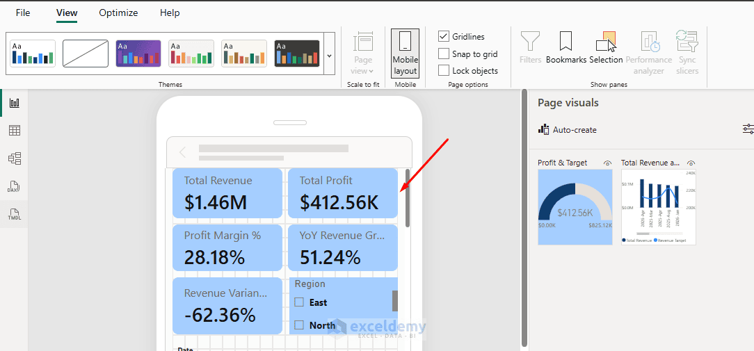
Simplify Charts:
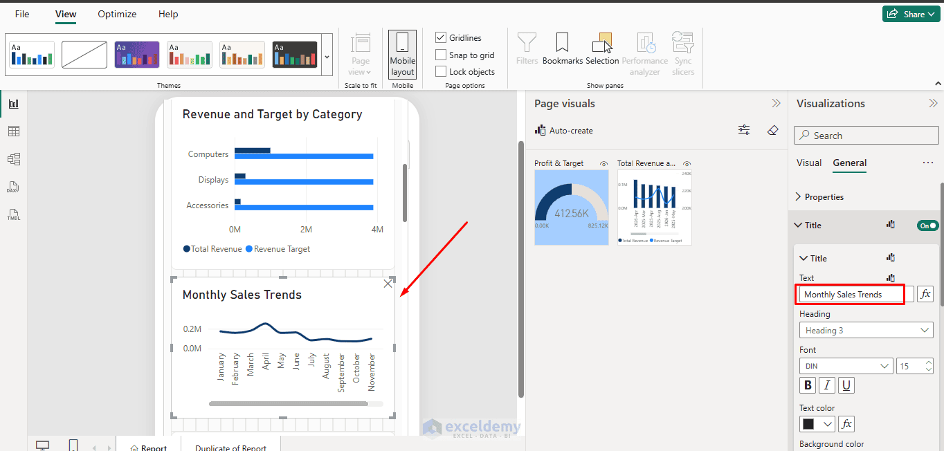
Charts often need to be slightly taller on mobile. A very wide, short line chart may become difficult to interpret once compressed to phone width.
- Increase its height so that:
- Data points are visible
- Axis labels remain readable
- Chart interaction is easier
Slicers:
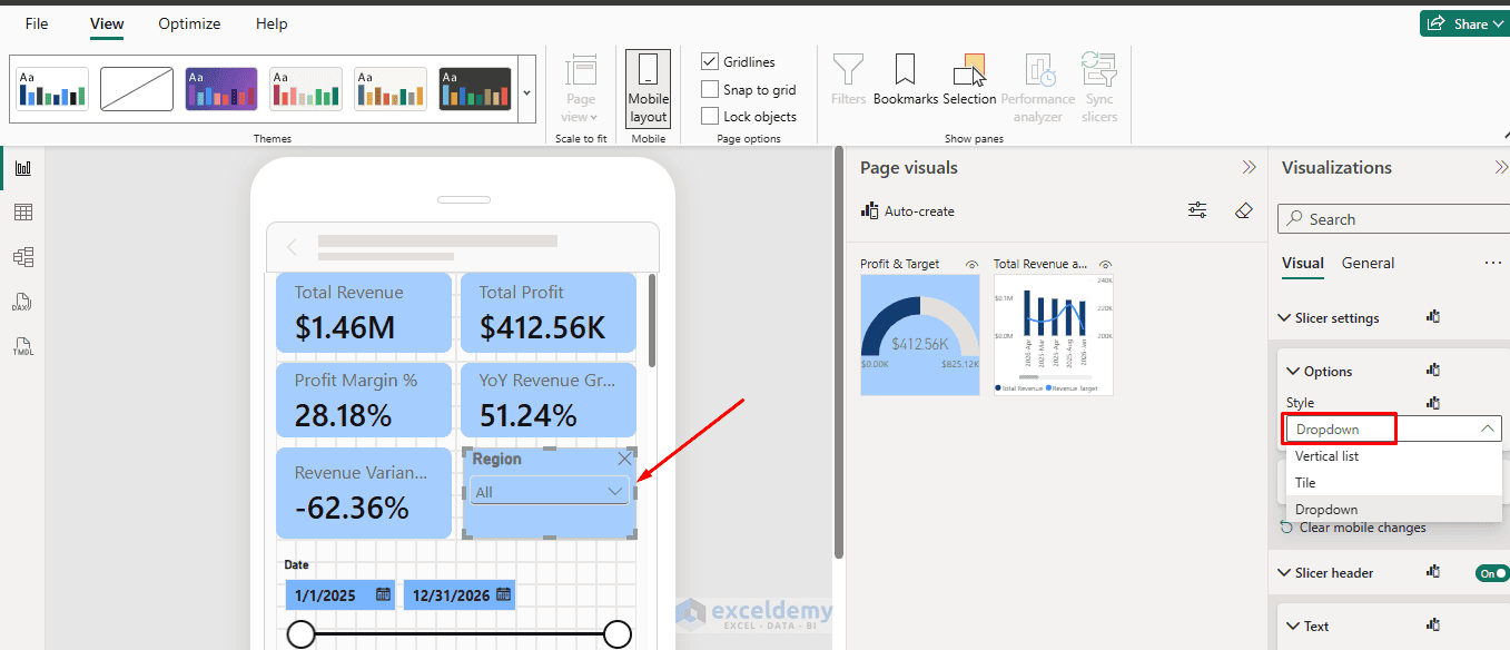
- Avoid slicers containing many tiny buttons
- Where appropriate, use a compact dropdown-style slicer instead of displaying every option at once
Mobile users interact with their fingers rather than a precise mouse pointer, so sufficient spacing between interactive elements is important. Microsoft specifically recommends giving visuals enough space so users can interact with them comfortably.
Step 6: Optimize Slicers, Buttons, and Touch Interactions
Phone users interact with the report using their fingers, not a mouse, so slicers, buttons, and navigation elements should be easy to tap.
Suppose your desktop report contains slicers for:
- Year
- Month
- Region
- Category
- Product
- Salesperson
Displaying all six slicers on a phone would take up too much space.
Instead, keep only the most important ones, such as:
- Date
- Region
- Category
Avoid slicers containing many tiny buttons. Where appropriate, use a compact dropdown-style slicer instead of displaying every option at once.
Less frequently used filters can remain available through Power BI’s filtering options. Buttons should also have enough space between them so users do not accidentally select the wrong one.
Step 7: Handle Tables and Detailed Data Carefully
Large tables are often difficult to use on phones. For example, displaying a table containing 100 product rows can force users to scroll through the report and then scroll again inside the table.
This creates a frustrating experience. Instead, consider:
- Showing only the most important rows
- Displaying Top 5 or Top 10 items
- Moving detailed tables to the bottom
- Creating a separate detail page
- Allowing users to open the visual when they need deeper analysis
For example, instead of displaying every product, show the top products:
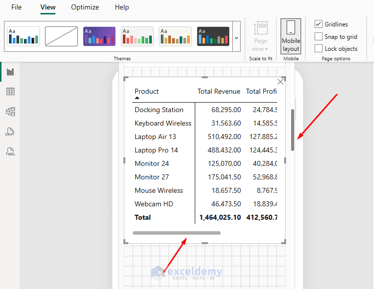
This gives users a quick summary without overwhelming the phone screen.
Also, leave some space between visuals. A small amount of empty space makes KPI cards, charts, and filters easier to distinguish.
Step 8: Test the Report in Mobile Layout
Do not judge the mobile report only by how it looks. Test how it behaves. While working in the mobile layout, check whether users can easily explore the filter options, such as:
- Slicers
- Charts
- Buttons
- Navigation controls
- Bookmarks
For example, select East from the Region slicer and check whether Total Sales, Profit, and other charts update correctly.
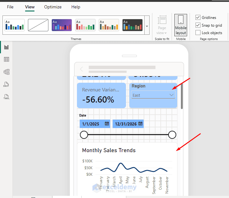
Power BI’s mobile layout canvas supports interaction with report elements while you design the mobile experience.
Also check readability. Make sure:
- Chart titles are short
- Labels are readable
- KPI values are not cut off
- Legends are not overcrowded
- Users do not need to zoom constantly
Step 9: Publish and Test in the Power BI Mobile App
Once the mobile layout is ready, save and publish your report as usual.
- Go to the Home tab >> click Publish
- Select the required Power BI workspace
- Complete the publishing process
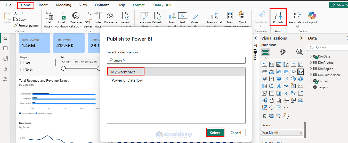
You do not need to publish the mobile layout separately. It is included with the Power BI report.
- Now open the report in the Power BI Mobile app
When a phone-optimized layout exists, Power BI automatically displays that optimized version when the phone is held vertically.
Test the complete experience again. Pay particular attention to:
- Text readability
- KPI visibility
- Chart size
- Filter usability
- Button spacing
- Scrolling distance
- Visual order
Testing on an actual phone is important because a layout that looks acceptable inside Power BI Desktop may feel different on a smaller physical screen.
Best Practices for Power BI Mobile Reports
When designing a Power BI report for phones, keep these points in mind:
- Show the most important KPIs first
- Do not include every desktop visual
- Use short chart titles
- Keep fonts large enough to read comfortably
- Use fewer slicers
- Keep buttons large enough for touch
- Limit the number of categories in charts
- Avoid large tables when possible
- Leave enough space between visuals
- Arrange insights from summary to detail
- Always test the final report on a real phone
Conclusion
By following this tutorial, you can design reports that actually work on a phone in the Power BI Mobile app. A successful Power BI mobile report is not just a smaller version of the desktop dashboard. The phone layout should be designed around how mobile users consume information: quickly, vertically, and through touch. Power BI’s Mobile layout lets you reorganize the same report specifically for smartphone users without affecting the desktop version. The key is to keep the design simple: important KPIs first, useful filters next, charts after that, and detailed information last. With Power BI’s dedicated Mobile layout, you can provide a much better phone experience without changing the underlying desktop report.
Get FREE Advanced Excel Exercises with Solutions!