This is an overview:
Download Practice Workbook
Download the practice workbook.
How to Add a Trendline in Excel – Easy Steps
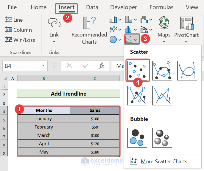
1. Insert a Chart to Add Trendlines
- Select B4:C9 >> go to Insert >> click Insert Scatter >> select Scatter.
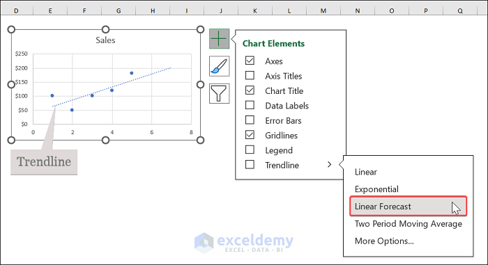
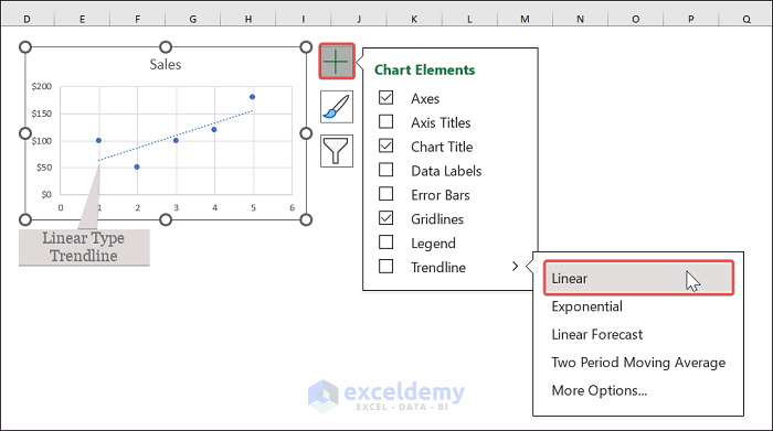
2. Expand Trendline Options from Chart Elements
- Click the chart area >> click the PLUS icon >> expand the Trendline options.

3. Insert a Trendline in an Excel Chart
- Choose a trendline type. Here, Linear Forecast.
How to Insert Multiple Trendlines in a Chart?
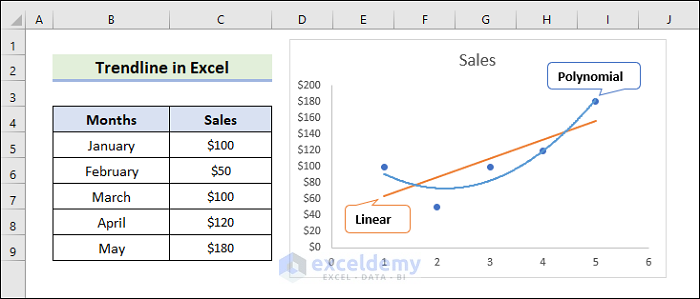
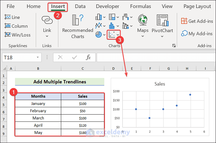
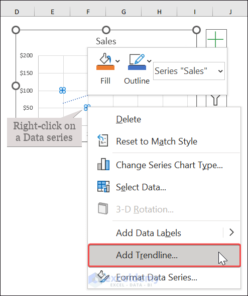
1. Inserting Multiple Trendlines in a Chart
- Choose B4:C9 >> go to the Insert tab >> choose Scatter.
- Click the PLUS icon >> Expand the Trendline options >> Choose Linear.
- Right-click any data series >> click Add Trendline.
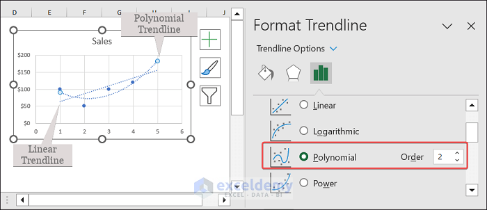
- In Format Trendline, choose Polynomial >> Enter 2 in order.
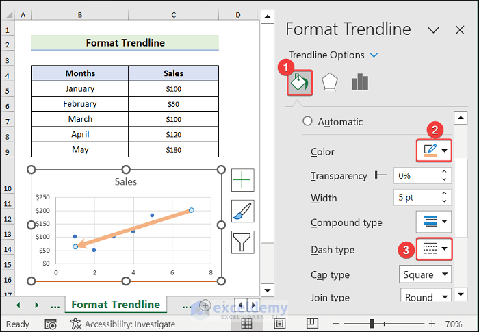
How to Format a Trendline in Excel?
- Right-click the trendline >> Choose Format Trendline.
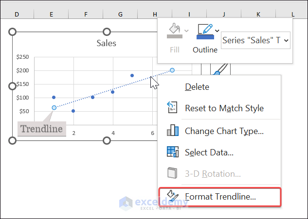
- Choose Fill & Line >> Apply formatting.
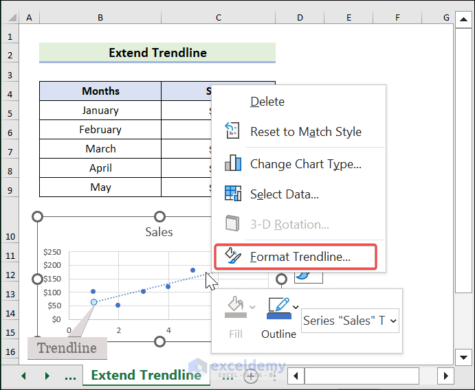
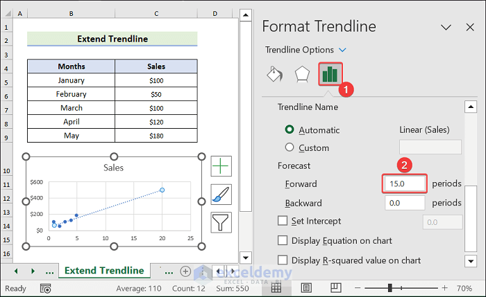
How to Extend a Trendline in Excel?
- Right-click the trendline >> Choose Format Trendline.
- Click Trendline Options >> enter Forward periods.
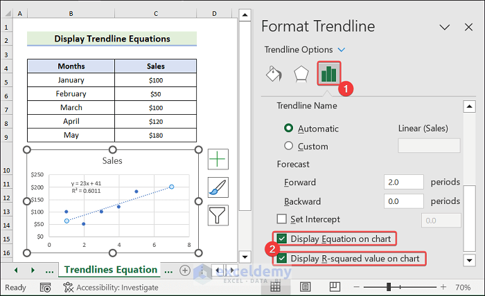
How to Display Trendline Equations on a Chart?
- Open the Format Trendline pane >> Choose Trendline Options >> Check Display Equation on Chart >> Check Display R-squared value on chart to display the trendline equation.
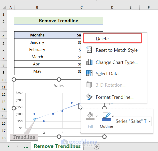
How to Remove a Trendline from a Chart?
- Right-click the trendline >> Choose Delete.
Why are Trendlines Not Showing?
- If you have few data points, Excel may not be able to generate a trendline.
- Not all chart types support trendlines. Use a compatible chart type, such as a scatter plot or line chart.
Trendline in Excel: Knowledge Hub
<< Go Back To Excel Charts | Learn Excel
Get FREE Advanced Excel Exercises with Solutions!
