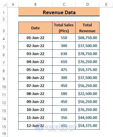
In the dataset below, the Total Revenue amounts depend on multiple conditions. To insert a polynomial trendline:
Polynomial and Its Expression
Polynomials are expressions containing variables (i.e., x and y) and coefficients (i.e.,a0,a2.. etc.); the expressions allow Arithmetic Operators and positive integer exponentiation. A typical Polynomial Expression is
a0+a1x+a2x2+…+an-1xn-1+anxn
Method 1 – Using the Chart Elements Option to Insert a Polynomial Trendline
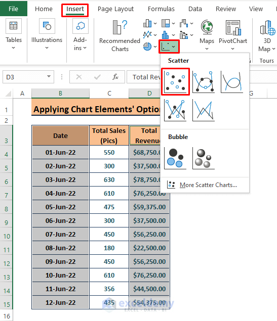
- Select the columns in the dataset and go to Insert.
- Click a Chart type. Here, Insert Scatter or Bubble Chart.
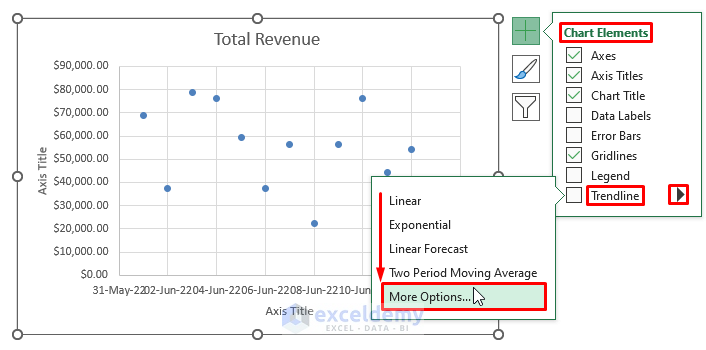
Step 2:
- Click the chart.
- Click on the Plus Icon > Arrow Icon beside Trendline > More Options.
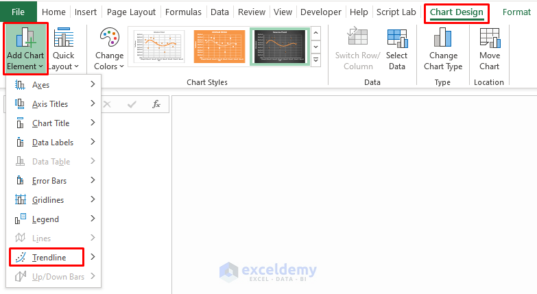
You can also add the trendline by clicking the Chart > Chart Design > Add Chart Element (in Chart Layouts) > Trendline.
Step 3:
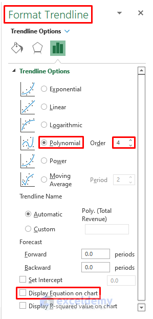
- In the Format Trendline window, select Polynomial and enter 4 in Order.
You can display the polynomial equation on the Chart.
- Format the Chart:
Method 2 – Using a Polynomial Formula to Create a Trendline
Step 1:
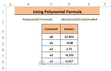
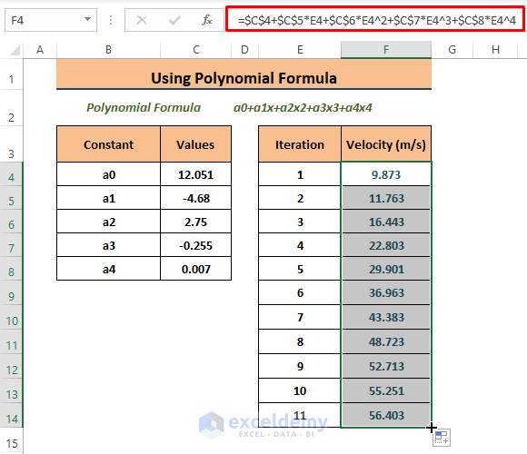
- Enter the random constant values as shown in the picture below.
Step 2:
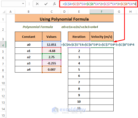
- Copy the following formula into G4.
=$C$4+$C$5*E4+$C$6*E4^2+$C$7*E4^3+$C$8*E4^4In the formula: C4 = a0 C5= a1 C6= a2 C7= a3 C8= a4
Step 3:
- Press ENTER.
- Drag down the Fill Handle to see the result in the rest of the cells.
Step 4:
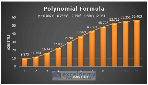
- Repeat Steps 1 to 3 in Method 1 to insert a Column Chart and a Trendline.
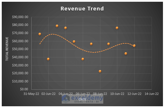
This is the output.
Read More: How to Create Trend Chart in Excel
Download Excel Workbook
Related Articles
- How to Draw Best Fit Line in Excel
- How to Insert Trendline in an Excel Cell
- How to Calculate Trend Analysis in Excel
- How to Create Monthly Trend Chart in Excel
- How to Calculate Trend Percentage in Excel
<< Go Back To Trendline in Excel | Excel Charts | Learn Excel
Get FREE Advanced Excel Exercises with Solutions!
