Excel is a versatile tool that can be used to analyze data and create charts and graphs. One common use of Excel is to plot the best-fit line through a set of data points. A quadratic best-fit line can be used to model data that has a curved relationship between the independent and dependent variables. In this article, we will discuss two step-by-step methods for plotting a quadratic best fit line in Excel. These methods will allow you to create a visual representation of the relationship between two variables and make predictions based on the data.
Quadratic Trendline Equation
The quadratic trendline equation in Excel is a mathematical formula that represents the best-fit quadratic curve for a set of data points. The equation takes the form of:
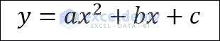
where “a”, “b”, and “c” are coefficients determined by Excel’s trendline analysis. The “a” coefficient represents the quadratic term, the “b” coefficient represents the linear term, and the “c” coefficient represents the constant term.
How to Plot Best Fit Quadratic Line in Excel: 2 Easy Ways
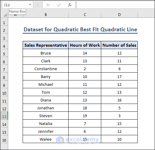
Here we have given a dataset of Sales and we are going to make a best fit quadratic line using the dataset, where the Number of Sales is dependent and Hours of Work is a dependent variable.
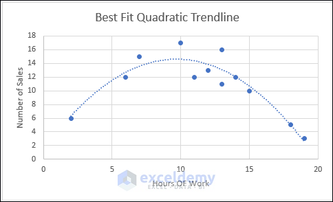
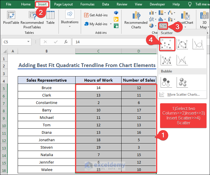
1. Adding Best Fit Quadratic Trendline From Chart Elements
In this section, we are going to demonstrate how to create the best fit quadratic trendline from chart elements. In order to do so, we have to follow the following steps to create a scatter graph first then add a polynomial trendline with an order of 2.
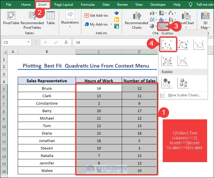
- First, select the “Hours of Work” and “Number of Sales” columns (the range C5:D16).
- Then go to Insert>> Insert Scatter and select Scatter.
- Then we select Chart Elements>> Trend Line>> More Options to select a polynomial trendline.
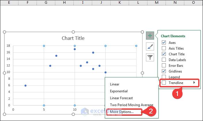
- Then after selecting Trendline Options>>Polynomial, insert 2 as Order.

- After giving the proper Chart Title and Axis Title, the graph should look like the one below.

2. Plotting Best Fit Quadratic Line From Context Menu
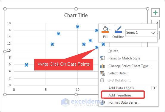
This procedure is almost the same as the above. Instead of Chart Elements, we have used the context menu we get while right-clicking the data points to access the trendline formatting options here. You have to go through the following steps.
- First, select the “Hours of Work” and “Number of cells” columns (the range C5:D10).
- Then go to Insert>>Insert Scatter>>Scatter to get a scatter graph.
- After selection, you will get the Scatter graph. Then select Add Trendline from the context menu you will get from right-clicking on the data points.
- Then after selecting Trendline Options>>Polynomial, insert an Order of 2.
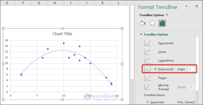
- After giving the proper Chart Title and Axis Title, the chart should look like below.
Read More: How to Draw Best Fit Line in Excel
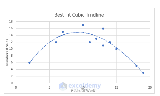
How to Add Cubic Trendline in Excel
To add a cubic trendline, we have to create a scatter graph first and add a trend line of polynomial order of 3. In order to do so, you have to follow the steps mentioned below.
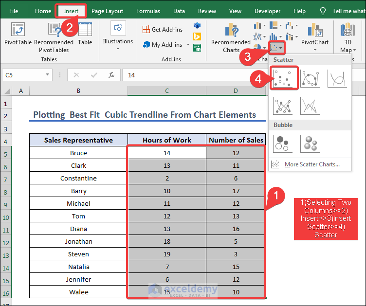
- First, we have selected the “Hours of Work” and “Number of Sales” columns.
- Then we selected Insert>>Insert Scatter>>Scatter like before to get the scatter graph.
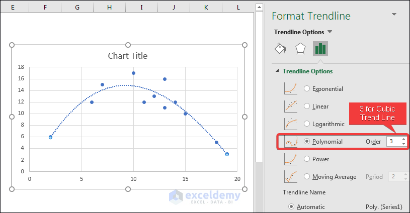
- After that, we selected Chart Elements>> Trend Line>> More Options like the image below.

- Then after selecting Trendline Options>>Polynomial, we selected an Order of 3. Order 3 defines the best fit cubic trend line.
- After giving the proper Chart Title and Axis Title we get the final graph as shown below.

Things to Remember
Here are some things to remember about the best fit quadratic trendline.
1. Make sure your data is organized in a table with clear headings for each column.
2. Ensure that your data has a curved relationship between the independent and dependent variables. If the relationship is linear, a quadratic best fit line will not accurately represent the data.
3. Always label your chart with clear titles and axes labels, so that readers can easily interpret the data.
4. Remember that a quadratic best fit line is just a model of the data, and should not be relied on as a perfect prediction tool.
5. If you are unsure about the best method to use for your data, consult a statistician or Excel expert for guidance.
6. Finally, be mindful of potential errors or mistakes in your data, and double-check your calculations and chart to ensure accuracy.
Download Practice Workbook
You can download the Excel workbook that we used to prepare this article.
Conclusion
In conclusion, plotting a quadratic line of best fit in Excel can help to visualize data with a curved relationship between the independent and dependent variables. With just a few simple steps, Excel users can create a scatterplot and add a quadratic trendline to model their data. It is important to note that a quadratic line of best fit is only a model and should be used with caution when making predictions. As with any statistical analysis, it is important to ensure the accuracy of the data and consult a statistician or Excel expert if necessary. By following the steps outlined in this guide, users can easily and accurately plot a quadratic line of best fit in Excel and use it to better understand their data.
Frequently Asked Questions (FAQs)
Q1: What is a quadratic best fit line?
A: A quadratic best fit line is a curve that represents the best possible fit through a set of data points with a curved relationship between the independent and dependent variables.
Q2: Why would I want to plot a quadratic best fit line in Excel?
A: If your data has a curved relationship, a quadratic best fit line can provide a more accurate representation of the data than a linear best fit line.
Q3: What are some benefits of using Excel to plot a quadratic best fit line?
A: Excel provides a quick and easy way to plot a best fit line and visualize the relationship between two variables. It also allows you to easily update and modify the chart as new data becomes available.
Related Articles
- How to Make a Polynomial Trendline in Excel
- How to Insert Trendline in an Excel Cell
- How to Calculate Trend Analysis in Excel
- How to Create Trend Chart in Excel
- How to Create Monthly Trend Chart in Excel
- How to Calculate Trend Percentage in Excel
<< Go Back To Trendline in Excel | Excel Charts | Learn Excel
Get FREE Advanced Excel Exercises with Solutions!
