Method 1 – Applying the FORECAST.LINEAR Function to Create a Monthly Trend Chart
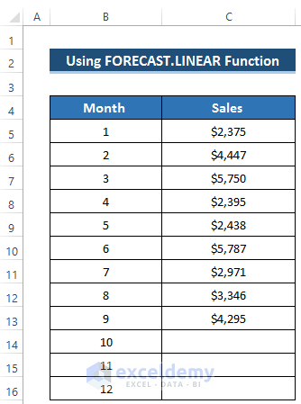
We have a dataset that includes sales for nine months. We are using the FORECAST.LINEAR function to predict future sales along with a linear trendline.
Steps
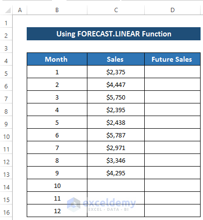
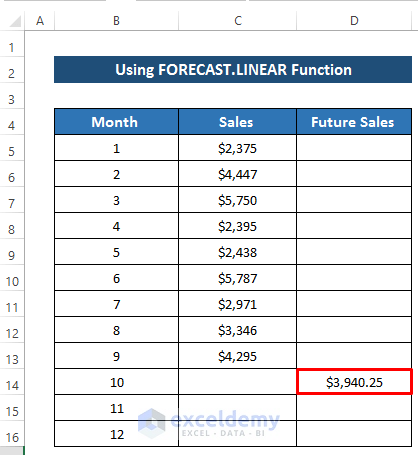
- Create a new column where we want to predict future sales.
- Select cell D10.
- Enter the following formula:
=FORECAST.LINEAR(B14,$C$5:$C$13,$B$5:$B$13)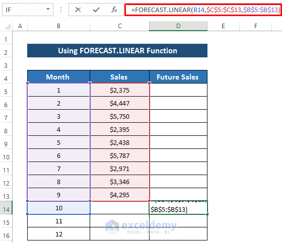
- Press Enter to apply the formula.
- Drag the Fill Handle icon down the column.
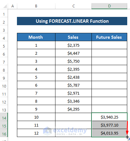
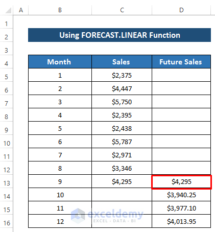
- Before using the scatter chart, set the sales value of month 9 into cell D9.
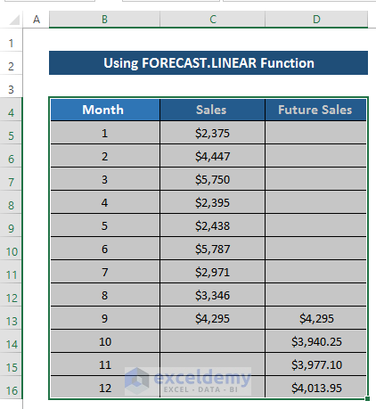
- Select the range of cells B4 to D16.
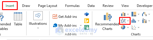
- Go to the Insert tab in the ribbon.
- From the Charts group, select Insert Scatter or Bubble chart.
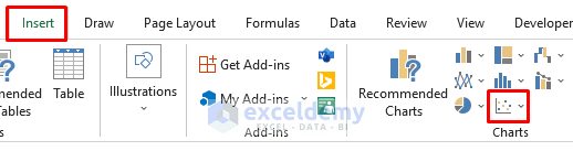
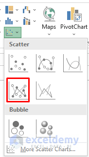
- It will give us several options.
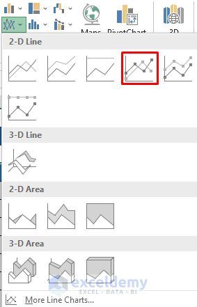
- Select Scatter with Straight Lines and Makers.
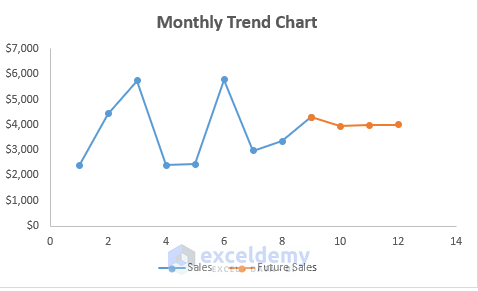
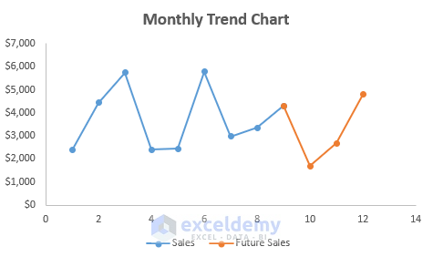
- It will give us the following result. See the screenshot.
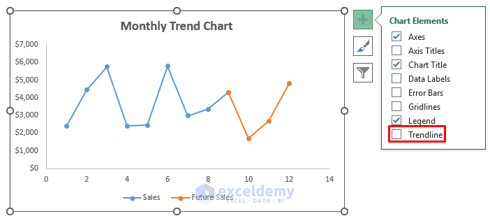
- Select the Plus (+) icon on the right side of the chart.
- Click on Trendline.
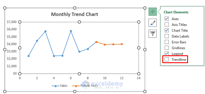
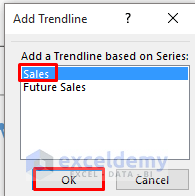
- The Add Trendline dialog box will appear.
- Select the Sales option from the Add a Trendline based on Series section.
- Click on OK.
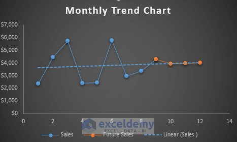
- As a result, a linear trendline will occur.
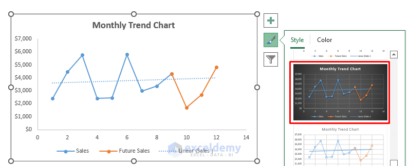
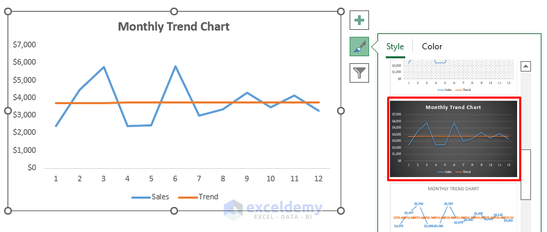
- To change the Chart Style, click on the Brush icon on the right side of the chart.
- Select any of the chart styles.

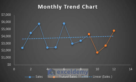
- We’ll get the following result. See the screenshot.
Read More: How to Create Trend Chart in Excel
Method 2 – Using the Excel FORECAST.ETS Function to Create a Monthly Trend Chart
Steps
- Create a new column where we want to predict future sales.
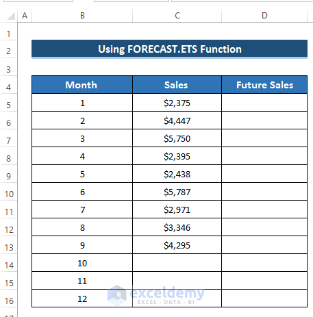
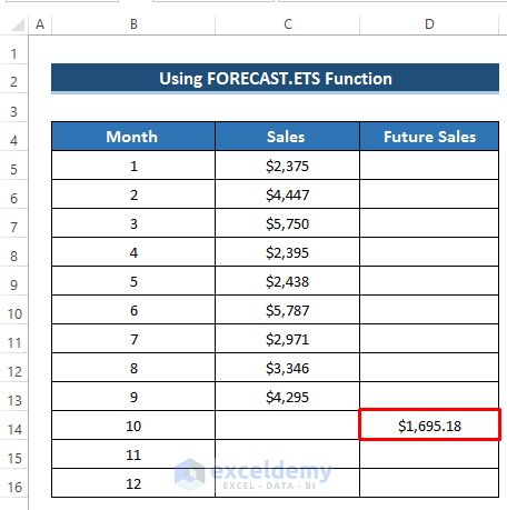
- Select cell D10.
- Enter the following formula:
=FORECAST.ETS(B14,$C$5:$C$13,$B$5:$B$13,1)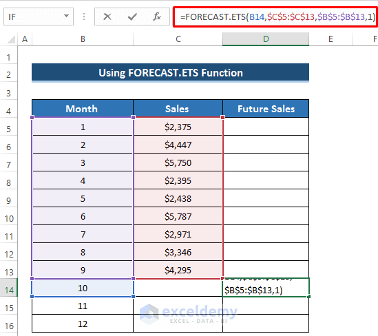
- Press Enter to apply the formula.
- Drag the Fill Handle icon down the column.
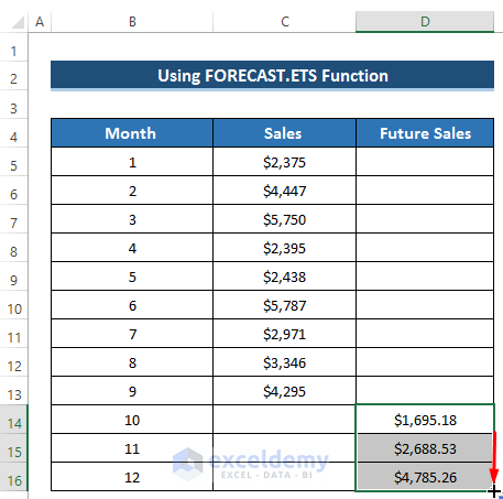
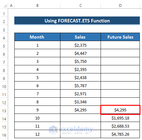
- Before using the scatter chart, set the sales value of month 9 into cell D9.
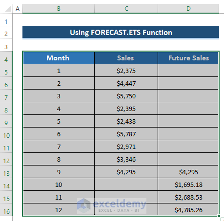
- Select the range of cells B4 to D16.
- Go to the Insert tab in the ribbon.
- From the Charts group, select Insert Scatter or Bubble chart.
- It will give us several options.
- Select Scatter with Straight Lines and Makers.
- It will give us the following result. See the screenshot.
- Select the Plus (+) icon on the right side of the chart.
- Click on Trendline.
- The Add Trendline dialog box will occur.
- Select the Sales option from the Add a Trendline based on Series section.
- Click on OK.
- As a result, a linear trendline will occur.
- To change the Chart Style, click on the Brush icon on the right side of the chart.
- Select any of the chart styles.
- We’ll get the following result. See the screenshot.
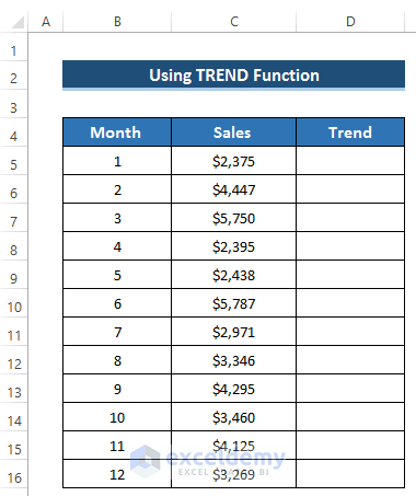
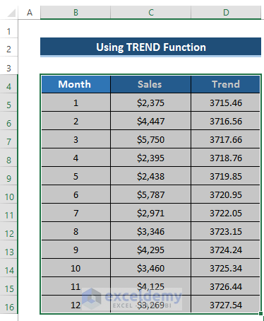
Method 3 – Using the TREND Function to Create a Monthly Trend Chart
Steps
- Create a new column named Trend.
- Select the range of cells D5 to D16.
- Enter the following formula in the formula box:
=TREND(C5:C16,B5:B16)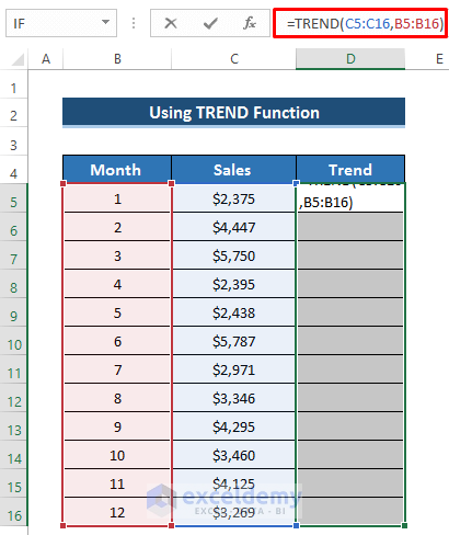
- To apply the formula, press Ctrl+Shift+Enter.
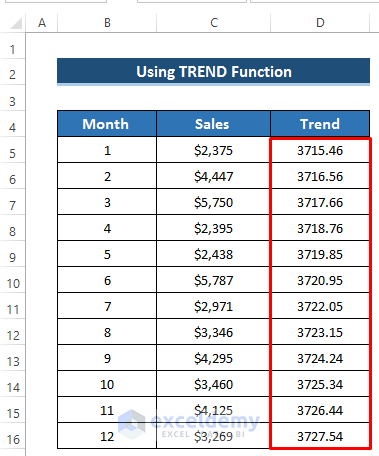
- It will give us the following result.
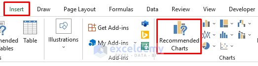
- Select the range of cells B4 to D16.
- Go to the Insert tab in the ribbon.
- From the Charts group, select Recommended Charts.
- The Insert Chart dialog box will occur.
- Select Line chart.
- Click on OK.
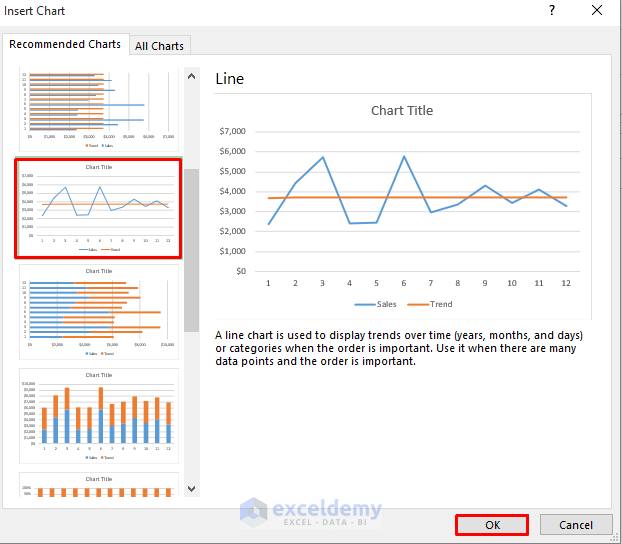
- It will give us the following result. See the screenshot.
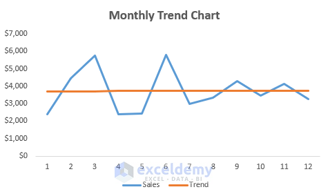
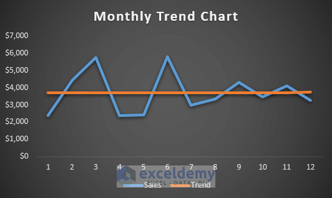
- To change the Chart Style, click on the Brush icon on the right side of the chart.
- Select any of the chart styles.
- We will get the following results. See the screenshot.
Read More: How to Calculate Trend Analysis in Excel
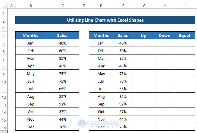
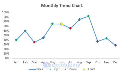
Method 4 – Combining a Line Chart with Excel Shapes to Make a Monthly Trend Chart
Steps
- Create some new columns with some random values.
- This is created to modify the chart.
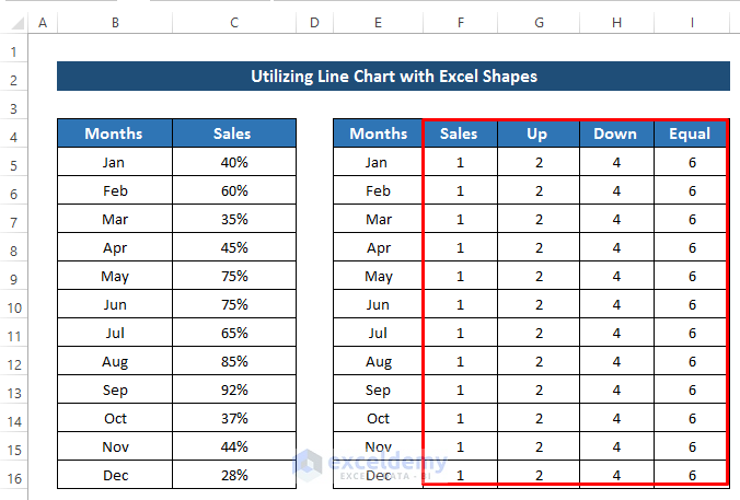
- Select the range of cells E4 to I16.
- Go to the Insert tab in the ribbon.
- From the Charts group, select the Insert Line or Area Chart drop-down option.
- From the Line or Area Chart, select the Line with Markers chart option.
- It will give us the following result. See the screenshot.
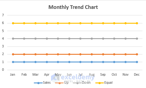
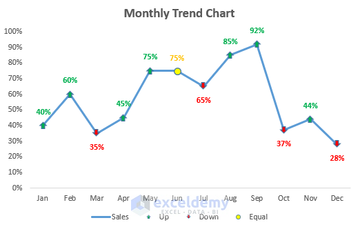
- Create some shapes for up, down, and equal sales.
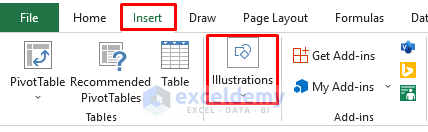
- Go to the Insert tab in the ribbon.
- Select the Illustrations drop-down option.
- From the Shapes drop-down option, select the up arrow for sales up and select the down arrow for sales down.
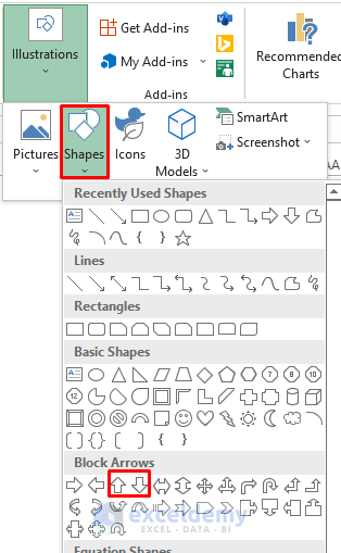
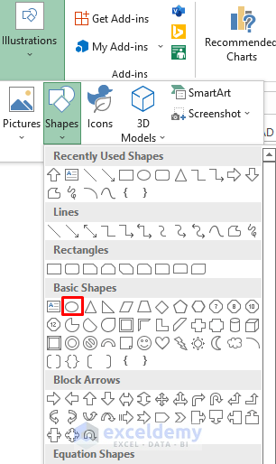
- For the equal percentage of sales, select the Oval sign.
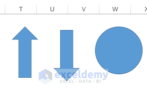
- It will give us the following results. See the screenshot.
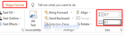
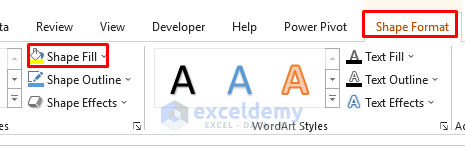
- Select any shape, and the Shape Format tab in the ribbon will open up.
- Go to the Shape Format tab in the ribbon.
- From the Size group, change the size of the shape.
- Go to the Shape Format tab in the ribbon
- From the Shape Style group, select Shape Fill.
- For the up arrow, set Shape Fill to green.
- For the down arrow, set Shape Fill to red.
- For the oval shape, set the Shape Fill to yellow.
- Click on the markers for the up column. It will select the markers.
- Press Ctrl+V to paste the up arrow.
- It will give us the following results.
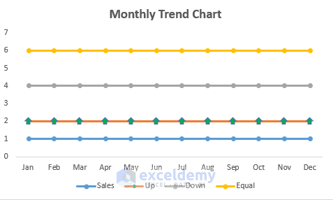
- Do the same thing for the down arrow and oval shape.
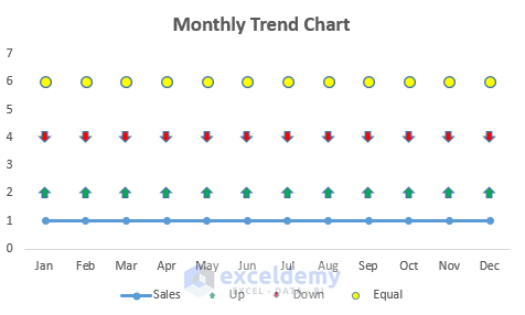
- It will give you the following result.
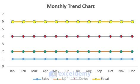
- Remove the line from the Up, Down, and Equal series.
- To remove the line, double on the line.
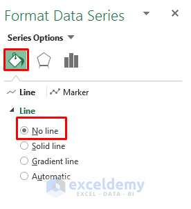
- It will open the Format Data Series dialog box.
- From the Line section, select No Line.
- Do it for the other two, and you’ll get the following result: See the screenshot.
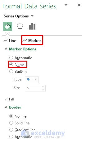
- We want to remove the markers from the Sales series.
- Double-click on the sales line with markers.
- It will open up the Format Data Series dialog box.
- Select the Marker
- In the Marker Options section, click on None.
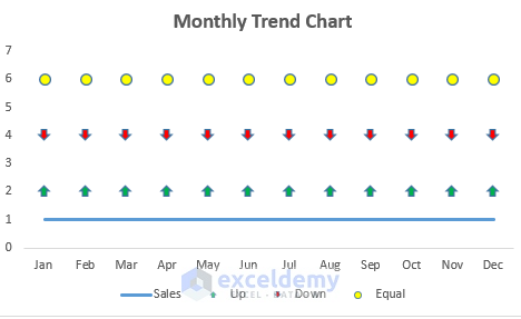
- It will give us the following result.
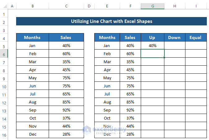
- Change column F and set the value of column C.
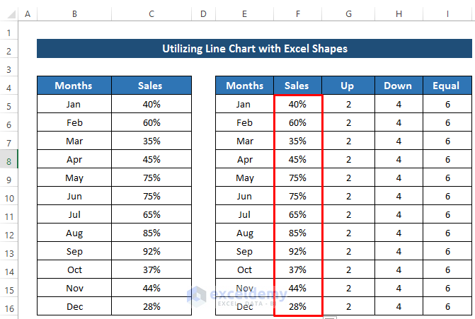
- Delete the values of column G, column H, and column I.
- In the first month, we set the sales percentage to 40% in cell G5.
- For the other 11 months, we need to apply some conditions.
- Select cell G6.
- Enter the following formula using the IF and NA functions.
=IF(F6>F5,F6,NA())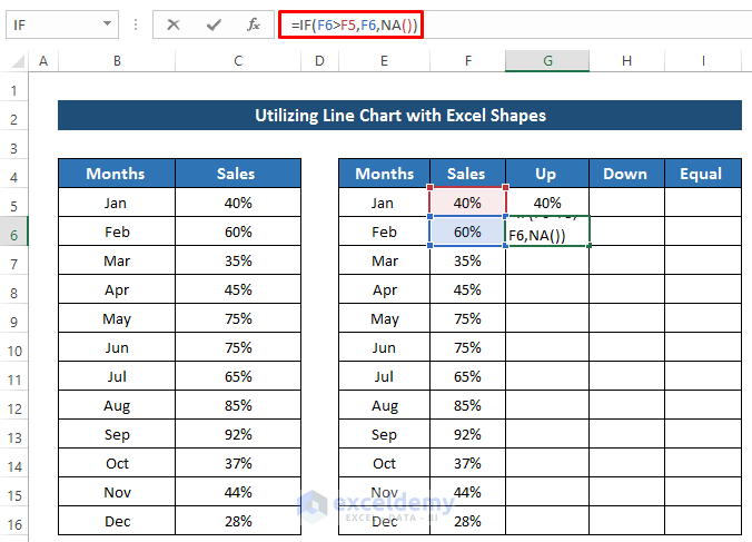
- Press Enter to apply the formula.
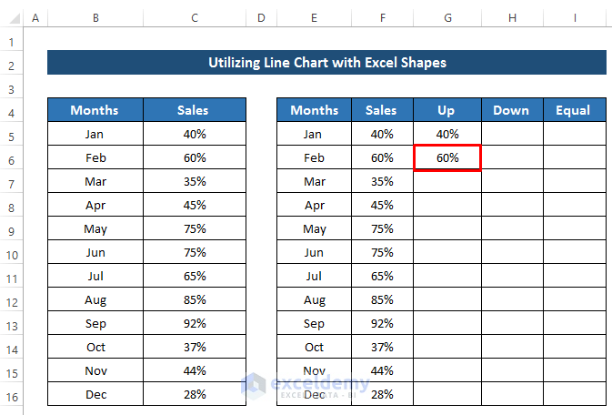
- Drag the Fill Handle icon down the column.
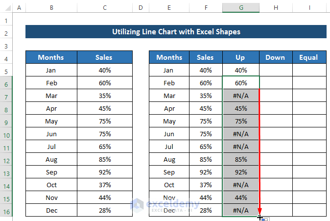
- As we set the first month as up sales, the down sales will be blank.
- Select cell H6.
- Enter the following formula:
=IF(F6<F5,F6,NA())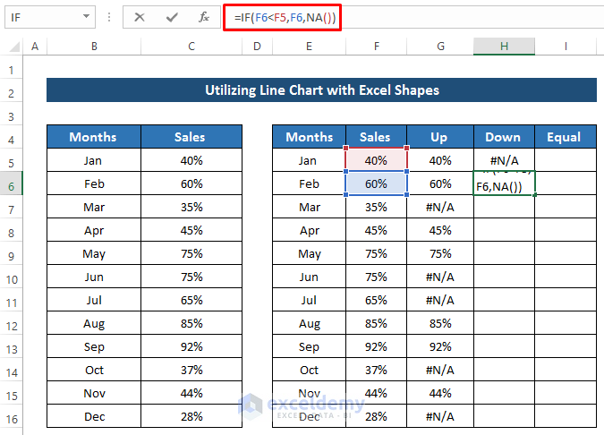
- Press Enter to apply the formula.
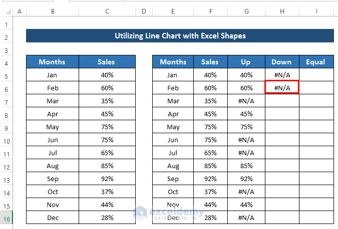
- Drag the Fill handle icon down the column.
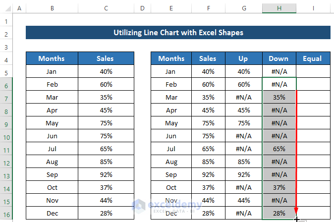
- As we set the first month as up sales, the equal sales will be blank.
- Select cell I6.
- Enter the following formula.
=IF(F6=F5,F6,NA())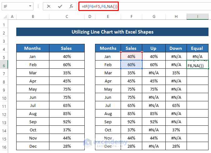
- Press Enter to apply the formula.
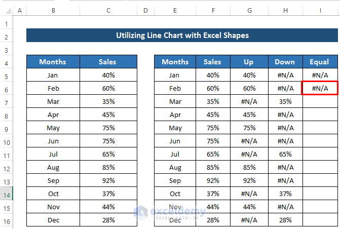
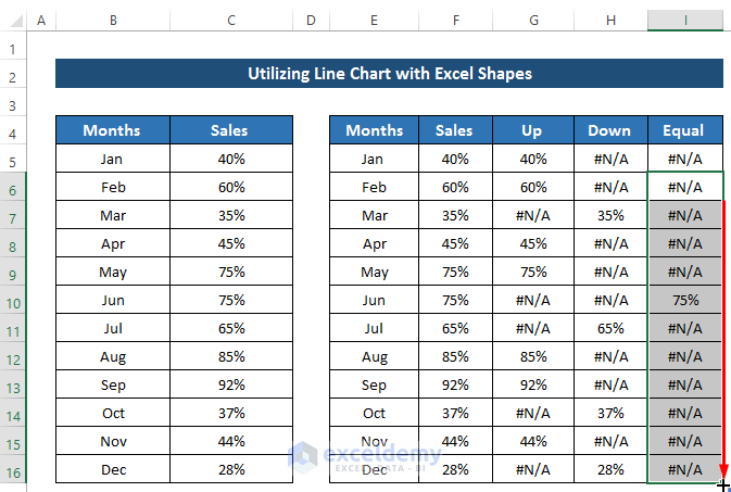
- Drag the Fill Handle icon down the column.
Breakdown of the Formula
⟹ IF(F6>F5,F6,NA()): It denotes that if cell F6 is greater than cell F5, then, it will return the value of cell F6. Otherwise, it will return that no value is available. It means that if the sales are higher than the previous month, it will return the sale of this month, or else it will return nothing,
⟹ IF(F6<F5,F6,NA()): It denotes that if cell F6 is lower than cell F5, then, it will return the value of cell F6. Otherwise, it will return that no value is available. It means that if the sales are lower than the previous month, it will return the sale of this month, or else it will return nothing,
⟹ IF(F6=F5,F6,NA()): It denotes that if cell F6 is equal to cell F5, then, it will return the value of cell F6. Otherwise, it will return that no value is available. It means that if the sales are equal to the previous month, it will return the sale of this month, or else it will return nothing
- It will give us the following solution in the chart. See the screenshot.
- Then, right-click on the markers.
- A Context Menu will occur. From there, select Add Data Labels.
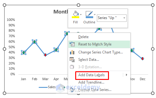
- Finally, you’ll get the following result. See the screenshot.
Download the Practice Workbook
Download the practice workbook below.
Related Articles
- How to Make a Polynomial Trendline in Excel
- How to Draw Best Fit Line in Excel
- How to Insert Trendline in an Excel Cell
- How to Calculate Trend Percentage in Excel
<< Go Back To Trendline in Excel | Excel Charts | Learn Excel
Get FREE Advanced Excel Exercises with Solutions!
