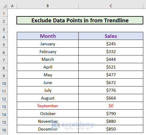
This is the sample dataset. It showcases month-wise sales data. In September, the organization did not operate: the sales amount is $0.
To exclude this value from the chart:
Method 1 – Edit the Dataset to Exclude Data Points from the Trendline
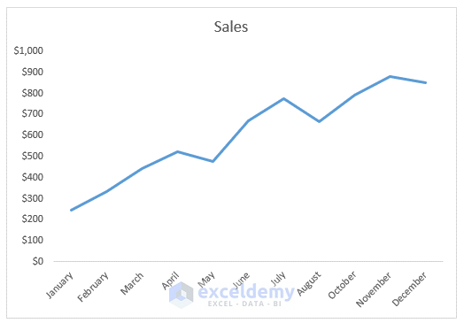
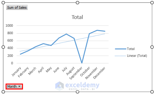
This is the line chart for the dataset.
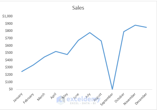
The sales value for September is an outlier and misrepresents the trend.
Steps:
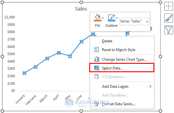
- Select the data points.
- Right-click.
- Click Select Data.
- In the new box, uncheck September in Horizontal Axis Labels.
- Click OK.
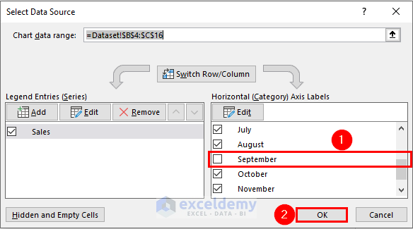
Excel will exclude the data point for September.
Read More: How to Create Equation from Data Points in Excel
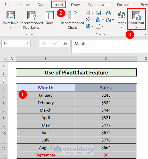
Method 2 – Use the PivotChart Feature to Exclude Data Points from a Trendline
Steps:
- Select the dataset: B4:C16.
- Go to the Insert tab.
- Select PivotChart.
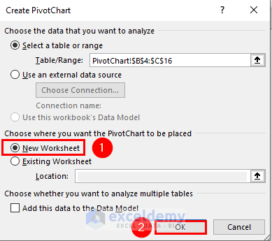
- In the Create PivotChart box, select the location of your PivotChart.
- Click OK.
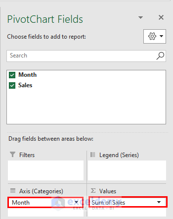
- Excel will create a PivotChart.
- Drag Month to Categories and Sales to Values.
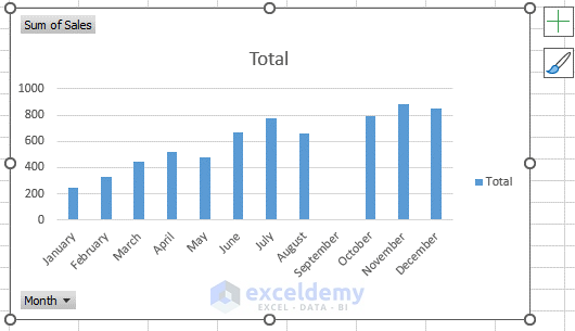
Excel will by default calculate the Sum of Sales.
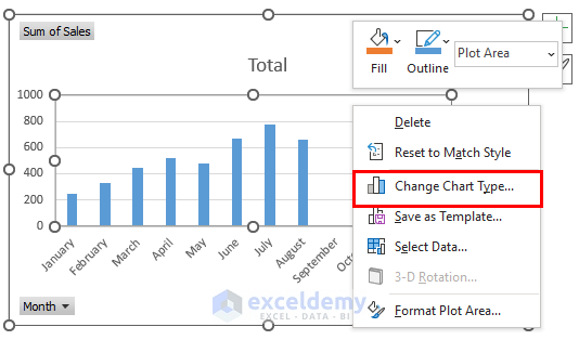
- A column chart will be displayed.
- Change the chart type.
- Select the chart and right-click.
- Select Change Chart Type.
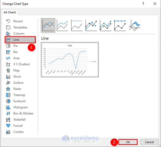
- Select Line
- Click OK.
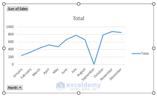
- A line chart is created.
- Select the Add Element.
- Check Trendline.
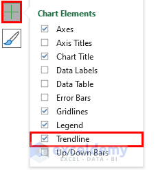
Excel will add a Trendline.
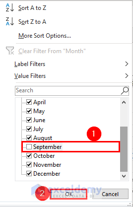
- To filter months, select the drop-down for Month.
- Uncheck September.
- Click OK.
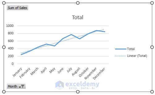
Excel will exclude the data point for September.
Things to Remember
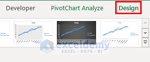
- You can also add a Trendline in Design. This window will be displayed when you select the chart:
Download Practice Workbook
Download the workbook and practice.
Related Articles
- How to Add Trendline Equation in Excel
- How to Add a Trendline to a Stacked Bar Chart in Excel
- How to Find Unknown Value on Excel Graph
- How to Extend Trendline in Excel
- [Solved]: Trendline Option Not Showing in Excel
- How to Add Trendline in Excel Online
<< Go Back To Trendline in Excel | Excel Charts | Learn Excel
Get FREE Advanced Excel Exercises with Solutions!
