A Trendline is a popular way to make predictions in Excel. Often, we need to find the Trendline equation to see the slope and the constant. Excel has a feature that lets us get that equation for different types of trendlines. In this article, we’ll see how easy it is to add a Trendline equation in Excel.
What is Trendline and Trendline Equation in Excel?
A Trendline is a chart pattern that is made up of a straight line of highs or lows. It is made by putting a straight line between two or more price points. One can use a Trendline to show how prices have moved in the past. Also to show where support and resistance levels are. We use the Trendline equation to determine a line that provides the most accurate fit to a set of data points.
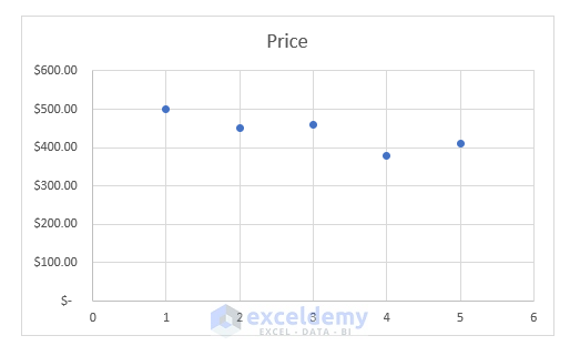
We’ll need a Trendline on our chart to figure out the Trendline equation. There are different kinds of trendlines in Excel. We’ll choose the one that gets us the most points. For instance, we have a sample dataset like the one below to show how these things work. Here, we can see how the price of decor has changed over time.

Also, a Scatter Plot of the given dataset is shown below.
Now to add the trendline equation to the plot, we need to follow the steps below.
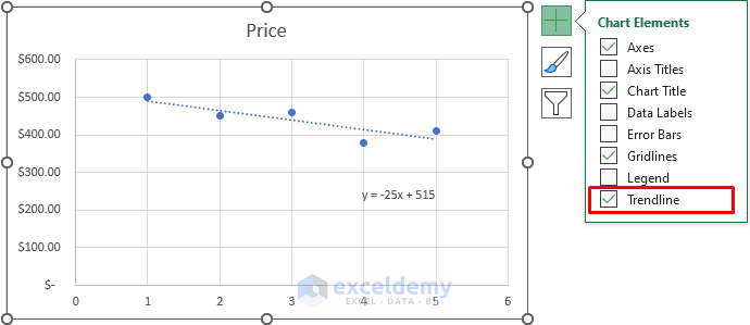
Step 1: Creating Chart with Trendline
First, we will need a Trendline on our plot to add a Trendline equation to it. To do so, we will follow these steps:
- To begin with, we need to select the chart. Click on the ‘+’ sign or the Chart Element.

- Additionally, select Trendline from the Chart Element That will instantly add a linear Trendline to the plot.
Read More: How to Add a Trendline to a Stacked Bar Chart in Excel
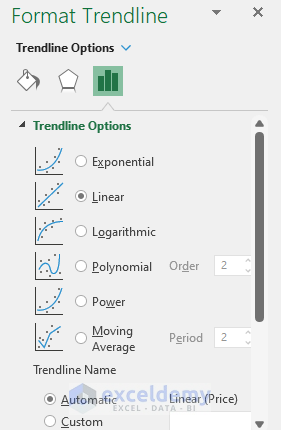
Step 2: Adding Trendline Equation to Excel Chart
Now we have our Trendline, we can add an equation to it. To do so, we will follow these steps:
- Firstly, select the Trendline on the plot and double-click on it. This will open the Format Trendline panel like this. From this panel, we can also choose different kinds of trendlines.
- Secondly, we will go to the bottom of the panel and see there is an option ‘Display Equation on the chart’.
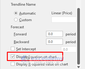
- Finally, selecting that option will immediately insert an equation on the chart like the below image.
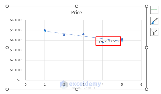
- Moreover, we can drag the equation to a suitable place to see it properly and get an image like this.

There we have it. Trendline equation, added to our plot, using Format Trendline panel.
Read More: How to Find the Equation of a Trendline in Excel
Things to Remember
- If you have any problem with Linear Trendline, you can choose other options from the Format Trendline.
- Choosing different types of trendlines will give us different Trendline equations. But the method will be exactly the same to obtain that equation.
Download Practice Workbook
You can download the practice workbook from here.
Conclusion
In this article, we showed how to insert a Trendline on the scatter plot and how to get a Trendline equation in Excel. We use Trendline equations to show the rise or fall of anything over time in a mathematical way. If you’re still having trouble with any of these steps, let us know in the comments. Our team is ready to answer all of your questions.
Related Articles
- How to Visualize Trends in Excel
- How to Find Unknown Value on Excel Graph
- How to Extend Trendline in Excel
- How to Exclude Data Points from Trendline in Excel
- How to Add Multiple Trendlines in Excel
- [Solved]: Trendline Option Not Showing in Excel
- How to Add Trendline in Excel Online
- How to Use Trendline Equation in Excel
- How to Create Trend Chart in Excel
<< Go Back To Trendline Equation Excel | Trendline in Excel | Excel Charts | Learn Excel
Get FREE Advanced Excel Exercises with Solutions!
