Trendlines help an individual to determine the current market price direction. It is important to make decisions about trading products, investing money in business, etc. Excel can help greatly to visualize both current and future trends using data. In this article, we will walk you through 3 effective ways to visualize trends in Excel.
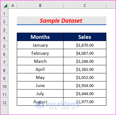
In this article, we will demonstrate three suitable ways to visualize trends in Excel. We will use the following dataset for this purpose. The dataset contains a column of Months and another column of Sales.
1. Inserting Trendline into a Chart to Visualize Trends
In the first method, we will insert a trendline in a chart to visualize trends. The steps are discussed below.
Steps:
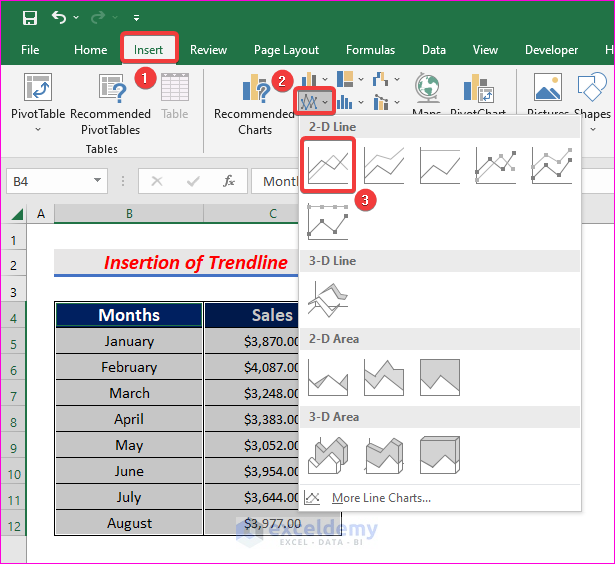
- First of all, select the column of Sales and then hold Ctrl button and select the column of Months.
- Next, from the Insert tab, go to,
Insert → Charts → Insert Line or Chart Area → Line
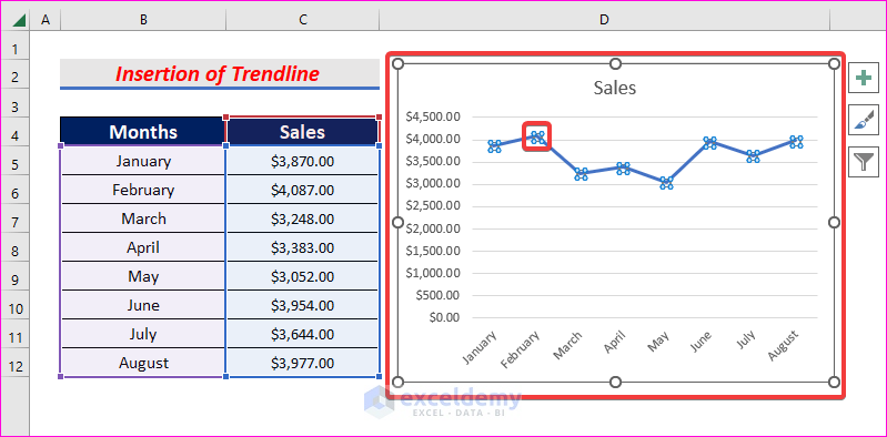
- A chart with all the data points will be created.
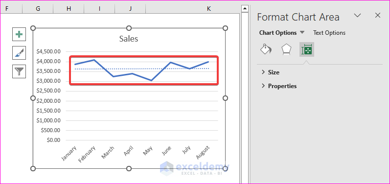
- Now left-click on the line in the chart. It will show all the points on the line.
- Then right-click on the line and select Add Trendline.
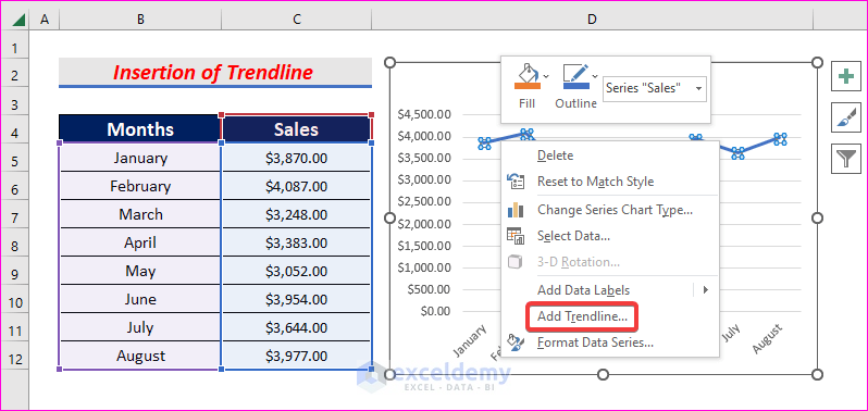
- Once you click on Add Trendline, a trendline will be visible on the chart.
- Additionally, the Format Chart Area will appear on the right side of the window.
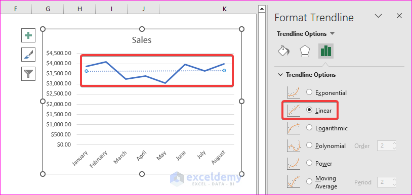
- Now click on the trendline and select Linear from Trendline Options. You can also choose Exponential, Logarithmic, Polynomial, if you need.
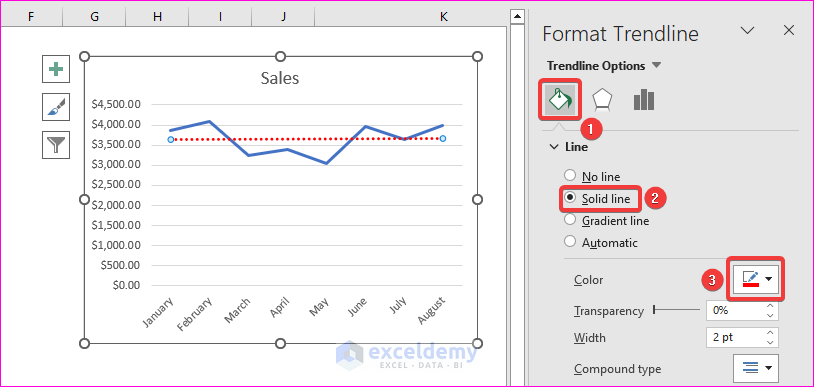
- Now we want to format our trendline. To do it, select the trendline and click on Fill & Line.
- Then select Solid line and change the Color as per your need.
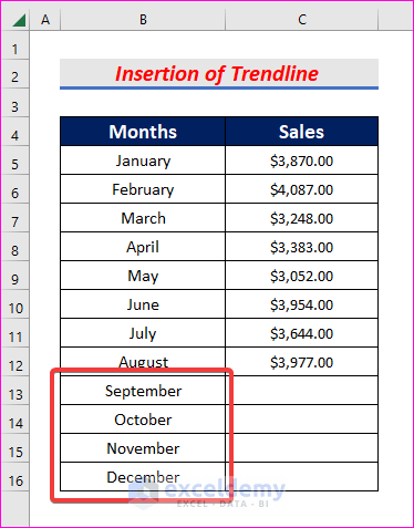
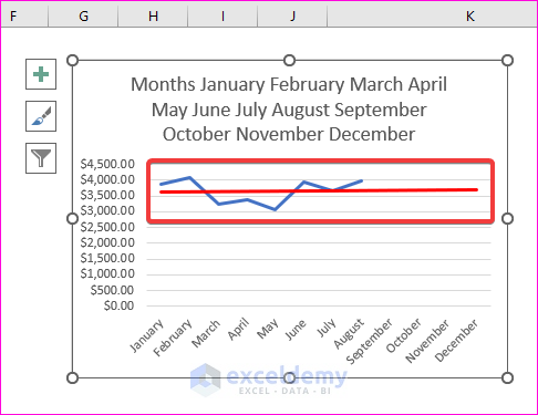
- Now we want to see trends for the future months. Therefore, add September to December months in the Months column.
- Then select the chart and change the Period to 4 in the Forward option under Forecast.
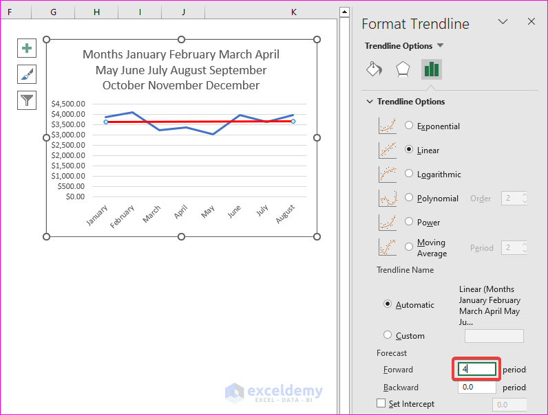
- After that, click on the chart to see the extended trendline for the newly added four months.
Read More: How to Add Trendline in Excel Online
2. Using the TREND Function to Visualize Trends in Excel
In this method, we will use the TREND function to visualize trends in Excel. Keep reading to learn the steps.
Steps:
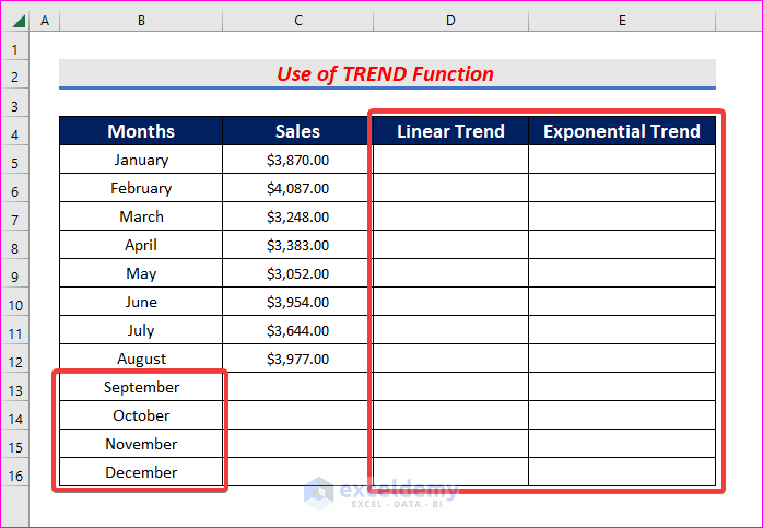
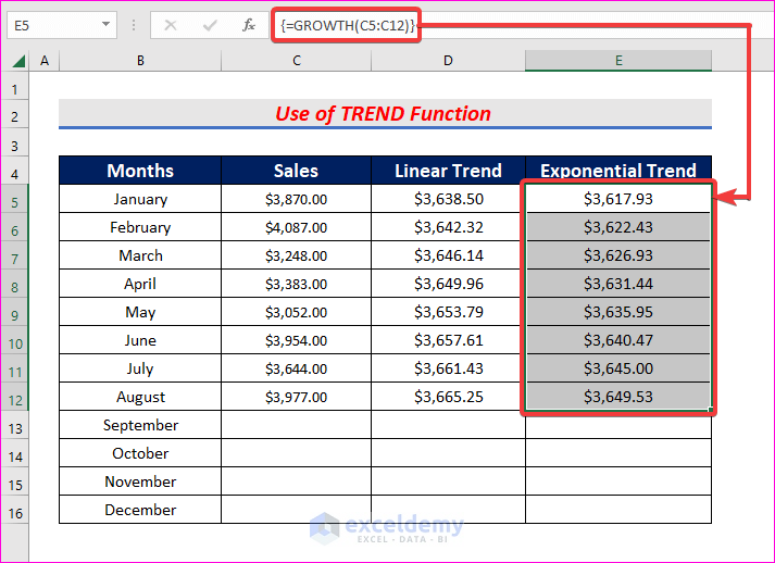
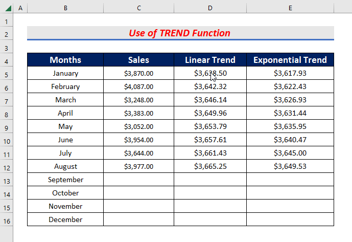
- First, insert two columns named Linear Trend and Exponential Trend.
- Then add 4 months in the Months column to see trends for the rest of the year.
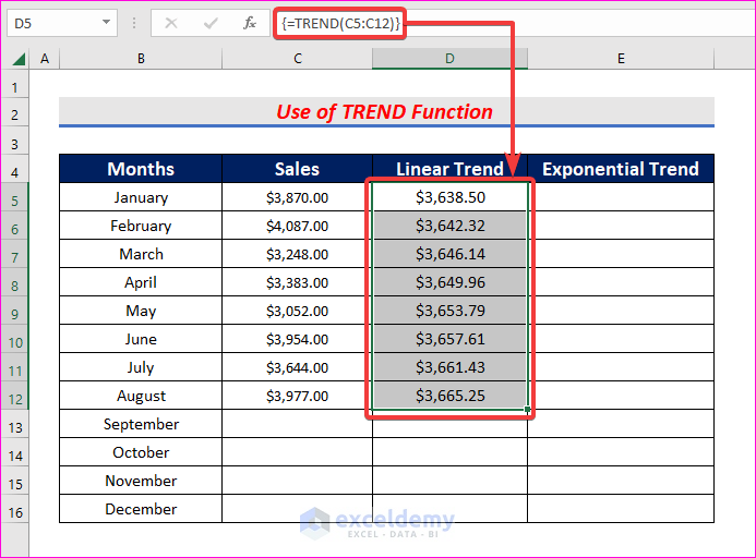
- After that, select cells D5 to D12 and write down the following formula.
=TREND(C5:C12)- After writing this formula, press Ctrl + Shift + Enter .
- Similarly, write the following formula in cells E5 to E12 if you want to see exponential growth.
=GROWTH(C5:C12)- Then press Ctrl + Shift + Enter.
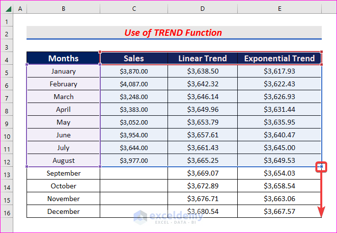
- Next, we need to convert these cell data into only values without the formula.
- Therefore, select all the data from columns D to E.
- Then bring your cursor to the bottom of the selected cells.
- After that, hold down the left button of your mouse drag the cells around for a while, and bring it back to their original position.
- Then select Copy Here as Values Only.
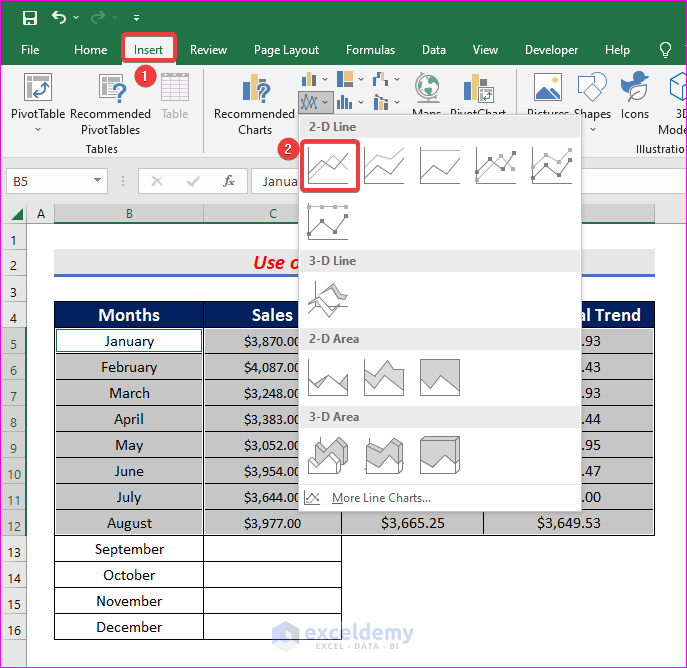
- Now select the Sales, Linear Trend, and Exponential Trend columns together.
- Then hold the Ctrl key and select the Months column.
- After that, from the Insert tab, go to,
Insert → Charts → Insert Line or Chart Area → Line
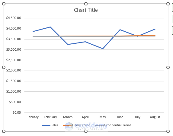
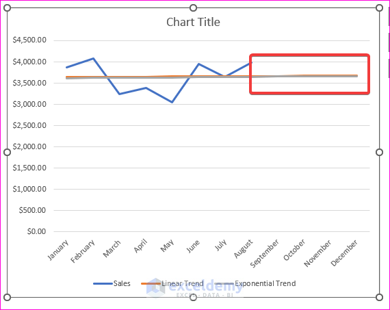
- A chart will be created with the selected data points and two trendlines will be visible up to the month of August.
- To see the trendlines for the next 4 months, select columns D and E. Then Autofill the values up to row 16.
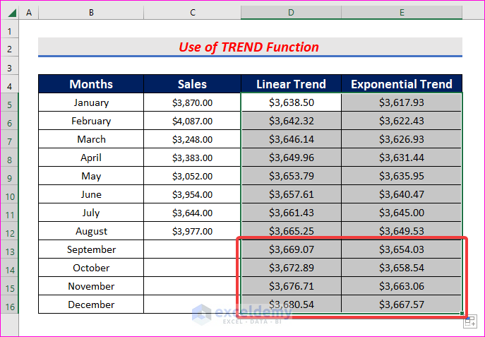
- After that, click on the chart and then drag the bottom right corner of cell E5 to E16.
- As a result, both the linear trendline and exponential trendline will be extended up to December.
Read More: How to Add Multiple Trendlines in Excel
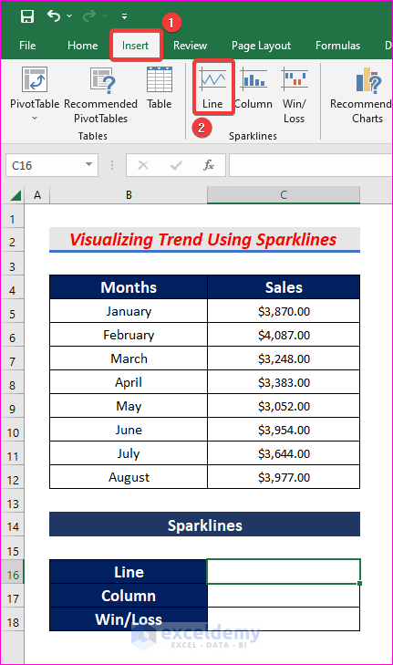
3. Visualizing Trends Using Sparklines
Now we will visualize trends using sparklines. Read the following steps to learn how to do it.
Steps:
- First, insert three rows to show Line, Column, and Win/Loss sparklines.
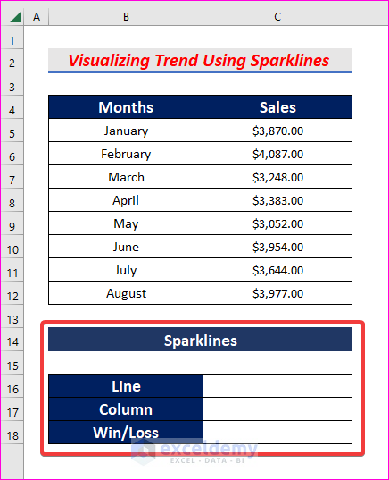
- Next, select cell C16, and from the Insert tab, go to,
Insert → Sparklines → Line
- Once you select Line, the Create Sparklines dialogue box will appear.
- In the box, select cells C5 to C12 as Data Range.
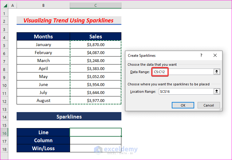
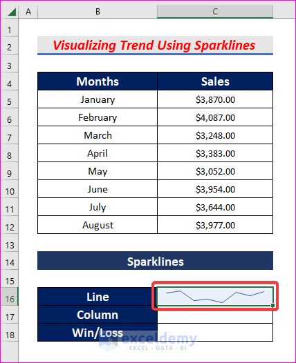
- Then press Enter to see the Line sparkline in cell C16 of the current months.
- Similarly, select Column in Sparkline Type to see column sparkline.
- Check the boxes of High Point and Low Point to highlight the maximum and minimum data points.
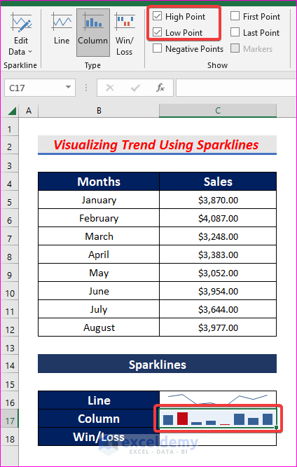
- Following the same steps, create and highlight the Win/Loss sparkline.
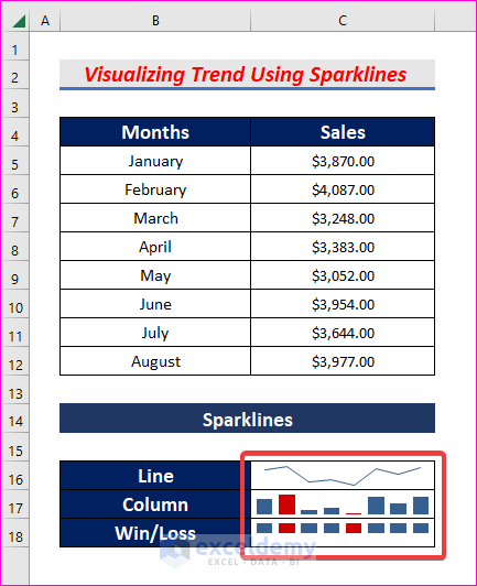
- In the Sparklines method, you can only see the current trends and won’t be able to see the future trends.
- Do not press Enter after typing the TREND and GROWTH formulas. It would be best if you pressed Ctrl+Shift+Enter.
Download Practice Workbook
Download this practice workbook to exercise while you are reading this article.
Conclusion
Thanks for making it this far. I hope you find this article useful. Now you know three easy ways to visualize trends in Excel. Please let us know if you have any further queries, and feel free to give us any recommendations in the comment section below.
Related Articles
- How to Add Trendline Equation in Excel
- How to Add a Trendline to a Stacked Bar Chart in Excel
- How to Find Unknown Value on Excel Graph
- How to Extend Trendline in Excel
- How to Exclude Data Points from Trendline in Excel
- [Solved]: Trendline Option Not Showing in Excel
<< Go Back To Add a Trendline in Excel | Trendline in Excel | Excel Charts | Learn Excel
Get FREE Advanced Excel Exercises with Solutions!
