The trendline is a very common and important feature in the field of data analysis, business forecasting, decision-making for stakeholders, and many more. Therefore we need to know how to add a trendline in Excel. In this article, we will get to know the trendline a little more, and afterward, we will learn how to add multiple trendlines in Excel with quick steps.
What Is Trendline?
In easy language, a trendline is basically a straight or curved line that illustrates the pattern or direction of a dataset. It generally gives information on data differences or data movements over a period of time. It also shows the interrelation between variables. The trendline can be expressed through column charts, line charts, scattered charts, etc. The number of trendlines depends on the number of data types selected in Excel.
How to Add Multiple Trendlines in Excel: Step by Step Procedures
Now, we will go through the step-by-step procedures to add multiple trendlines in Excel. Simply follow the steps below:
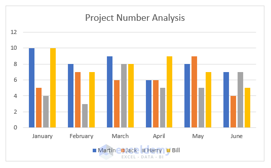
Step 1: Prepare Dataset in Excel
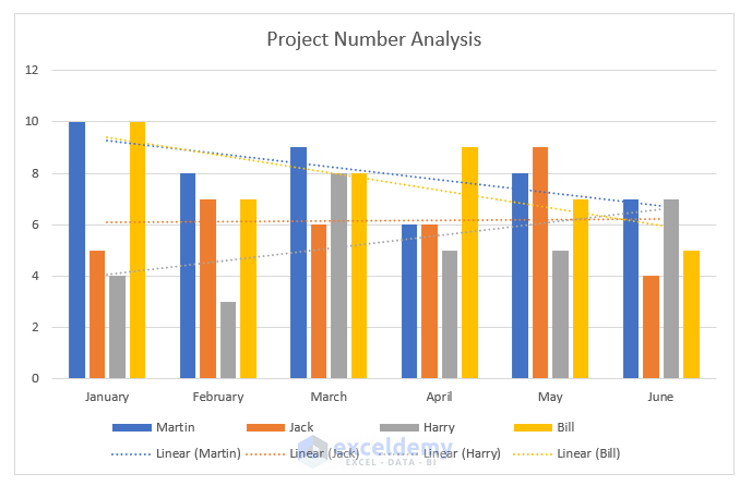
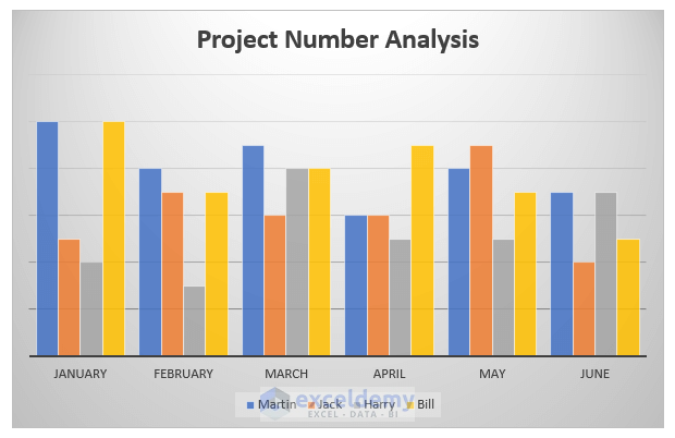
To get the best output, we need a proper dataset. Here we will prepare a dataset on project numbers of 4 employees in a company for the first half months of a year.
- First, insert months in range B4:B10.
- After that, put the numbers of projects in each employee’s section (range C4:F10)
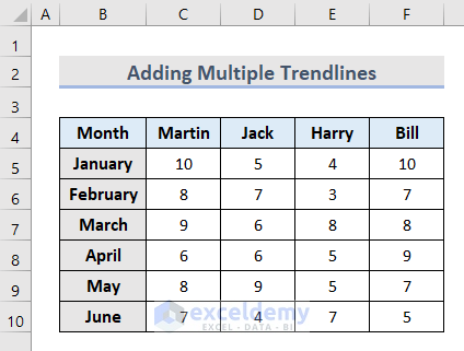
- That’s it. We have our required dataset to work on.
Step 2: Create Column Chart with Dataset
The trendline can be placed on different types of charts. Here we will create a column chart. To perform this, follow the steps below:
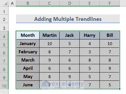
- First, select the dataset you want to create a column chart with.
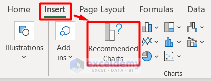
- Secondly, go to the Insert tab and select Recommended Charts.
- After that, a new window named Insert Chart will appear.
- In this window, select the Clustered Column among the Column options in the All Charts section.
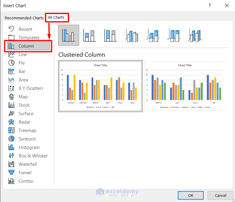
- Finally, we have our column chart.
Read More: How to Add a Trendline to a Stacked Bar Chart in Excel
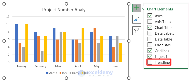
Step 3: Add Single Trendline from Dataset
As we have our chart now, we will add our first trendline. Let’s look at the steps below:
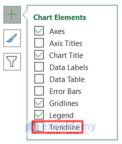
- First, select the Column Chart and click on the Plus (+) icon beside this.
- Then, from the drop-down section, click on Trendline.
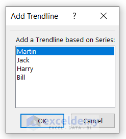
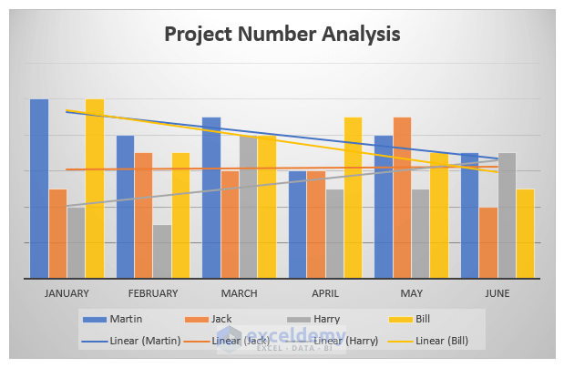
- It will then open a new window Add Trendline asking which data series you want to include. For example, we have chosen Martin here.
- After that, press OK.
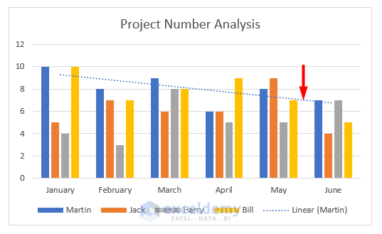
- Finally, you can see our first trendline in the column chart.
Read More: How to Add Trendline Equation in Excel
Step 4: Add Multiple Trendlines
Our main target is to add multiple trendlines to this column chart. Now we will do that with the steps below:
- Follow the similar procedure that we used to add a single trendline.
- In this case, you have to select the Name of the Data Series each time you need to insert a trendline for that.
- Following that, we have successfully added multiple trendlines in Excel.
Step 5: Format the Trendlines
At this stage, we will edit and customize the trendlines that we added to the column chart because by default their appearance is not clean and easy to understand.
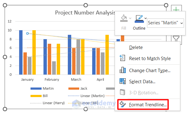
- Firstly, select any one trendline from the chart.
- Secondly, right-click and select Format Trendline from its context Menu.
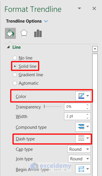
- After that, change the Line to Solid Line.
- Along with it, change the Color and Dash type as well.
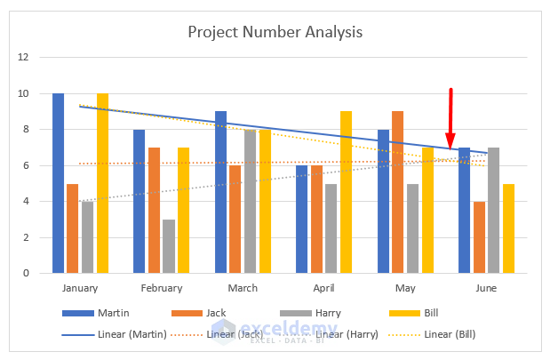
- Finally, we have a clear trendline on the first selected data series.
- Following a similar procedure, we can format other trendlines as well.
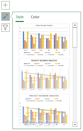
- Afterward, we also changed the Chart Style from the Styles section.
- Finally, we have successfully added multiple trendlines in Excel with the necessary customization.
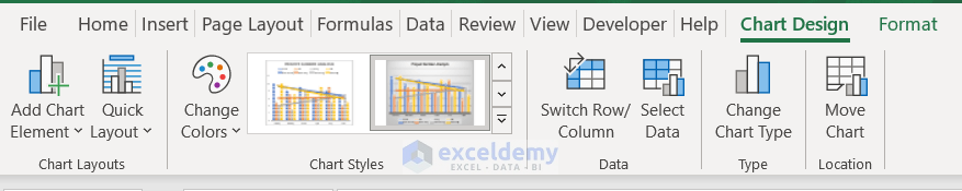
- You can also edit and customize the trendlines along with the chart from the Chart Design tab.
- Explore more options to customize trendline from the Format Trendline panel and Chart Design tab.
How to Remove Trendline in Excel
The process to remove single or multiple trendlines in Excel is very simple and easy. Let’s see how to do that.
- In the beginning, select the chart and click on the Plus (+) sign.
- Then, remove the Tick Mark from the Trendline in the Chart Elements section.
- In the end, you see that the trendlines are not visible in the chart anymore.
Download Workbook
Get the sample file here and download it by yourself.
Conclusion
In concluding the article, hope that it was a useful one on how to add multiple trendlines in excel with some quick steps. Let us know your feedback on this article in the comments section.
Related Articles
- How to Visualize Trends in Excel
- How to Find Unknown Value on Excel Graph
- How to Extend Trendline in Excel
- How to Exclude Data Points from Trendline in Excel
- [Solved]: Trendline Option Not Showing in Excel
- How to Add Trendline in Excel Online
- How to Make a Polynomial Trendline in Excel
<< Go Back To Add a Trendline in Excel | Trendline in Excel | Excel Charts | Learn Excel
Get FREE Advanced Excel Exercises with Solutions!
