Overview of Trend Charts in Excel

Method 1 – Using the FORECAST.LINEAR Function to Create a Trend Chart in Excel
We’ll utilize a dataset comprising months and their corresponding sales over a span of 9 months. We’ll project future sales alongside a linear trendline.
Steps:
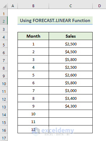
- Create a new column where we intend to predict future sales.
- Set the sales value for the ninth month into cell D9.
- Select cell D10.
- Enter the following formula:
=FORECAST.LINEAR(B14,$C$5:$C$13,$B$5:$B$13)
- Press Enter to apply the formula.
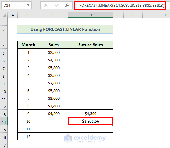
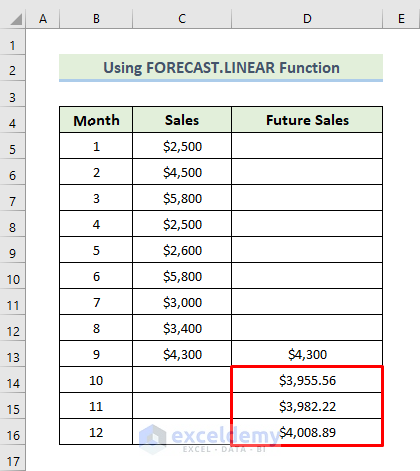
- Drag the Fill Handle icon to populate the remaining cells with the formula.
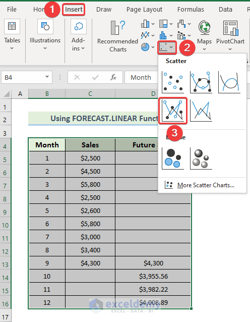
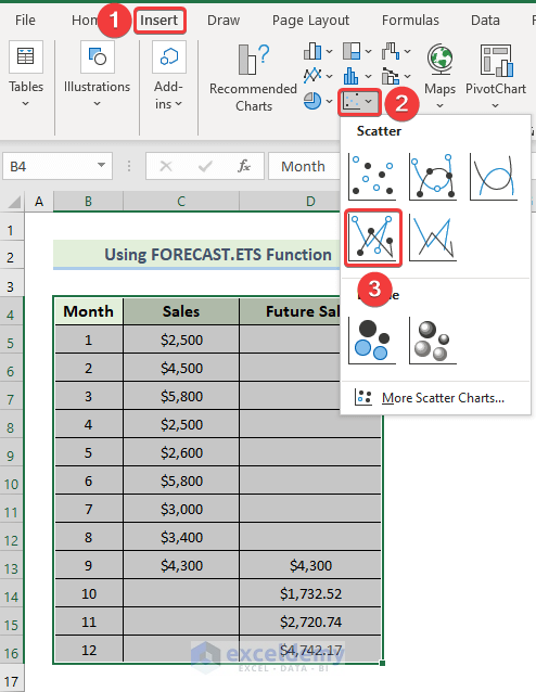
- Select the range of cells B4:D16.
- Navigate to the Insert tab in the ribbon.
- From the Charts group, choose Insert Scatter or Bubble chart.
- Select Scatter with Straight Lines and Markers.
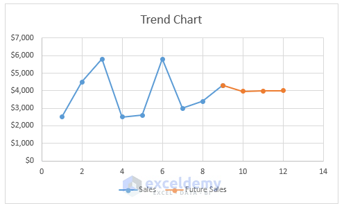
- The chart will be displayed as shown below.
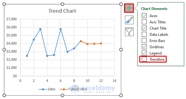
- Click on the Plus (+) icon located on the right side of the chart.
- Choose Trendline from the options.
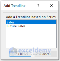
- The Add Trendline dialog box will appear.
- Select the Sales option from the Add a Trendline based on Series.
- Click on OK.
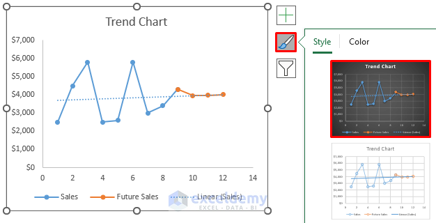
- This will generate a linear trendline.
- To alter the Chart Style, click on the Brush icon situated on the right side of the chart.
- Select any desired chart style.
- The resulting trend chart in Excel will be as follows.
Read More: How to Add Trendline in Excel Online
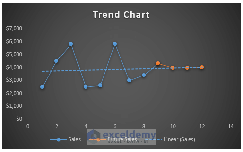
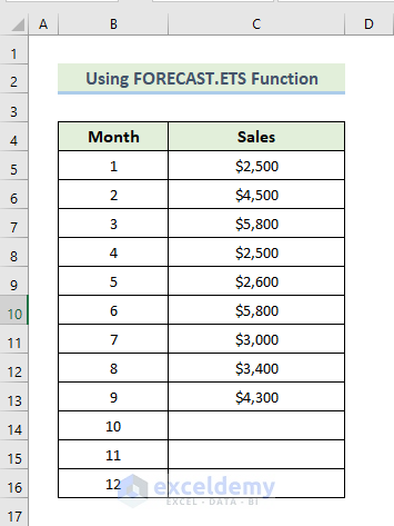
Method 2 – Utilizing the Excel FORECAST.ETS Function to Create a Trend Chart
This function uses exponential triple smoothing to provide future values. We’ll work with a dataset containing months and their corresponding sales over a span of 9 months.
Steps:
- Create a new column where we intend to predict future sales.
- Set the sales value for the ninth month into cell D9.
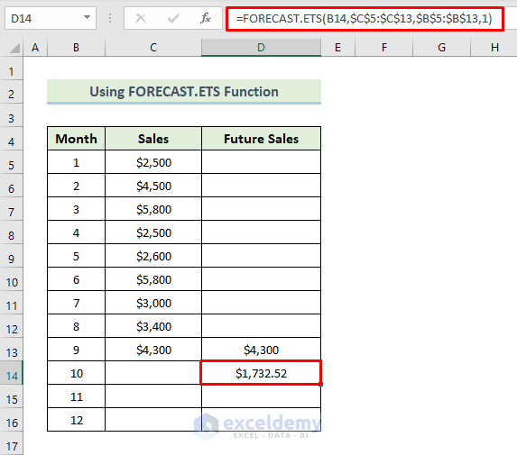
- Select cell D10.
- Enter the following formula:
=FORECAST.ETS(B14,$C$5:$C$13,$B$5:$B$13,1)
- Press Enter to apply the formula.
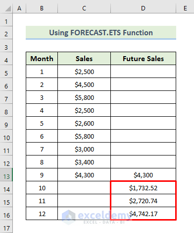
- Drag the Fill Handle icon to populate the remaining cells with the formula.
- Select the range of cells B4:D16.
- Navigate to the Insert tab in the ribbon.
- From the Charts group, choose Insert Scatter or Bubble chart.
- It will present various options. Select Scatter with Straight Lines and Markers.
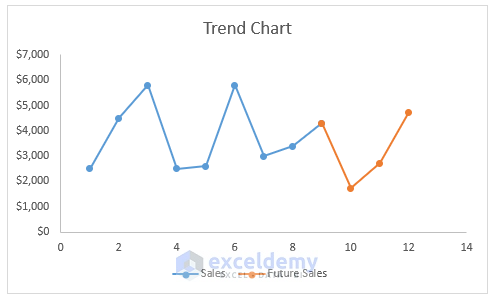
- The chart will be displayed as shown below.
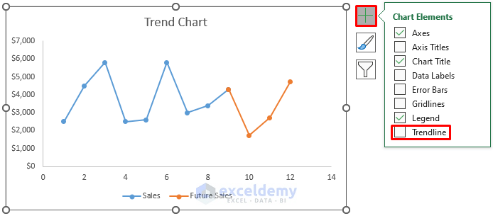
- Click on the Plus (+) icon located on the right side of the chart.
- Choose Trendline from the options.
- The Add Trendline dialog box will appear.
- Select the Sales option from the Add a Trendline based on Series.
- Click OK.

- This will generate a linear trendline.
- To alter the Chart Style, click on the Brush icon situated on the right side of the chart.
- Select any desired chart style.
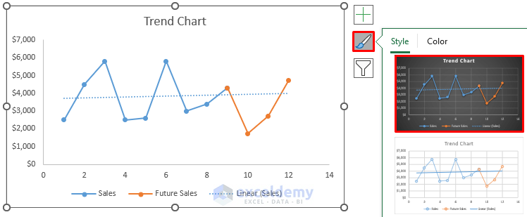
- The resulting trend chart in Excel will appear as follows.
Read More: How to Create Monthly Trend Chart in Excel
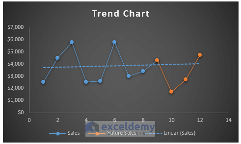
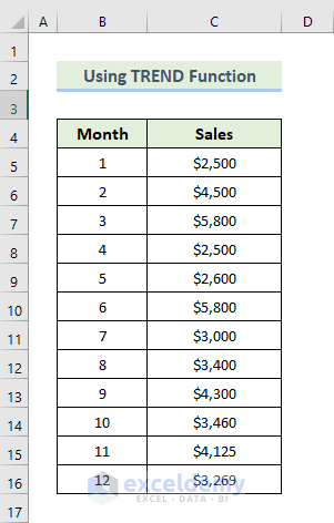
Method 3 – Utilizing the TREND Function to Create a Trend Chart
We’ll utilize a dataset containing months and their corresponding sales.
Steps:
- Create a new column named Future Sales.
- Select the range of cells D5 to D16.
- Enter the following formula into the formula box:
=TREND(C5:C16,B5:B16)
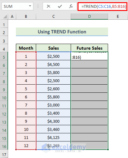
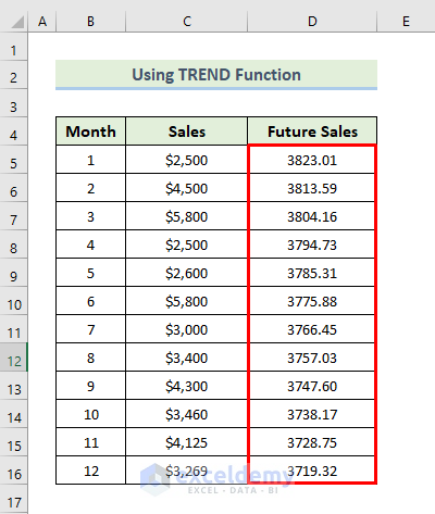
- As this is an array formula, to apply it, press Ctrl + Shift + Enter.
- This will generate the calculated trendline.
- Select the range of cells B4 to D16.
- Navigate to the Insert tab in the ribbon.
- From the Charts group, select Recommended Charts.
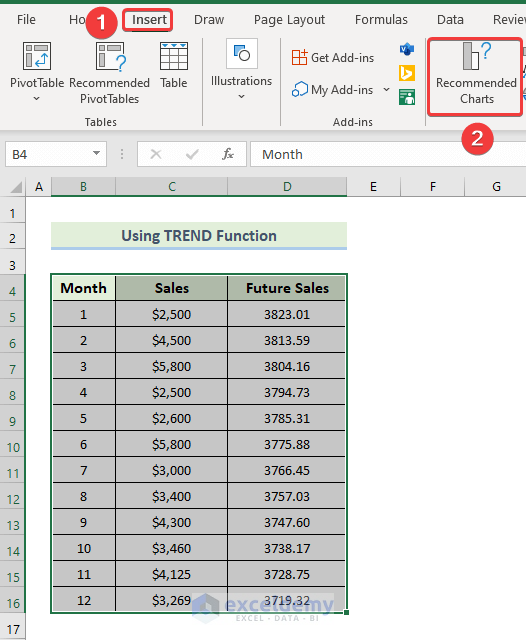
- The Insert Chart dialog box will appear.
- Choose Line chart from the options.
- Click OK.
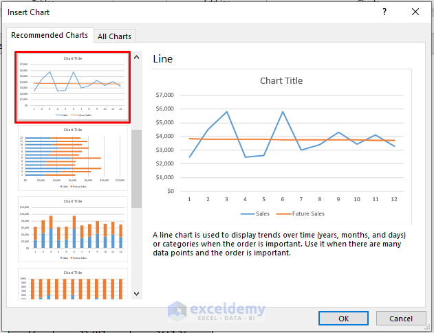
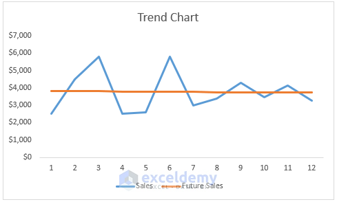
- The chart will be generated.
- To modify the Chart Style, click on the Brush icon situated on the right side of the chart.
- Select any desired chart style.
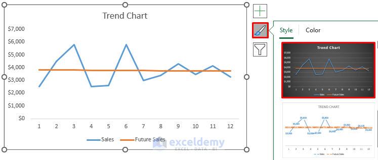
- The resulting trend chart in Excel will appear as follows.
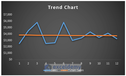
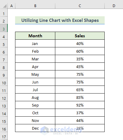
Method 4 – Utilizing a Line Chart with Excel Shapes to Create a Trend Chart
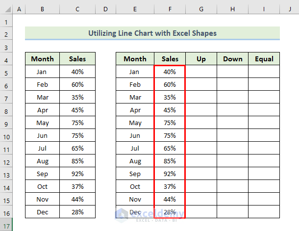
We’ll use a dataset comprising several months and their sales percentages to observe how sales percentages behave over 12 months.
Steps:
- Create new columns with select values, intended for chart modification.
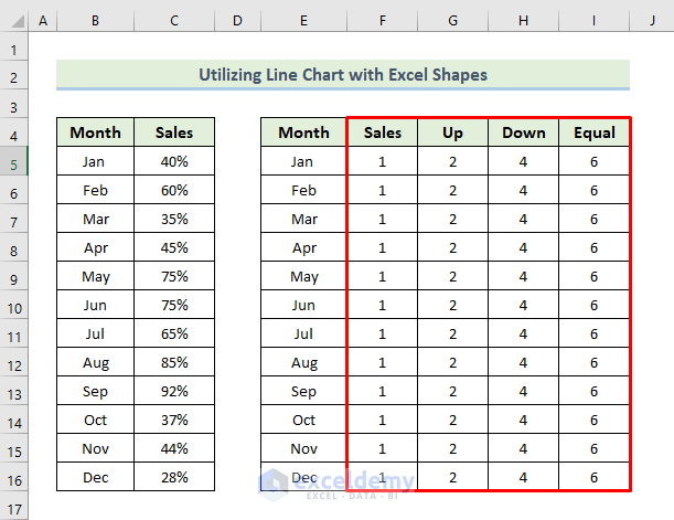
- Select the range of cells E4 to I16.
- Navigate to the Insert tab in the ribbon.
- From the Charts group, select the Insert Line or Area Chart drop-down option.
- Choose the Line with Markers chart option.
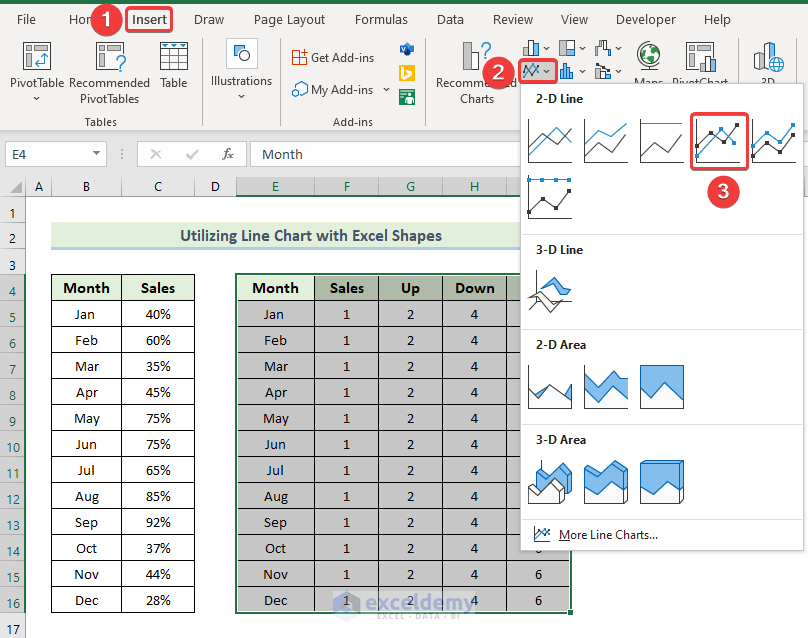
- This will generate the initial chart.
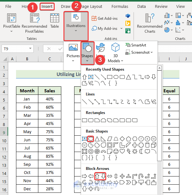
- Create shapes for up, down, and equal sales percentages.
- Go to the Insert tab in the ribbon.
- Select the Illustrations drop-down option.
- From the Shapes drop-down option, choose the up arrow for sales up, the down arrow for sales down, and the oval sign for equal sales.
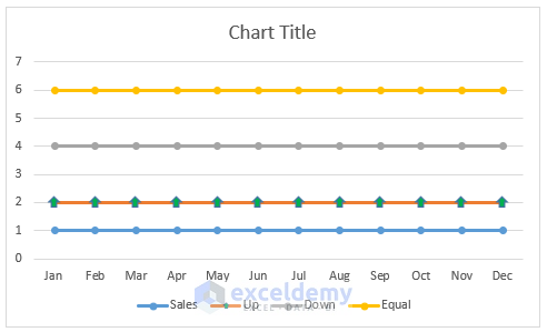
- It will give us the following results.
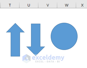
- Modify the size and fill color of each shape as per preference.
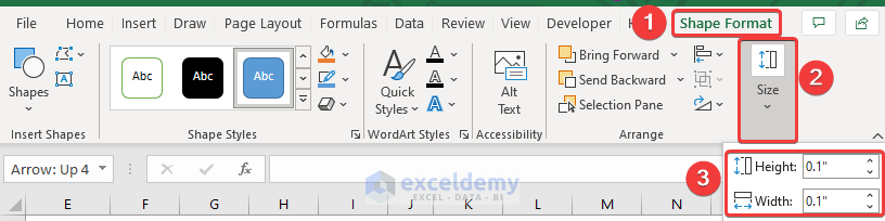
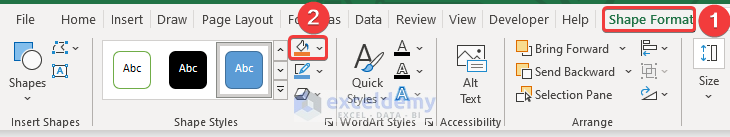
- Select any shape, and it will open up the Shape Format tab in the ribbon.
- Navigate to the Shape Format tab in the ribbon.
- From the Size group, change the size of the shape.
- Return to the Shape Format tab in the ribbon
- From the Shape Style group, select Shape Fill and change the color of the shapes.
- Copy each shape as needed and align them with the respective data points on the chart.
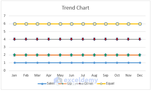
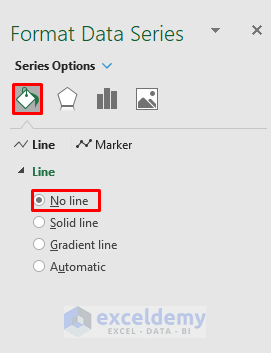
- Remove the line from the Up, Down, and Equal series by selecting each line, opening the Format Data Series dialog box, and choosing No Line from the Line section.
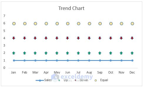
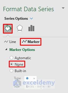
- Remove the markers from the Sales series by double-clicking on the sales line with markers, opening the Format Data Series dialog box, and selecting None from the Marker Options section.
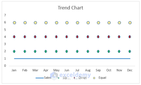
- It will give us the following result.
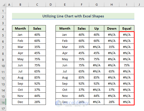
- Adjust column F by setting its value equal to column C.
- Delete the values of columns G, H, and I.
- Apply formulas using the IF and NA functions to determine up, down, and equal sales percentages for each month.
- In the first month, we increase the sales percentage. Put 40% in cell G5.
- For the other 11 months, we will apply some conditions.
- Select cell G6.
- Enter the following formula:
=IF(F6>F5,F6,NA())
- Press Enter to apply the formula.
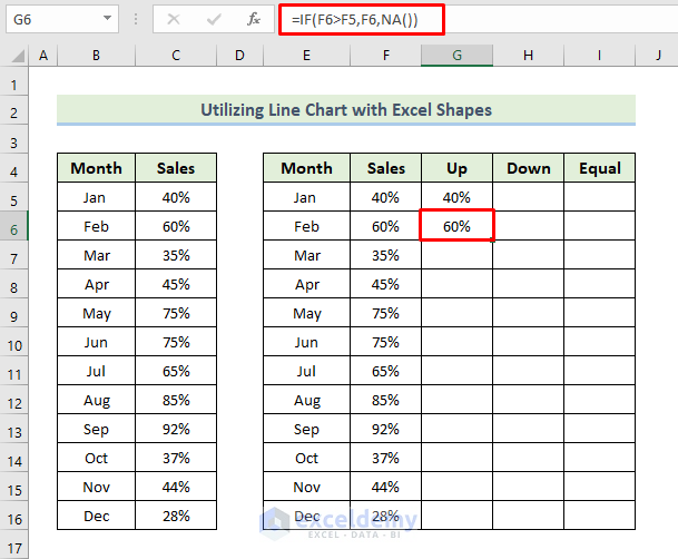
- Drag the Fill Handle icon to fill the other cells with the formula.
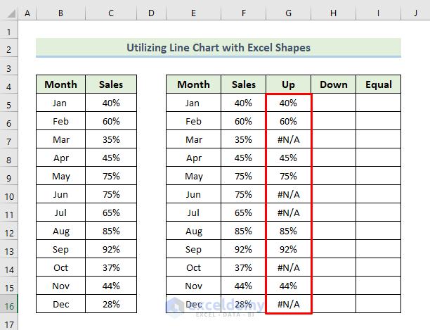
- As we set the first month as increased sales, the down sales fields will be blank.
- Select cell H6.
- Enter the following formula.
=IF(F6<F5,F6,NA())
- Press Enter to apply the formula.
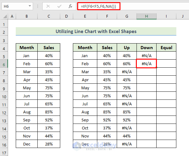
- Drag the Fill Handle icon to fill the other cells with the formula.
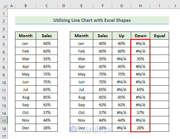
- As we set the first month as increased sales, the equal sales fields will be blank.
- Select cell I6.
- Enter the following formula.
=IF(F6=F5,F6,NA())
- Press Enter to apply the formula.
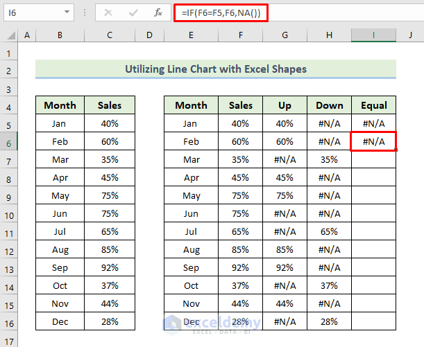
- Drag the Fill Handle icon to fill the other cells with the formula.
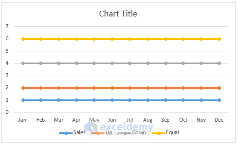
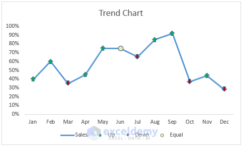
- It will give us the following the chart.
- Customize the chart based on preference, such as adding data labels.
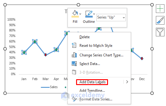
- You can now customize the chart based on your preference.
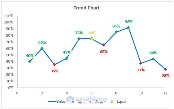
The resulting trend chart in Excel will reflect the sales trends over the 12-month period.
How Does the Formula Work?
- IF(F6>F5,F6,NA()): Returns the sales value of the current month if it is higher than the previous month, otherwise returns NA.
- IF(F6<F5,F6,NA()): Returns the sales value of the current month if it is lower than the previous month, otherwise returns NA.
- IF(F6=F5,F6,NA()): Returns the sales value of the current month if it is equal to the previous month, otherwise returns NA.
Download the Practice Workbook
You can download the practice workbook from here:
Related Articles
<< Go Back To Add a Trendline in Excel | Trendline in Excel | Excel Charts | Learn Excel
Get FREE Advanced Excel Exercises with Solutions!
