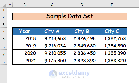
We have four-year data on the population of three big cities. We’ll use the information to plot trendlines for the population.
Method 1 – Using Sparklines to Insert a Trendline in an Excel Cell
Steps:
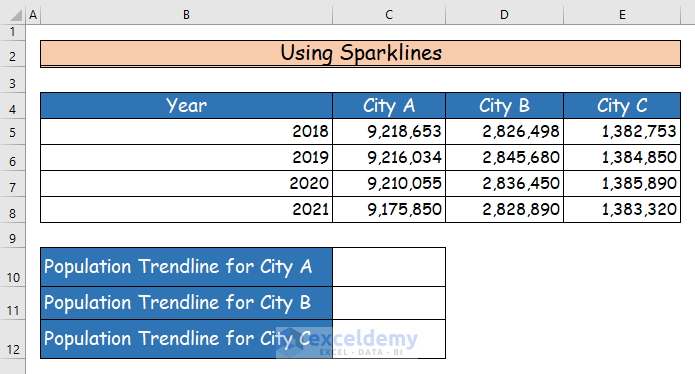
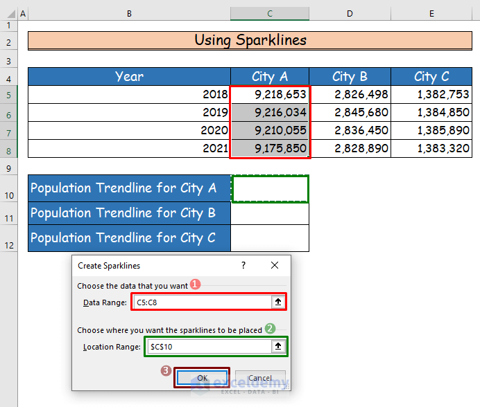
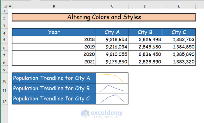
- Make a table below the original data set.
- In the table, add three extra cells in C10, C11, and C12 to show the trendline.
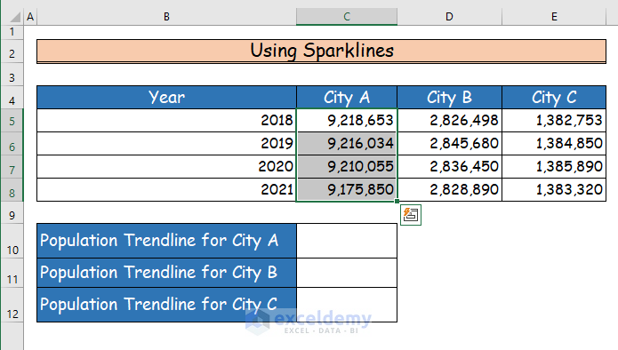
- Select the data range from C5 to C8.
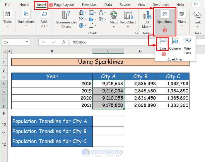
- Go to the Insert tab of the ribbon.
- Go to the Sparklines command from the Sparklines group.
- Select the Line Sparkline option.
- You’ll get a new dialogue box named Create Sparklines.
- The Data Range type box should be already filled in.
- Select the location of the trendline in the Location Range type box. For our example, we chose cell C10 as the location of the first trendline.
- Press OK.
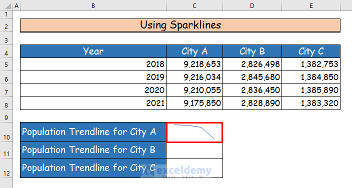
- You will see the trendline in cell C10 for the yearly population of City A.
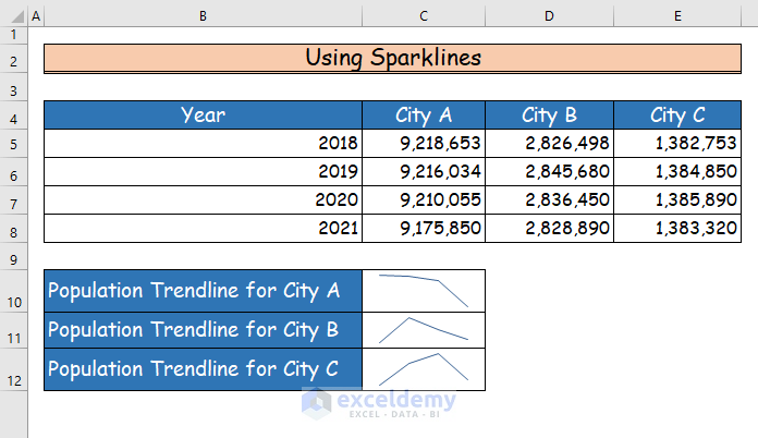
- Repeat the steps to insert trendlines for the population of the other two cities as well.
Method 2 – Adding Column Bar Charts to Insert a Trendline in an Excel Cell
Steps:
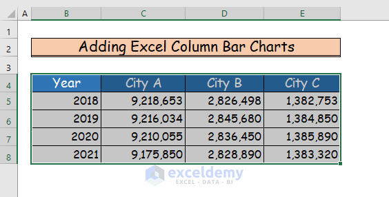
- Select the data range from B4 to E8.
- Go to the Insert tab of the ribbon and select the Recommended Charts command.
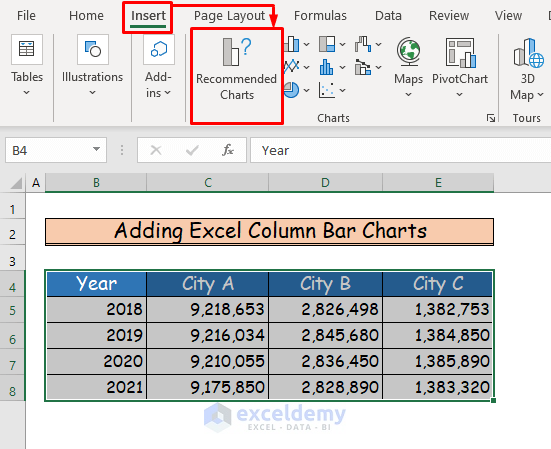
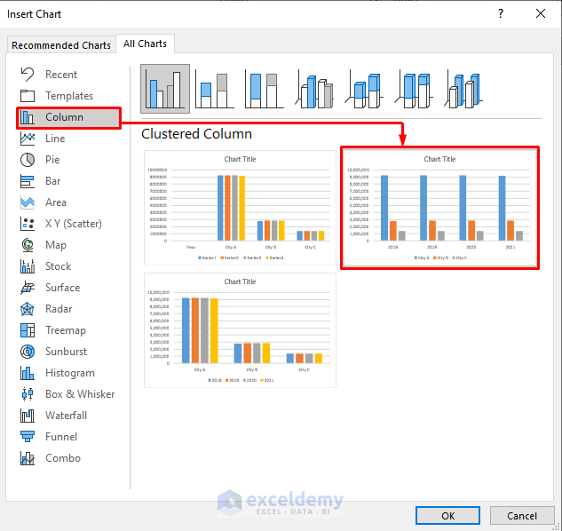
- A new box named Insert Chart will open.
- Select the chart of your choice. We chose the Clustered Column chart like in the image below.
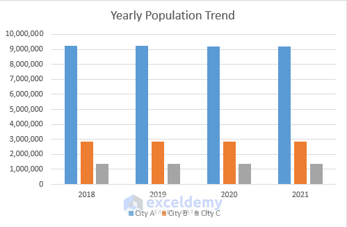
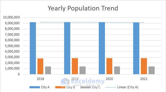
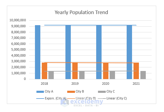
- You’ll get a column chart. Name the chart as Yearly Population Trend.
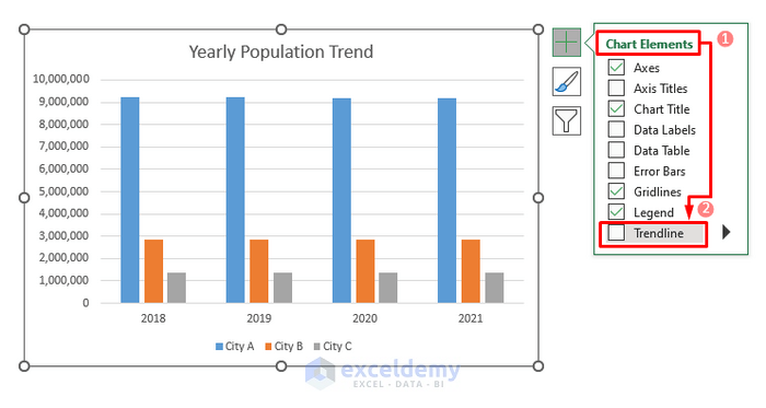
- To add the trendline to the chart, click on the chart.
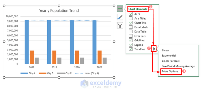
- You will see three icons right beside the chart.
- Select the Chart Elements command.
- Click on the Trendline option.
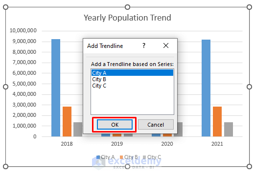
- A new box named “Add Trendline” will appear. Select the first city and then press OK.
- You will see the trendline for City A in the chart.
- Repeat the process to start adding trendlines for other cities.
- Select City B and then press OK.
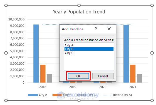
- You will see the trendline in the chart for the second city.
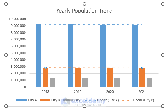
- Repeat the above steps for the last city.
Customizing Trendlines
Case 1 – Altering Colors and Styles of Trendlines in an Excel Cell
Steps:
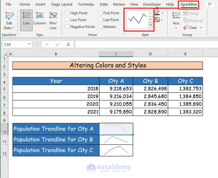
- Go to the Sparkline tab of the ribbon, which you will only see after choosing the trendline.
- Go to the Sparkline Color command.
- Under the Theme Colors option, select any color of your choice.
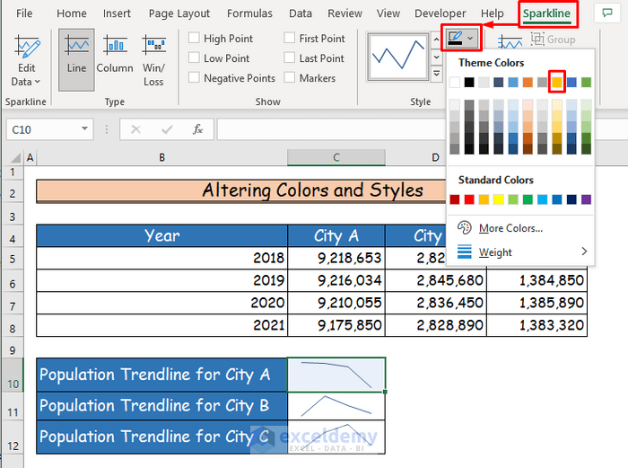
- You will see that the color of your trendline will change.
- You can change the color of any trendline you want.
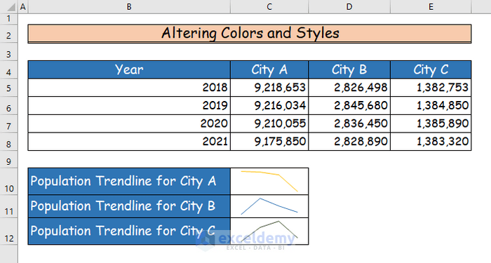
- In the Sparkline tab, choose the Style command.
- Choose a style of the sparkline you want.
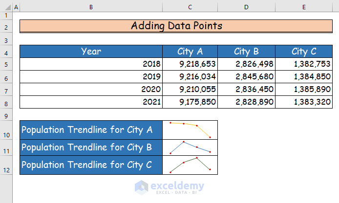
Case 2 – Adding Data Points in Trendlines in an Excel Cell
Steps:
- Select the sparkline.
- Go to the Show group in the Sparkline tab of the ribbon.
- Check the Markers command.
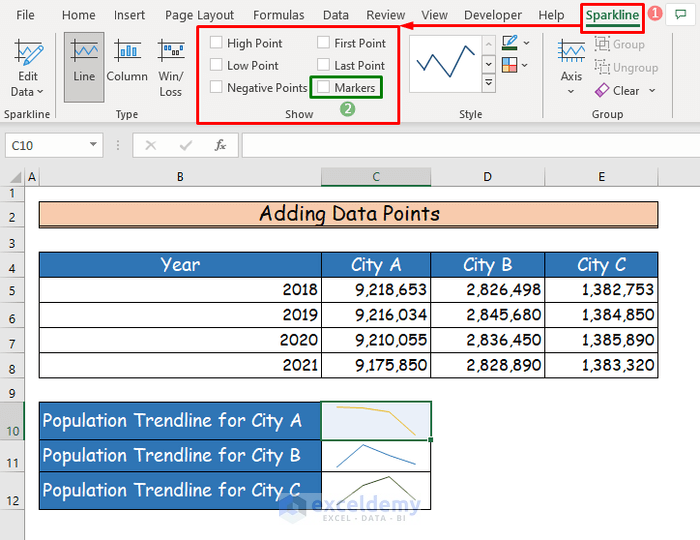
- The trendline will show all the data points in it.
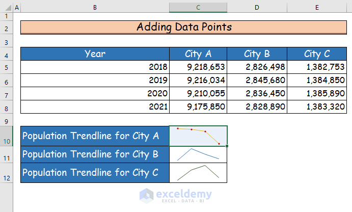
- Repeat these steps for making data points in other trendlines.
Read More: How to Create Equation from Data Points in Excel
Case 3 – Modifying Trendlines after Adding Them from an Excel Column Bar Chart
Steps:
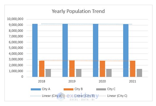
- Double-click on any of the trendlines in the chart.
- You will see a window pane named “Format Trendline” at the right of the chart.
- Under the Line label, mark the Solid Line option.
- Change the width of the chart in the Width box.
- Change the Dash type of the trendline.
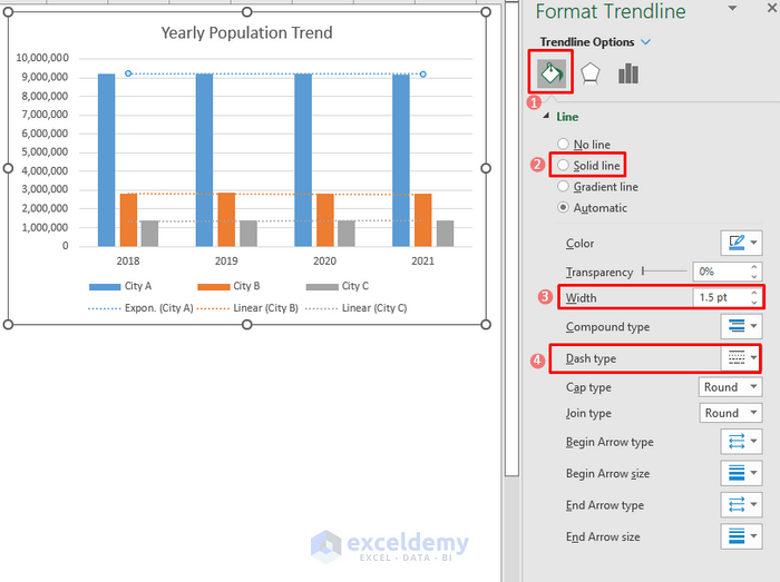
- The sparkline will change according to the new criteria.

- Follow the above steps again to change the trendlines in the other two bars.
Download the Practice Workbook
You can download the free Excel workbook from here and practice on your own.
Related Articles
- How to Make a Polynomial Trendline in Excel
- How to Draw Best Fit Line in Excel
- How to Calculate Trend Analysis in Excel
- How to Create Trend Chart in Excel
- How to Create Monthly Trend Chart in Excel
- How to Calculate Trend Percentage in Excel
<< Go Back To Add a Trendline in Excel | Trendline in Excel | Excel Charts | Learn Excel
Get FREE Advanced Excel Exercises with Solutions!
