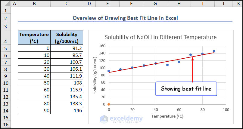
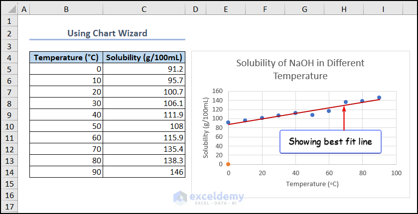
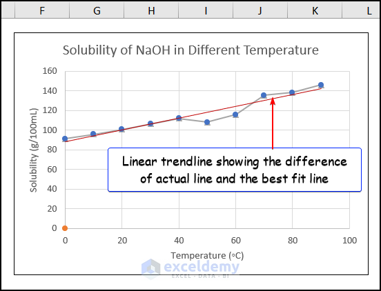
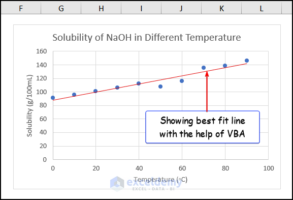
One of the fundamental aspects of data analysis is linear regression. This involves finding the relationship between two or more variables. To visualize the trend or pattern in the data, you may need to know how to draw the best fit line. In the below image, the red line indicates the best fit line.
What Is the Best Fit Line?
The best fit line, also known as a linear regression line, represents the relationship between two variables in a dataset. It helps predict the value of an independent variable based on the dependent variable.
What are the Benefits of a Best Fit Line?
- Visualization: The best fit line shows the general trend of the data, making it easier to identify outliers or unusual points.
- Prediction: By extrapolating the line, you can estimate the value of a dependent variable for a known independent variable value.
- Correlation: It helps determine the correlation between two variables (positive or negative).
- Simplification: The best fit line simplifies complex datasets into an easy-to-understand line.
Dataset Overview
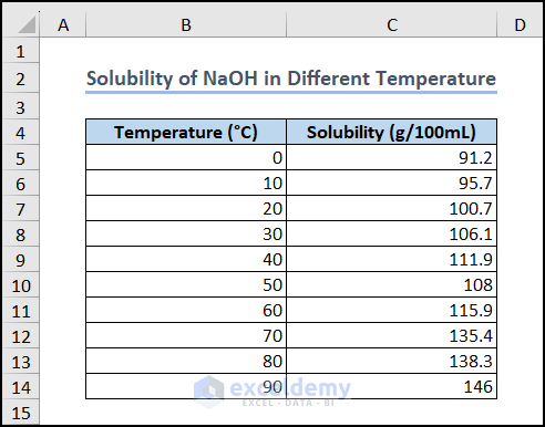
To demonstrate the methods, we’ll use a dataset with two variables. Here, we have taken a dataset of the “Solubility of NaOH at Different Temperatures”.
Method 1 – Use Chart Wizard
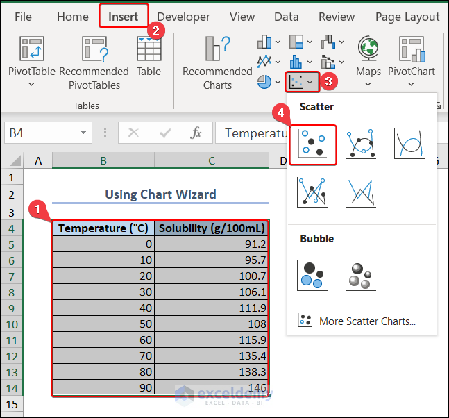
- Select Data:
- Choose a dataset with two variables. For example, consider the “Solubility of NaOH at Different Temperatures.”
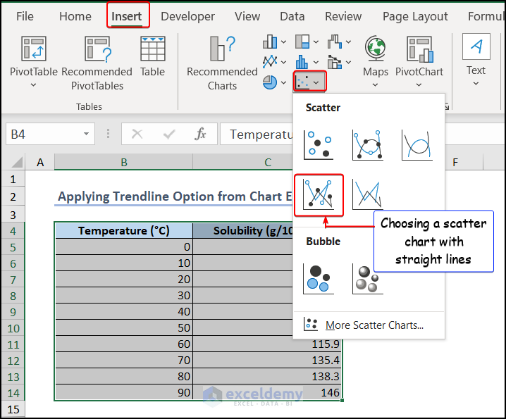
- Insert Scatter Chart:
- Select the entire dataset and go to the Insert tab. Choose Scatter (X, Y) or Bubble Chart under the Charts group.
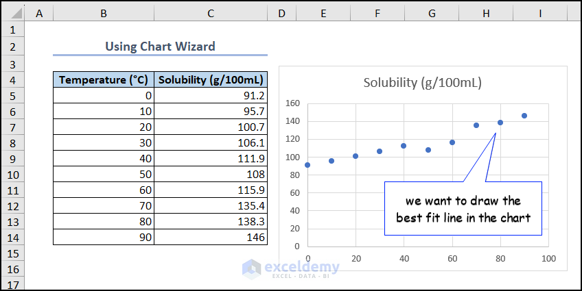
-
- A scatter chart will be plotted where we will draw the best fit line.
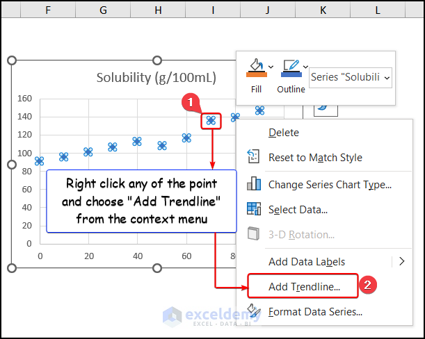
- Add Trendline:
- Right-click on any data point in the scatter chart and select Add Trendline from the Context Menu.
- Choose Linear Trendline:
- Opt for a linear trendline from the Trendline Options.
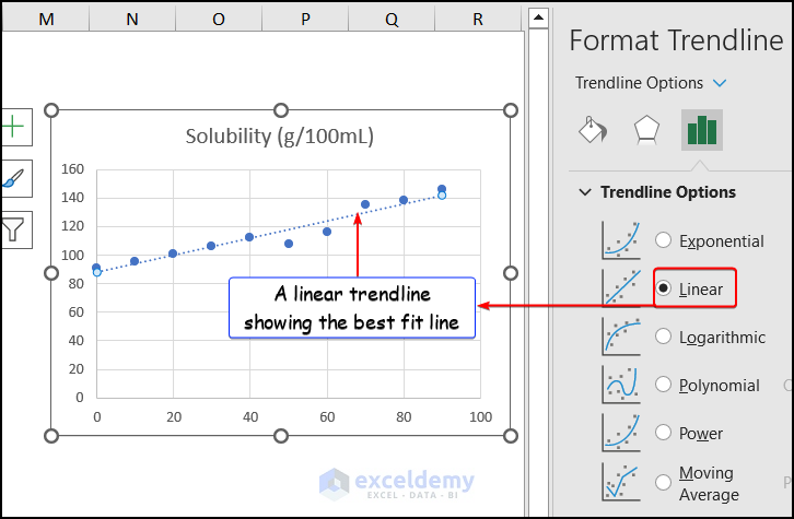
- Format Trendline:
- Customize the trendline appearance using the Format Trendline sidebar. You can change it to a solid line for clarity.
Method 2 – Apply Trendline Option from Chart Elements
- Select Data:
- Choose a dataset with two variables.
- Insert Scatter Chart:
- Hover over the Insert tab, select Scatter (X, Y) or Bubble Chart under the Charts group, and pick Scatter with Straight Lines and Markers.
- Add Trendline:
- Click on the chart, then choose the ➕ (plus) sign representing the Chart Elements. Check the Trendline box and select Linear.
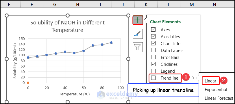
- Format the Line: Customize the trendline appearance according to your preference.
Note: Both methods involve creating a scatter plot with data points and adding a trendline. The difference lies in how the trendline is added. In the first method, we use the Add Trendline option from the Context Menu after right-clicking on a data point. In the second method, we use the Trendline option in the Chart Elements group.
Read More: How to Create Trend Chart in Excel
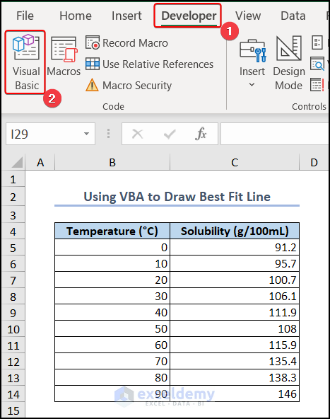
Method 3 – Use VBA Macro to Draw Best Fit Line
- Access Visual Basic:
- Select the Developer tab and choose Visual Basic.
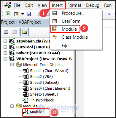
- Create a Module:
- In the Visual Basic Editor, select the Insert tab, then choose Module to create a new module (e.g., Module1).
- Enter the VBA Code:
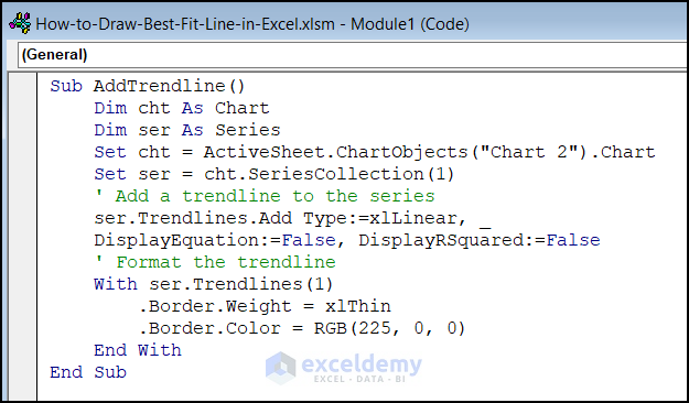
Sub AddTrendline()
Dim cht As Chart
Dim ser As Series
Set cht = ActiveSheet.ChartObjects("Chart 2").Chart
Set ser = cht.SeriesCollection(1)
' Add a trendline to the series
ser.Trendlines.Add Type:=xlLinear, _
DisplayEquation:=False, DisplayRSquared:=False
' Format the trendline
With ser.Trendlines(1)
.Border.Weight = xlThin
.Border.Color = RGB(225, 0, 0)
End With
End Sub
Code Breakdown:
- We have inserted a sub-procedure AddTrendline().
- We declare two variables named “cht” and “ser” as a chart object and as a series object, respectively.
- Set cht = ActiveSheet.ChartObjects(“Chart 2”).Chart – sets the value of “cht” to the chart object named “Chart 2” on the active worksheet.
- Set ser = cht.SeriesCollection(1) – sets the value of “ser” to the first series in the chart
- ser.Trendlines.Add Type:=xlLinear – adds a trendline to the series and specifies that it should be a linear trendline.
- We set the weight of the trendline border to thin by the .Border.Weight = xlThin command and the color of the trendline border to red by the .Border.Color = RGB(225, 0, 0) command.
- Run the Code:
- Press F5 to execute the VBA code. The best fit line will be automatically drawn on your chart.
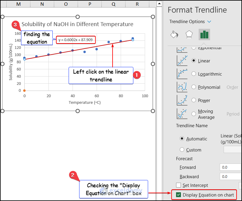
Showing the Equation of the Best Fit Line in Excel
To show the equation of the best fit line:
- Left click on the trendline.
- In the Format Trendline sidebar, check the Display Equation on chart box.
Read More: How to Show Equation in Excel Graph
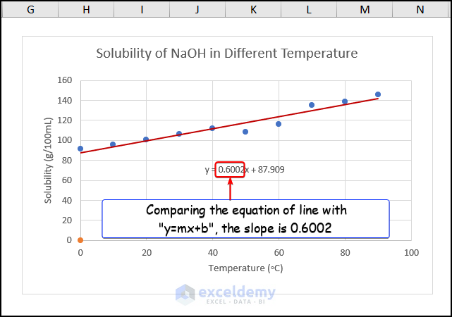
Calculating the Slope of the Best Fit Line in Excel
The equation will be displayed on your chart. For example, if your equation is y = 0.6002x + 87.909, the slope (m) is 0.6002. You can calculate any value of y for a given x using this equation.
Read More: How to Find Slope of Trendline in Excel
Things to Remember
Here are some important points to remember when working with best fit lines:
- Data Quality Matters: The accuracy of the best fit line depends on the quality and quantity of your data. If you have a small sample size or significant variability, the line may not accurately represent the correlation between the variables.
- Extrapolation Caution: Be cautious when extrapolating beyond the line. The best fit line may not behave accurately for points outside its range. Always consider the limitations of your data when making predictions.
Download Practice Workbook
You can download the practice workbook from here:
Frequently Asked Questions
Can we customize the appearance of the best fit line in Excel?
- Yes, you can customize the appearance of the best fit line in Excel. To do so:
- Right-click the trendline.
- Choose Format Trendline from the context menu.
- Adjust properties such as line color, style, and weight according to your preferences.
How can we remove a best fit line from a chart in Excel?
- To remove a best fit line from an Excel chart:
- Click the trendline to select it.
- Press the Delete key on your keyboard.
- Alternatively, right-click the trendline and choose Delete.
Can we add multiple best fit lines to a chart in Excel?
- Excel allows you to include multiple best fit lines in a graph.
- Simply add a trendline to each data set following the same procedure.
Can we edit the data used to create the best fit line in Excel?
- You can modify the data used to create the best fit line:
- Click the Select Data option in the Data menu of the Excel ribbon.
- Choose the data set you want to change.
- Modify the region of cells associated with the data series.
Can we copy a best fit line from one chart to another in Excel?
- To copy a best fit line from one chart to another:
- Right-click the trendline-containing graphic.
- Choose Copy from the context menu.
- Then, right-click the target chart and select Paste.
Related Articles
- How to Make a Polynomial Trendline in Excel
- How to Plot Quadratic Line of Best Fit in Excel
- How to Insert Trendline in an Excel Cell
- How to Calculate Trend Analysis in Excel
- How to Create Monthly Trend Chart in Excel
- How to Calculate Trend Percentage in Excel
<< Go Back To Trendline in Excel | Excel Charts | Learn Excel
Get FREE Advanced Excel Exercises with Solutions!
