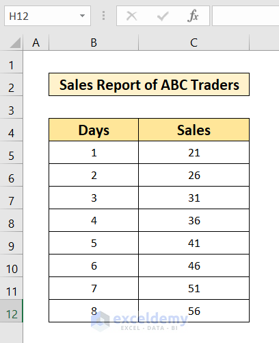
The dataset, Sales Report of ABC Traders, has 2 columns indicating Days and Sales. We will look at 3 easy steps for showing equations in an Excel graph.
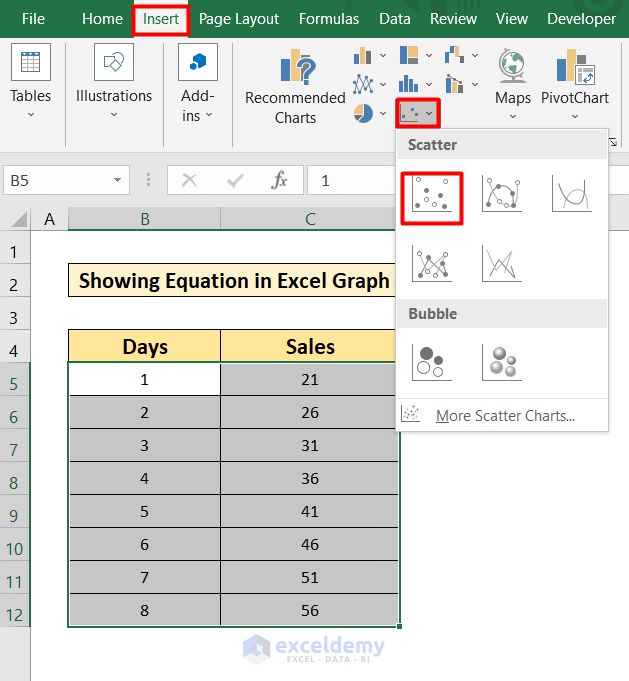
Step 1: Insert a Scatter Chart
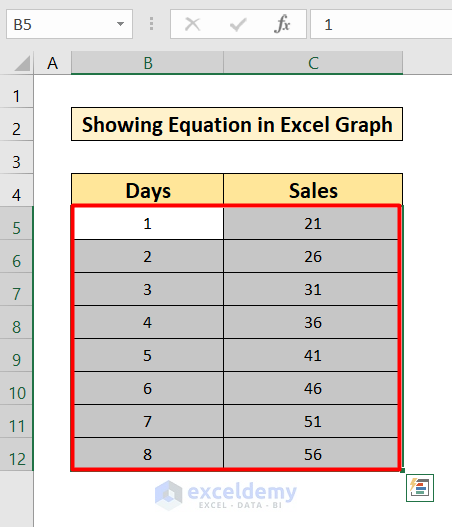
- Select the data table ranging from B5 to C12.
- Go to the Insert tab in your Toolbar.
- Select the Scatter Plot. Select the first option.
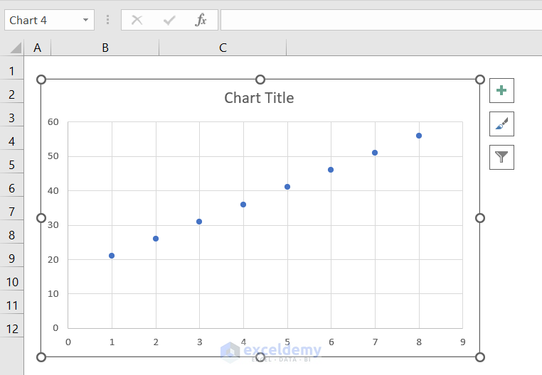
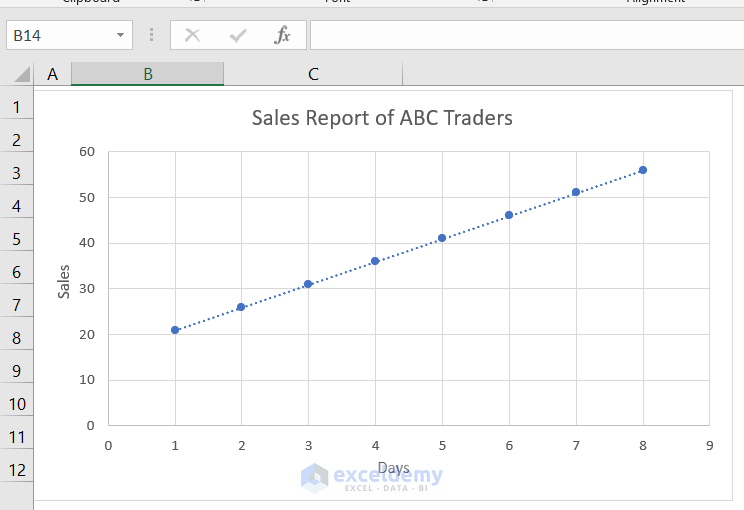
- You will find your graph like the one below.
Read More: How to Add a Trendline to a Stacked Bar Chart in Excel
Step 2: Add a Trendline in the Graph
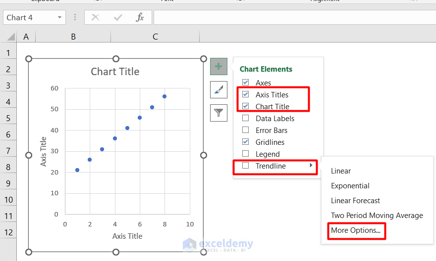
- Click on the graph.
- Select the “+” icon on the right side of the graph.
- Select the options Axis Title, Chart Title & Trendline.
- Go to the More Options to add the equation.
- After changing the Titles, your graph will be just like the one given below.
- A window will pop up on the right side of the graph after clicking more options.
- Select the icon indicated in the next picture.
- Scroll down to the options.
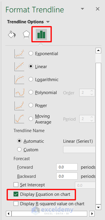
- Select the Display Equation on Chart.
Read More: How to Find the Equation of a Line in Excel
Step 3: Show Equation from the Format Trendline Command
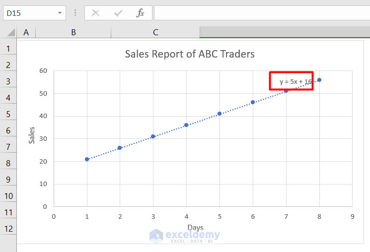
- You will find the graph with equations like the one below.
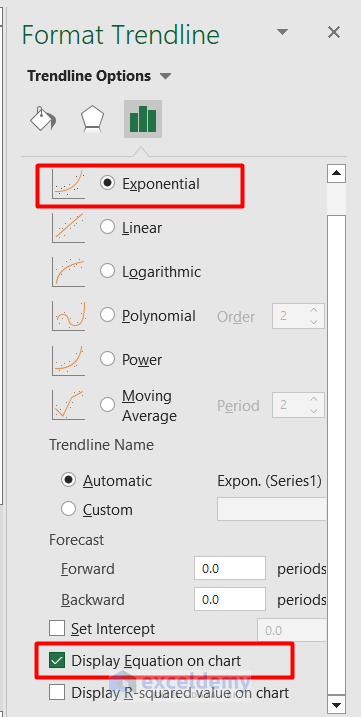
- Change the trendline option from Linear to Exponential.
- Select the Display Equation on Chart.
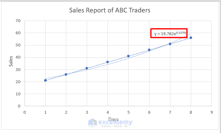
- You can see the result just like the one given below.
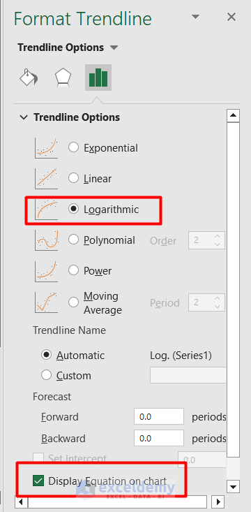
- Select the Logarithmic option and Select the Display Equation on Chart.
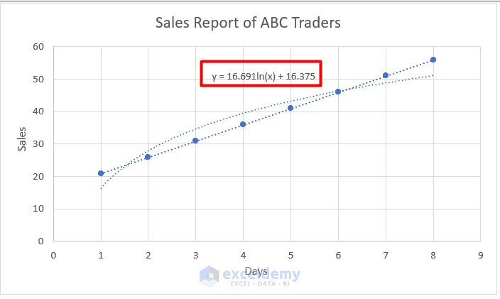
- You will find the graph just like the one given below.
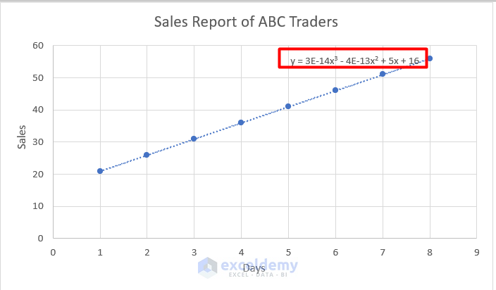
- Select the Polynomial and Set the Order 3.
- Select the option Display Equation on chart.
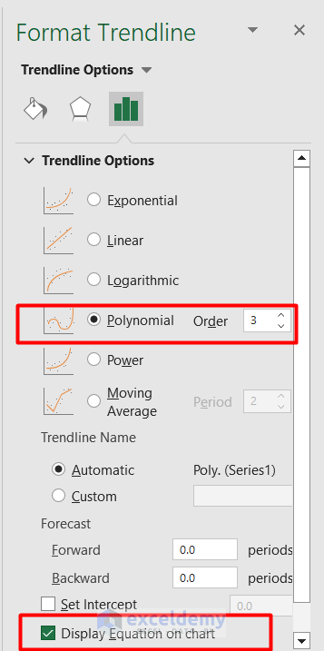
- You will find a graph like the one below.
Things to Remember
- In this example, as my dataset represents a linear equation, the equation found in the chart is linear. However, you will find a non-linear equation if your trendline becomes nonlinear.
Download the Practice Workbook
Download the practice workbook and practice yourself.
Related Articles
- How to Find the Equation of a Trendline in Excel
- How to Create Equation from Data Points in Excel
- How to Use Trendline Equation in Excel
- How to Find Slope of Trendline in Excel
- How to Find Intersection of Two Trend Lines in Excel
<< Go Back To Trendline Equation Excel | Trendline in Excel | Excel Charts | Learn Excel
Get FREE Advanced Excel Exercises with Solutions!
