This is an overview.
Download Practice Workbook
Download the workbook here.
What is a Trendline in Excel?
A trendline is a straight or curved line that represents the overall trend of a set of data points in a chart.
Excel has different types of trendlines: linear, exponential, polynomial, logarithmic, power trendline, etc.
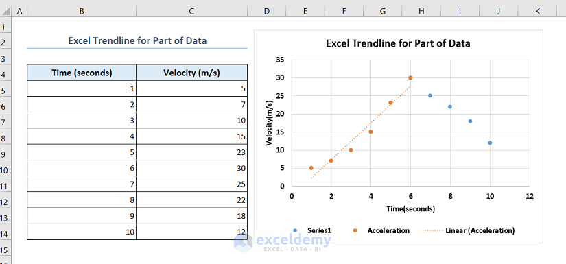
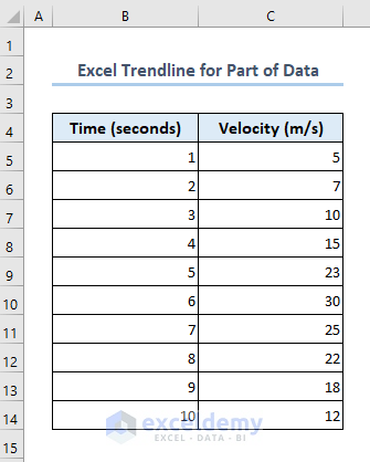
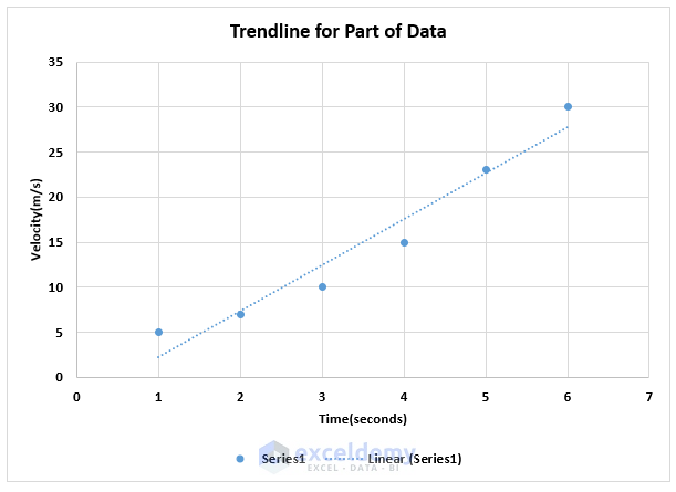
The dataset showcases the speed record of a vehicle.
Method 1 – Using a Trendline for Part of the Data within the Full Chart
- Select your dataset: B5:C12.
- Go to the Insert tab >> Insert Scatter (X, Y) or Bubble Chart >> Scatter.
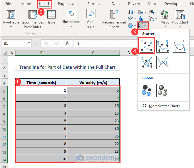
A scatter chart will be plotted.
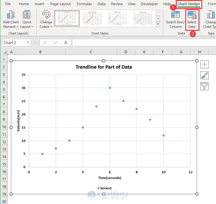
To create a trendline for the first 6 points of the graph: B5:C10:
- Select the chart.
- Go to the Chart Design tab.
- Click Select Data.
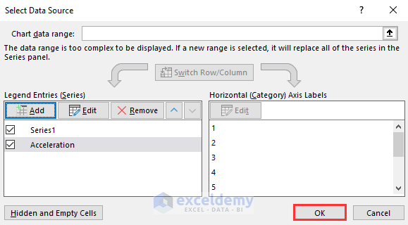
- In Select Data Source, click Add.
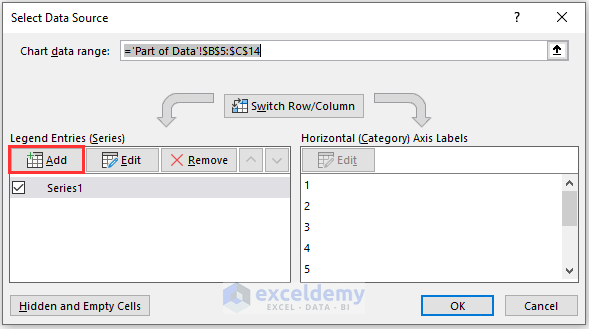
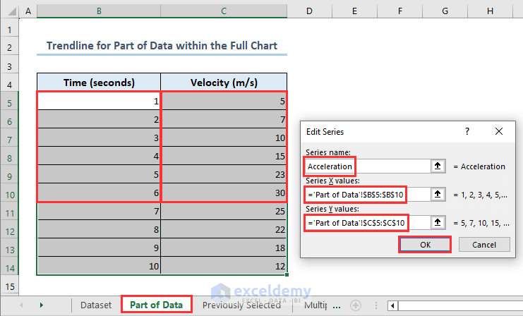
- Set the Series name. Here, Acceleration.
- Set Series X values as B5:B10.
- Set Series Y values as C5:C10.
- Click OK.
The worksheet name is Part of Data.
- Click OK.
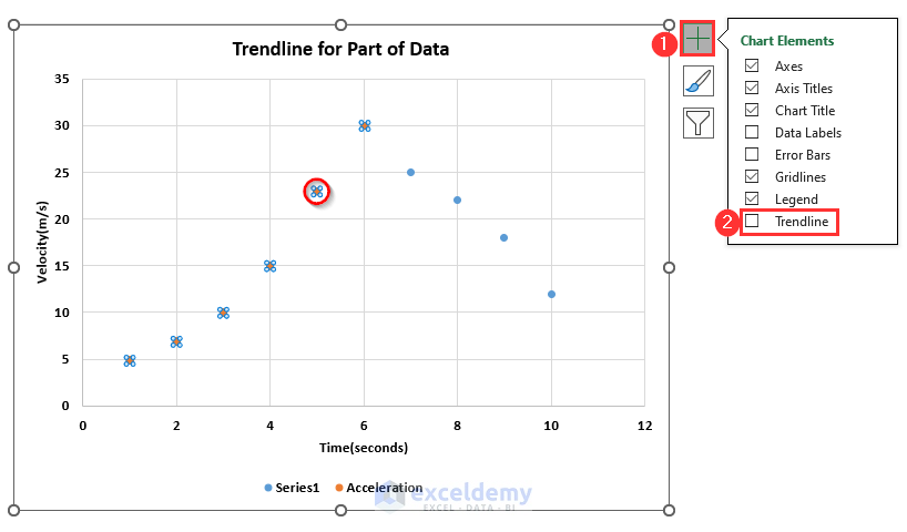
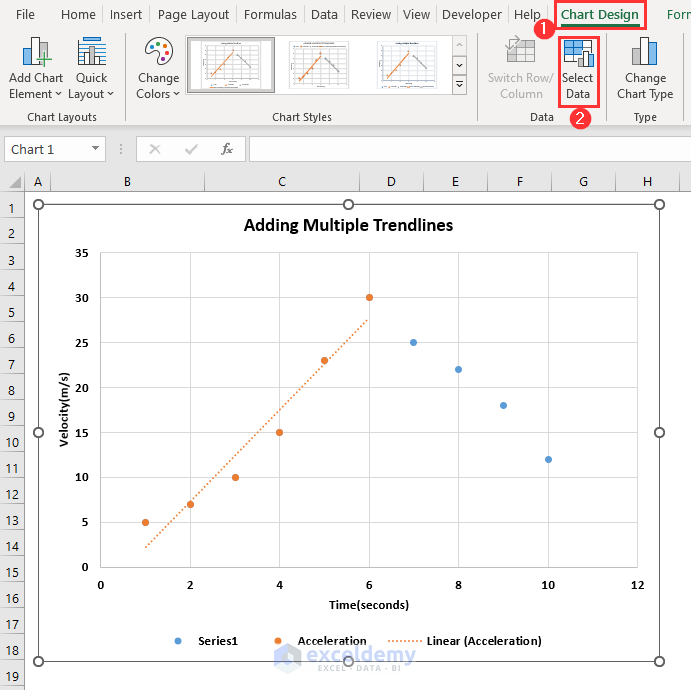
- The orange points represent the first 6 parts of the dataset and the blue points represent the rest of it.
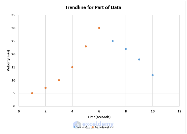
- To create a trendline for the orange points, select any orange point and click the plus (+) icon.
- Check Trendline.
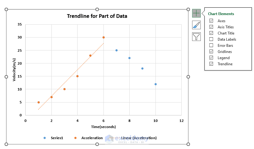
- The trendline is created.
Method 2 – Creating a Trendline for Previously Selected Data
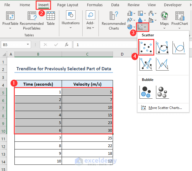
- Select B5:C10.
- Go to the Insert tab.
- Click Insert Scatter (X, Y) or Bubble Chart.
- Select Scatter.
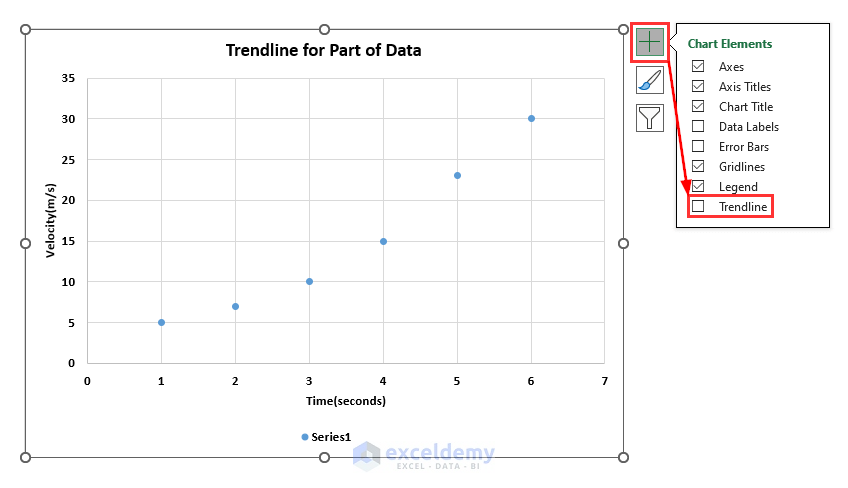
A scatter chart will be created.
- Select the chart.
- Click the Plus (+) icon.
- Check Trendline.
This is the output.
How to Add Multiple Trendlines in Excel
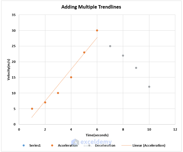
To add another trendline to the same chart, follow the steps described in the 1st method. The trendline displays orange points. Add a trendline for the blue points.
- Select the chart.
- Go to the Chart Design tab.
- Click Select Data.
- Click Add.
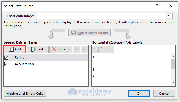
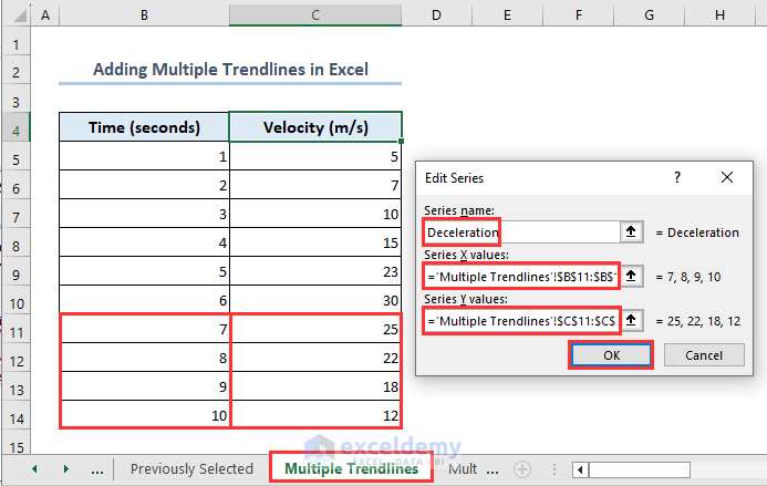
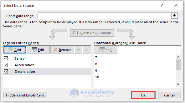
- Set the Series name. Here, Deceleration.
- Set the Series X values as B11:B14.
- Insert C11:C14 in the Series Y values.
- Click OK.
The worksheet name is Multiple Trendlines.
- Click OK again.
- You will see that the colors of the points changed from blue to ash.
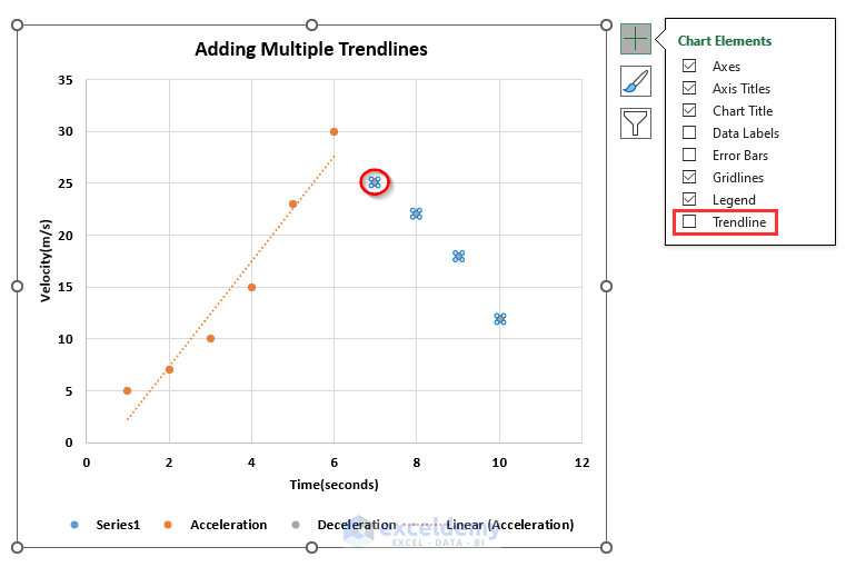
- Select any ash point.
- Click the plus (+) icon.
- Check Trendline.
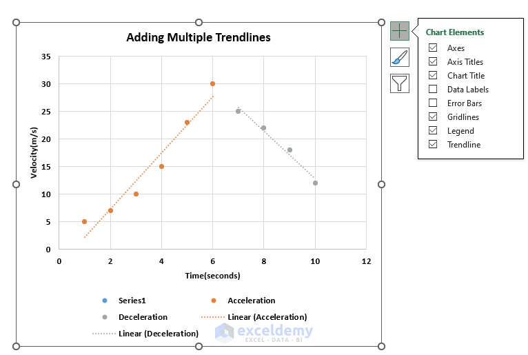
- There are two trendlines in the graph:
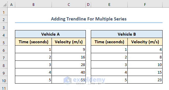
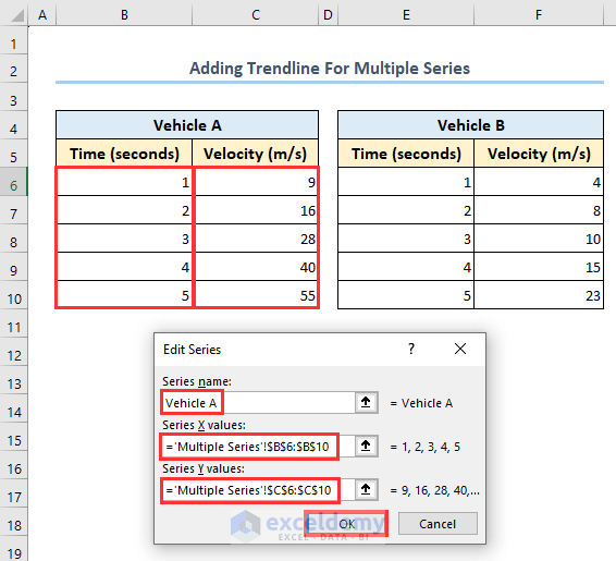
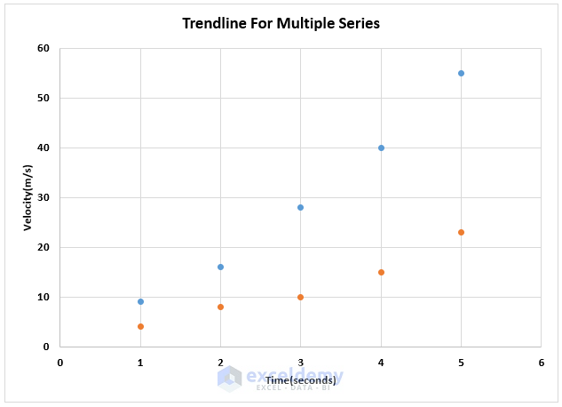
How to Add a Trendline For Multiple Series
The dataset showcases the speed record of two vehicles.
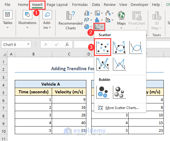
- Go to the Insert tab.
- Click Insert Scatter (X, Y) or Bubble Chart.
- Select Scatter.
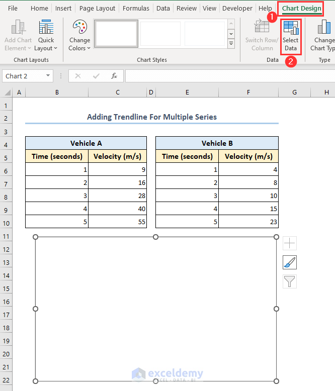
- An empty page will be displayed.
- Select it and go to the Chart Design tab.
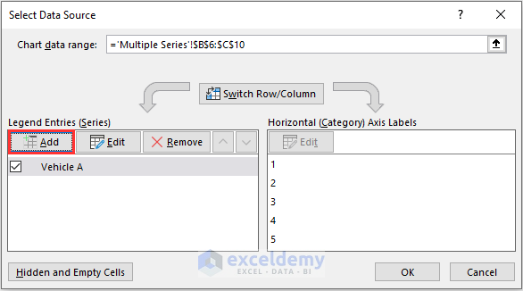
- Click Select Data.
- Click Add.
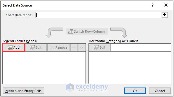
- Set Series name as Vehicle A.
- Select B6:B10 in the Series X values.
- Select C6:C10 in the Series Y values.
- Click OK.
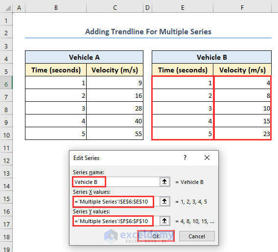
- Click Add again.
- Set the Series name as Vehicle B.
- Set the Series X values as E6:E10.
- Select F6:F10 in Series Y values.
- Click OK.
- Click OK again.
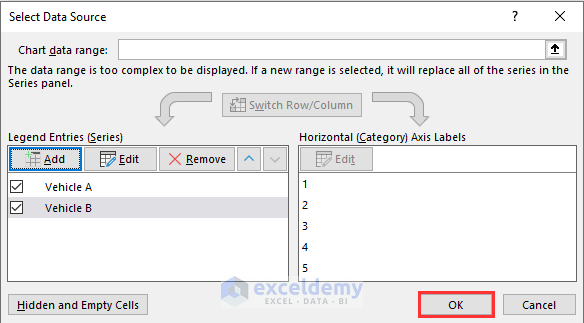
- The chart will be created. You can see blue and orange points.
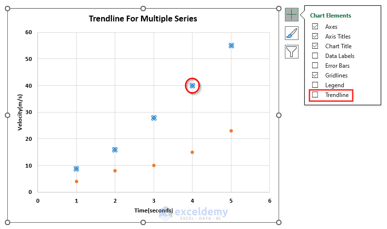
- Select any blue point.
- Click the plus (+) icon.
- Check Trendline.
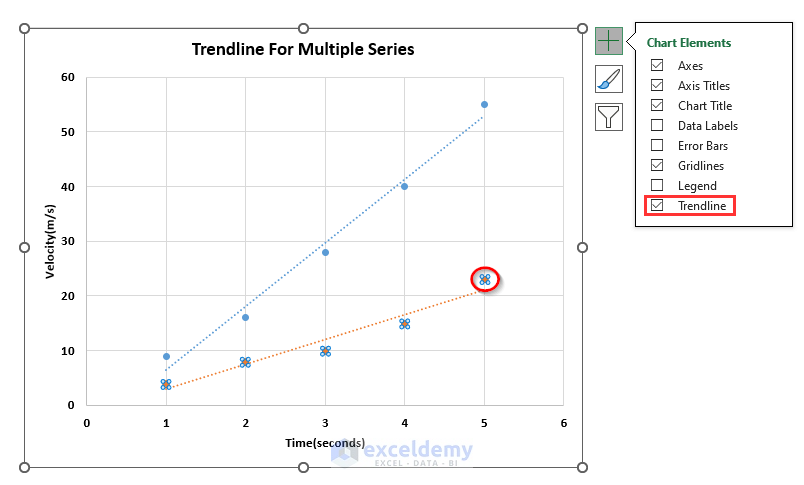
- Select any orange point.
- Click the plus (+) icon.
- Check Trendline.
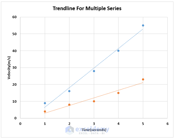
- This is the final output:
Frequently Asked Questions
1. Can I customize the trendline in Excel?
Yes, you can customize color, line style, type (line, exponential, polynomial, etc.), equation and R-squared value.
2. Can I remove or edit the trendline later?
Yes. To edit a trendline, select it on the chart, click, and use the Format Trendline choices to replace or remove it.
3. How can I interpret the trendline equation and R-squared value?
The trendline equation can be used to forecast values that go beyond the data at hand. How well the trendline fits the data is determined by its R-squared value; a number near 1.0 indicates a good fit, while one closer to 0.0 indicates a bad fit.
Get FREE Advanced Excel Exercises with Solutions!

