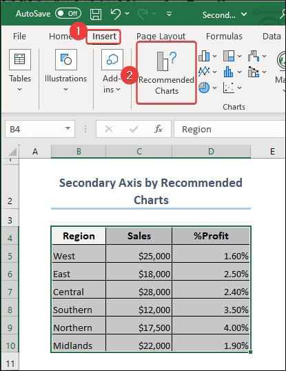
Method 1 – How to Add Secondary Axis Using Recommended Charts Option?
- Select the dataset and click on the Insert tab.
- Under the Insert tab, you will find the option Recommended Charts.
- Select the Recommended Charts option, you will find a chart like the image below in your worksheet. The first one is automatically selected. Click OK.
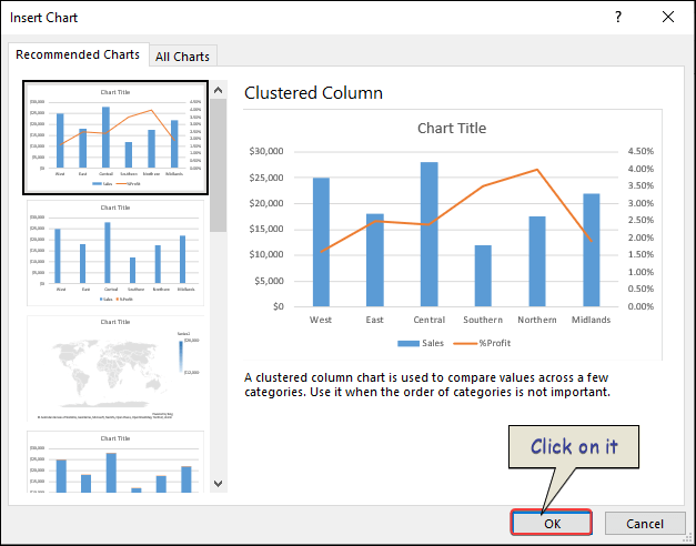
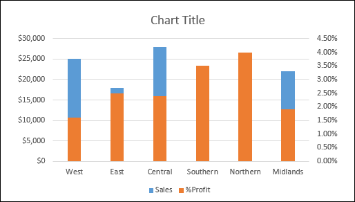
- Find a chart in your worksheet that contains the % of profit on the secondary axis.
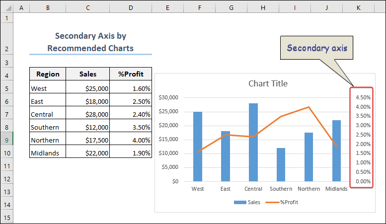
Click the Image for Detailed View
Method 2 – Can I Add a Secondary Axis Manually?
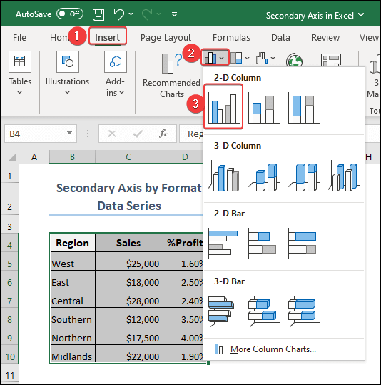
- The previous method, select the dataset.
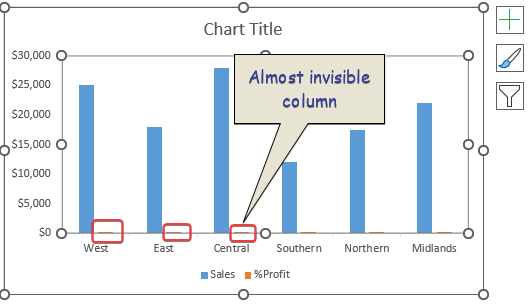
- Click on Insert Column or Bar Chart. Select 2D Column for your charts.
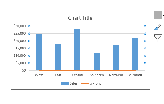
- The columns for % of profit are so small and impossible to interpret. To better visualize the data, we will add a secondary axis.
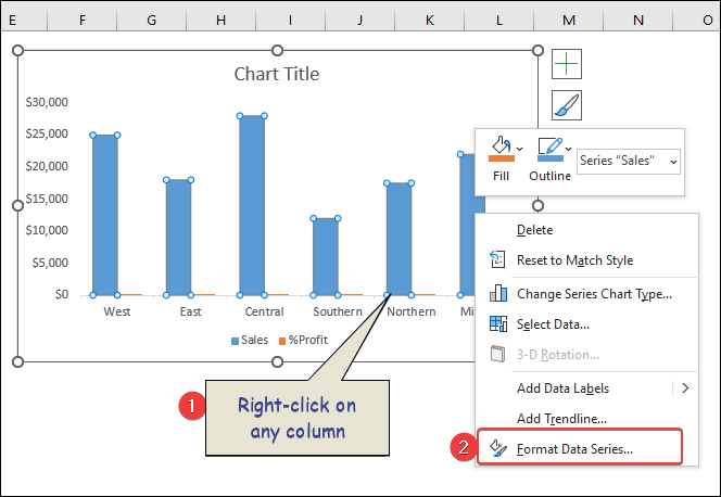
 Right-click on any column.
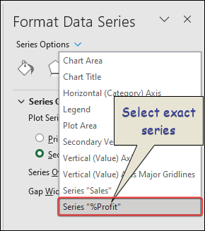
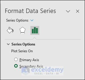
- From the Series Options, select the series you want to see in the secondary axis. In our case, it is Series “%Profit”.
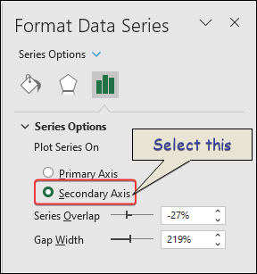
- You’ll get the following thing and check the circle before Secondary Axis.
- Your chart will look like the following one.
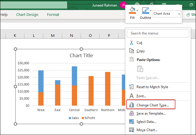
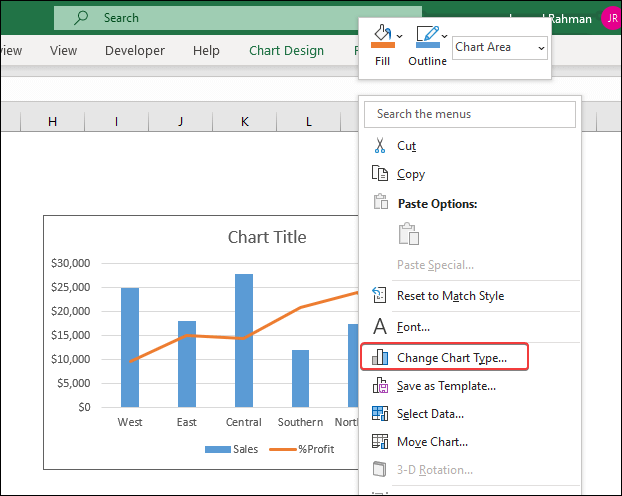
 Change the chart type of %Profit. Right-click on the chart and select Change Chart Type.
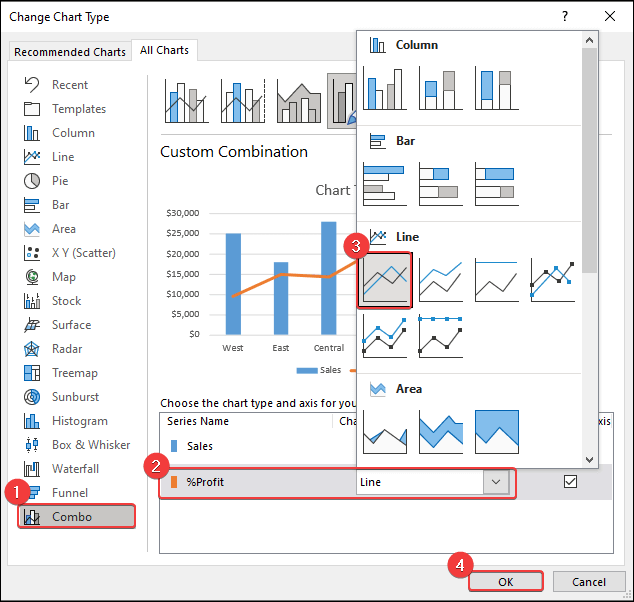
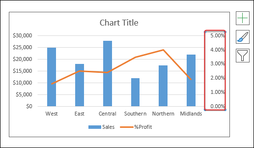
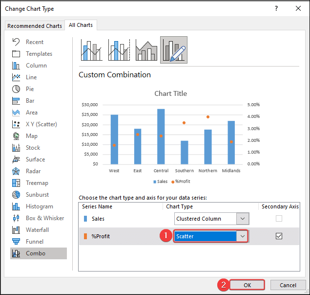
- In the Combo chart option, we will set the %profit series to Line type graph.
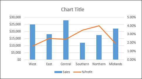
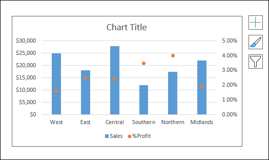
 The final look of your chart will look like the following image.
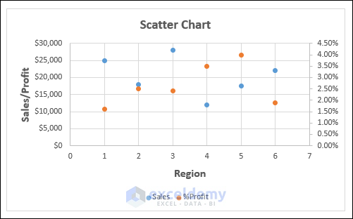
Method 3 – How to Add Secondary Axis in Excel Scatter Plot?
- Select the data series.
- Right-click on the mouse to select the Format Data Series option.
You will find the following change in your chart.
How to Remove Secondary Axis in Excel?
If you need to remove the secondary axis, you must follow some specific steps in Excel.
- In order to remove the secondary axis from your chart, select that like the image below.
 Hit the Delete or Backspace key on your keyboard. The secondary axis will disappear instantly.
Is it Possible to Change the Y-axis in Excel?
Yes, you may do it by changing the chart type from the context menu.
- Right-click on the chart and select Change Chart Type from the options.
- A box appears with various options. Change the option shown in the following image.
- After completing the steps described above, you will find a chart with a different look in your worksheet.
How to Add Secondary X Axis in Excel?
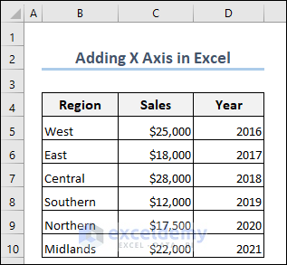
We have seen ways of adding a secondary Y-axis in Excel. You are curious whether you can add a secondary X-axis in Excel. The answer is, YES! We will use the same dataset to add a secondary X-axis in Excel. You will see the dataset in which we want to apply a secondary X axis.
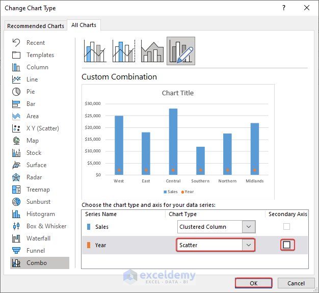
- We will use the Recommended Charts option to insert a chart in Excel. Change the chart type of the series “Year” into Scatter. Also, uncheck the Secondary Axis option next to the Chart Type drop-down menu.
- In the Format Data Series task pane, change the series option from Primary Axis to Secondary Axis.
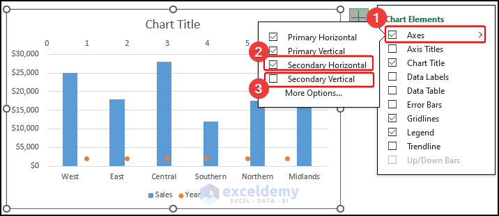
- Click on the “+” sign in the upper right corner of the chart. Click Axes >>Check Secondary Horizontal >> Uncheck Secondary Vertical.
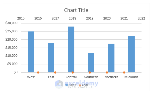
- You can see that the X-axis labels show values like 0,1,2, etc. But we don’t want to see those values. To modify this, right-click on the chart >> choose Select Data.
- Edit the “Year” series. In the Series X Values option, select the “Year” range (D5:D10) and select the “Region” range (B5:B10) as the Series Y Values.
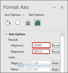
- Change the highest and lowest values in the X-axis label. Since our dataset starts with the value “2016” and ends at the value “2021”, we set these to the Minimum and Maximum values in the label.
Select the primary X-axis and check the option On Tick Marks under the Axis Position of Format Axis task pane (Do this to bring the years in the middle of 2D columns).
- Select the points of the Year series and apply No Fill and No Border to them.
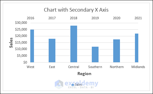
- Give an appropriate title of the chart as well as the axes titles. The following image is the final appearance of the chart.
Which Things You Have to Keep in Mind?
- Use the secondary axis in your chart only when you have data series with different units of measurement.
- Label the secondary axis perfectly to indicate the unit of measurement or the data series it represents.
- Maintain simplicity and clarity of the chart by avoiding overcrowding of the chart with too many series.
Frequently Asked Questions
1. Why would I need to use a secondary axis in my chart?
Answer: You may need to add a secondary axis for various purposes like when you have multiple data types, data with different trends, different units of measurement, etc.
2. What types of charts support a secondary axis in Excel?
Answer: Not all types of charts support the secondary axis. The following types of charts support secondary axis: Column chart, Line chart, Area chart, and Bar chart.
3. Can I display different chart types on the primary and secondary axes?
Answer: Yes, you can. Just change the chart type and give it to your desired format. You may format the primary axis as Clustered Column and the secondary axis to a Scatter Chart.
Download Practice Workbook
Secondary Axis in Excel: Knowledge Hub
- How to Add Secondary Axis in Excel
- How to Combine Graphs with Different X Axis in Excel
- How to Hide Secondary Axis in Excel Without Losing Data
<< Go Back To Excel Charts | Learn Excel
Get FREE Advanced Excel Exercises with Solutions!
