Sometimes, you need to use a secondary axis in Excel to express the dataset more clearly. Because of using a secondary axis, we will have a new axis and scaling. Your secondary data will be set into charts according to secondary axis scaling. This article will show you how to hide the secondary axis in Excel without losing data which means you will hide the secondary axis but the data remains the same. I hope you find this article very interesting and gain lots of knowledge regarding this topic.
How to Hide Secondary Axis in Excel Without Losing Data: 2 Suitable Methods
To hide the secondary axis in Excel without losing data, we have found two different approaches through which you can hide the secondary axis in Excel but the scaling of the data remains the same. Both of the methods are highly applicable for your future purpose.
First, you need to add the secondary axis in Excel using the process we discussed previously. Then, you can hide the secondary axis from the chart element.
But in this case, after hiding the conversion rate, the scaling will be changed. As the conversion rate value is very small compared to sales and profit, you won’t get it in the chart until you add the required secondary axis for the conversion rate.

To eliminate the problem, we have found two effective methods through which you can solve the issue. Follow the methods carefully to understand them.
1. Using No Fill from Format Axis to Hide Secondary Axis
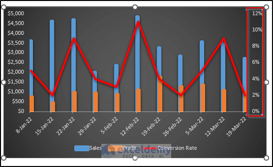
Our first method is based on using the no-fill for the secondary axis. First, we take a dataset where a secondary axis is a must. After that, we add the secondary axis. Then, we would like to hide the secondary axis without losing data and also without losing the scaling. For our case, we get the following chart including a secondary axis.
To do this follow the steps.
Steps
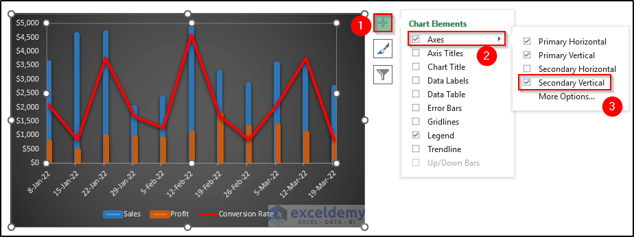
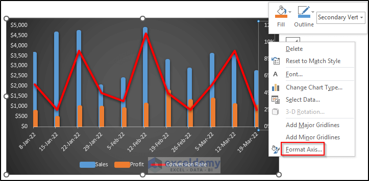
- First, right-click on the secondary axis.
- Then, select Format Axis from the Context Menu.

- After that, the Format Axis dialog box will appear.
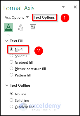
- Then, select the Text Options tab at the top.
- Select No fill from the Text Fill section.
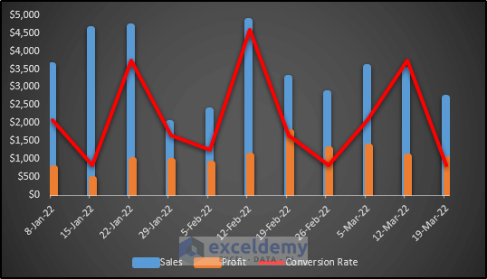
- As a consequence, we will get the following chart where the conversion rate data and scaling remain similar.
2. Setting Axis Transparency to 100% to Hide
Our next method is based on setting transparency to 100% while using the Solid fill. First, we take a dataset where a secondary axis is a must. After that, we add the secondary axis. Then, we would like to hide the secondary axis without losing data and also without losing the scaling. For our case, we get the following chart including a secondary axis.

Follow the steps properly to understand the method.
Steps
- First, right-click on the secondary axis.
- Then, select Format Axis from the Context Menu.
- After that, the Format Axis dialog box will appear.
- Then, select the Text Options tab at the top.
- Select Solid fill from the Text Fill section.
- Then, set the Transparency to 100%.

- As a consequence, we will get the following chart where the conversion rate data and scaling remain similar.

How to Add Secondary Axis in Excel
Before hiding the secondary axis in Excel without losing data, we need to add a secondary axis in Excel. To show the process, we take a dataset that includes the date, sales, profit, and conversion rate. We would like to add a secondary axis for conversion rate. Follow the steps carefully.
Steps
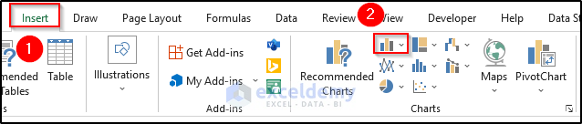
- First, select the range of cells B4 to E15.

- Then, go to the Insert tab on the ribbon.
- Select the Insert Column or Bar Chart drop-down option from the Charts group.
- Then, select Clustered Column from the Insert Column or Bar Chart drop-down option.
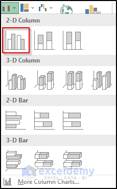
- As a result, you will get the following chart.
- However, the secondary axis is absent. As the conversion rate value is very small compared to sales and profit, you won’t get it in the chart until you add the required secondary axis for the conversion rate.

- Then, right-click on the chart.
- A Context Menu will appear. From there select the Change Chart Type option.

- Then, the Change Chart Type dialog box will appear.
- Select Combo chart options from the Recommended Charts section.
- Then, select the Custom Combination option where you can customize your chart combination.
- After that. Check on the secondary axis for the conversion rate.
- Finally, click on OK.
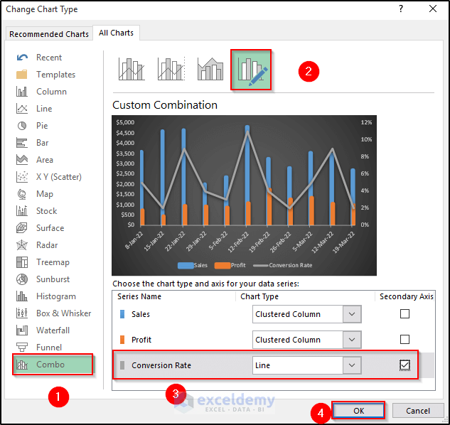
- As a consequence, you will get the following chart along with the secondary axis that represents the conversion rate.
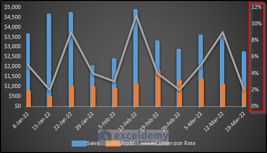
- To get a better view, we can alter the color of the conversion rate line.
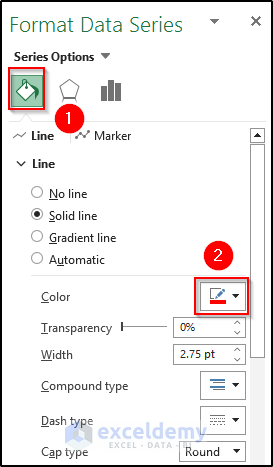
- To do this, right-click on the line.
- Then, select Format Data Series from the Context Menu.

- As a result, the Format Data Series dialog box will appear.
- Then, select Fill & Line.
- After that, change the color of the line.
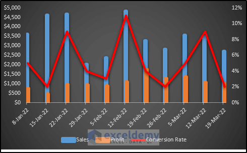
- Finally, we get the following chart along with the secondary axis. See the screenshot.
Things to Remember
You can hide the secondary axis in Excel from the Chart Elements options or Chart Design. In both cases, the scaling will alter. So, you can’t get the data after hiding the secondary axis.
Download Practice Workbook
Download the practice workbook below.
Conclusion
We have shown two different and effective methods to hide the secondary axis in Excel without losing data. All of these methods are user-friendly. In both cases, the scaling of the data remains similar. I hope covered all possible areas of this topic. If you have any questions, feel free to ask in the comment box.
Related Articles
<< Go Back To Secondary Axis in Excel | Excel Charts | Learn Excel
Get FREE Advanced Excel Exercises with Solutions!

Or you could go to Format Axis > Axis options >Labels > Change Label position to ‘None’. This way the axis is actually hidden and wont take up any space in your chart.
Hello Donald Duck,
Thank you for sharing your wonderful tip to hide the secondary axis in Excel. I hope it will profoundly help our users.
Regards,
Guria
ExcelDemy