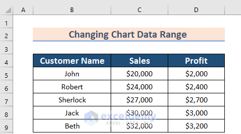
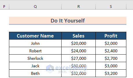
In the sample dataset, there are 3 columns: Customer Name, Sales, and Profit.
Method 1 – Using the Design Tab
Steps:
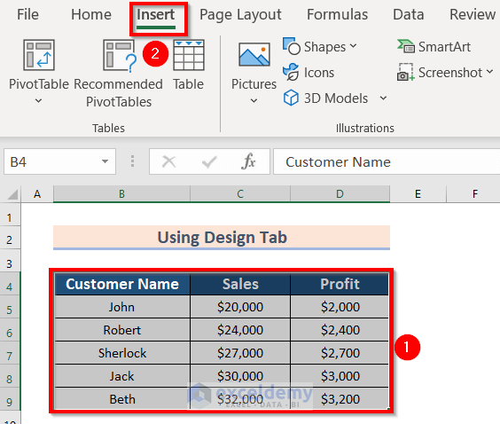
- Select the data. We have selected the range B4:D9.
- Go to the Insert tab.
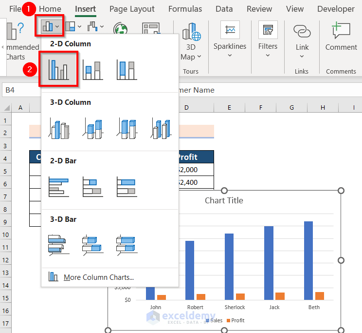
- From the Charts group section, select Insert Column or Bar Chart.
- We chose under 2-D Column >> Clustered Column. Select according to your preference.
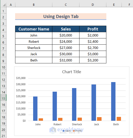
- Click the 2-D Clustered Column feature and get the result.
- Select the chart.
- From Chart Design >> choose Select Data.
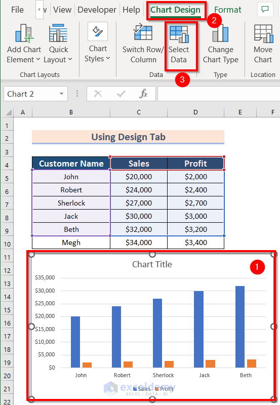
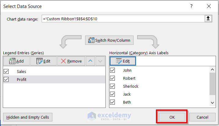
You will see the following dialog box named Select Data Source.
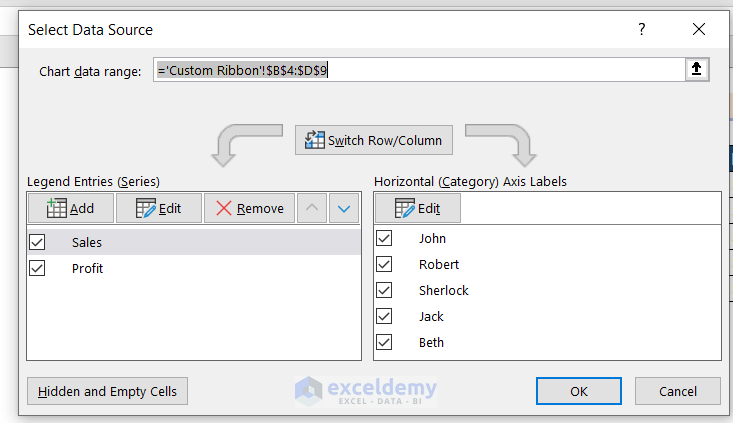
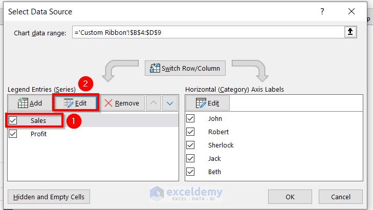
- From the dialog box of Select Data Source, choose the Sales Option.
- Click on the Edit feature.
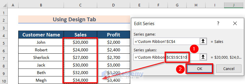
A new dialog box named Edit Series will appear.
- Enter the data range in Series values up to what you want to keep in the chart. We have included a new cell C10 and have written it as $C$5:$C$10.
- Click OK.
The previous dialog box of Select Data Source will appear.
- Select the Profit option to change the data range of Profit.
- Choose the Edit feature.
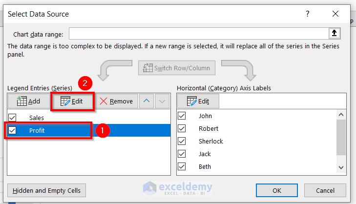
- The dialog box named Edit Series will appear.
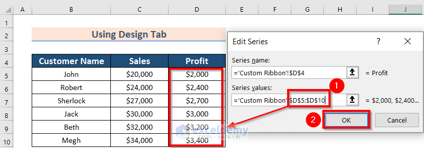
- Edit the Profit.
- We have included a new cell, D10, and written $D$5:$D$10 in the Series values box.
- Click on OK.
The previous dialog box of Select Data Source will appear.
- Click on the Edit option to change the Axis Labels.
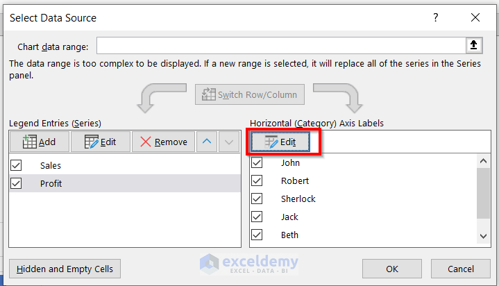
A dialog box named Axis Labels will appear.
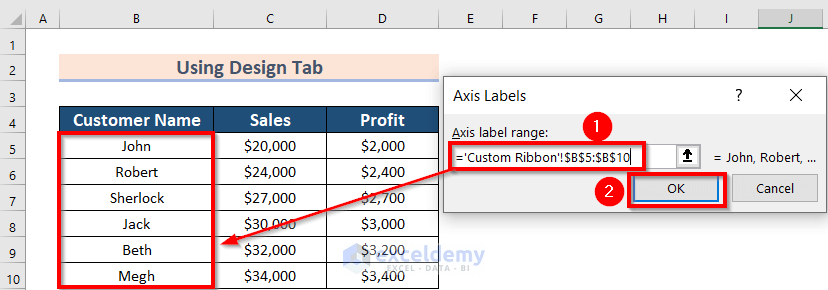
- Then, you have to select the Axis label range. Here, I have selected the range from B5:B10.
- Now, press OK to make the changes.
- Press OK on the Select Data Source box.
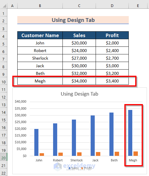
You can view the following Chart with the changed data range.
Read More: How to Change Data Source in Excel Chart
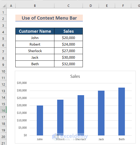
Method 2 – Using the Context Menu Bar
Steps:
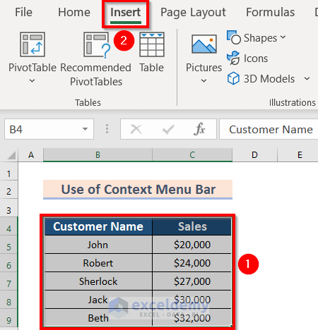
- Select the data. We have selected the range B4:D9.
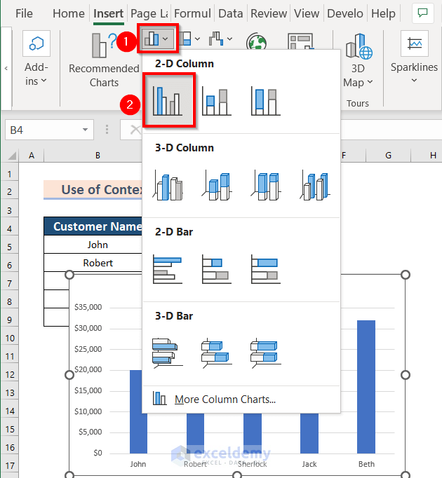
- Go to the Insert tab.
- From the Charts group section, select Insert Column or Bar Chart.
- We have chosen under 2-D Column >> Clustered Column. Here, the selection will be according to your preference.
You can now see the following Column Chart.
Now, you want to change the chart data range.
- Right-Click on the chart.
- From the Context Menu Bar >> choose Select Data.
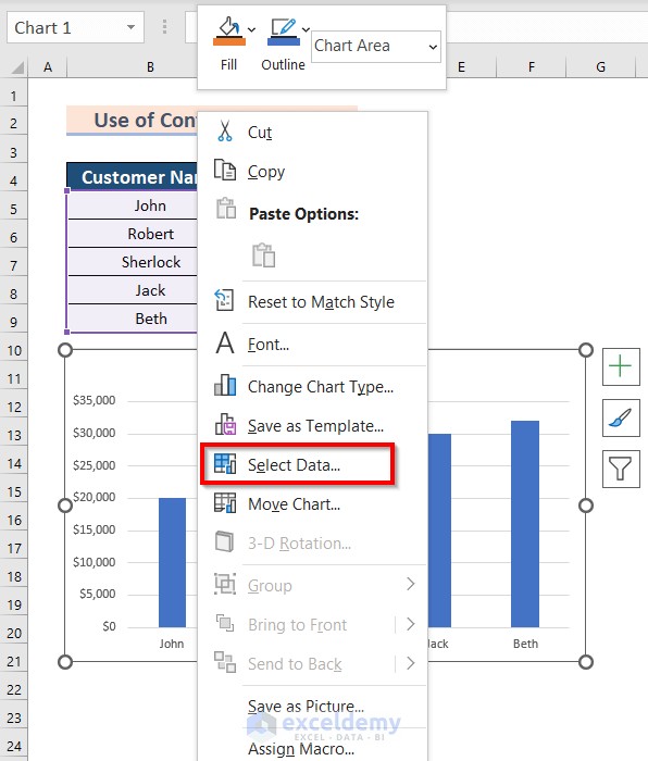
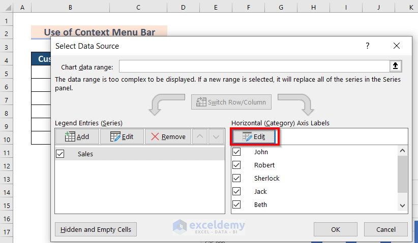
You will see the following dialog box of Select Data Source.
- From the dialog box of Select Data Source, choose the Edit feature under the Sales option.
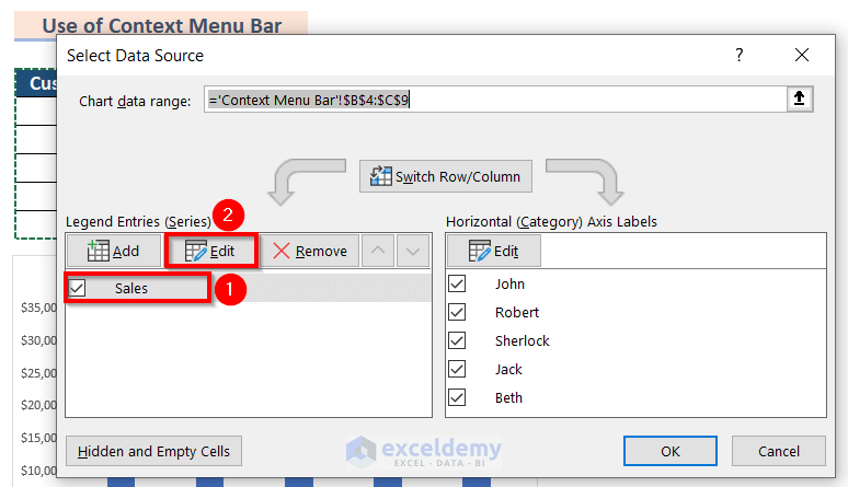
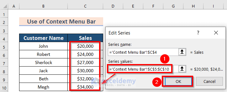
A new dialog box named Edit Series will appear.
- Enter the data range in Series values up to what you want to keep in the chart. We have included a new cell C10 and have written $C$5:$C$10.
- Click OK.
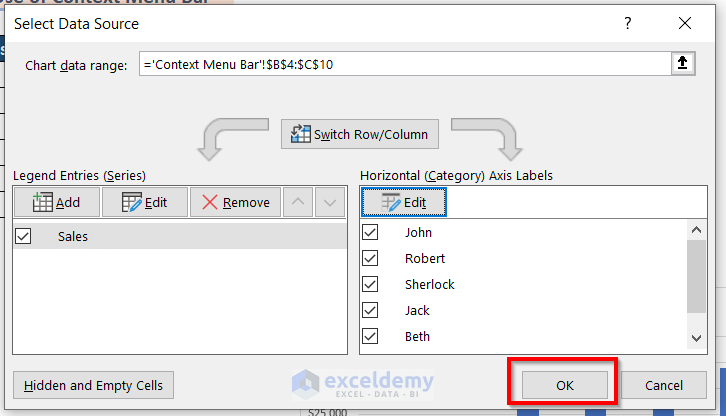
The previous dialog box of Select Data Source will appear.
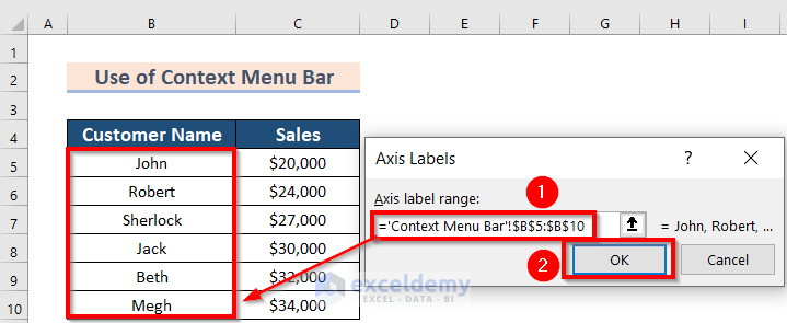
- Click on the Edit option to change the Axis Labels.
- Select the Axis label range. We have selected the range from B5:B10.
- Press OK to make the changes.
- Press OK on the Select Data Source box.
You will see the following changed chart. 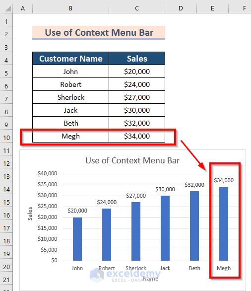
Read More: How to Edit Chart Data in Excel
Method 3 – Using the Mouse Pointer
Steps:
- Click on the chart.
- Go to the data range and drag the Mouse Pointer below to include the data.
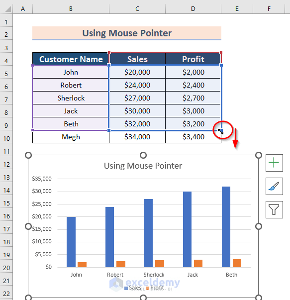
You can see that all wanted data are selected.
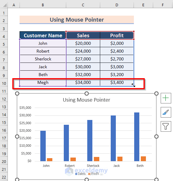
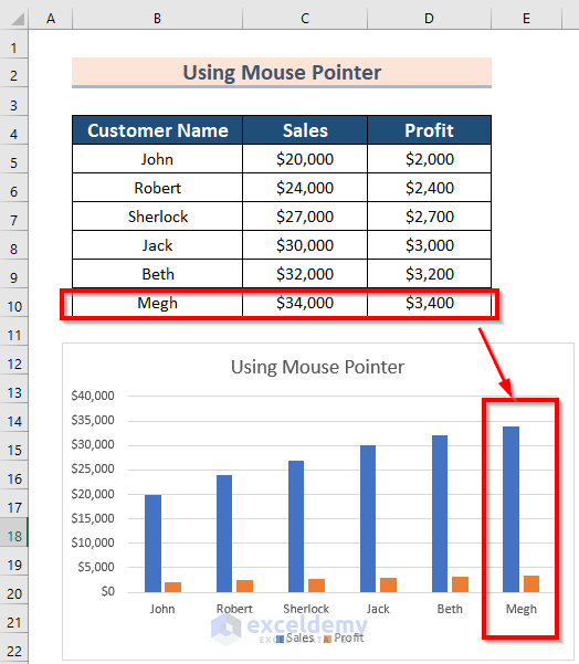
You will see the result.
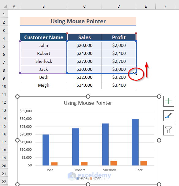
If you want to remove some data:
- Click on the chart.
- Drag the Mouse Pointer up in the data range.
You can see the result below.
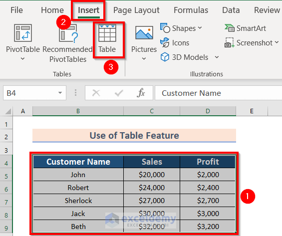
Method 4 – Using the Table Feature
Steps:
- Select the data. We have selected the range B4:D9.
- From the Insert tab >> select the Table feature.
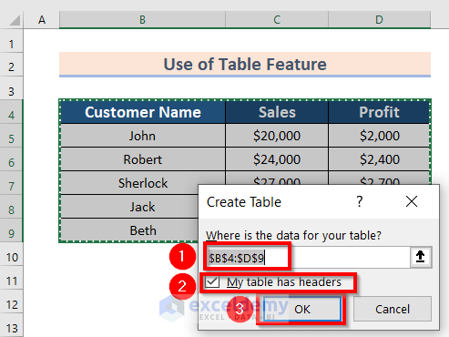
A dialog box of Create Table will appear.
- Select the data for your table. This will be auto-selection. The auto-selected range is B4:D9.
- Make sure that “My table has headers” is marked.
- Press OK.
You will see the following table.
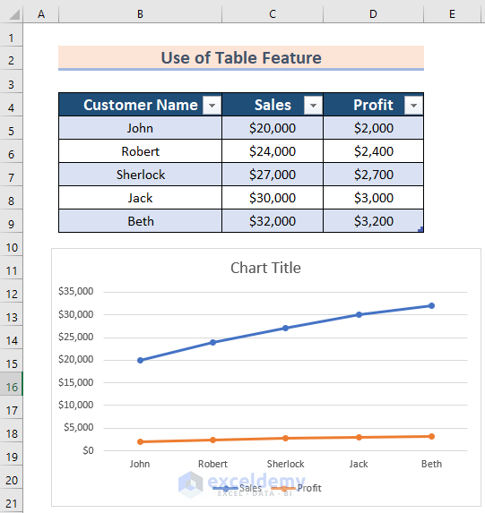
- Select the table.
- Go to the Insert tab.
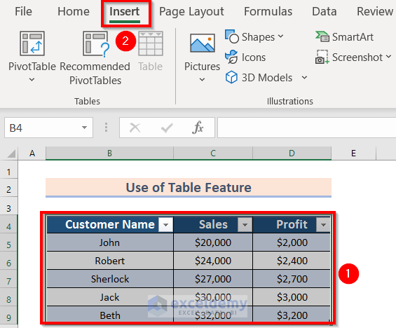
- From the Charts group >> choose 2-D Line >> select Line with Markers feature.
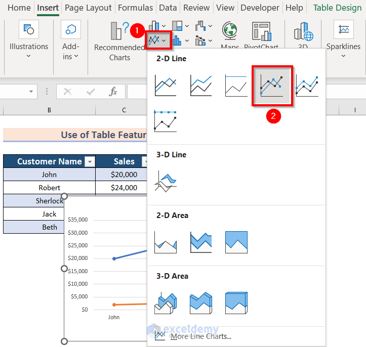
The Chart is ready now.
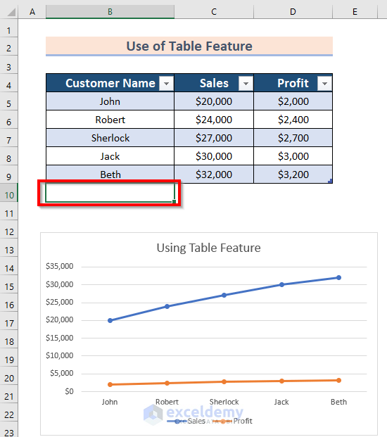
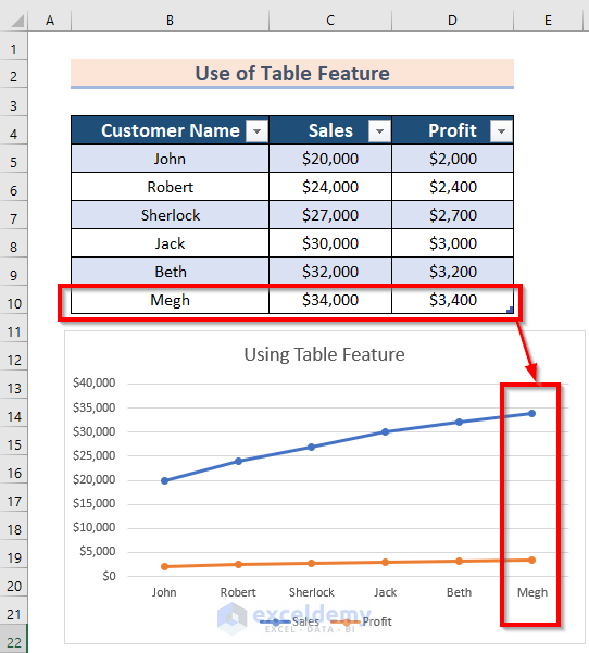
If you Copy-Paste any data to the cell that is adjacent below to the table, you will see the curve will be auto-modified. We will copy some data to cell B10.
You will see the result. We have changed the chart title to the modified chart.
Method 5 – Using Formulas
Steps:
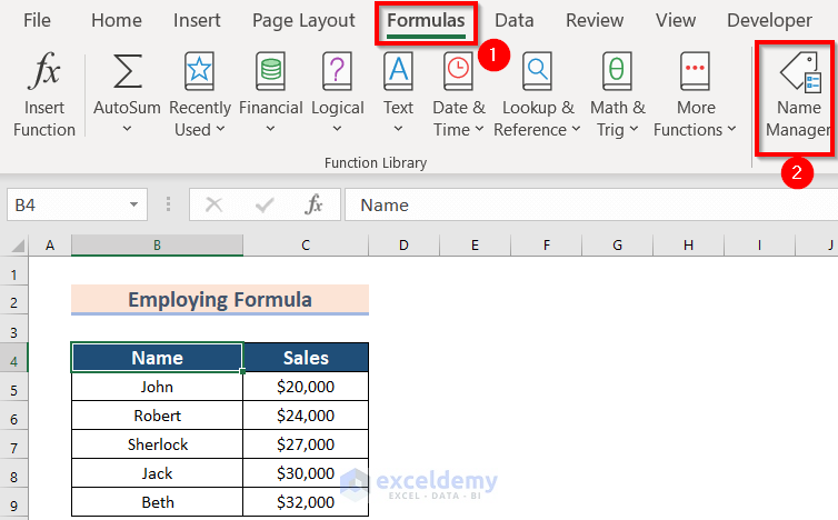
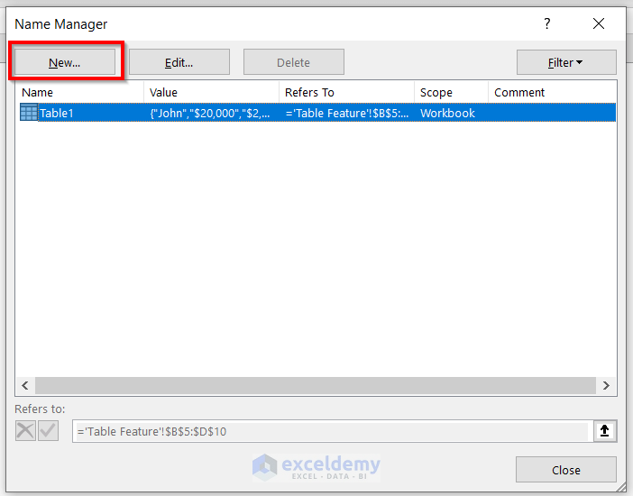
- From the Formulas ribbon >> go to Name Manager.
A new dialog box named Name Manager will appear.
- Click on New to that box.
You will see another dialog box named New Name.
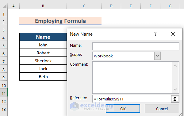
- Enter the name ChartName in the Name box to call the Name column.
- Select your worksheet in the Scope box. My worksheet is Formulas.
- Enter the following formula in the Refers to box:
- Press OK.
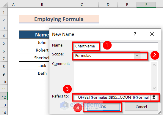
Formula Breakdown
- COUNTIF will count the number of cells for a range that meets a given criterion.
- COUNTIF(Formulas!$B$5:$B$100,”<>”)—> will count all the valued cells from B5 to B100 and will skip the duplicate values. This will count here 7.
- Formulas!$B$5—> is the reference here.
- OFFSET will return some values from a reference range.
- OFFSET(Formulas!$B$5,,,7)—> This will call your 7 data from the cell
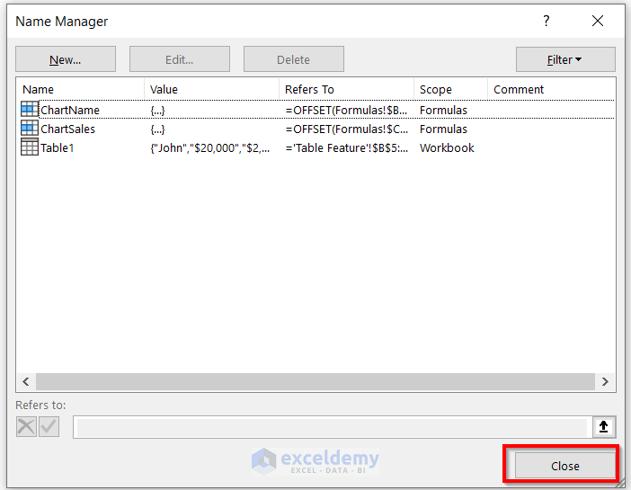
The Name Manager dialog box will appear.
- Choose New.
You need to do the same thing according to your data in the chart.
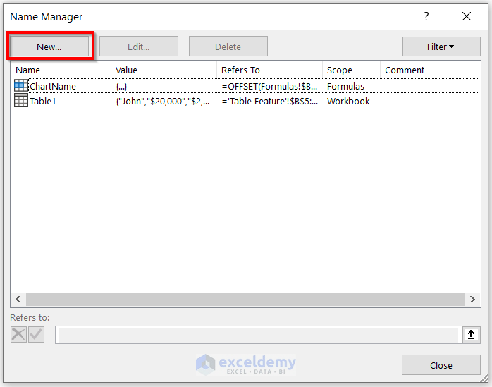
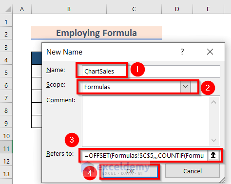
- Enter the name ChartSales in the Name box to call the Sales column.
- Select your worksheet in the Scope box. My worksheet is Formulas.
- Enter the following formula in the Refers to box:
- Press OK.
Formula Breakdown
- COUNTIF will count the number of cells for a range that meets a given criterion.
- COUNTIF(Formulas!$C$5:$C$100,”<>”)—> will count all the valued cells from C5 to C100. This will count here 7.
- Formulas!$C$5—> is the reference here.
- OFFSET will return some values from a reference range.
- OFFSET(Formulas!$C$5,,,7)—> This will call your 7 data from the cell.
- Close your Name Manager dialog box.
- Choose any cell. We have chosen Cell B11.
- Go to the Insert tab.
- From 2-D Line >> choose Line with Markers.
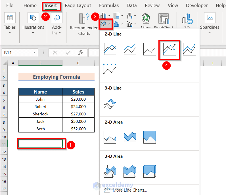
You can see the following blank box.
- Select the Blank Chart.
- From the Chart Design tab >> go to Select Data ribbon.
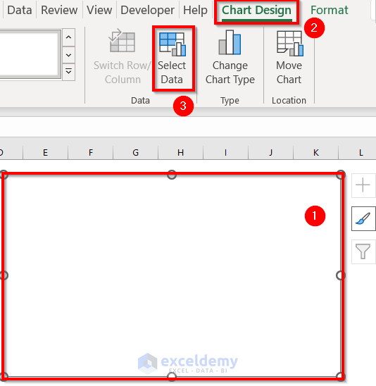
A dialog box of Select Data Source will appear.
- Select Add from the following box.
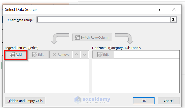
Another dialog box will appear.
- You must mention the worksheet in the Series values. We have mentioned the worksheet Formulas.
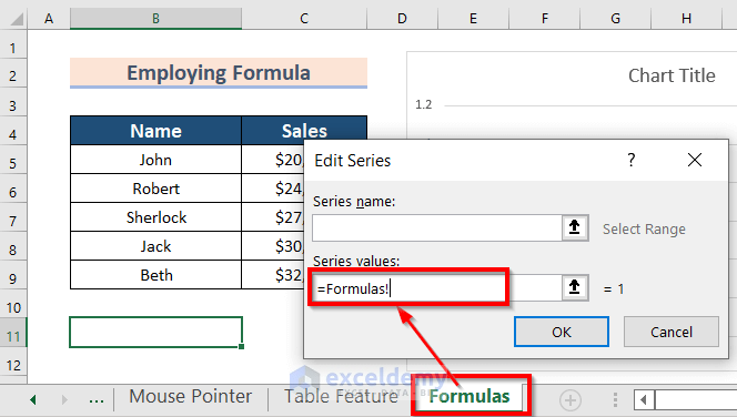
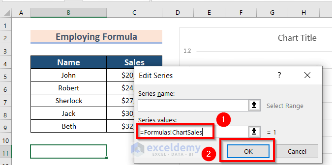
- Call your data by entering the following:
This formula will call you data. The column header is Sales.
- Click on OK to get the changes.
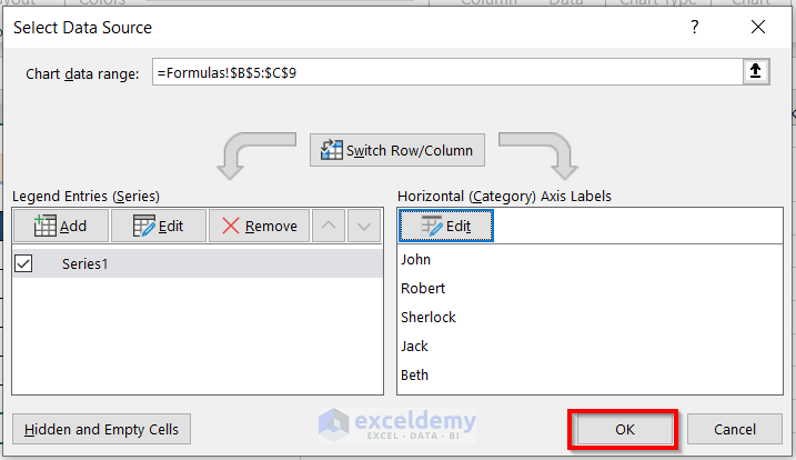
The previous dialog box of Select Data Source will appear.
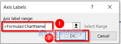
- Click on the Edit option to change the Axis Labels.
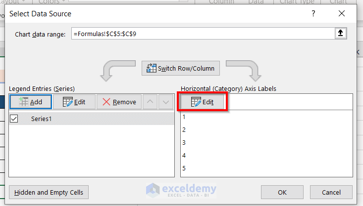
- Enter the following formula in the Axis label range:
This formula will call you data. The column header is Name.
- Click on OK.
- Press OK on the Select Data Source box.
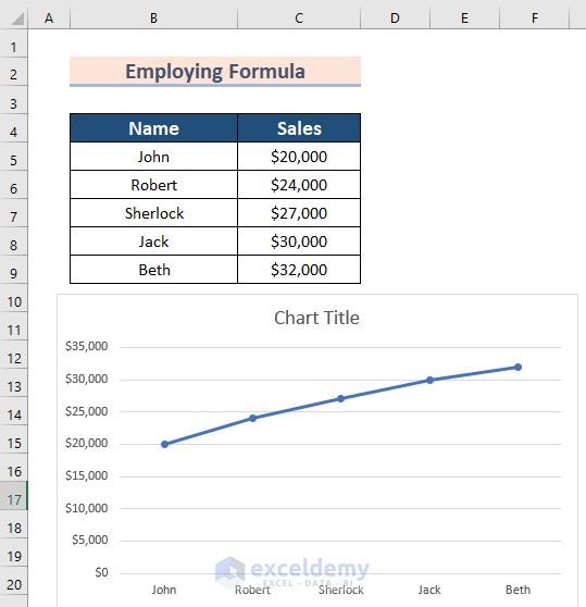
You will see the following line chart.
If you add any value to your data range by copying or writing it down, you will see the changes in the chart automatically.
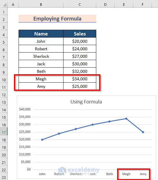
We have included two more pieces of information B10:C11.
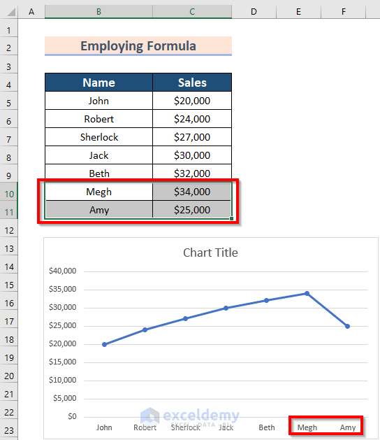
The following is the final result in which I have introduced the Chart title.
Read More: How to Change Chart Data Range Automatically in Excel
Things to Remember
- If you change any data used in the chart, then the chart will be auto-updated.
- Furthermore, using the Mouse Pointer method is the easiest method.
- Moreover, using a table for the chart is the best option.
Practice Section
Now, you can practice the explained method by yourself.
Download the Practice Workbook
You can download the practice workbook from here:
Related Articles
- How to Edit Data Table in Excel Chart
- How to Change X-Axis Values in Excel
- How to Sort Data in Excel Chart
- How to Group Data in Excel Chart
- How to Limit Data Range in Excel Chart
- How to Skip Data Points in an Excel Graph
- How to Remove One Data Point from Excel Chart
- How to Hide Chart Data in Excel
<< Go Back to Edit Chart Data | Excel Chart Data | Excel Charts | Learn Excel
Get FREE Advanced Excel Exercises with Solutions!
