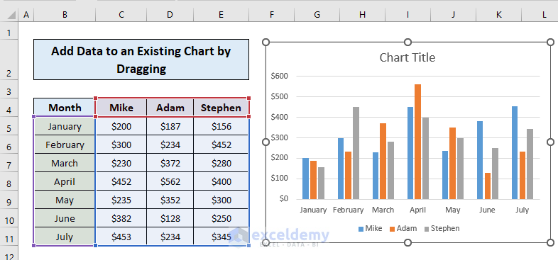
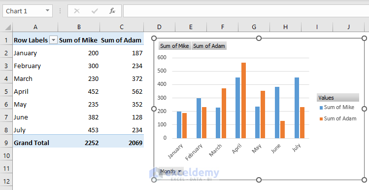
Method 1 – Add Data to an Existing Chart on the Same Worksheet by Dragging
We have a dataset of sales for sales assistants who work at a shop over a certain period of time.
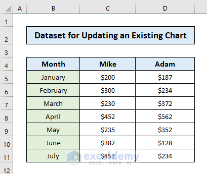
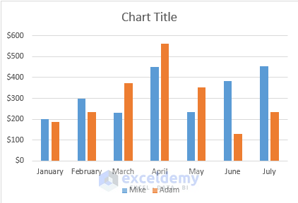
We have made a chart describing the sales of these representatives over the time period mentioned.
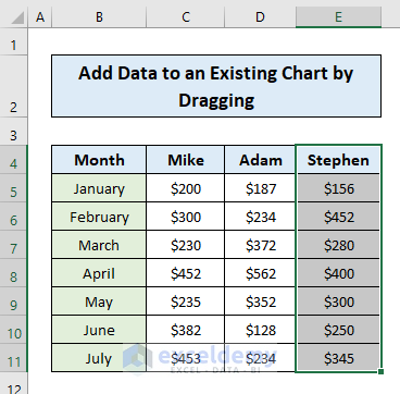
- Add a new data column to your previous data set (i.e. sales of Stephen).
- Click the chart area, and you’ll see the data source which is currently displayed is selected on the worksheet, but the new data series is not selected.
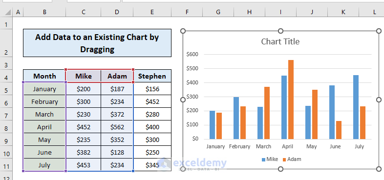
- Drag the sizing handles to include the new data series and the chart will update.
Read More: How to Expand Chart Data Range in Excel
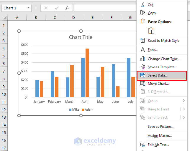
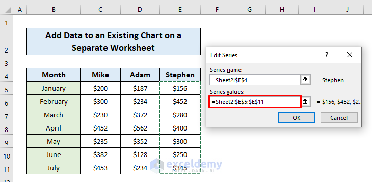
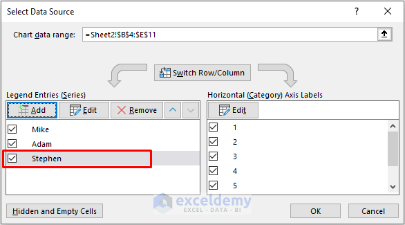
Method 2 – Add Data to an Existing Chart on a Separate Worksheet
- Right-click on the chart and click Select Data.
- A dialogue box will show up. Click Add on the Legend Entries (Series) box.
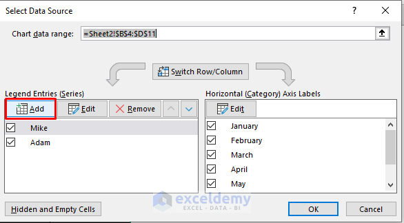
- Go to the sheet containing the new data entries. Assign a new Series name (i.e. Stephen).
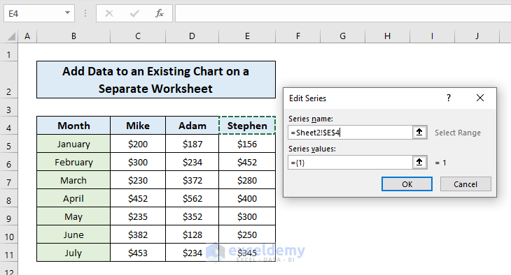
- Assign the cells containing new data entries as the Series values.
- The heading of the new data entries will show up on the Legend Entries box. Click OK on the dialogue box.
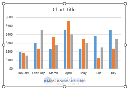
- Your existing chart will show the updated data.
Read More: Selecting Data in Different Columns for an Excel Chart
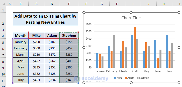
Method 3 – Update Data to a Chart by Pasting New Entries
- Copy the new data entries of the dataset.
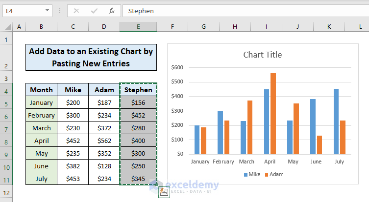
- Click on the chart and paste. Your chart will be updated.
Read More: How to Select Data for a Chart in Excel
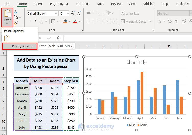
Method 4 – Use the Paste Special Option to Add Data to a Chart
- Copy the new data entries and click on the chart.
- Go to the Home tab, select Paste, and click Paste Special
- A dialog box will show up displaying multiple options for you for full control of what is pasted.
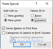
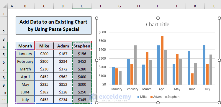
- Choose the options you want and your updated chart will be ready.
Method 5 – Use a Pivot Table to Add Data to an Existing Chart
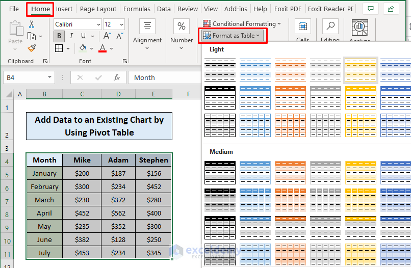
- Select the data range.
- Go to the Home tab and click Format as Table.
- Choose a design for the table.
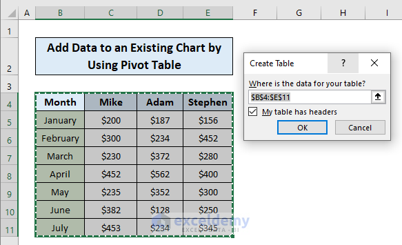
- The Create Table dialogue box will show up. Mark if your table has headers.
- Click OK.
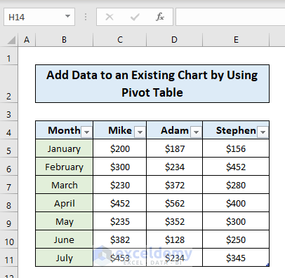
- Your table will be created.
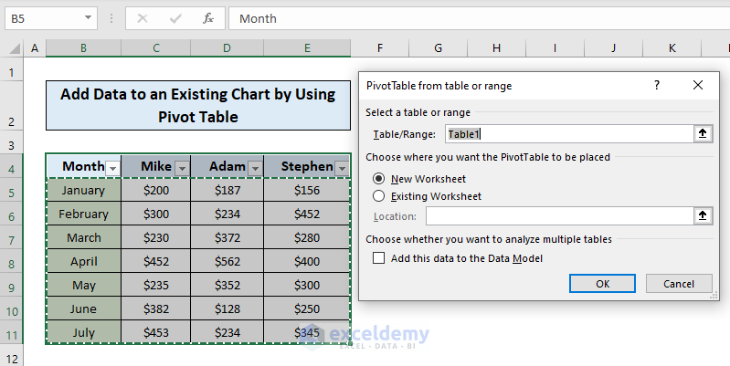
- Go to the Insert tab, click Pivot Table, and select From Table/Range.

- Choose whether you want your pivot table on the same sheet or a different sheet.
- A PivotTable Fields box will show up.
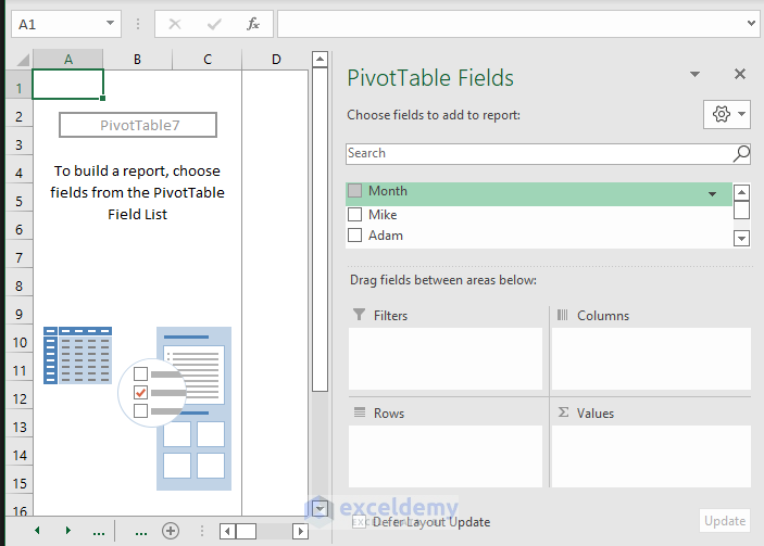
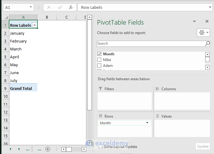
- Drag your data range to the drag fields you want (i.e. drag Month to Rows)
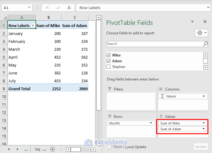
- Drag the other data ranges to the other drag field (i.e. Mike and Adam to Values)
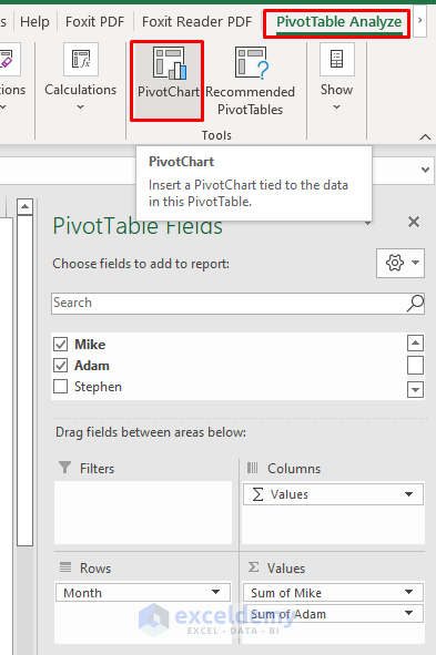
- Go to the Pivot Table Analyze tab and select Pivot Chart.
- Create a chart (i.e. Clustered Column)

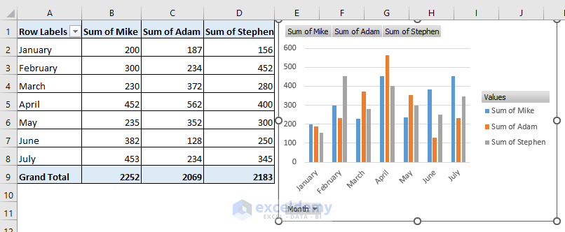
- Your sheet will show the chart.
- Drag your new data entries to the field (i.e. Stephen to Values).
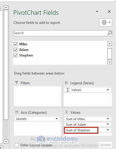
- Your chart will show the added new data entries.
Download the Practice Workbook
Related Articles
- How to Add Data Table in an Excel Chart
- How to Format Data Table in Excel Chart
- How to Add Data Points to an Existing Graph in Excel
- How to Create Excel Chart Using Data Range Based on Cell Value
- How to Get Data Points from a Graph in Excel
<< Go Back to Edit Chart Data | Excel Chart Data | Excel Charts | Learn Excel
Get FREE Advanced Excel Exercises with Solutions!
