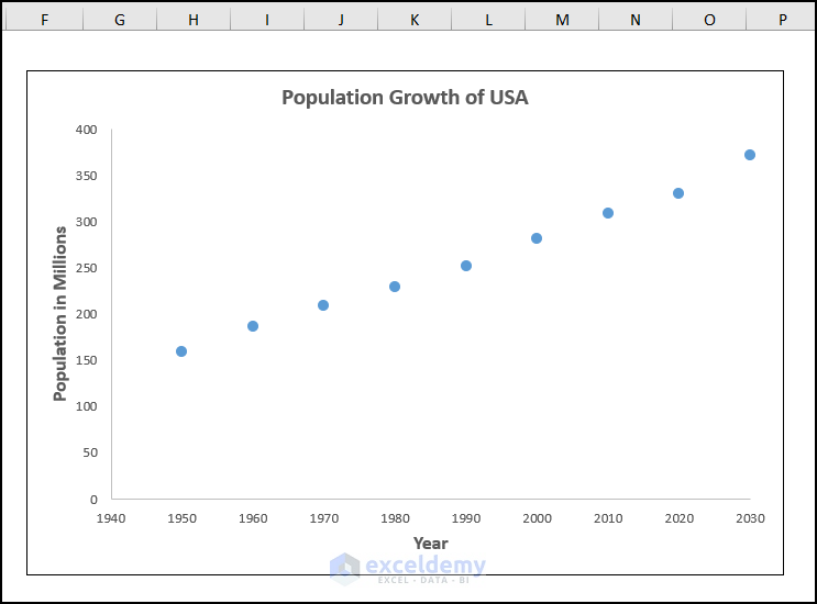
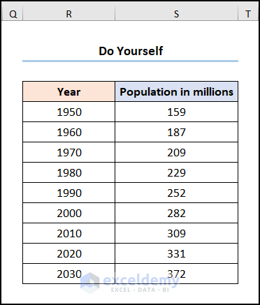
The dataset showcases the Population Growth in The USA.

Using the above dataset, you’ll get the following graph.
To add data points to the existing graph:
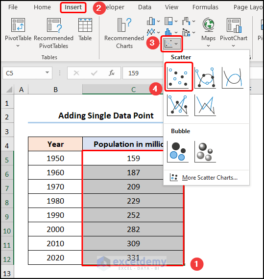
Method 1- Inserting a Single Data Point
Steps:
- Select C5:C12 >> go to the Insert tab >> choose Scatter.
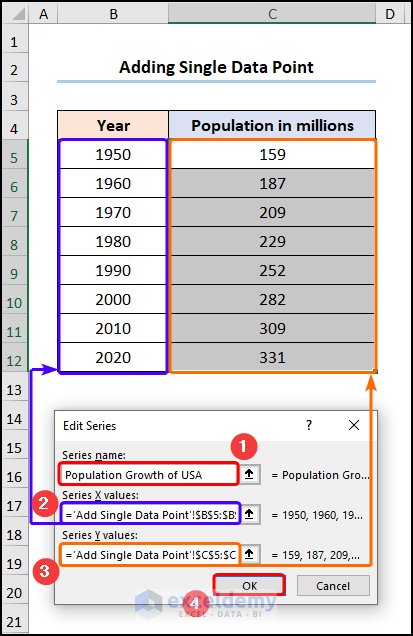
- Select the chart >> Click Select Data.
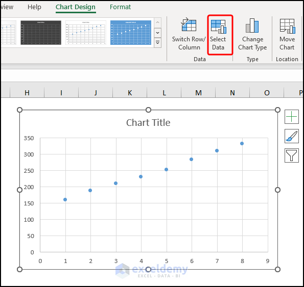
- In the Select Data Source window, click Edit.
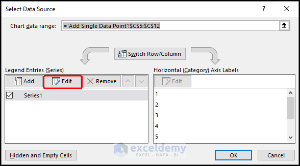
- Enter the Series name, here “Population Growth of USA”.
- Select the Series X and Y values: B4:B12 and C4:C12.
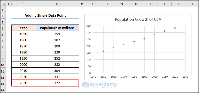
- Add the predicted “Population of 372 million” for the “Year 2030” as highlighted below.
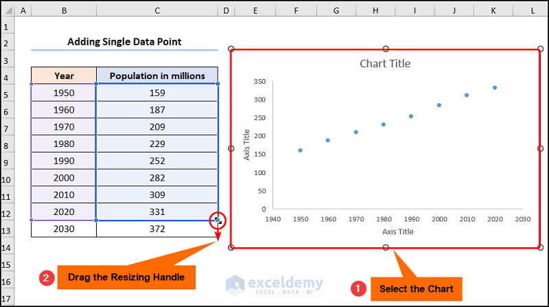
- Select the chart >> drag the Resizing Handle to add the new data point.
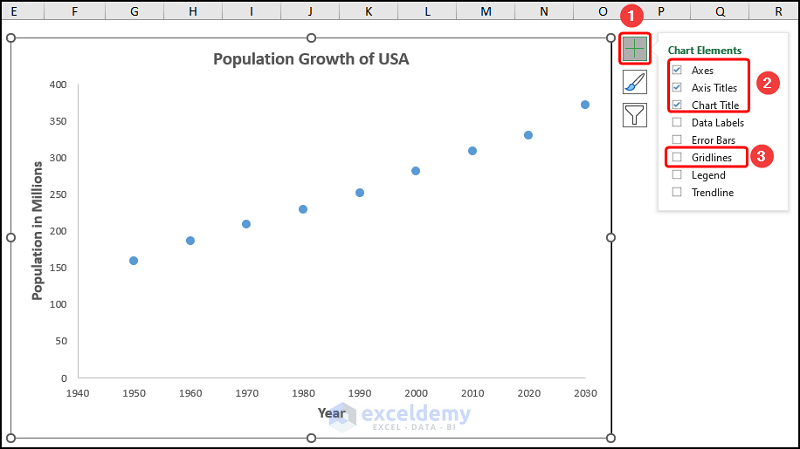
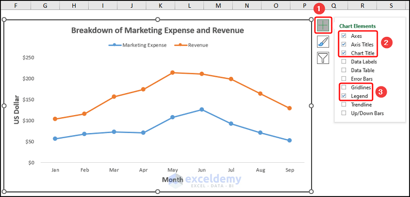
Format the chart using the Chart Elements:.
- Check Axes and Axis Title to name the axes. Here, “Year” and “Population in Millions”.
- Check Chart Title: “Population Growth of USA”.
- Uncheck Gridlines.
This is the output.

Read More: How to Expand Chart Data Range in Excel
Method 2 – Using Resizing Handles
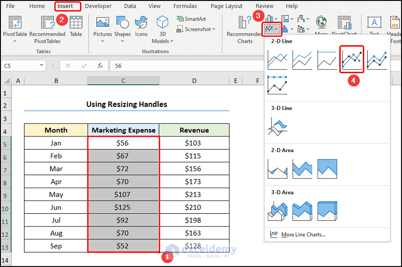
The dataset showcases the Breakdown of Marketing Expense and Revenue.
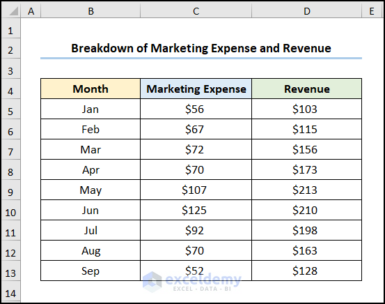
Steps:
- Select C5:C13 >> go to the Insert tab >> select Lines with Markers.
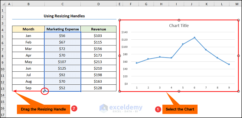
- Click to select the chart >> drag the Resizing Handles to add the x-axis values.
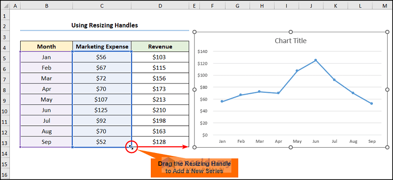
- Drag the Resizing Handles to add a new series. Here, “Revenue”.
Format the chart in Chart Elements.
- Check Axes and Axis Title to name the axes. Here, “Month” and “US Dollar”.
- Add the Chart Title: “Breakdown of Marketing Expense and Revenue”.
- Check Legend to show the “Marketing Expense” and “Revenue” series.
- Uncheck Gridlines.
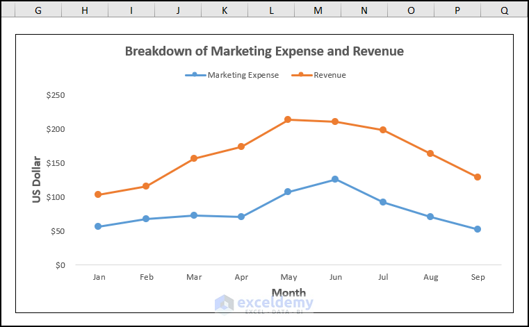
This is the output.
Read More: How to Add Data to an Existing Chart in Excel
Method 3 – Utilizing the Select Data Option
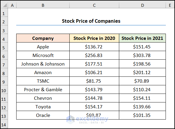
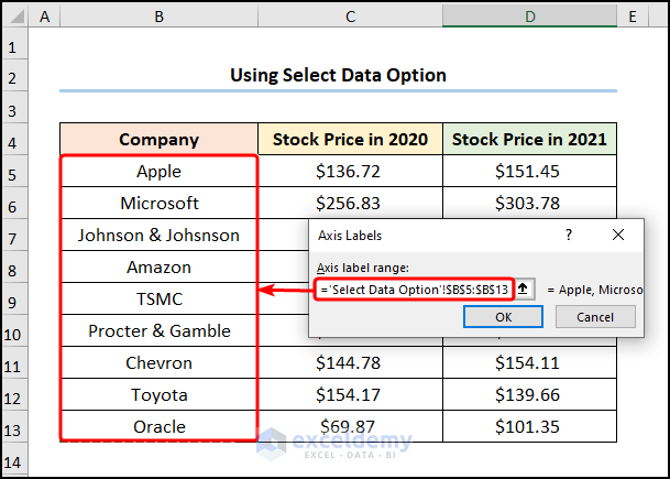
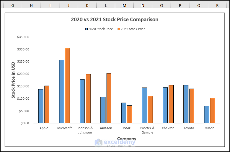
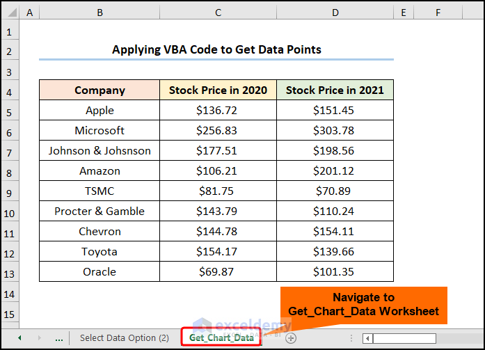
Consider the dataset below: Stock Price of Companies.
Steps:
- Select C5:C13 >> go to the Insert tab >> click Insert Column or Bar Chart.
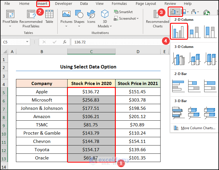
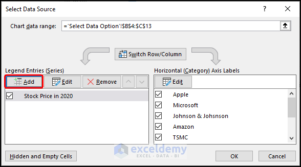
- Select the chart >> Click Select Data.
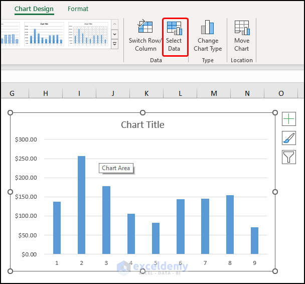
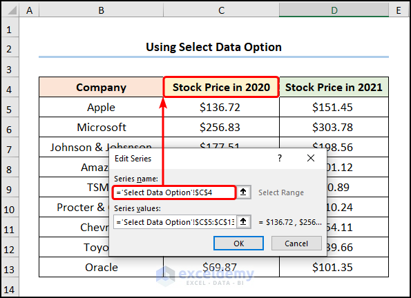
- Click Edit to add the x-axis labels.
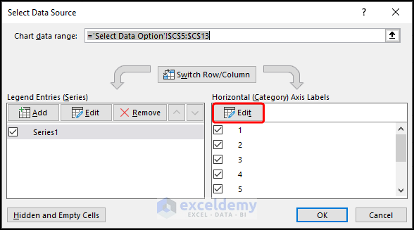
- Select B5:B13 as the Axis label range >> click OK.
- Click Edit to enter a name for the data series.
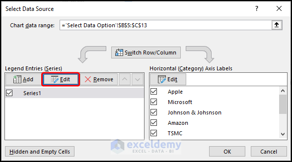
- Choose C4 (“Stock Price in 2020”) as Series name >> Click OK.
- Select Add to add the data points for a new series.
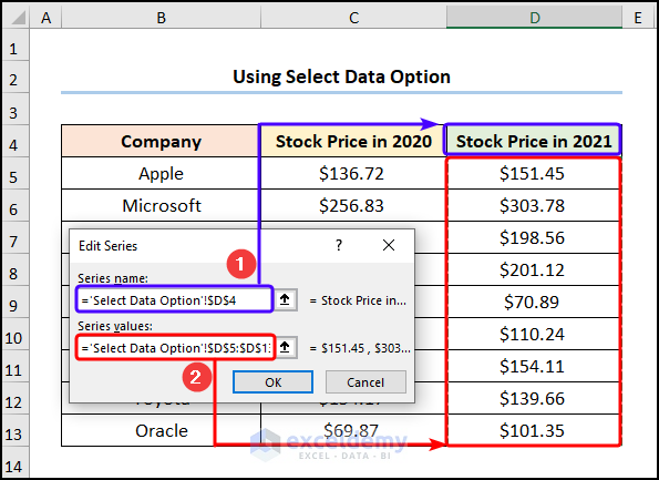
- Select D4 (“Stock Price in 2021”) in Series name >> choose D5:D13 as Series Values.
Format the chart as shown in the previous method to see the output.
Read More: Selecting Data in Different Columns for an Excel Chart
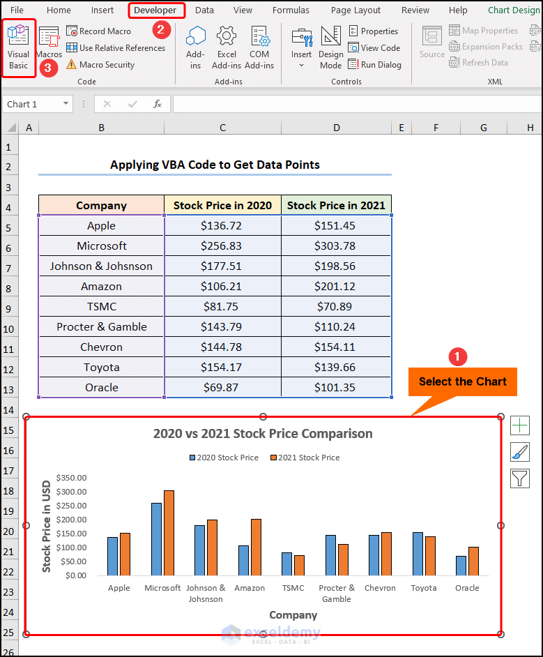
How to Get Data Points from a Graph in Excel
Steps:
- Select the chart >> go to the Developer tab >> click Visual Basic.
The Visual Basic Editor window is displayed.
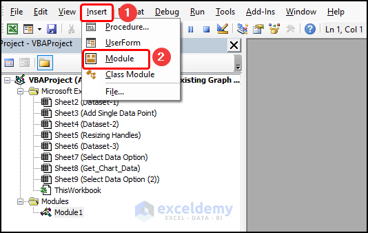
- Go to the Insert tab >> select Module.
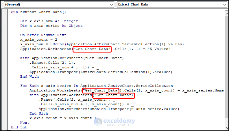
Sub Extract_Chart_Data()

    Dim x_axis_num As Integer
    Dim x_axis_series As Object

    On Error Resume Next
    x_axis_count = 2
    x_axis_num = UBound(Application.ActiveChart.SeriesCollection(1).Values)
    Application.Worksheets("Get_Chart_Data").Cells(1, 1) = "X Values"

    With Application.Worksheets("Get_Chart_Data")
        .Range(.Cells(2, 1), _
        .Cells(x_axis_num + 1, 1)) = _
        Application.Transpose(ActiveChart.SeriesCollection(1).XValues)
    End With

    For Each x_axis_series In Application.ActiveChart.SeriesCollection
        Application.Worksheets("Get_Chart_Data").Cells(1, x_axis_count) = x_axis_series.Name
        With Application.Worksheets("Get_Chart_Data")
            .Range(.Cells(2, x_axis_count), _
            .Cells(x_axis_num + 1, x_axis_count)) = _
            Application.WorksheetFunction.Transpose(x_axis_series.Values)
        End With
        x_axis_count = x_axis_count + 1
    Next

End Sub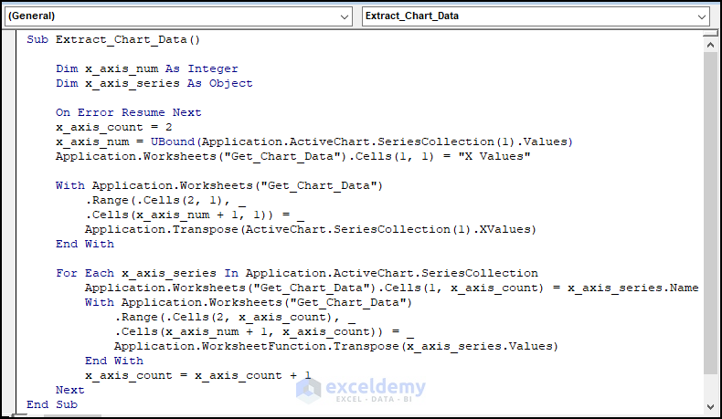
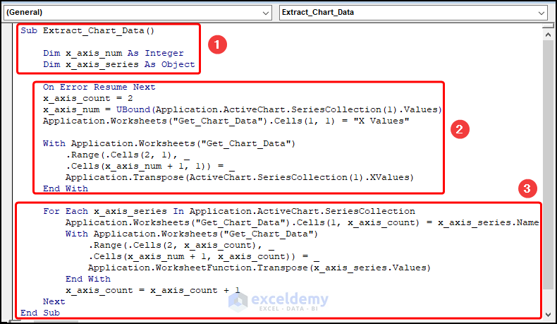
Code Breakdown:
- the sub-routine is named: Extract_Chart_Data().
- the variables x_axis_num and x_axis_series are defined as Integer and Object data types.
- the x_axis_count is set to 2 and the UBound function is applied to get the largest value.
- the Worksheet object defines the worksheet name, here “Get_Chart_Data” and returns the x-axis values.
- the With statement loops through all the x-axis values and returns the values in the worksheet.
- the For Loop and the With statement iterate and extract the y-axis values and the series names.
- returns them in the adjacent cells.
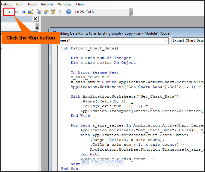
- Click Run or press F5 to run the VBA code.
This is the output.
Things to Remember
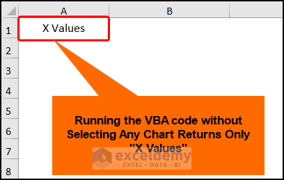
- Select the chart and run the VBA code, otherwise, the program returns the string of text “X Values”.
- Rename your worksheet to “Get_Chart_Data” or edit the VBA code to enter a worksheet name.
Practice Section
Practice here.
Download Practice Workbook
Related Articles
- How to Add Data Table in an Excel Chart
- How to Format Data Table in Excel Chart
- How to Create Excel Chart Using Data Range Based on Cell Value
- How to Get Data Points from a Graph in Excel
<< Go Back to Edit Chart Data | Excel Chart Data | Excel Charts | Learn Excel
Get FREE Advanced Excel Exercises with Solutions!
