In this article, we will describe how to make a simple Bar graph in Excel. We will describe the step-by-step procedure to insert a simple Bar graph in Excel. Also, we will extensively describe different types of Bar graph and their usages.
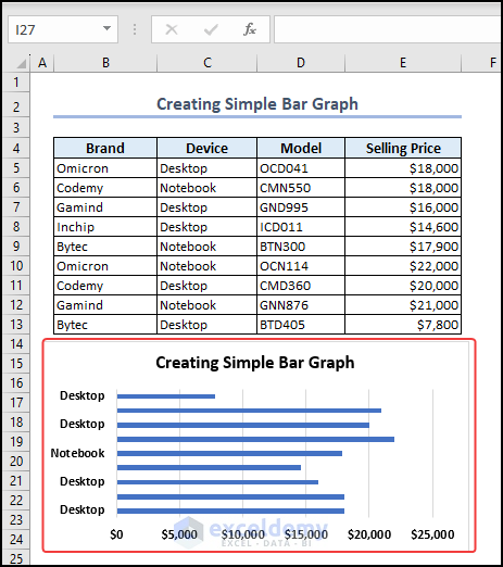
Here, in the following image, you can see that we have created a simple Bar graph from the dataset. Next, we will describe how to do this effortlessly. So let’s dive with us.
Bar Graphs in Excel – The Basics
A Bar graph presents various categories of data with horizontal rectangular bars. The length of the bars is proportional to the data category size.
It is helpful to be able to present data in an Excel chart in a way that is easily understood when collecting, analyzing, or sharing data. Bar charts or column graphs are great for visualizing data sets since you can compare the lengths and heights of the bars in a category easily.
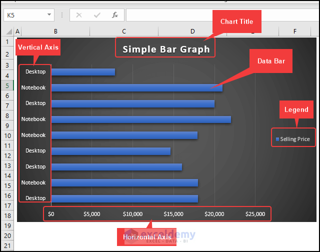
The following image shows a 2D Clustered Bar graph. We have marked different parts of the Bar graph for your better understanding.
How to Make a Simple Bar Graph in Excel: With Easy Steps
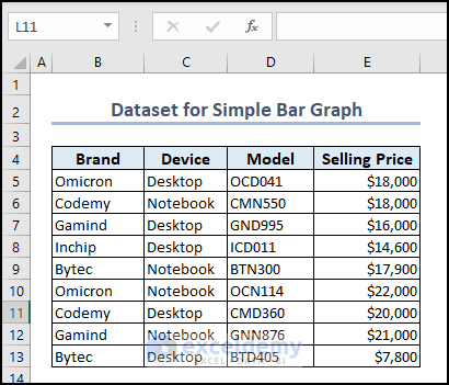
In the following dataset, you can see the Brand, Device, Model, and Selling Price columns. Further, using this dataset, we will go through step-by-step procedures to make a simple Bar graph in Excel.
Here, we used Excel 365. You can use any available Excel version.
Step-1: Making Simple Bar Graph
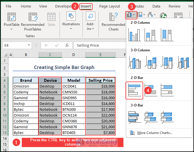
- We will select the Device column >> press the CTRL.
- Then, select the Selling Price column >> go to the Insert.
- From the Chart group >> select 2D Clustered Bar Chart.
You can see the created Bar Chart. Here, we modified the Chart Title according to our needs.

Step-2: Format Bar Graph in Excel
In this step, we will format the Bar graph. If you wish, you can format your chart in many different ways. It is possible to change the style and color of your bar chart, as well as add or edit labels for the axes on both sides. We will format the Bar graph by following the steps:
Add and Edit Axis Labels
- Click the green Chart Elements icon (+) to add axis labels to your bar chart.
- Enable the Axis Titles checkbox from the Chart Elements.
- On the horizontal and vertical axis of the chart, Axis Title.
- Then, we edited the Axis Titles according to our needs.

Change Chart Style and Bar Color
Now, we will select a Chart Style and change the chart bar color to make the Bar chart more eye-soothing. First, to change the Chart Style, go through the following steps:
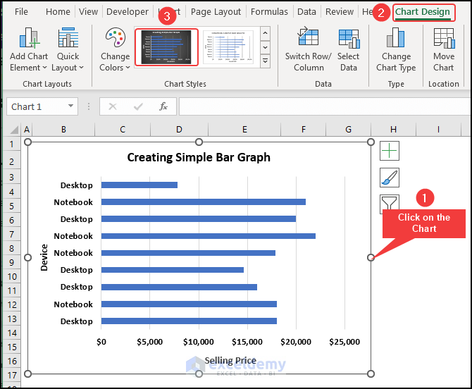
- We will click on the Bar chart >> go to the Chart Design.
- Then, from the Chart Styles group >> select a chart style according to your choices.
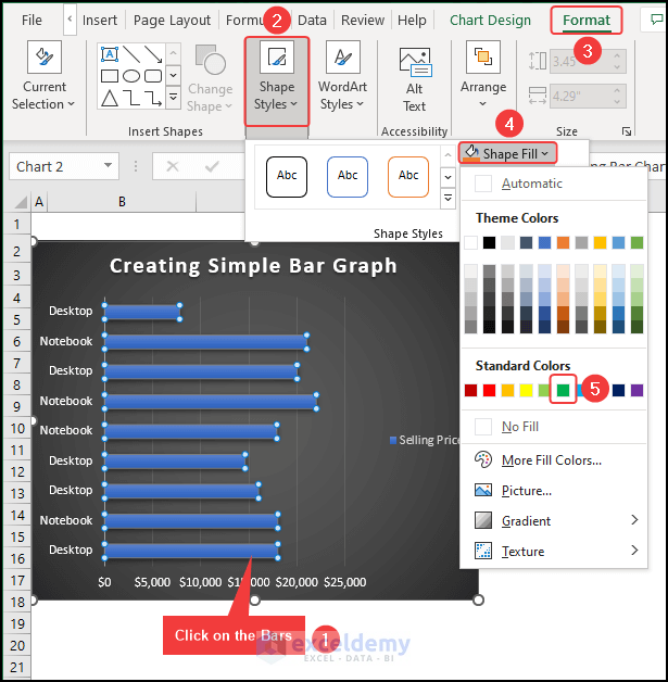
Now, to change the Chart Bar Color,
- Select the bars >> go to the Format.
- Then, from the Shape Styles group >> select Shape Fill >> choose a color.
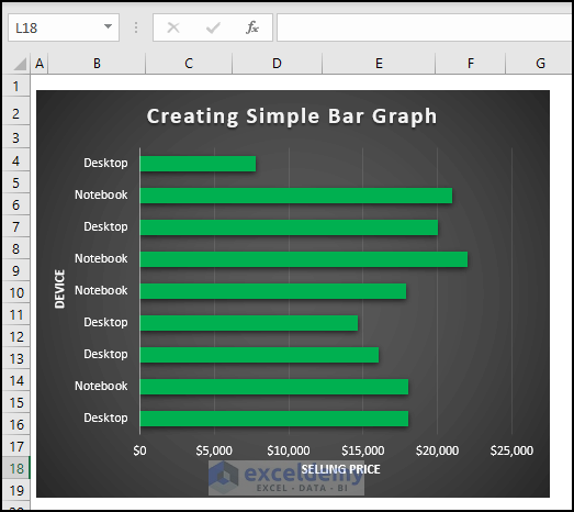
Hence, you can see the formatted Bar graph.
Read More: Excel Chart Bar Width Too Thin
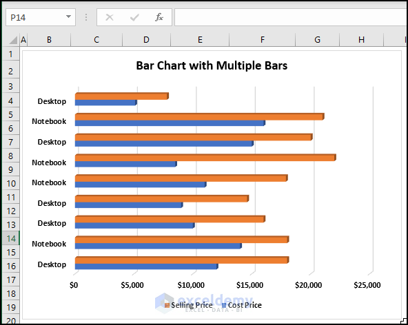
How to Create a Bar Chart with Multiple Bars in Excel
Here, we will show you how you can create a Bar chart with multiple bars in Excel. Actually, we will create a 3D Clustered Bar chart which will have multiple bars.
- To do so, we have modified the dataset and added a Cost Price.
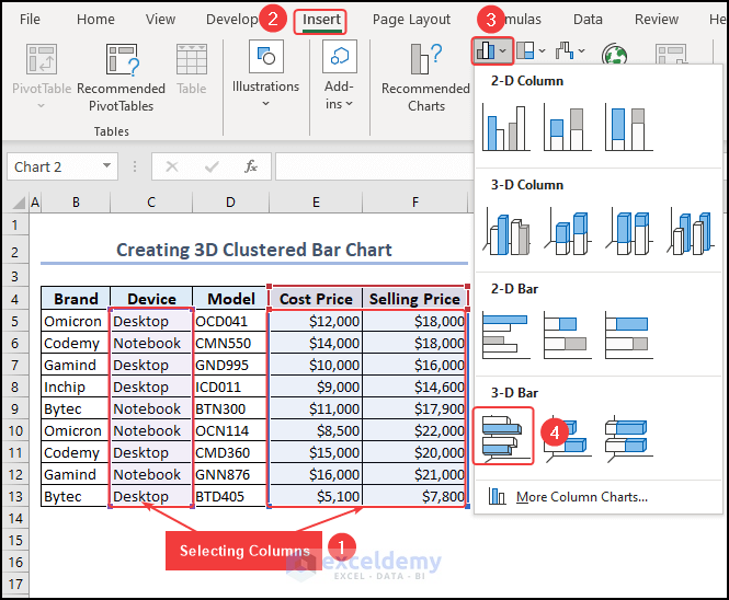
- We will select the Device column >> hold the CTRL.
- Then, we select the Selling Price and Cost Price.
- Go to the Insert tab >> from the Insert Column or Bar Chart group >> select 3D Clustered Bar Chart.
Therefore, you can see a 3D Clustered Bar chart with multiple bars.
Types of Excel Bar Chart
Excel has several Bar chart types. Below we describe them.
1. 2D Clustered Bar Chart
A 2D clustered bar chart is a handy tool for clearly presenting and comparing different sets of data. It is used in the following cases:
- To represent sales data
- To present survey results
- For financial data.
Below you can see a 2D clustered Bar chart.

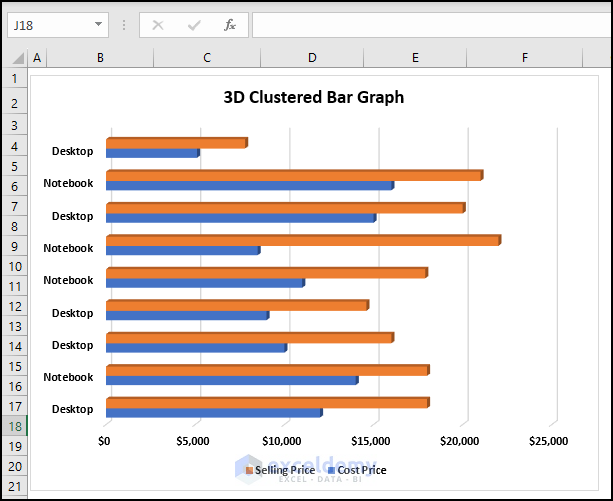
2. 3D Clustered Bar Chart
A 3D clustered bar uses three-dimensional bars clustered together to represent data. The 3D clustered Bar chart is used in the following cases:
- Comparing multiple variables
- To display trends over time
- Highlighting differences
- Showing composition
Below you can see a 3D Clustered Bar Chart.
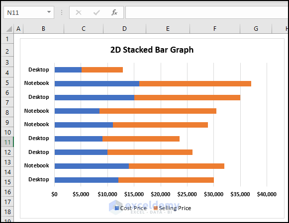
3. 2D Stacked Bar Chart
A 2D stacked bar chart displays data as rectangular bars with lengths proportionate to the values they represent. The bars are stacked on top of one another, making it easy to compare the total magnitude of each category. Also, it is helpful to compare the proportion of each sub-category inside that category.
The usages of a 2D Stacked Bar Chart are given below:
- 2D Stacked Bar compares the total size of different categories.
- Analyzing the composition of each category.
- Tracking changes over time.
- Highlighting patterns and trends.
In the following picture, you can see a 2D Stacked Bar chart.
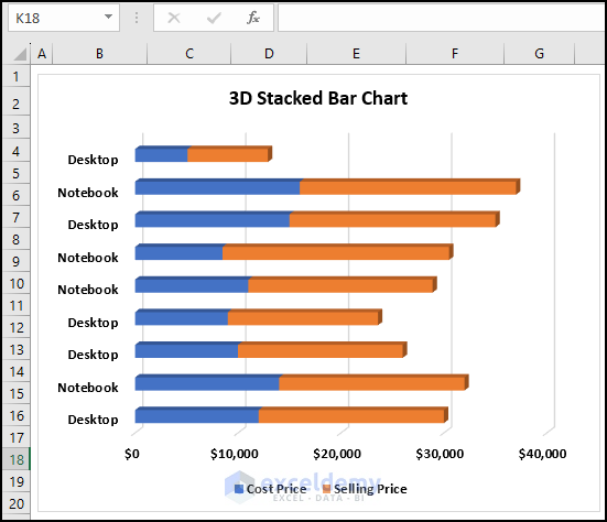
4. 3D Stacked Bar Chart
In a 3D stacked bar chart, the length and breadth of each bar represent the values of the variables being measured, while the height of the bar represents the various categories or subgroups being compared. A 3D Stacked Bar chart is used for:
- Comparing proportions
- Tracking changes over time
- Visualizing complex data
- Showing hierarchy
- Displaying data with multiple dimensions
Below, you can see a 3D Stacked Bar chart.
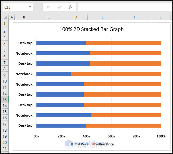
5. 100% 2D Stacked Bar Chart
A 100% 2D stacked bar chart shows the proportion of various categories in a dataset. It is identical to a standard stacked bar chart, except that the height of the bars has been normalized to 100%. This means that the total height of each bar represents the total of all the categories being compared. The usages of a 100% 2D Stacked Bar chart are given below:
- Comparing the proportions of different categories
- Comparing datasets with different sample sizes
- Communicating data to a wide audience
In the following image, you can see a 100% 2D Stacked Bar chart.
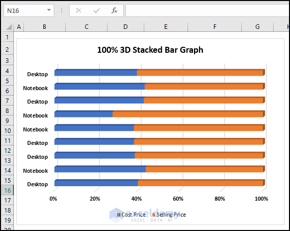
6. 100% 3D Stacked Bar Graph
A 100% 3D Stacked Bar Chart shows data comparisons across categories in three dimensions.
Each bar divided into segments represents different subcategories of data. The height of each segment represents the percentage of that sub-category in relation to the whole category. Below we are proving the usages of a 100% 3D Stacked Bar graph.
- Showing proportions
- Comparing data
- Highlighting trends
- Making data more engaging
In the following image, you can see a 100%3D Stacked Bar Graph.
Creating a Cylinder, Cone, and Pyramid Graph from a Bar Graph in Excel 2013 and 2016
In Excel 2010, or earlier versions of Excel, you will find Cylinder, Cone, and Pyramid Graphs. However, in Excel 2016 and later versions of Excel, this type of chart is unavailable.
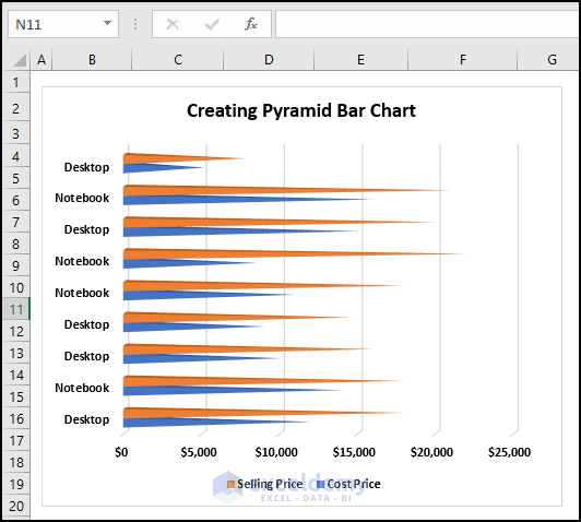
However, you can easily create a Cylinder, Cone, and Pyramid Graph from a Bar Graph in Excel 2013 and higher versions of Excel. Here, we will create a Pyramid graph from a Bar chart in Excel.
- First, we have to create a 3-D Bar chart (clustered, stacked, or 100% stacked).
- Here, we have created a 3D Clustered multiple bar chart.
- Now, right-click on the Selling Price
- Then, select Format Data Series from the Context Menu.
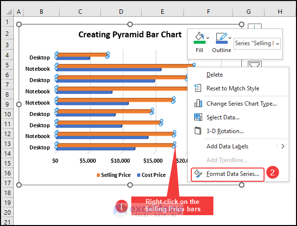
- A Format Data Series dialog box will appear.
- Then, from the Series Options >> select Full Pyramid.
Repeat the similar procedures for the Cost Price bars as well.
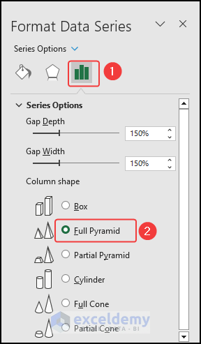
Therefore, you can see the Pyramid Bar chart.
What Is a Bar Chart Used for?
- Bar charts are useful for presenting data that can be divided into several categories or groups. The horizontal bars of the bar chart represent the values that are being compared.
- Bar charts are useful to represent trends, patterns, and relationships in data.
- They are used in reports, presentations, and publications to make the data clear and concise.
- Users can interpret and understand the information easily represented through a Bar chart.
Frequently Asked Questions
1. How do I change the Orientation of My Bar Graph in Excel?
Click on the chart >> click on the Switch Row/Column option in the Data tab.
This will change the X and Y axis of your chart and change its orientation.
2. How do I Resize My Bar Graph in Excel?
Click on the chart >> click and drag the edges or corners of the chart.
This will adjust its size.
You can also use the Size & Properties option in the Format tab to resize the chart according to your needs.
Tips
Bar graphs can be copied from Excel and then pasted into other Microsoft Programs like Word or PowerPoint.
Download Practice Workbook
You can download the Excel file and practice the explained methods.
Conclusion
In this article, we describe extensively how to make a simple bar graph in Excel. Thank you for going through the article. We hope you find this article helpful. Please share your comments or suggestions in the comment section.
Create Bar Chart in Excel: Knowledge Hub
<< Go Back to Excel Bar Chart | Excel Charts | Learn Excel
Get FREE Advanced Excel Exercises with Solutions!
