Step 1 – Insert Data for Bar Graph
We will insert data for the Week and the Sales columns.
- Select Range B5:C9.
- Go to the Insert tab.
- Choose the 2-D Bar option from the Insert Column or Bar Chart.
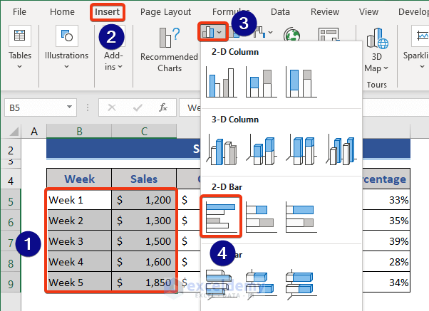
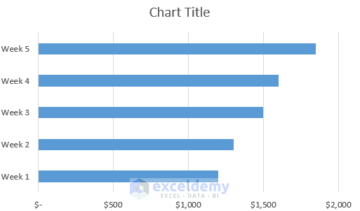
- A bar chart will be inserted into the worksheet.
Read More: How to Make a Bar Graph in Excel with 2 Variables
Step 2 – Customize Legends in Bar Graph
- Right-click on the chart.
- Click on the Select Data from the Context Menu.
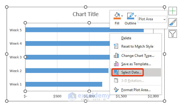
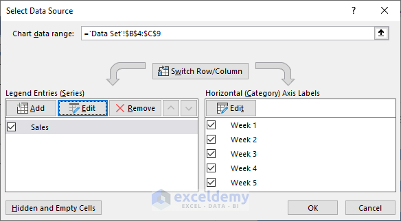
- The Select Data Source window will pop up.
- We can see that the data is named Series1. We can change the name here.
- Select Series1 and click on the Edit option.
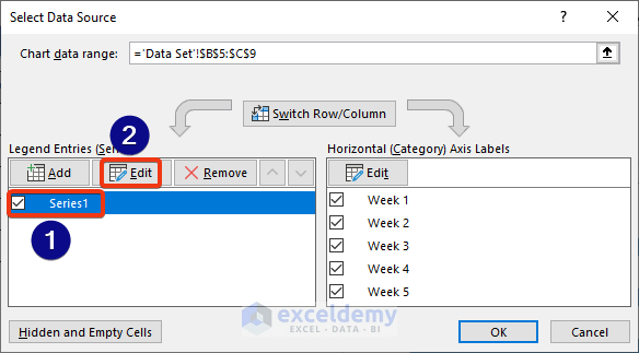
- In the Series name box, choose Cell C4, which will set the legend of the graph.
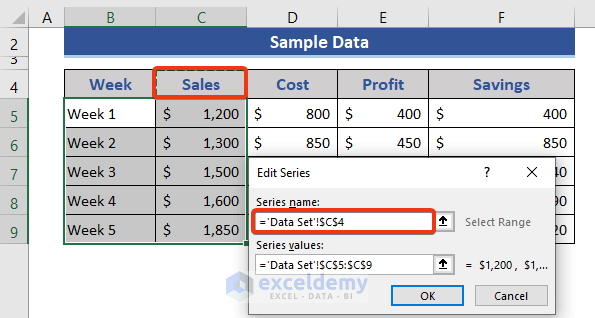
- Press OK.
- The chart name will be changed as shown in the following image.
Step 3 – Add New Variables
We will add 3 more variables to this graph.
- Click on the Add button of the Select Data Source window.
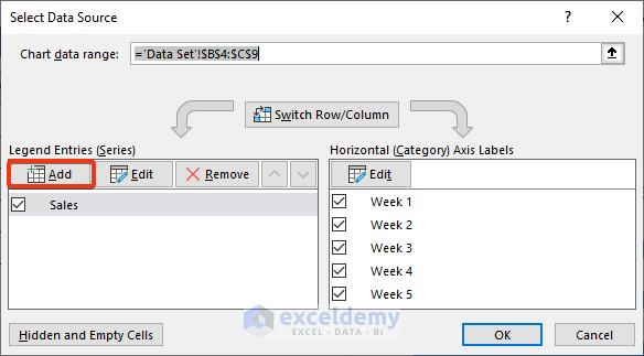
- The Edit Series window will open.
- In the Series name box, choose Cell D4. Choose the corresponding value column in the Series values
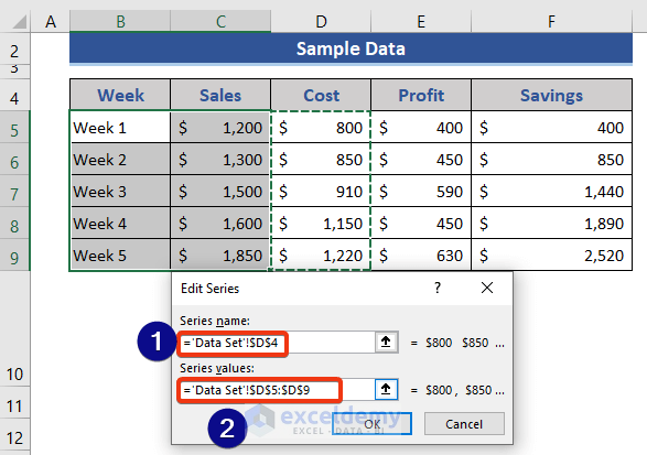
- Press OK.
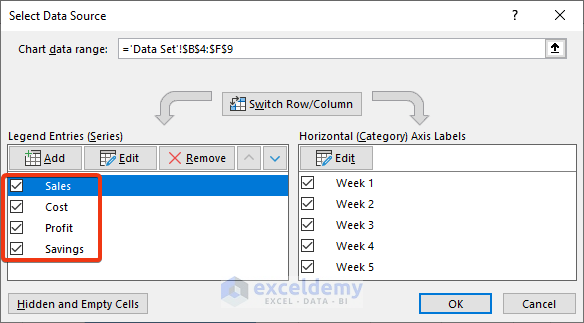
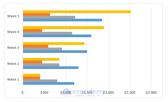
4 bars with different colors are shown for each week.
Read More: How to Make a Bar Graph with Multiple Variables in Excel
Step 4 – Customize Graph Elements
- Click on the graph.
- We can see a plus sign named Chart Elements.
- Click on the plus sign (+) button.
- Check the required elements from the list.
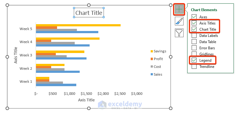
We want to customize the chart title, axis title and show the legends.
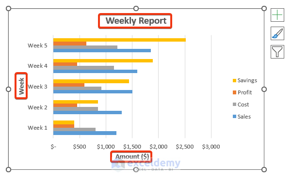
- Enter a name for the chart and the axes.
Axes title, chart title, and legends will be added to the chart.
Read More: How to Make a Bar Graph in Excel with 3 Variables
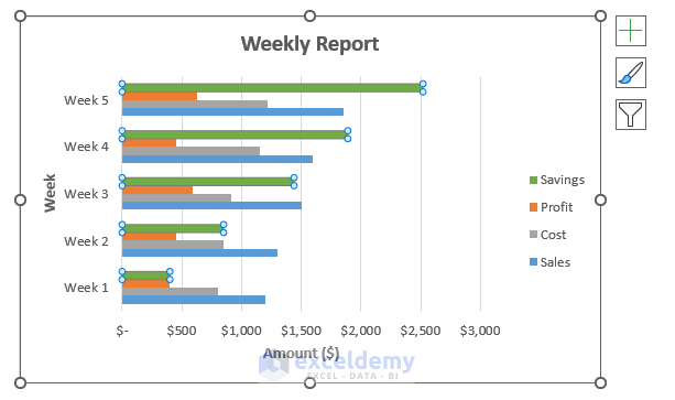
Step 5 – Edit and Format Data Series of Bar Graph
- Click on any bar of the graph.
- Double-click the bar.
- The Format Data Series window will open on the right side.
- Go to the Color option.
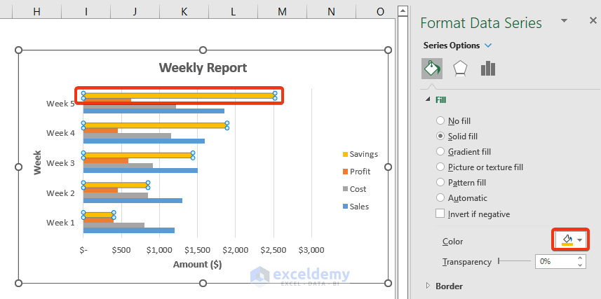
- Choose any color. We chose the green color.
Read More: How to Make a Bar Graph Comparing Two Sets of Data in Excel
Download Practice Workbook
Related Articles
- How to Make a Percentage Bar Graph in Excel
- How to Show Number and Percentage in Excel Bar Chart
- How to Show Difference Between Two Series in Excel Bar Chart
- Excel Bar Chart Side by Side with Secondary Axis
- How to Sort Bar Chart Without Sorting Data in Excel
- How to Change Bar Chart Width Based on Data in Excel
<< Go Back to Excel Bar Chart | Excel Charts | Learn Excel
Get FREE Advanced Excel Exercises with Solutions!
