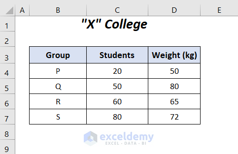
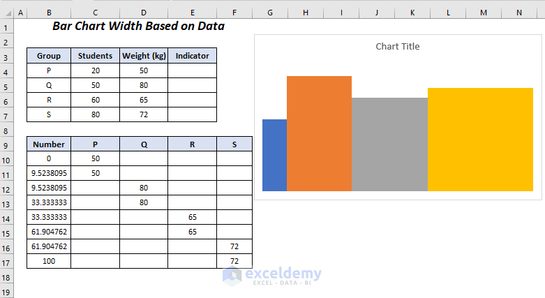
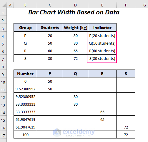
We have the following dataset containing 4 groups of students with different weights, and each group contains various numbers of students. We will plot the bars with different widths according to the number of students.
Step 1 – Arranging Values Using Formulas to Change the Bar Chart Width Based on Data
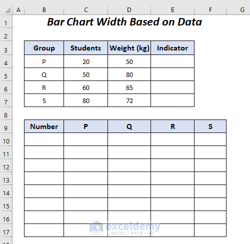
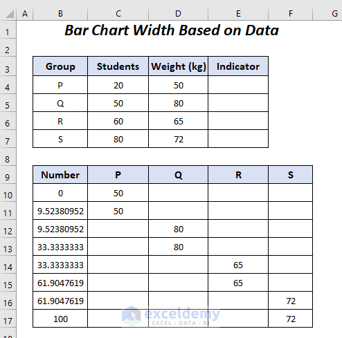
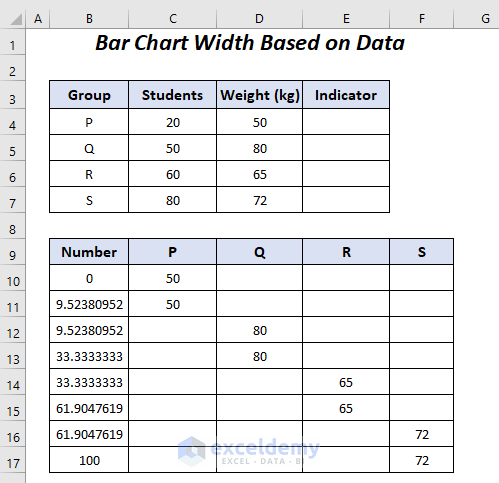
We have added a new dataset with 5 columns and a new column Indicator in the first dataset.
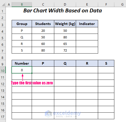
In the first cell of the Number column, enter 0 as we want to have the range of the X-axis from 0 to 100.
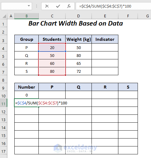
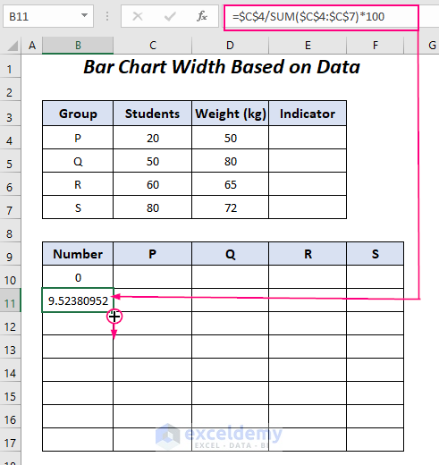
- Use the following formula in cell B11.
=$C$4/SUM($C$4:$C$7)*100$C$4 is the number of students in the P group, and $C$4:$C$7 is the range of the students in all of the 4 groups.
- SUM($C$4:$C$7) → the SUM function will add the values in the range $C$4:$C$7.
- Output → 210
- $C$4/SUM($C$4:$C$7) → becomes
- 20/210
- Output → 0.0952380952
- $C$4/SUM($C$4:$C$7)*100 → becomes
- 0952380952*100
- Output → 9.52380952
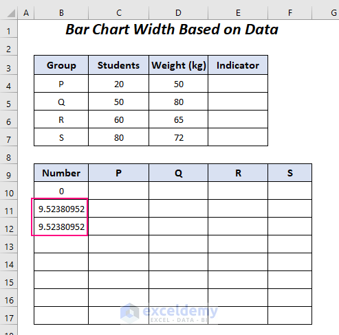
- Press Enter and drag down the Fill Handle tool to copy to cell B12.
We will get the same value 9.52380952 in the two cells B11 and B12.
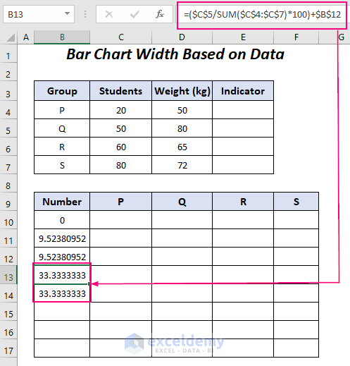
- Apply the following formula in cells B13 and B14.
=($C$5/SUM($C$4:$C$7)*100)+$B$12$C$5 is the number of students in the Q group and $C$4:$C$7 is the range of the students in all of the 4 groups. $B$12 is the number in the previous cell.
- SUM($C$4:$C$7) → the SUM function will add the values in the range $C$4:$C$7.
- Output → 210
- $C$5/SUM($C$4:$C$7) → becomes
- 50/210
- Output → 0.2380952380
- $C$5/SUM($C$4:$C$7)*100 → turns into
- 2380952380*100
- Output → 23.80952380
- ($C$5/SUM($C$4:$C$7)*100)+$B$12 → becomes
- 80952380+9.52380952
- Output → 33.333333333
- Use the following formula for cells B15 and B16.
=($C$6/SUM($C$4:$C$7)*100)+$B$14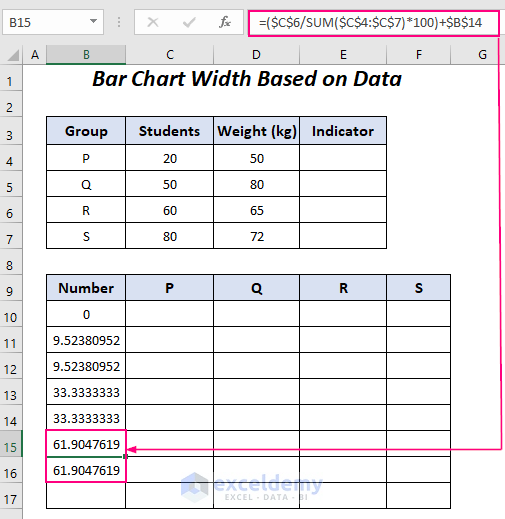
- Apply the similar formula in cell B17 for the S group students and you’ll get the value 100.
=($C$7/SUM($C$4:$C$7)*100)+$B$16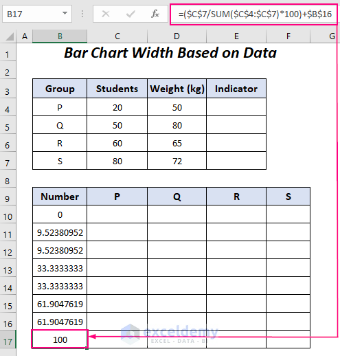
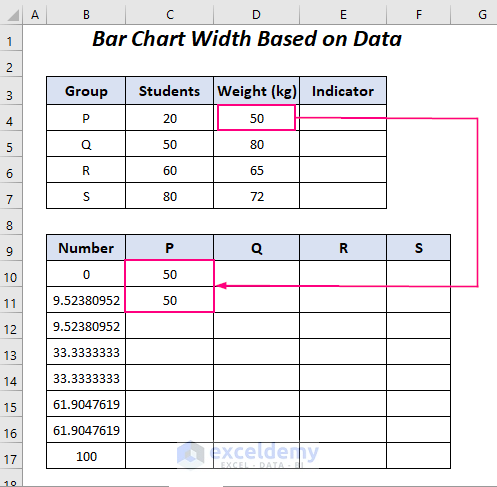
- Copy the number of students in the P group in the first two cells of the P column.
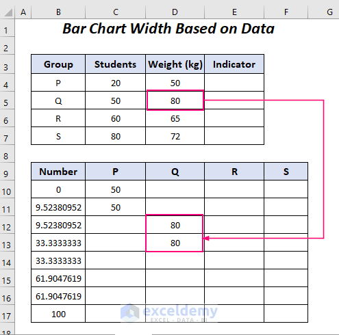
- Where the values end in the P column (Row 11), copy the number of students of the Q group in the Q column for the two cells starting from Row 12.
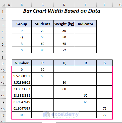
- Copy the number of students for the rest of the groups in the other two columns.
Read More: How to Make a Percentage Bar Graph in Excel
Step 2 – Insert a Stacked Area Chart and Format the Axis
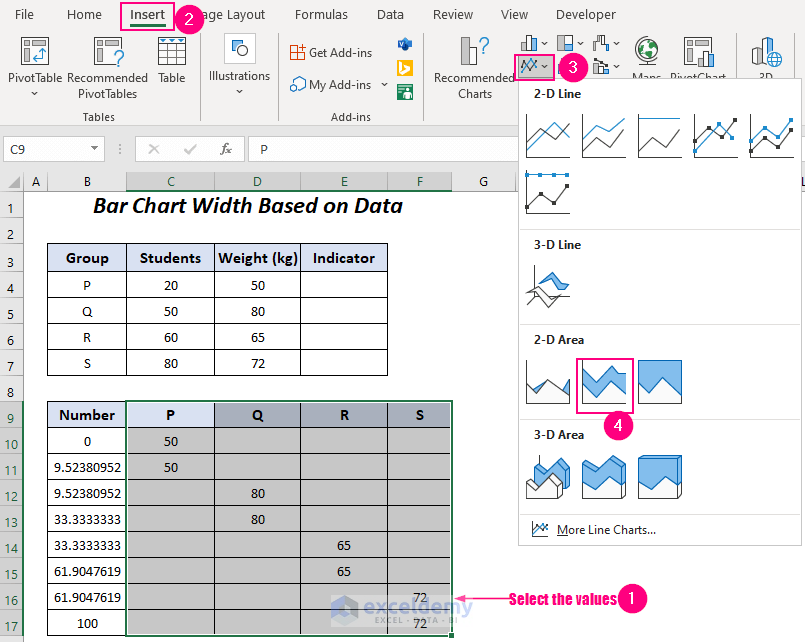
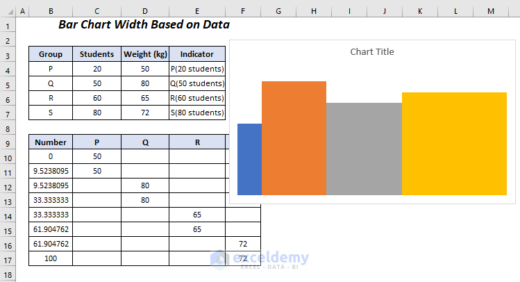
We will plot the chart using the second dataset of the following figure.
- Select the values of the four columns – P, Q, R, S.
- Go to the Insert, select the Insert Line or Area Chart drop-down and choose the Stacked Area option.
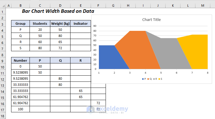
We will get the following chart.
- Right-click on the X-axis and select the Select Data option.
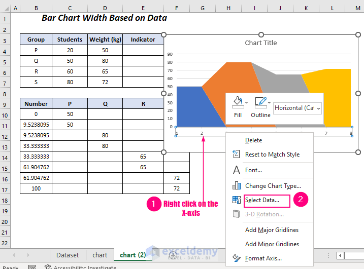
You will get the Select Data Source dialog box.
- Select the Edit option on the Horizontal (Category) Axis Labels.
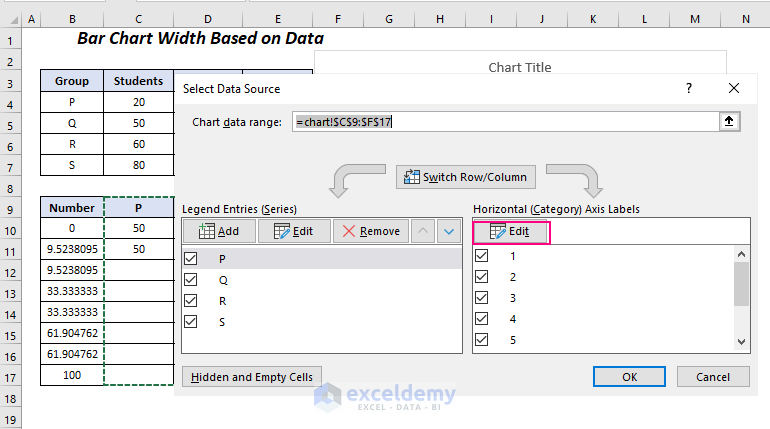
The Axis label range dialog box will appear.
- Select the range of the Number column in the Axis label range box and press OK.
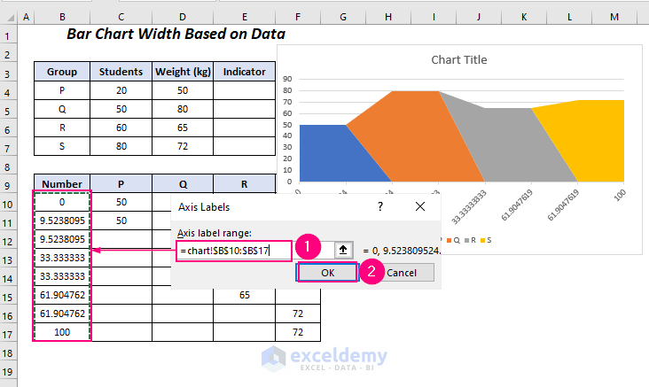
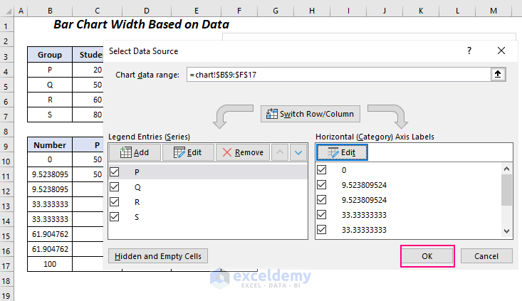
You will be taken to the Select Data Source dialog box again.
- Press OK.
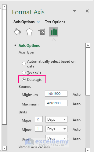
- Right-click on the X-axis and select the Format Axis option.
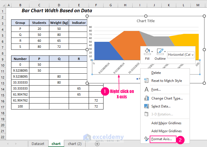
- On the Format Axis panel (it will appear on the right side of your Excel sheet) select the Date axis from the Axis Type option under Axis Options.
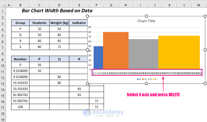
The shape of the chart will be changed into bars of different widths.
- Select the X-axis and press the Delete key.
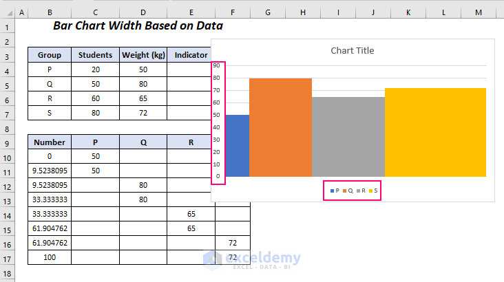
- Delete the Legend and Y-axis.
- Delete the Gridlines.
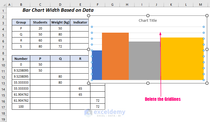
- We will get the following bar chart without labels.
Read More: How to Make a Bar Graph Comparing Two Sets of Data in Excel
Step 3 – Using a Formula to Create Labels
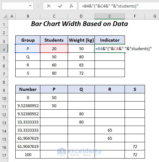
We will create our custom labels for the bars in the Indicator column.
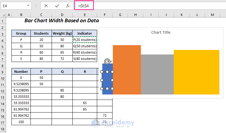
- Use the following formula in cell E4.
=B4&"("&C4&" "&"students)"The Ampersand operator will join the value in cell B4 with bracket, space, the value of cell C4, and with the text students.
- Press Enter and drag down the Fill Handle tool.
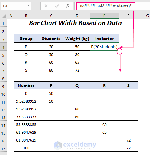
We will get all of the labels for the bars in the chart in the Indicator column.
Read More: How to Show Number and Percentage in Excel Bar Chart
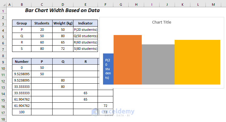
Step 4 – Adding the Labels to the Bar Chart Width Based on Data
We will add our created labels to each of the bars of this chart.
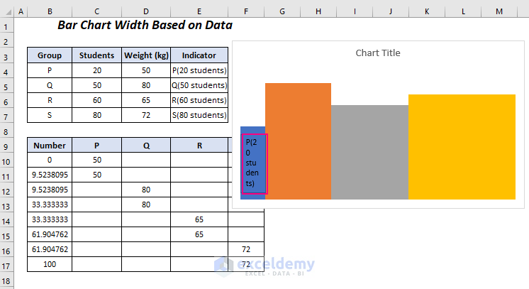
- Go to the Insert tab and select Shapes under Illustrations, then choose a shape. We selected a rectangular box.
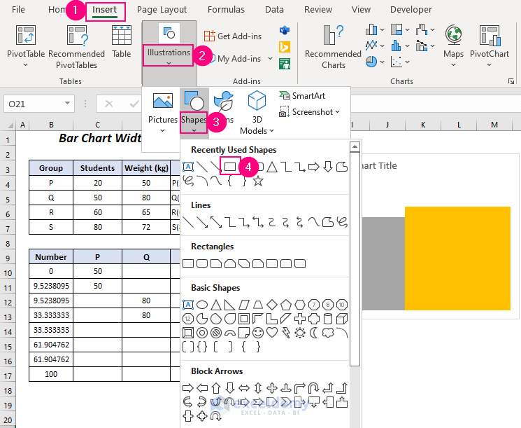
- A plus icon will appear as the cursor.
- Drag it to the right side and top down to create the rectangular box in the first bar.
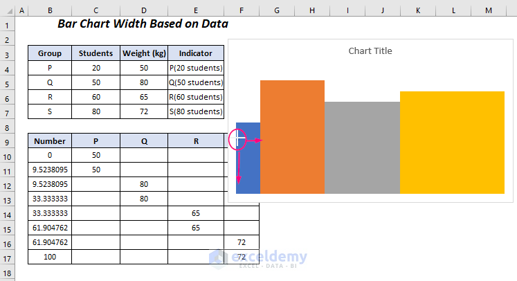
- After entering the rectangular shape, select it.
- Use the following formula in the Formula Bar.
=$E$4The value in cell $E$4 will be linked in the box.
We will get the label in the first bar, but we can change some options to make it more visible.
- Go to the Shape Format tab, select Shape Fill, and choose No Fill.
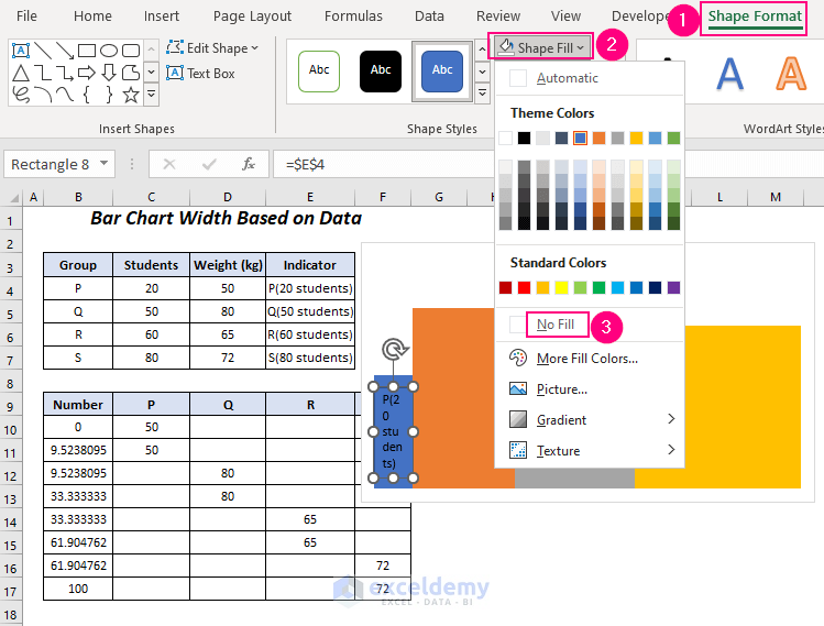
- To hide the outline of the box, go to the Shape Format tab and, under Shape Outline, select No Outline.
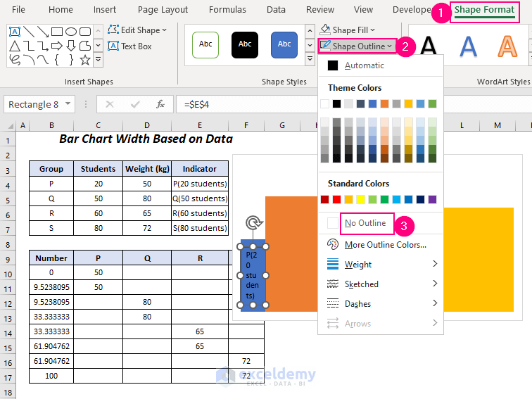
- Go to the Shape Format tab and the Text Fill drop-down, then choose your desired color. We selected the White color.
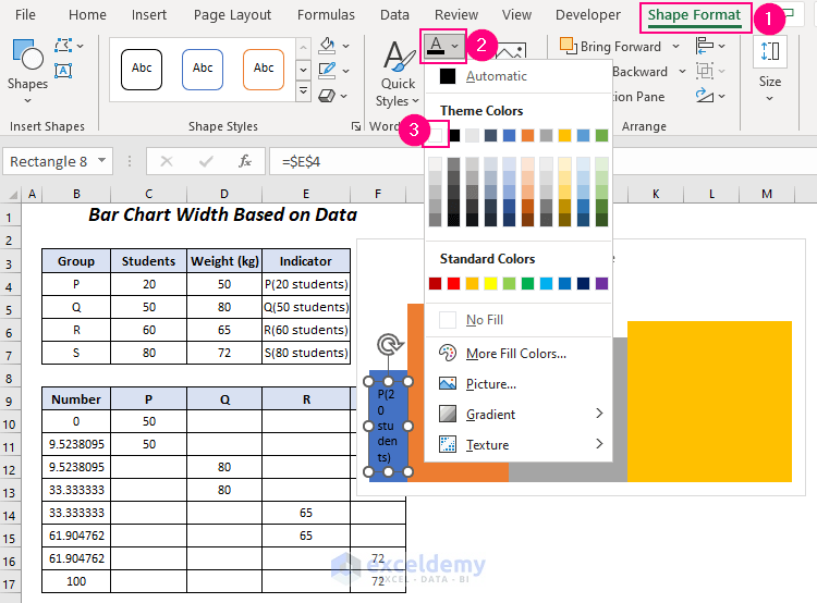
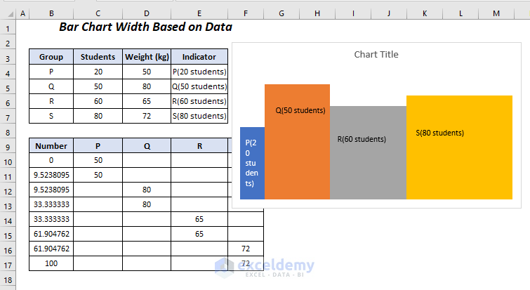
We have changed the format of the label of our first bar.
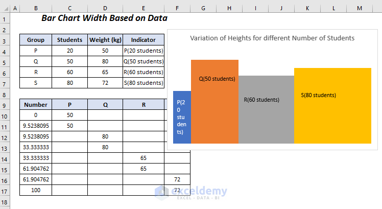
- Add and change the format of the labels of the rest of the bar.
- Change the chart title to “Variation of Heights for different Number of Students”.
Read More: How to Sort Bar Chart Without Sorting Data in Excel
Practice Section
We have provided a Practice section like below in each sheet on the right side so you can test the method.
Download the Practice Workbook
Related Articles
- How to Make a Bar Graph with Multiple Variables in Excel
- How to Make a Bar Graph in Excel with 2 Variables
- How to Make a Bar Graph in Excel with 3 Variables
- How to Make a Bar Graph in Excel with 4 Variables
- Excel Bar Chart Side by Side with Secondary Axis
- How to Show Difference Between Two Series in Excel Bar Chart
<< Go Back to Excel Bar Chart | Excel Charts | Learn Excel
Get FREE Advanced Excel Exercises with Solutions!
