Method 1 – Use a Helper Column to Show a Number and a Percentage in the Bar Chart
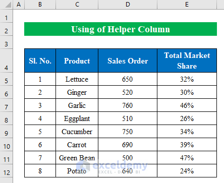
Suppose we have a dataset of some Products, Sales Order, and Total Market Share. Using helper columns, we will show numbers and percentages in an Excel bar chart.
Steps:
- Choose a cell. We have selected cell (F5).
- Enter the following formula.
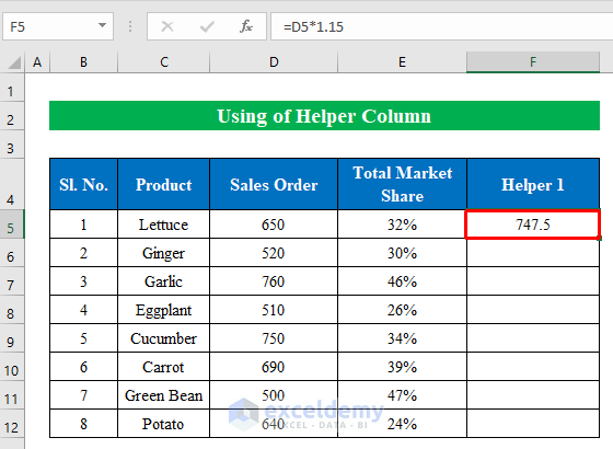
=D5*1.15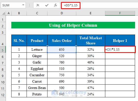
- Press Enter.
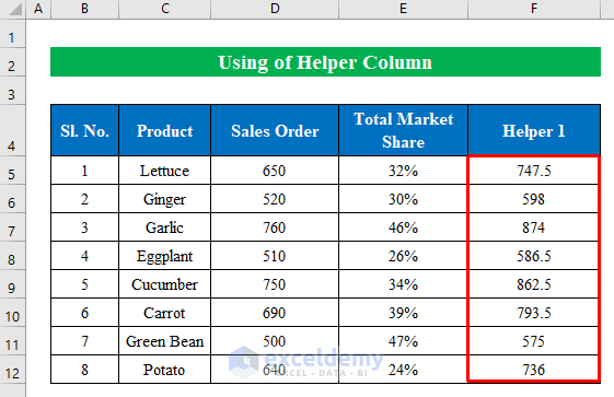
- Pull the fill handle down to fill the column.
- This sets up the first helper column.
- Copy the following formula into cell G5:
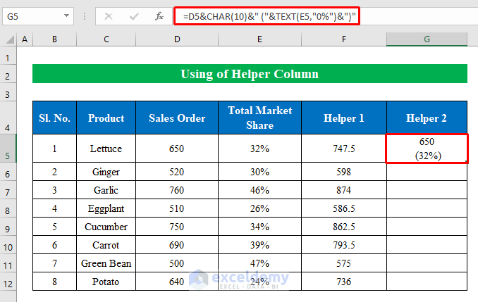
=D5&CHAR(10)&" ("&TEXT(E5,"0%")&")"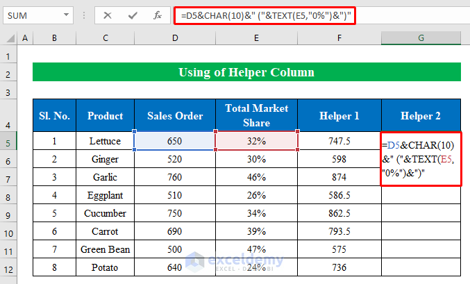
- Hit the Enter key to get the value.
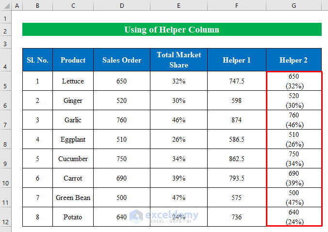
- Drag the formula down with the fill handle.
- The second helper column is ready.
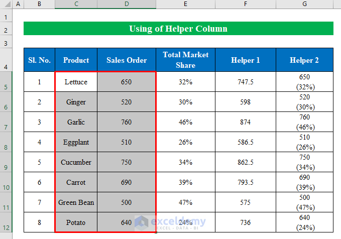
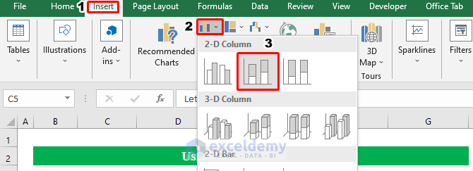
- Choose the data from the Product and Sales Order columns.
- From the Insert tab, choose 2-D Stacked Column.
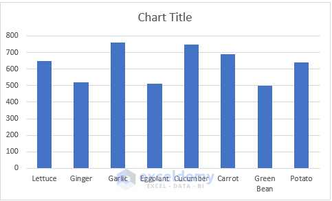
- A new bar chart will be created. We will need to edit the chart to show both numbers and percentages inside the chart.
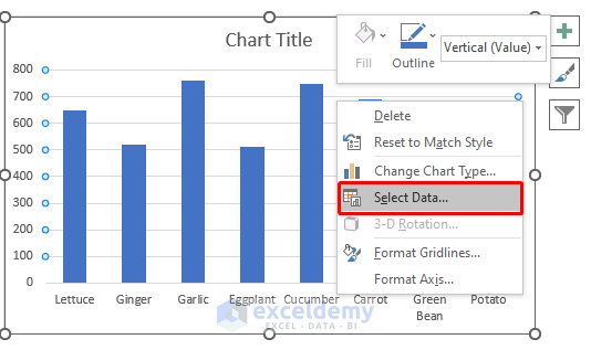
- Right-click on the chart.
- Choose the Select Data option.
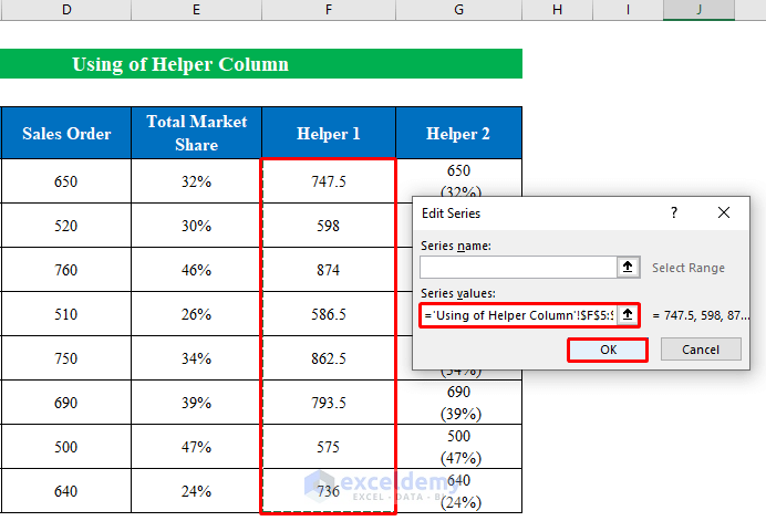
- In the Select Data Source dialog, click Add.
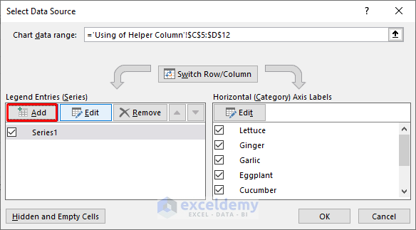
- In the Series values section, choose data from the Helper 1 column.
- Press OK to continue.
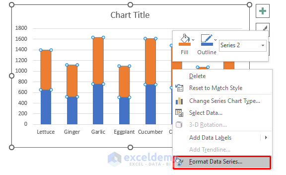
- Select the new bars and right-click.
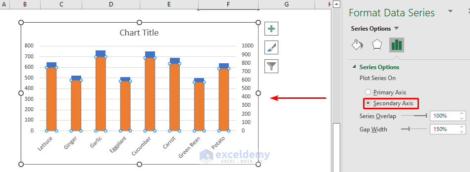
- Choose Format Data Series.
- Click Secondary Axis and your chart will look like the below screenshot.
- Right-click on the new bars again and choose Select Data.
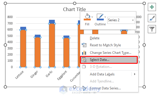
- Add Series 2 and press Edit to change it.
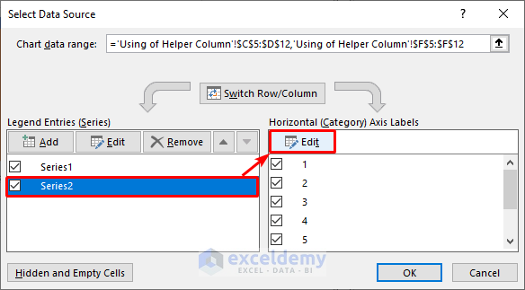
- A new window will appear named Axis labels. Select data from the Helper 2 column and press OK to continue.

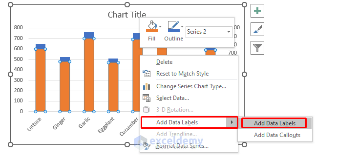
- Open the options by right-clicking on the chart.
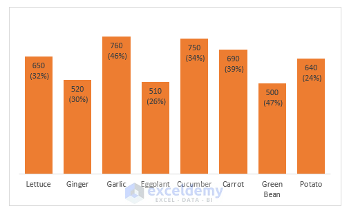
- Click on Add Data Labels.
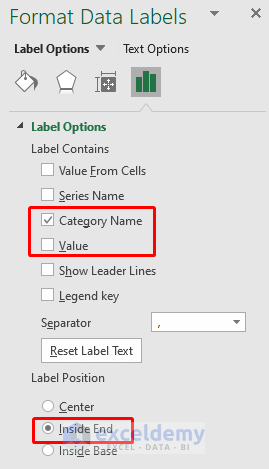
- Let’s change the format from the Format Data Labels.
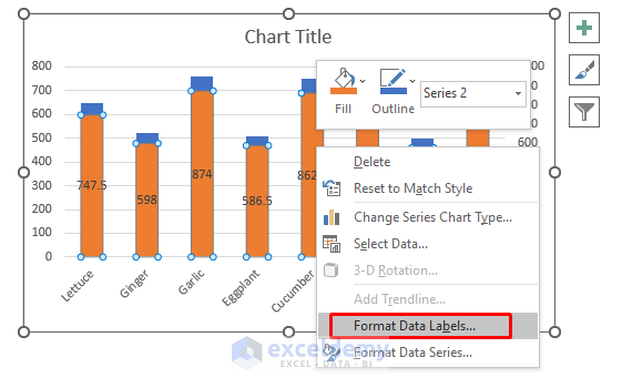
- Check Category Name from the list and choose Inside End to visualize data.
- Your final chart should look like the following image.
Read More: How to Make a Percentage Bar Graph in Excel
Method 2 – Use Format Chart to Show a Number and a Percentage in an Excel Bar Chart
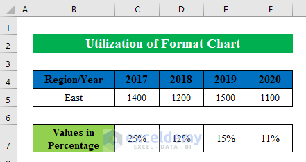
Suppose we have a dataset of Sales in a region over years. We also have some values in percentages. We will show both numbers and percentages in a bar chart.
Steps:
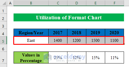
- Select data from the list. We have selected cells (B5:F5).
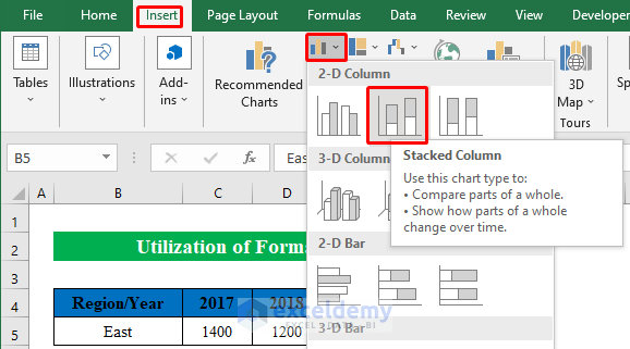
- While the dataset is selected, choose the 2-D Stacked Column chart from the Insert options.
- A chart will be created.
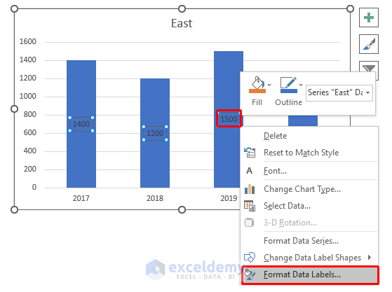
- Choose the bar from the chart and right-click on it.
- Go to Select Data.
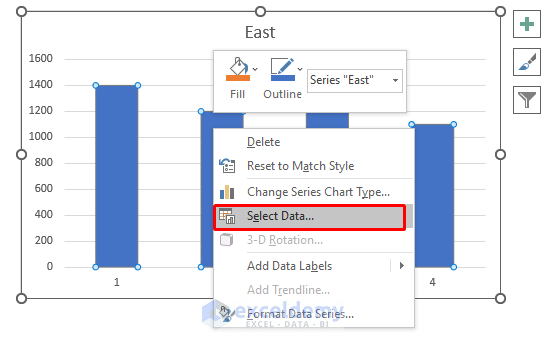
- A new window will appear named Select Data Source. Click Edit in the Horizontal Axis Labels category.
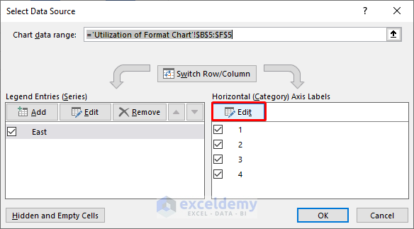
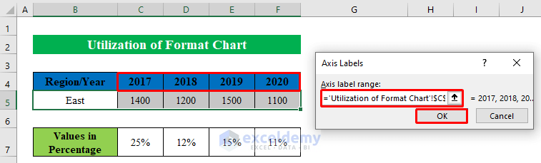
- Choose the years headers from your dataset and press OK. Years will be shown horizontally in the chart.
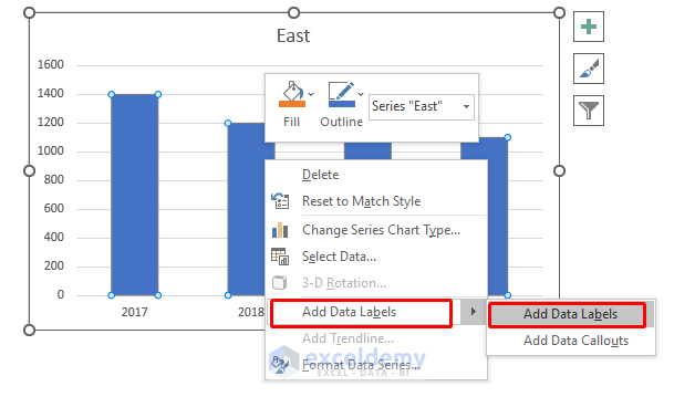
- Right-click on the bars and choose Add Data Labels to get the numbers inside the bars.
- Selecting the values on the bars, right-click, and choose Format Data Labels.
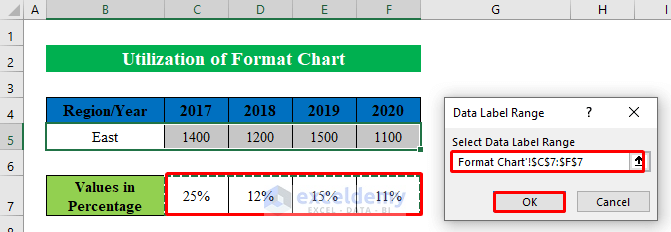
- From the right pane, go to Label Options and check Value from cells.

- A new window will appear asking for the range from your table. Choose the percentage values from the dataset and click OK.
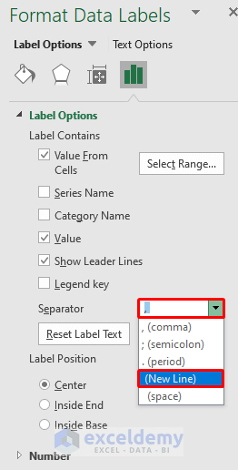
- Change the Separator to New line from the drop-down list to get percentage values just below the numbers.
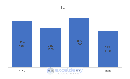
- Your chart will look like the following screenshot.
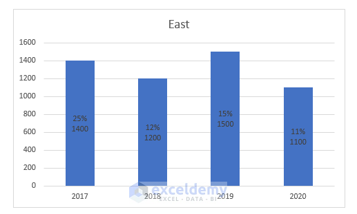
- Remove all the unnecessary elements and you will get your final chart.
Read More: How to Show Difference Between Two Series in Excel Bar Chart
Things to Remember
- In the second method, we have shown separating the percentages in a new line. This works in Excel 2013 or newer. Otherwise, you can use a comma (,) or semicolon (;) to separate them.
Download Practice Workbook
Download this practice workbook to follow along.
Related Articles
- How to Make a Bar Graph with Multiple Variables in Excel
- How to Make a Bar Graph in Excel with 2 Variables
- How to Make a Bar Graph in Excel with 3 Variables
- How to Make a Bar Graph in Excel with 4 Variables
- How to Make a Bar Graph Comparing Two Sets of Data in Excel
- Excel Bar Chart Side by Side with Secondary Axis
- How to Sort Bar Chart Without Sorting Data in Excel
- How to Change Bar Chart Width Based on Data in Excel
<< Go Back to Excel Bar Chart | Excel Charts | Learn Excel
Get FREE Advanced Excel Exercises with Solutions!

this was greatly helpfuul to me thank you
Hello Srivatsan Guru,
You are most welcome. It’s great to hear that it was helpful to you. Keep learning Excel with ExcelDemy.
Regards
ExcelDemy