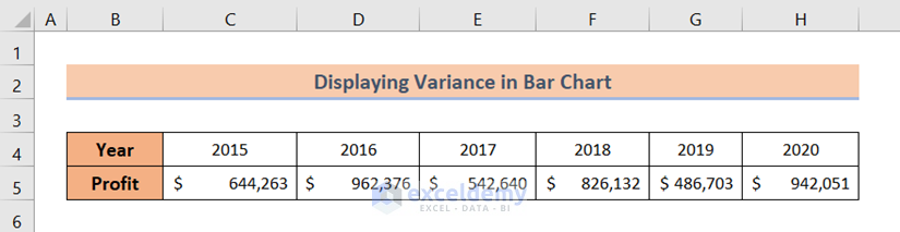
Dataset Overview
In the following dataset, I have an annual profit record. In the record, I have some annual profit amounts against their corresponding year. I will use this dataset to show you how to display variance in an Excel Bar Chart with ease.
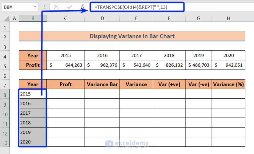
Step 1 – Prepare Dataset
- Transpose the years from the source dataset:
- In cell B8, enter the formula:
=TRANSPOSE(C4:H4)&REPT(" ",13)- Press ENTER.
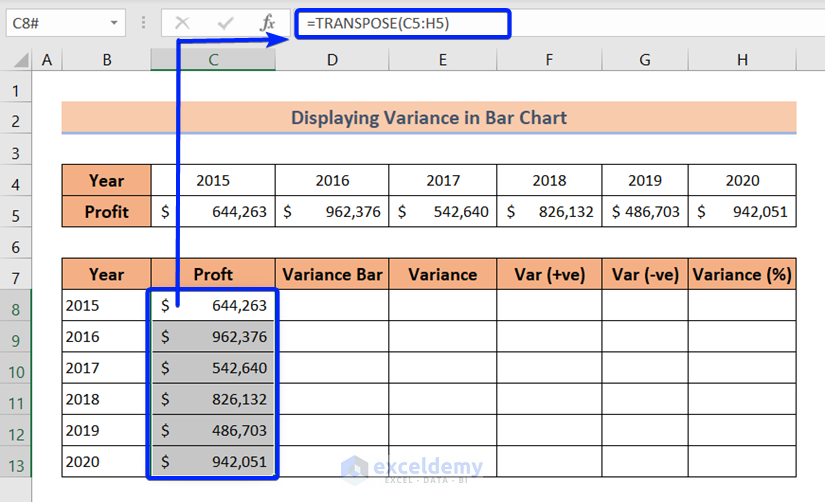
- Transpose the profit amounts from the source dataset:
- In cell C8, enter the formula:
=TRANSPOSE(C5:H5)- Press ENTER.
- To create a variance column, enter the following formula to retrieve the profit amounts from the Profit column.
=C9:C13- Press ENTER.
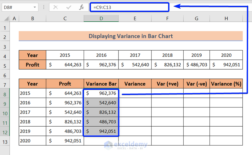
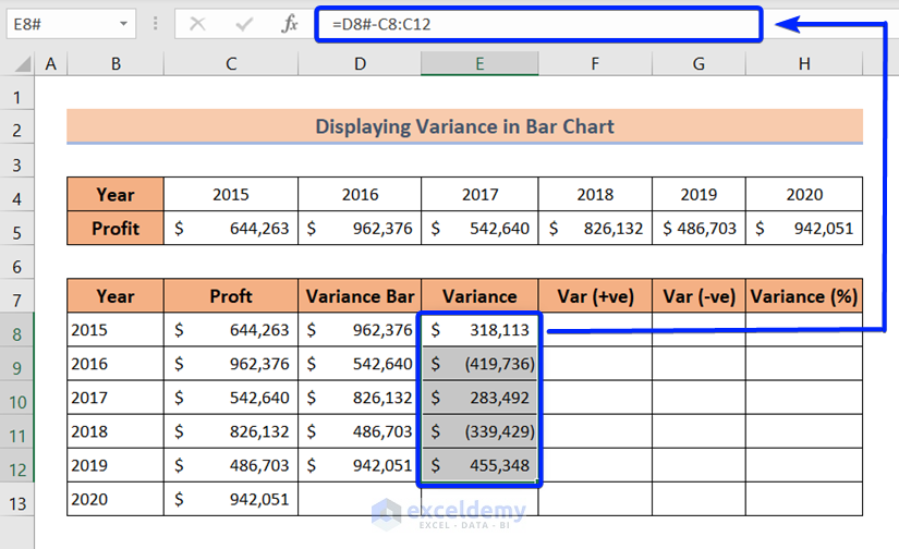
- Create a variance column by retrieving profit amounts from the Profit column:
- In cell E8, enter the formula:
=D8#-C8:C12- Press ENTER.
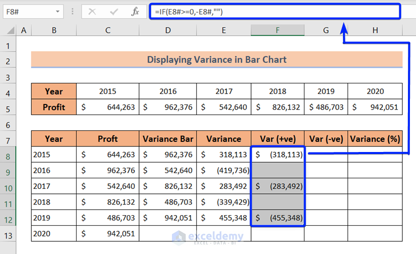
- Filter out positive variances:
- In cell F8, enter the formula:
=IF(E8#>=0,-E8#,"")- Press ENTER.
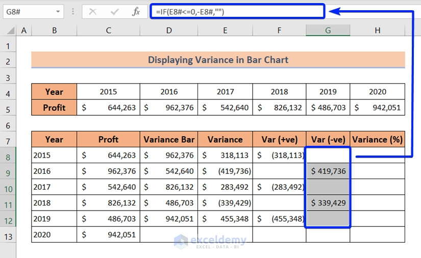
- Filter out negative variances:
- In cell G8, enter the formula:
=IF(E8#<=0,E8#,"")- Press ENTER.
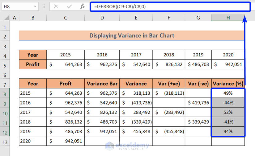
- Calculate variance in percentage:
- In cell H8, enter the formula:
=IFERROR((C9-C8)/C8,0)- Press the ENTER button.
- Drag the Fill Handle icon from cell H8 to H12.
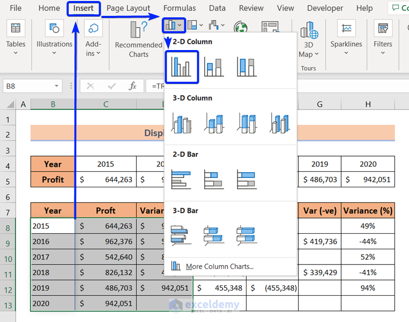
Step 2 – Insert a Bar Chart
- Select the entire Year, Profit, and Variance Bar columns.
- Go to the Insert tab.
- From the Charts group, click on the Insert Column or Bar Chart drop-down.
- From the 2-D Column section, choose Clustered Column.
Read More: How to Make a Simple Bar Graph in Excel
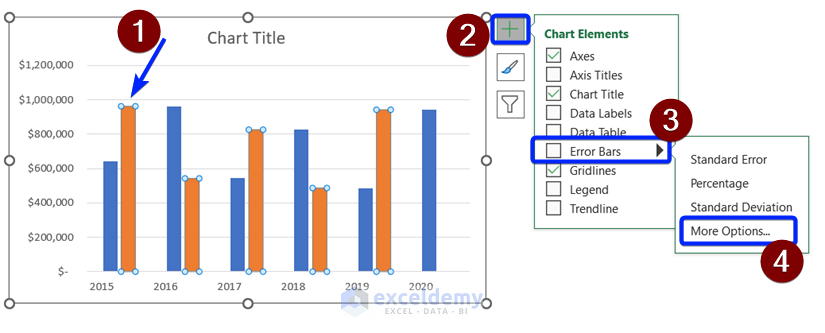
Step 3 – Add Error Bars
- Click on the Orange columns to select them all.
- Click the plus icon at the top-right corner of the chart.
- Go to Error Bars and click on More Options.
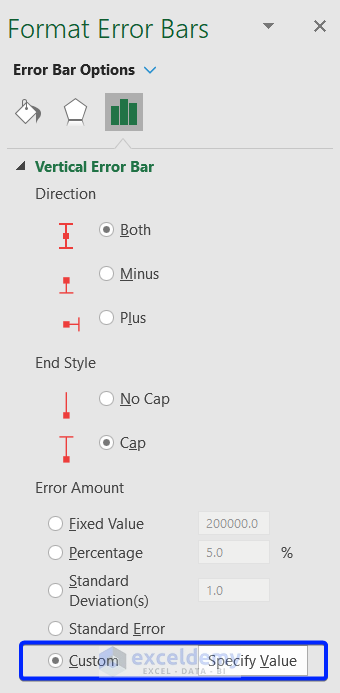
- In the Format Error Bars dialog, select Custom in the Error Amount section.
- Click on the Specify Value button.
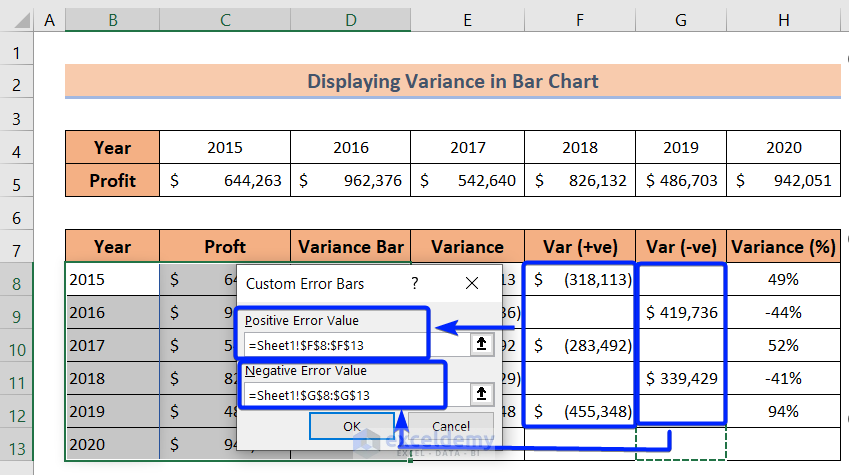
- Insert the range of the Var (+ve) column in the Positive Error Value box.
- Insert the range of the Var (-ve) column in the Negative Error Value box.
- Press OK.
Read More: How to Create Bar Chart with Error Bars in Excel
Step 4 – Increase Bar Width
- Click any blue column.
- Set Series Overlap and Gap Width to 0% in the Format Data Series dialog.
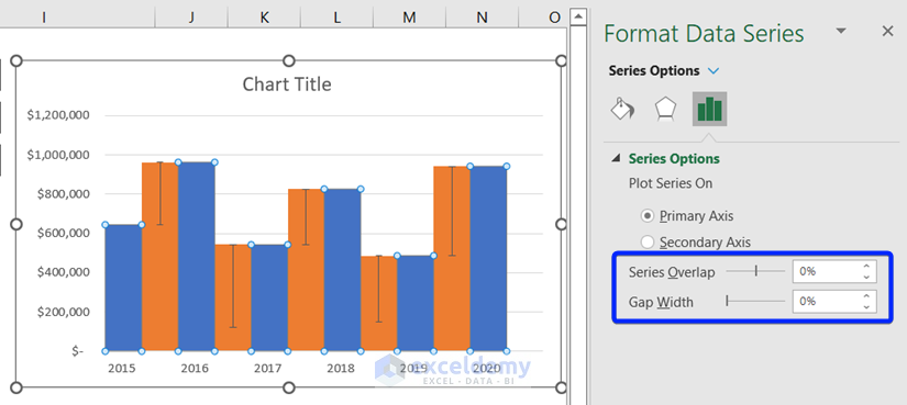
Read More: Excel Chart Bar Width Too Thin
Step 5 – Make Variance Bar Invisible
- Select an orange bar.
- Go to Format and select No Fill.
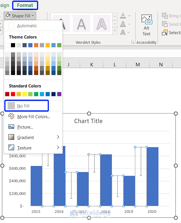
Read More: How to Create a 3D Bar Chart in Excel
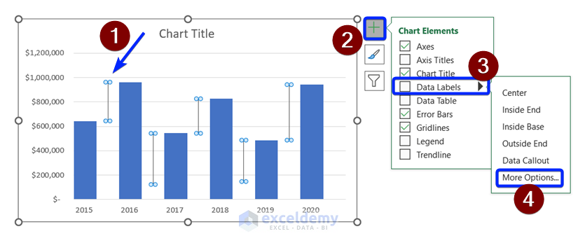
Step 6 – Show Variance with Data Labels
- Click any error bar to select.
- Click the plus icon at the top-right corner of the bar chart.
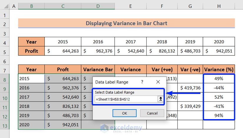
- Go to Data Labels and click on More Options.
- Select Value From Cells in the Format Data Labels dialog.
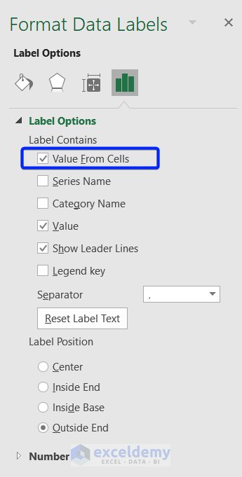
- Insert the entire range of the Variance (%) column, in the Select Data Label Range section.
- Press OK.
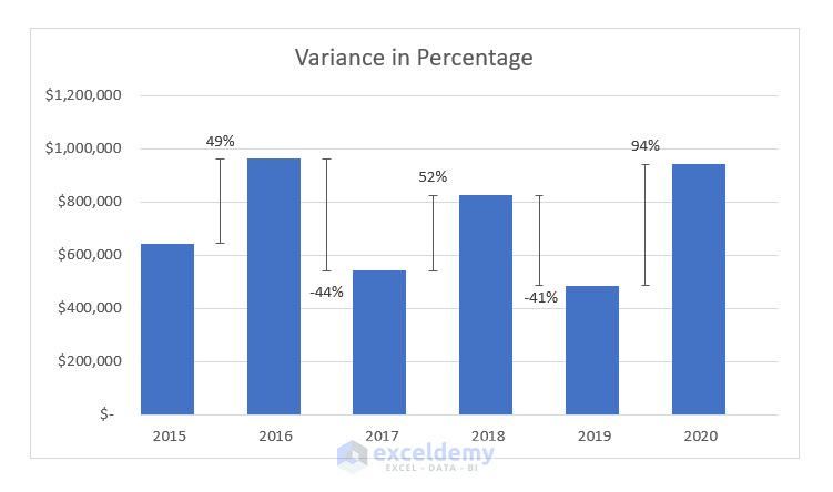
Your desired chart will now show variance using Error Bars.
Read More: How to Create a Bar Chart with Standard Deviation in Excel
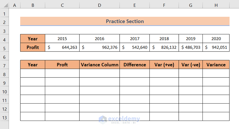
Practice Section
You’ll find an Excel sheet resembling the screenshot below at the end of the provided Excel file. This sheet allows you to practice all the topics covered in the article.
Download Practice Workbook
You can download the practice workbook from here:
Related Articles
- How to Flip Bar Chart in Excel
- How to Create Overlapping Bar Chart in Excel
- How to Create a Radial Bar Chart in Excel
- How to Create Construction Bar Chart in Excel
- How to Create Butterfly Chart in Excel
<< Go Back to Excel Bar Chart | Excel Charts | Learn Excel
Get FREE Advanced Excel Exercises with Solutions!
