Step 1 – Create Custom Combo Chart
- Select the dataset.
- Select “Create Custom Combo Chart” from the “Insert Combo Chart” menu under the Insert tab.
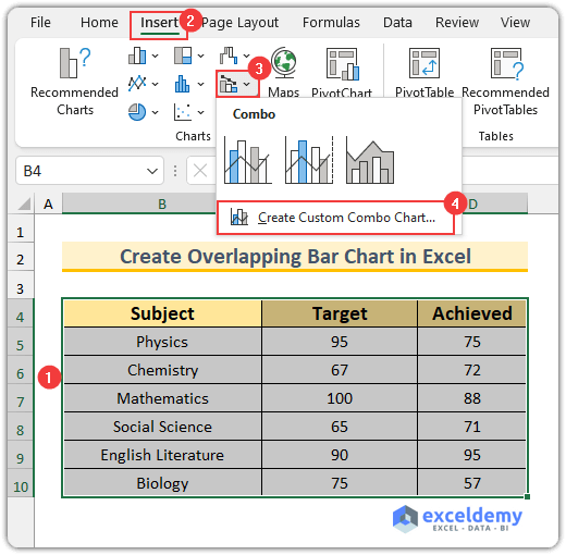
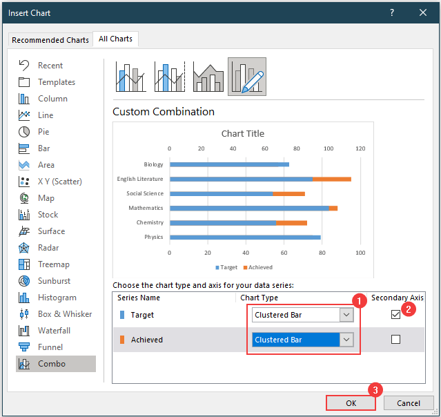
- The Insert Chart window will pop up.
- Change the Chart Type of both series to Clustered Bar.
- For the Target series, select Secondary Axis.
- Press OK.
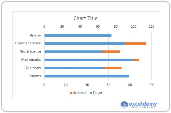
- The following chart will be inserted.
Read More: Excel Bar Chart Side by Side with Secondary Axis
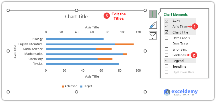
Step 2 – Edit Chart Elements
- Select the chart and click on the Chart Elements icon (the green plus sign).
- Select the Axis Titles.
- Deselect Gridlines.
- Double-click on the titles to change them.
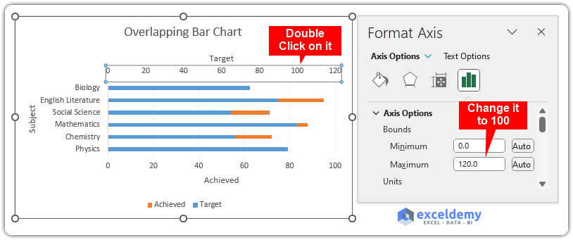
- Double-click on the “Target” Axis and set the Maximum Bounds to 100.
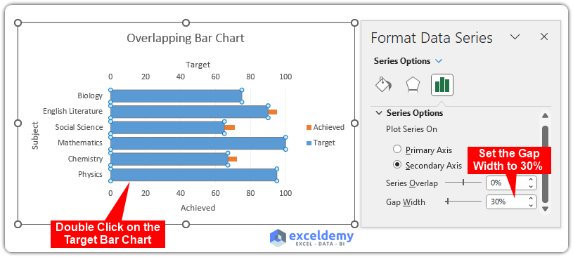
- Double-click on the “Target” bar chart.
- Set Gap Width to 30% from the Series Options tab (this value reduces the gap between the bars, you can change it according to your needs).
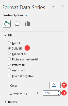
- Select the “Target” bar chart and go to the Fill & Line tab.
- Select Solid fill under the Fill section.
- Select your desired fill color inside the Color.
- Set the Transparency to 70%.
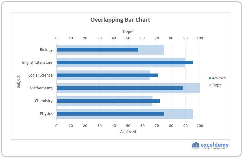
- The chart will be modified as shown in the following image.
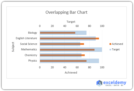
- Change the “Achieved” bar chart’s fill color.
- Enlarge the chart for better visuals. This will complete the creation process of the overlapping bar chart.
Read More: How to Create Construction Bar Chart in Excel
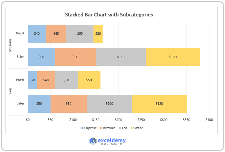
How to Create Stacked Bar Chart with Subcategories in Excel
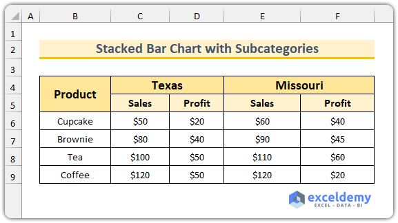
We have a sample dataset that shows sales and profits for four different products at a specific store that has two locations in Texas and Missouri to illustrate the process.
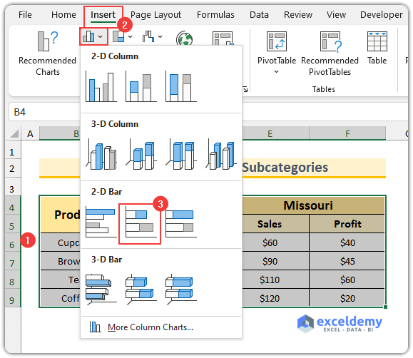
- Select the dataset.
- From the Insert tab, select Stacked Bar from the Insert tab, which is under the Insert Column or Bar Chart menu.
- A basic chart will be inserted.
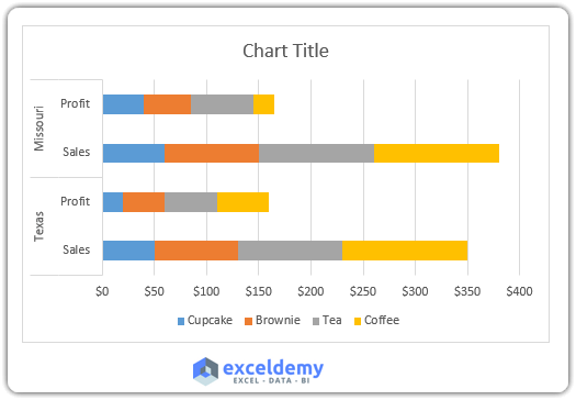
- We will insert a chart title, add data labels, decrease the series gap width and resize the chart for better visualization.
- The goal of creating a stacked bar chart with subcategories will be completed.
Read More: How to Create a 3D Bar Chart in Excel
Download Practice Workbook
Related Articles
- How to Show Variance in Excel Bar Chart
- How to Create a Bar Chart with Standard Deviation in Excel
- How to Flip Bar Chart in Excel
- How to Create a Radial Bar Chart in Excel
- How to Create Butterfly Chart in Excel
<< Go Back to Excel Bar Chart | Excel Charts | Learn Excel
Get FREE Advanced Excel Exercises with Solutions!
