This is an overview:
Step 1 – Preparing the Dataset
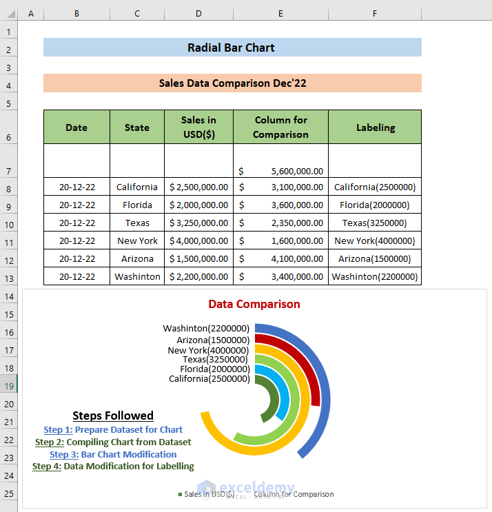
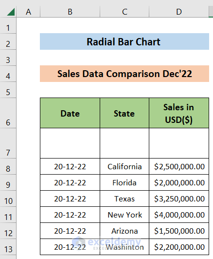
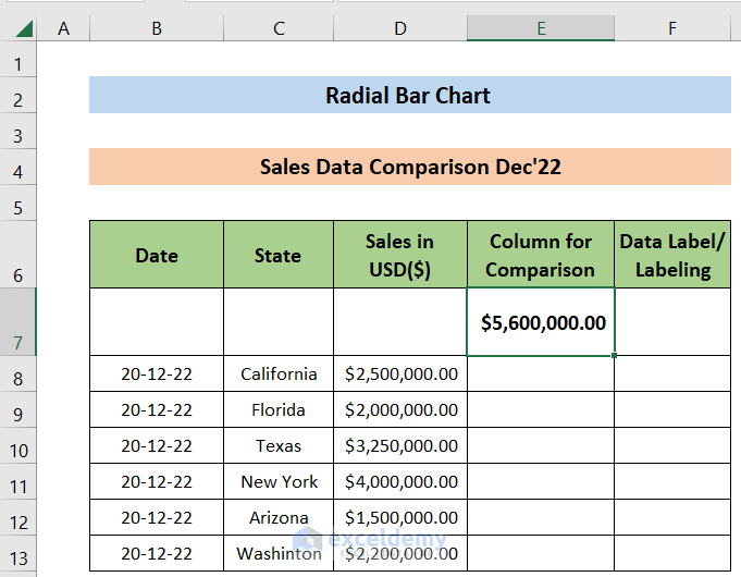
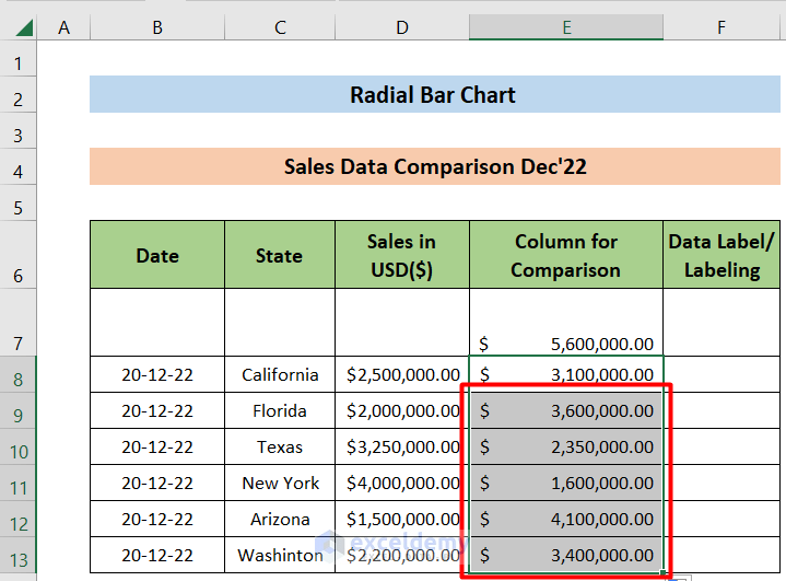
The sample dataset showcases sales data of the “iPhone 14 Plus” in December 2022 in outlets across six states: “California”, “Florida”, “Texas”, “New York”, “Arizona” and “Washington”.
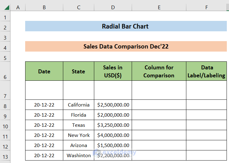
- Insert two Columns: “Column for Comparison” and “Labeling”.
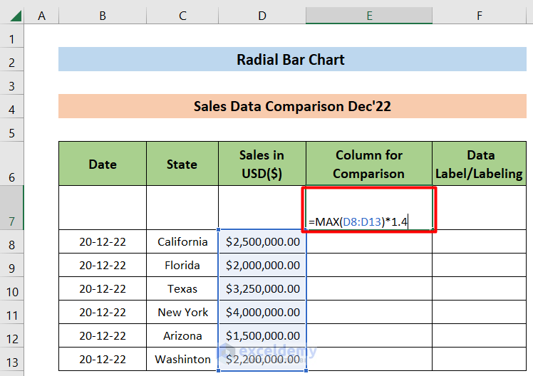
- Enter the following formula in D7 and press ENTER.
=MAX(C8:C13)*1.4The output will be 1.4 times the maximum sell value. Compare sales based on this value.
This is the output.
- Enter the following formula in E8 and press ENTER to get the difference between E7 and D8 :
=$E$7-D8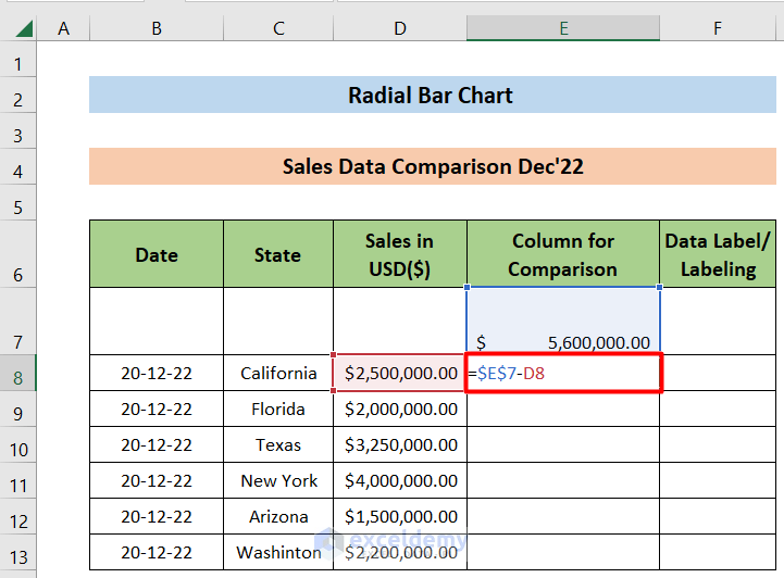
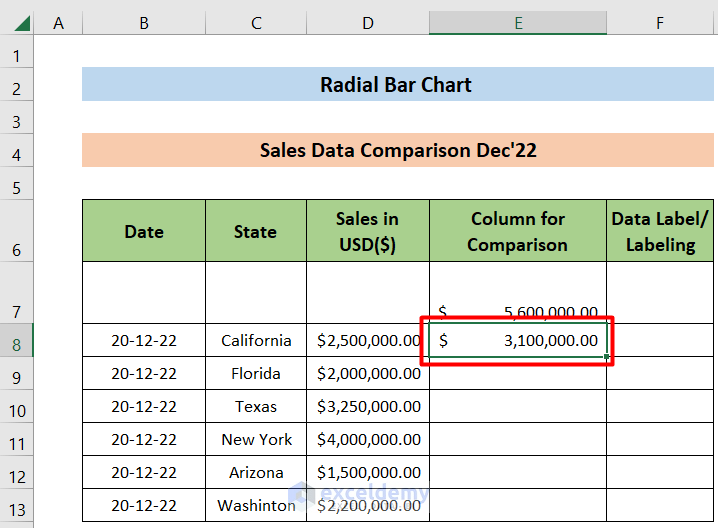
This is the output.
- Drag down the Fill Handle to see the result in the rest of the cells.
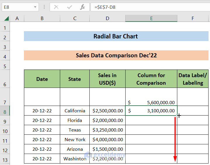
This is the output.
Read More: How to Flip Bar Chart in Excel
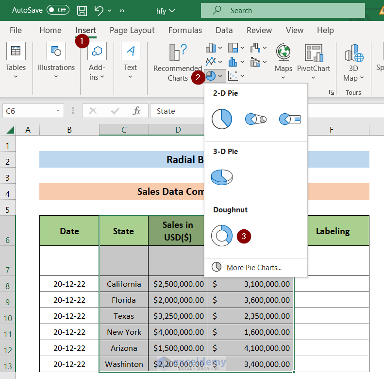
Step 2 – Create a Chart from the Dataset
- Select C6:E13.
- Go to “Insert” option and select Doughnut Chart.
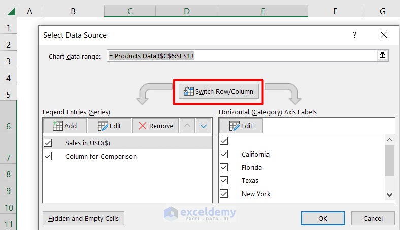
- To customize the chart, select the “Chart Area”.
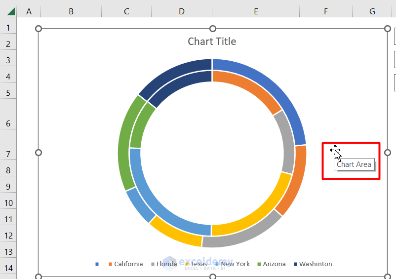
- Right Click it and choose Select Data.
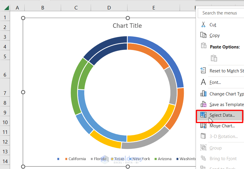
- Click Switch Row/Column to swap rows and columns.
- Click OK.
Read More: How to Create a 3D Bar Chart in Excel
Step 3 – Modify the Bar Chart
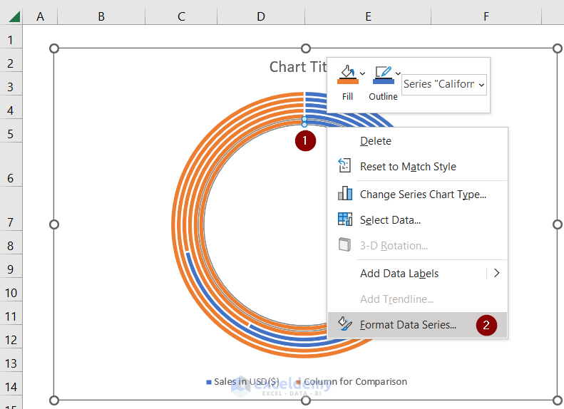
- Place the mouse on the Doughnut chart and Right Click.
- Select Format Data Series...
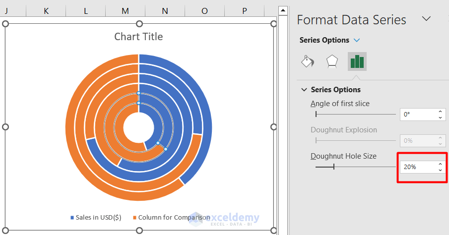
- Set the Doughnut Hole Size to 20%.
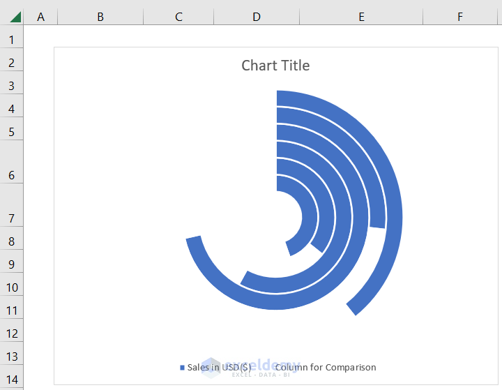
- Select the Orange portion (marked “1” in the image) of the outermost circle. It represents the Column for the Comparison in the dataset.
- In Fill, select “No fill”.
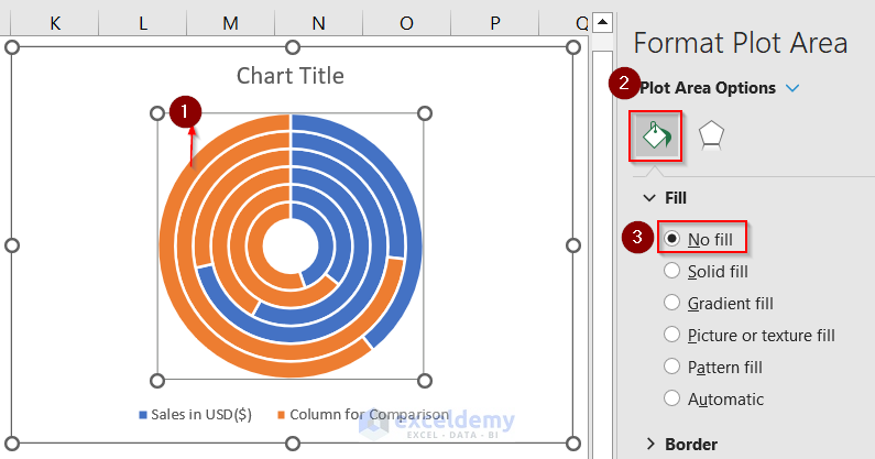
- Repeat the procedure for the other circles.
This is the output.
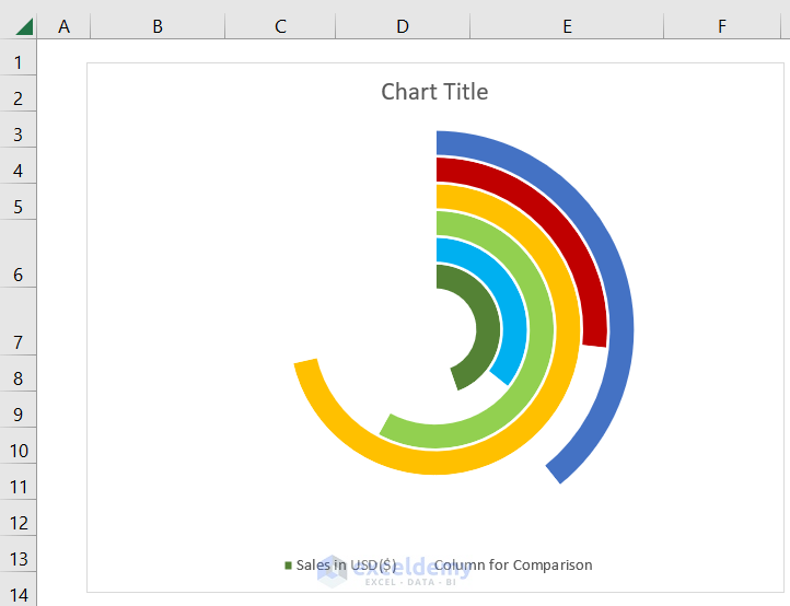
- Set different colors for the remaining portions of the circles.
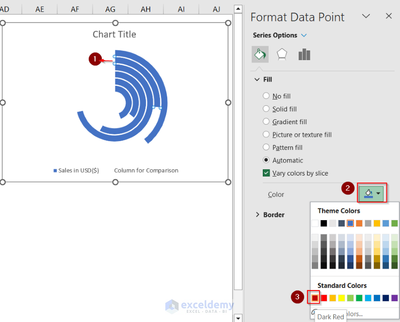
- Repeat the above step for the other slices.
This is the output.
Read More: How to Change Bar Chart Color Based on Category in Excel
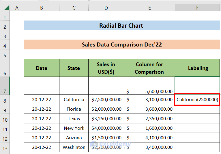
Step 4 – Label the Chart
- Enter the following formula in F8 and press ENTER.
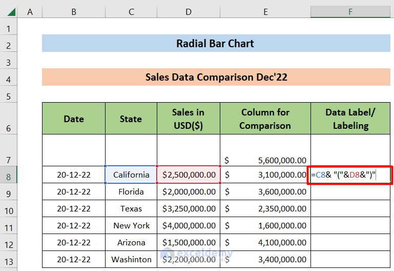
The output is :
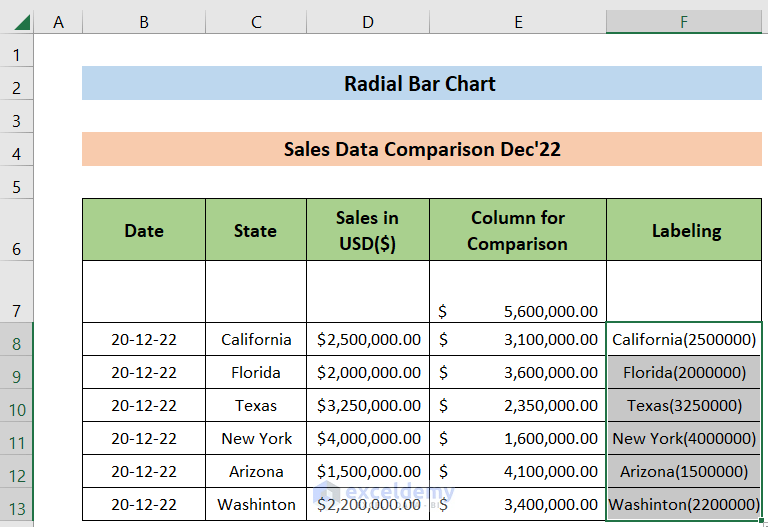
- Drag down the Fill Handle to see the result in the rest of the cells.
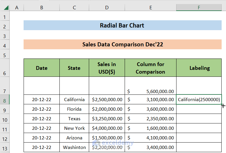
This is the output.
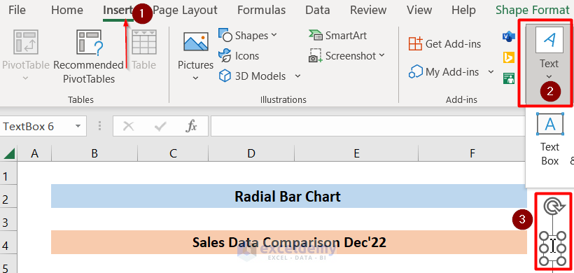
- Go to Insert and choose “Text Box”:
- Link F8 to the “Text Box” by selecting the “Text Box” and entering the following formula in the Formula Bar.
=$F$8This is the output.
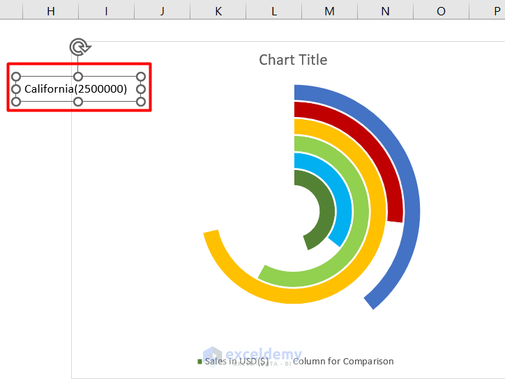
- Repeat the procedure for the cells in C9:C13 and place the Text Box in the chart.
- Group the six Text Boxes by selecting them and pressing Ctrl.
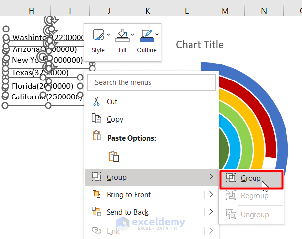
This is the output.
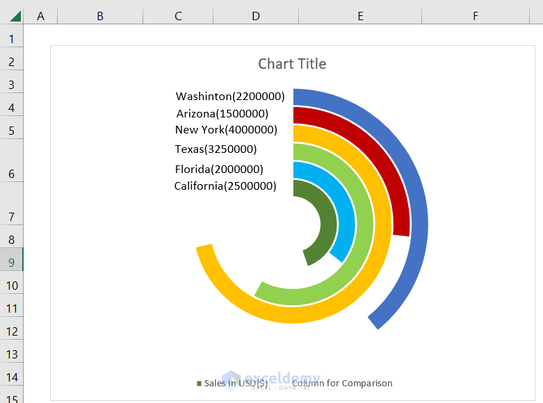
- The Text Boxes and the Doughnut Chart are also grouped and the Title of the chart is adjusted.
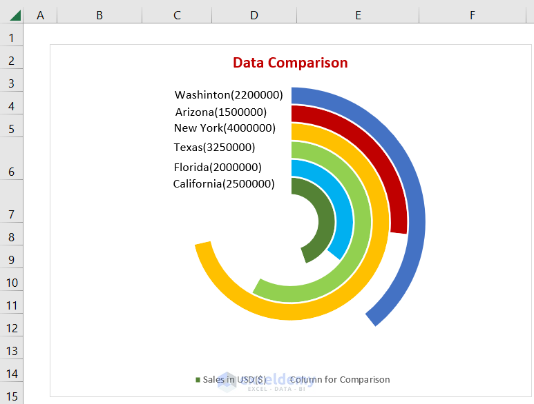
This is the final output:
Download Practice Workbook
Download the workbook.
Related Articles
- How to Show Variance in Excel Bar Chart
- How to Create a Bar Chart with Standard Deviation in Excel
- How to Create Overlapping Bar Chart in Excel
- How to Create Construction Bar Chart in Excel
- How to Create Butterfly Chart in Excel
<< Go Back to Excel Bar Chart | Excel Charts | Learn Excel
Get FREE Advanced Excel Exercises with Solutions!
