STEP 1 – Create Dataset for Bar Chart with Multiple Categories
- Create a dataset for the bar chart that includes categories, sub-categories, and items in three separate columns.
- In the sample box, we have included a category column Product Type, sub-categories column Product, and items column Quantity.
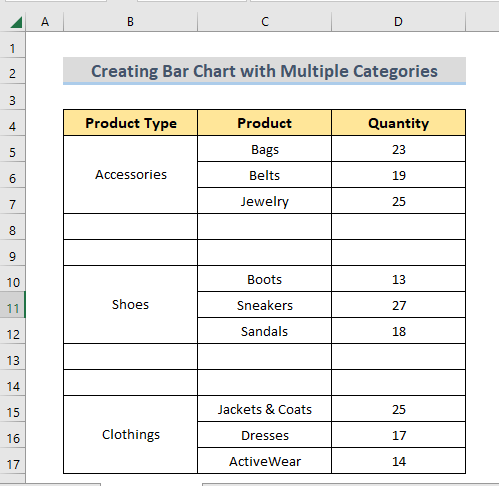
Note: Leave 2 blank rows in between each category and insert a space in the first empty cell of the blank row for better visualization of the chart.
Read More: How to Ignore Blank Cells in Excel Bar Chart
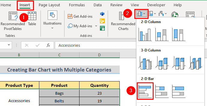
STEP 2 – Create Bar Chart Using Insert Tab of Excel
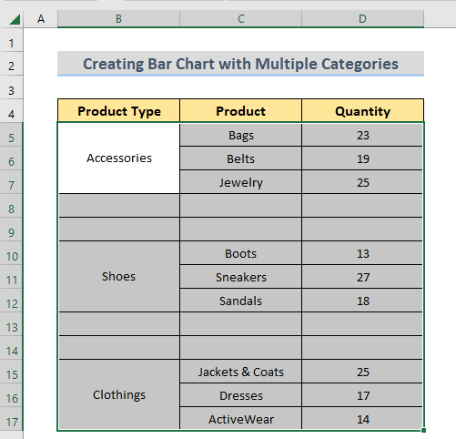
- Select the whole dataset to create a bar chart with it.
- Go to the Insert tab and select Insert Column or Bar Chart > 2-D Bar > Clustered Bar.
- A bar chart with multiple categories is created in the worksheet.
- Double-click on the chart title and give it a name.
Read More: How to Make a Stacked Bar Chart in Excel
STEP 3 – Give Different Colors to Bar Chart
- Click the chart. It will select all the chart items.
- Click on a single item and it will be selected as shown in the image
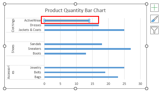
- Go to the Format tab and select a color from the Shape Fill option.
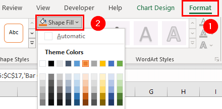
- Follow the same steps for different colors to items from different categories.
Read More: How to Color Bar Chart by Category in Excel
STEP 4 – Do Some Additional Formatting
- Select the bar chart.
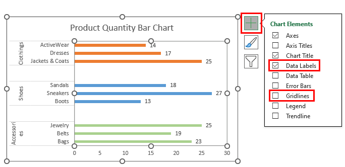
- From the upper right corner of the chart select Chart Elements.
- Select Data Labels. It will attach data labels to the chart elements.
- Unselect Gridlines and the gridlines from the graph will vanish.
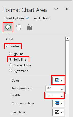
- Double-click on the chart.
- The Format Chart Area pane will appear.
- Select Border from the pane. You can choose the borderline type from here.
- In the sample image, we selected Solid Line. Different colors and line widths for the border line can be chosen from this section.
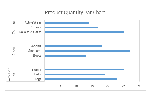
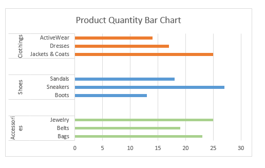
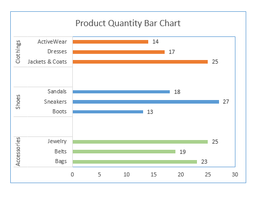
Final Output
Following all the steps given, the bar chart graph with multiple categories will look like the following sample image below.
Read More: How to Create Stacked Bar Chart for Multiple Series in Excel
How to Convert Bar Chart to Column Chart in Excel
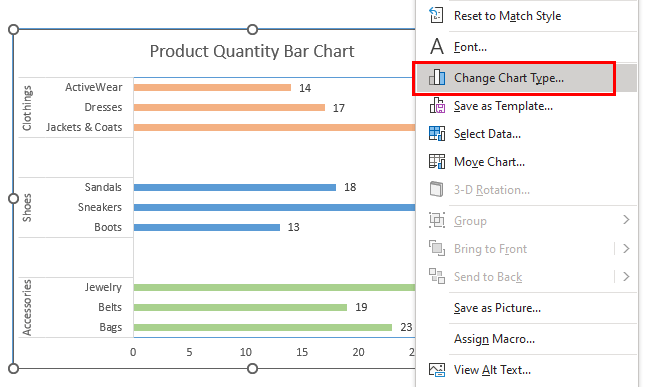
- Create a bar chart following the steps given in the previous section.
- Right-click on the bar chart.
- Select Change Chart Type.
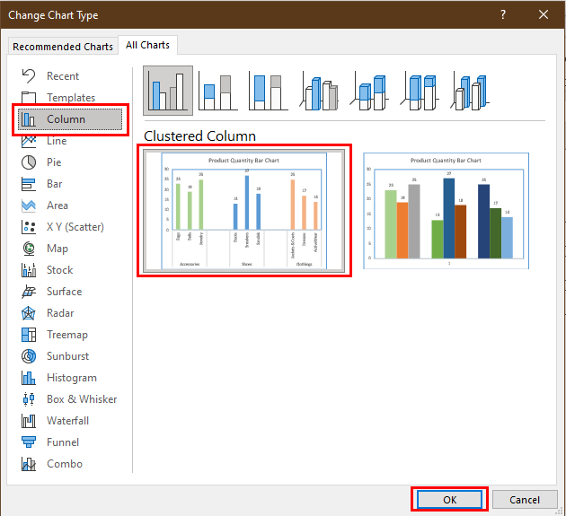
- The Change Chart Type window will appear.
- Select Column > Clustered Column from the window.
- Press OK.
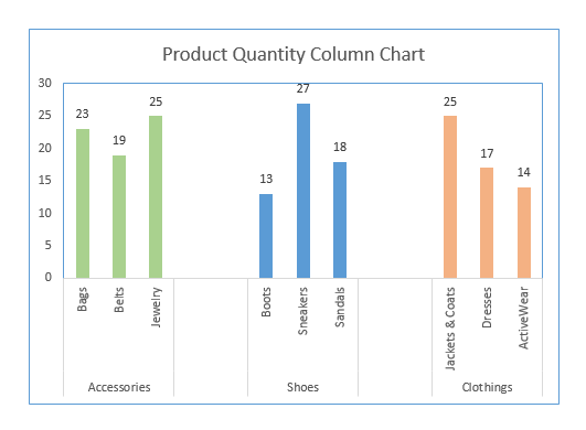
- The bar chart will convert to a column chart with multiple categories as in the image given below.
Download Practice Workbook
Related Articles
- Excel Stacked Bar Chart with Subcategories
- How to Create Stacked Bar Chart with Negative Values in Excel
- How to Create Stacked Bar Chart with Line in Excel
- How to Plot Stacked Bar Chart from Excel Pivot Table
- How to Create Stacked Bar Chart with Dates in Excel
<< Go Back to Excel Bar Chart | Excel Charts | Learn Excel
Get FREE Advanced Excel Exercises with Solutions!
