Example 1 – Plot a Stacked Bar Chart from an Excel Pivot Table
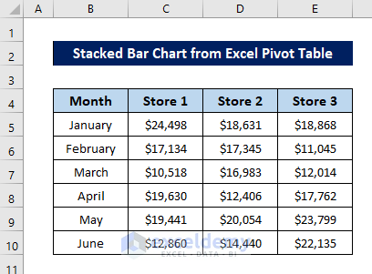
This is the sample dataset.
To Create a Pivot Table:
- Select the whole dataset (B4:E10).
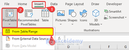
- Go to the Insert tab.
- Select PivotTable in Tables
- Select From Table/Range.
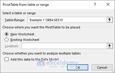
- Select your options in PivotTable from table or range and click OK.
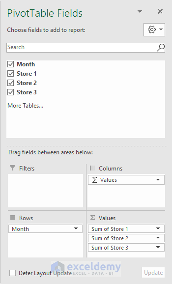
- In PivotTable Fields, click and drag Month to Rows.
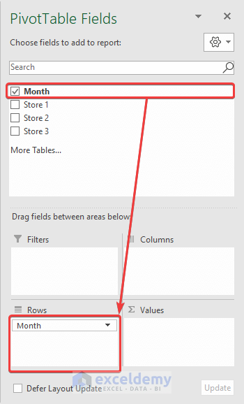
- Click and drag Store 1, Store 2, and Store 3 to Values.
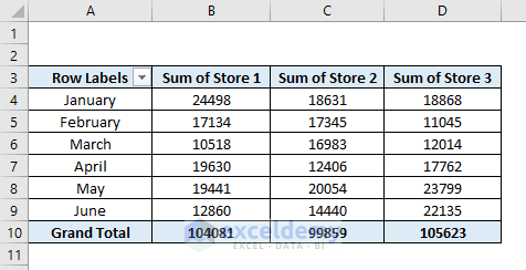
The pivot table will be displayed.
To Create a Stacked Bar Chart:
- Select the whole pivot table or a cell in the pivot table.
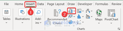
- Go to the Insert tab.
- Click Insert Column or Bar Chart in Charts.
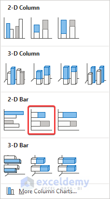
- Select Stacked Bar.
A stacked bar chart will be displayed.
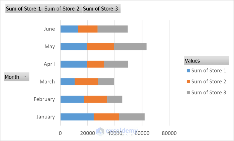
You can modify it.
Read More: How to Make a Stacked Bar Chart in Excel
Example 2 – Plot a Clustered Stacked Bar Chart from an Excel Pivot Table
To Create a Pivot Table:
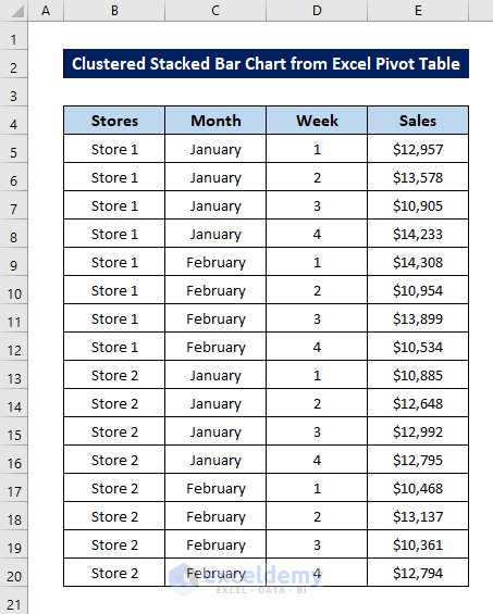
- Select the whole dataset (B4:E20).
- Go to the Insert tab.
- Select PivotTables inTables
- Select From Table/Range.
- Select your options in PivotTable from table or range and click OK.

- The PivotTable Fields window will be displayed.
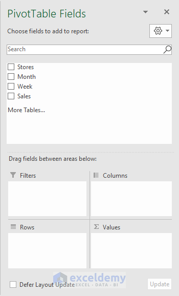
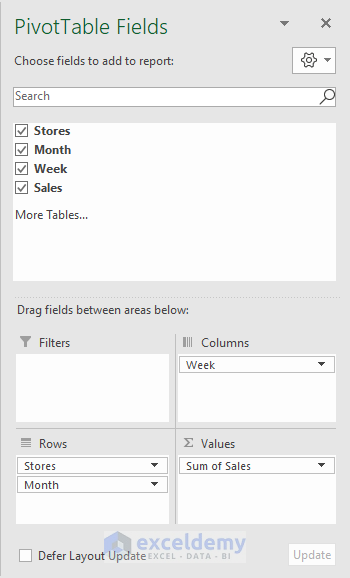
- Click and drag Stores and Month to Rows.
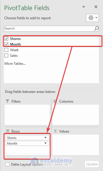
- Click and drag Week to Columns and Sales to Values.
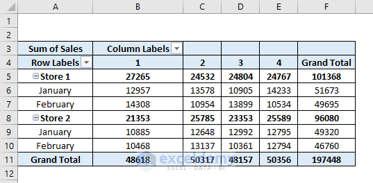
The pivot table will be displayed.
To Create a Clustered Stacked Bar Chart:
- Select the whole pivot table or a cell in the table.
- Go to the Insert tab and select Insert Column or Bar Chart in Charts.
- Select Stacked Bar.
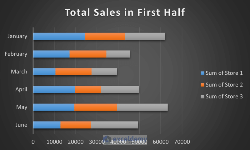
A stacked bar chart will be displayed.

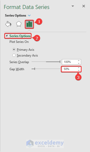
- Right-click a column and select Format Data Series.
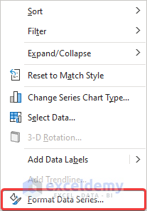
- In Format Data Series, go to Series Options.
- Change the Gap Width to 50% in Series Options.
The chart will automatically change from a stacked bar to a clustered stacked bar.
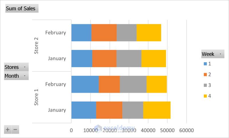
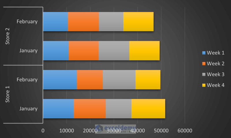
- Modify the graph.
You created a clustered stacked bar chart from a pivot table.
Read More: How to Create Stacked Bar Chart for Multiple Series in Excel
Download Practice Workbook
Download the workbook.
Related Articles
- Excel Stacked Bar Chart with Subcategories
- How to Create Stacked Bar Chart with Negative Values in Excel
- How to Create Stacked Bar Chart with Line in Excel
- How to Create Stacked Bar Chart with Dates in Excel
- How to Create Bar Chart with Multiple Categories in Excel
- How to Ignore Blank Cells in Excel Bar Chart
<< Go Back to Stacked Bar Chart in Excel | Excel Bar Chart | Excel Charts | Learn Excel
Get FREE Advanced Excel Exercises with Solutions!
