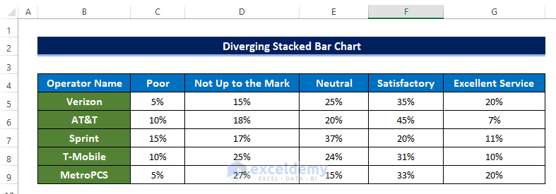
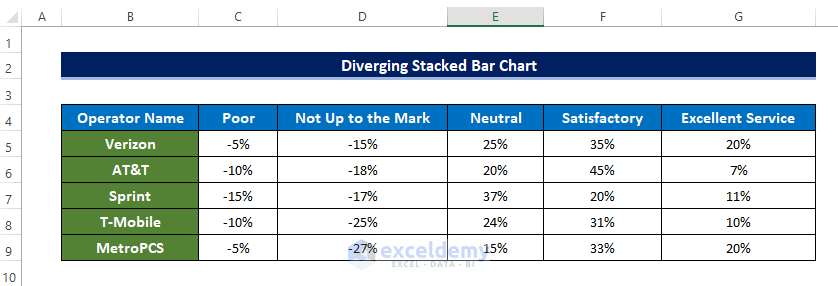
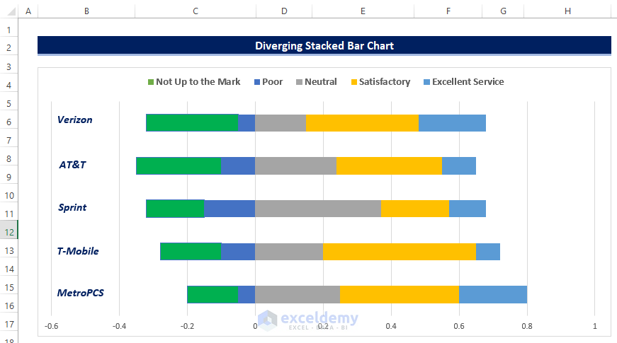
Consider a sample dataset with the top 5 most popular U.S. mobile network operators and their customer reviews. We will present them in the form of a diverging stacked bar chart.
Step 1 – Prepare Dataset
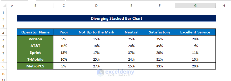
- Collect the information that is going to be plotted in a stacked bar chart.
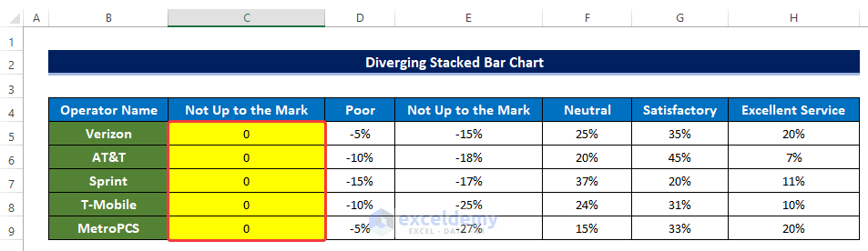
- We have the U.S. cellular operator customer reviews, categorized from Poor to Excellent Service.
- Customers gave their verdicts, and those were presented in the percentages format as a fraction of all total reviews.
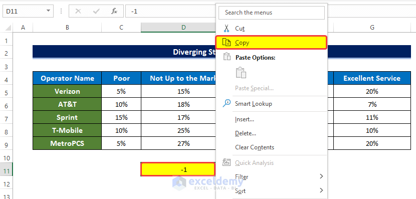
- For this type of data, you need to use the diverging format of the bar chart. In the diverging type of bar chart, you need to set a middle line from where your data will diverge.
- We will set the percentages before the Neutral negative. Input -1 as a helper value in cell D11.
- Right-click on the cell and click on Copy.
- Select the range of cells C5:D9 (two review types below Neutral) and right-click on the range.
- From the context menu, go to Paste Special and click Paste Special.
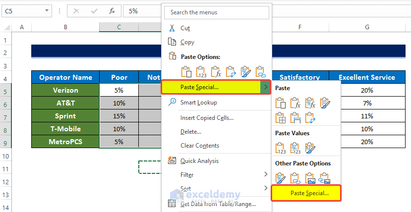
- In the Paste Special dialog box, select Multiply under the Operation group.
- Click OK.
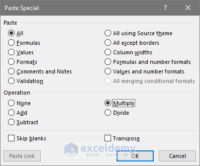
- The percentages will now have a negative sign in the range of cells C5:D9.
Read More: How to Make a Simple Bar Graph in Excel
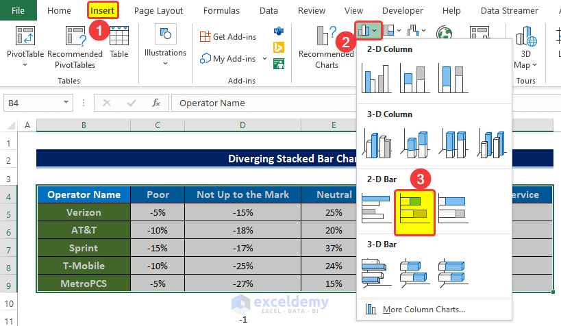
Step 2 – Create a 2-D Stacked Bar Chart
- Go to the Insert tab and the Charts group.
- Click on the Insert Column and Bar Charts and, from the drop-down menu, click on the 2-D bar chart.
- You will see a new chart inserted into the sheet, but it needs to be modified.
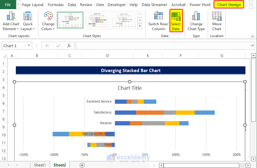
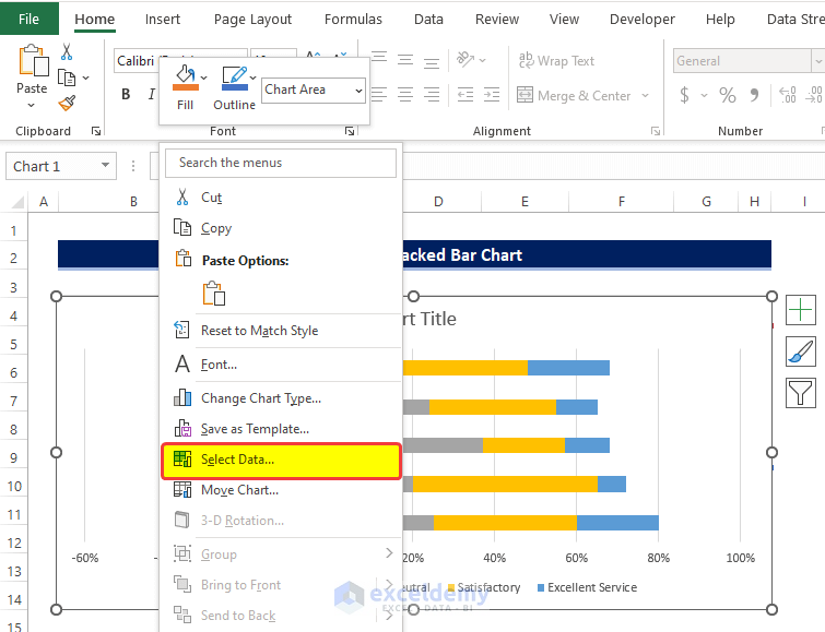
- Click on the chart.
- From Chart Design, click on Select Data.
- In the Select Data Source window, click the Switch Row/Column button.
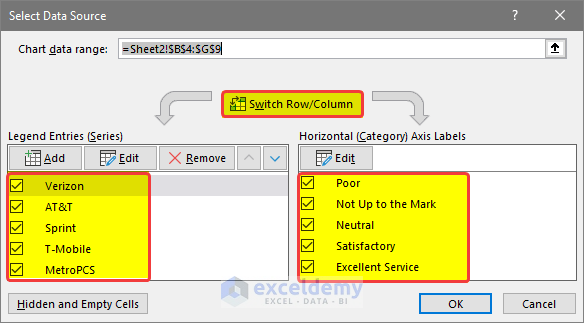
- The Legend Entries are now swapped in the Horizontal Axis Labels.
- Click OK.
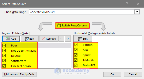
- Each bar now refers to a single provider, but it still needs modifications.
Read More: How to Make a 100 Percent Stacked Bar Chart in Excel
Step 3 – Make Adjustments to Reorder the Legends
- Delete the vertical axis text box.
- Insert a new column C.
- Enter value 0 in the range of cells C5:C9. And place the column header name as Not Up to the Mark.
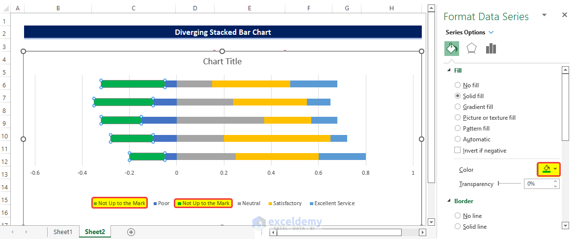
- Click on Select Data after right-clicking on the chart.
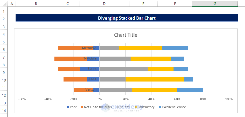
- Move Not up to the Mark to the top of the Legends Entries.
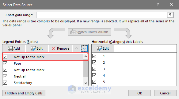
- The newly added Legend now shows in the first position of the chart.
- Adjust the color.
- Right-click on the data series, and from the context menu, click on the Format Data Series.
- From the side panel, click on Color.
- Choose a color that matches the color of the first entry in the legend list.
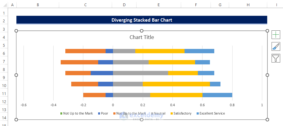
- Delete the original Not Up to the Mark legend entry.
- Click once on the legend to select the Legend.
- Click again on the Not up to Mark Legend to select it.
- Press the Delete button to delete the legend.
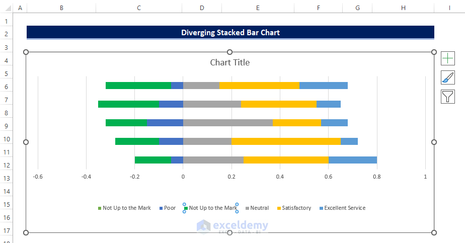
- This puts the values for Not Up to the Mark to the left of Poor.
Note
✎ Dummy values have to be 0, otherwise, it can mess with the existing data.
Read More: How to Create Clustered Stacked Bar Chart in Excel
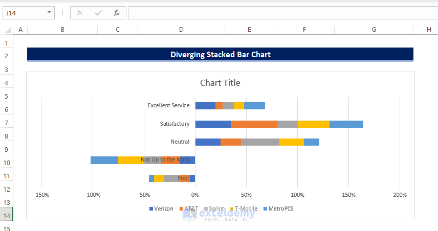
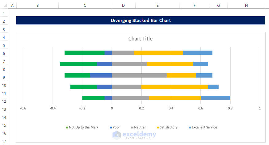
Step 4 – Finalize the Diverging Stacked Bar Chart
- Select the chart.
- From the Format tab, click on the text box option in the Insert Shapes group.
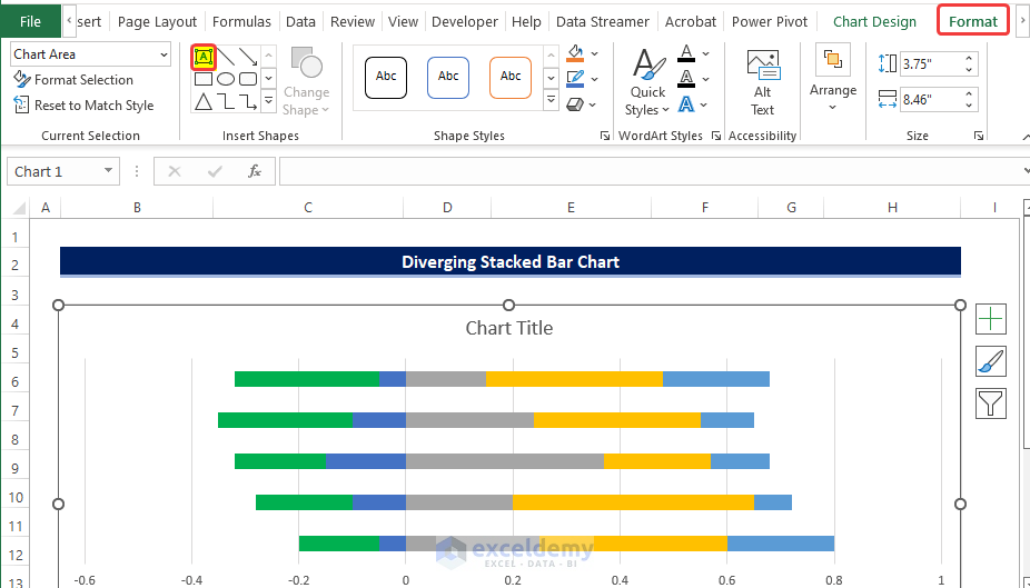
- Draw a box on the side of the chart.
- Input the first entry in the chart.
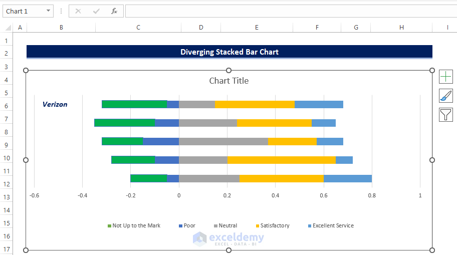
- Repeat the process for the rest of the entries until you get all provider names.
- We also moved the legend to the top of the chart.
Read More: How to Create a Bar Chart in Excel with Multiple Bars
Download the Practice Workbook
Related Articles
- How to Make a Bar Graph in Excel without Numbers
- Excel Chart Bar Width Too Thin
- How to Make a Grouped Bar Chart in Excel
- How to Make a Double Bar Graph in Excel
<< Go Back to Stacked Bar Chart in Excel | Excel Bar Chart | Excel Charts | Learn Excel
Get FREE Advanced Excel Exercises with Solutions!
