What Is a Grouped Bar Chart?
A grouped bar chart is also known as a clustered bar chart. It displays the values of various categories in different time periods, and is useful for representing data after comparing it in multiple categories.
Making a Grouped Bar Chart in Excel
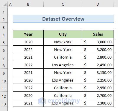
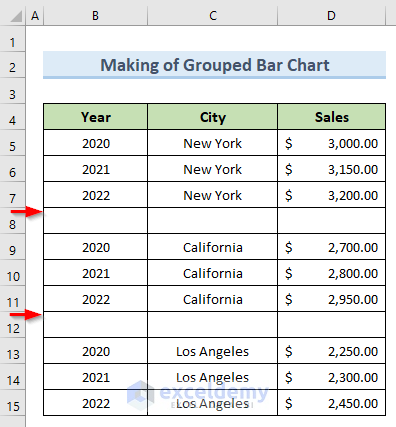
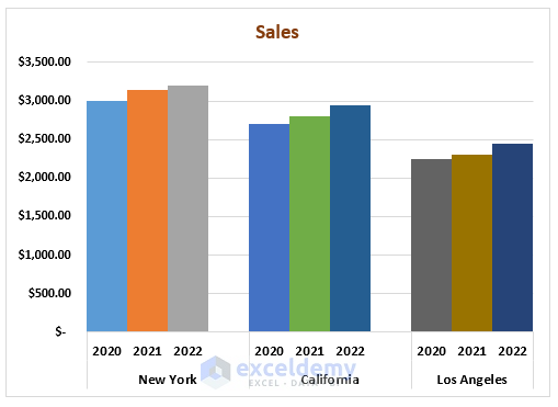
We will use the following dataset to derive our final bar chart.
The dataset contains the value of sales in different cities in particular years. But the data has been recorded randomly. We need to first group the data, then use that grouped data to create our grouped bar chart.
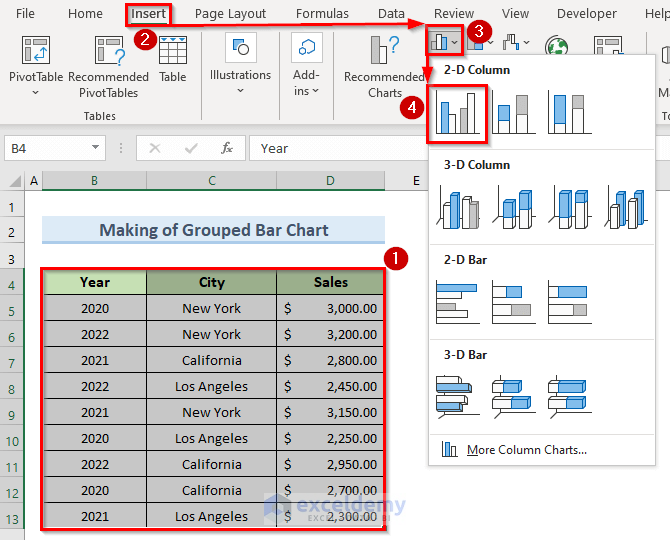
STEP 1 – Insert Clustered Column Chart
- Select the data range (B4:D13).
- Click the Insert tab.
- Select the Clustered Column option from the Chart option.
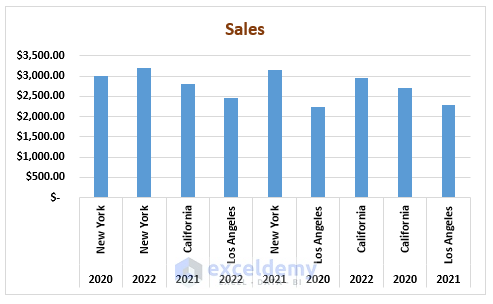
A chart like the following image is created.
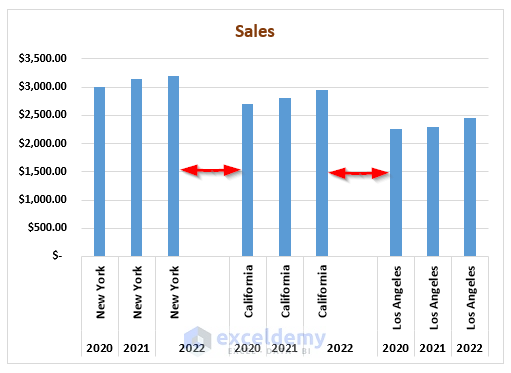
STEP 2 – Modify Chart by Sorting Column Data
To create a grouped bar chart, we need to sort the column data.
- Sort the Year and City columns like the following image.
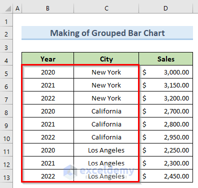
On our chart, the bars are grouped the same way.
Read More: How to Make a Simple Bar Graph in Excel
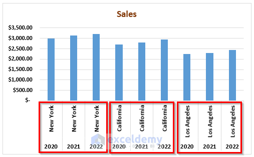
STEP 3 – Group Similar Data Together
Now we will create groups with similar types of data.
- Insert a blank row after each group of data (between the different cities).
On our chart, extra blank spaces between the groups are added too.
- Interchange the Year and City columns.
- Keep only the top City name in each group and delete the others.
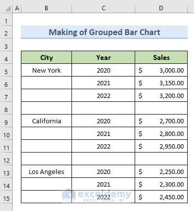
The names of the Cities and Years now appear on the x–axis of our chart.
Read More: How to Create a Bar Chart in Excel with Multiple Bars
STEP 4 – Format Grouped Chart
Let’s apply some formatting to our chart.
- Select the chart and click on the bars.
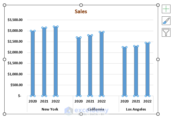
- Press ‘Ctrl + 1’.
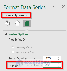
The ‘Format Data Series’ box opens to the right of the chart.
- Set the value of ‘Gap Width’ to 0%, which will combine the bars of the same category in one place.
- Under Fill, check ‘Vary colors by point’.
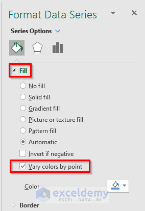
On our chart, bars of the same category are now not only combined, but also in different colors.
Read More: How to Create Clustered Stacked Bar Chart in Excel
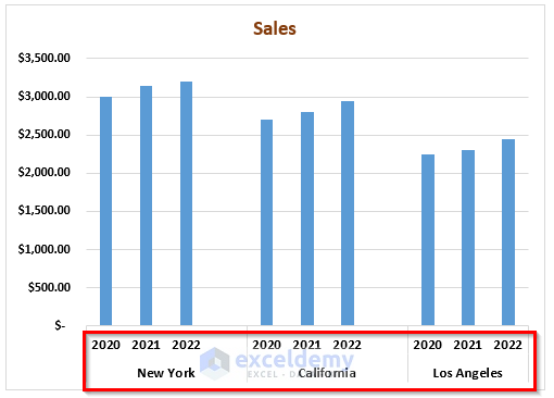
STEP 5 – Convert Clustered Column Chart to Clustered Bar Chart
In the final step, we will convert our clustered column chart into a clustered bar chart.
- Select the chart.
- From the top menu, select Chart Design > Change Chart Type.
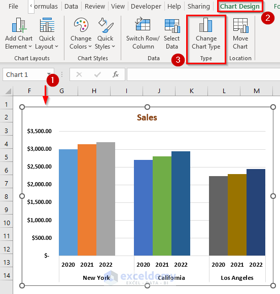
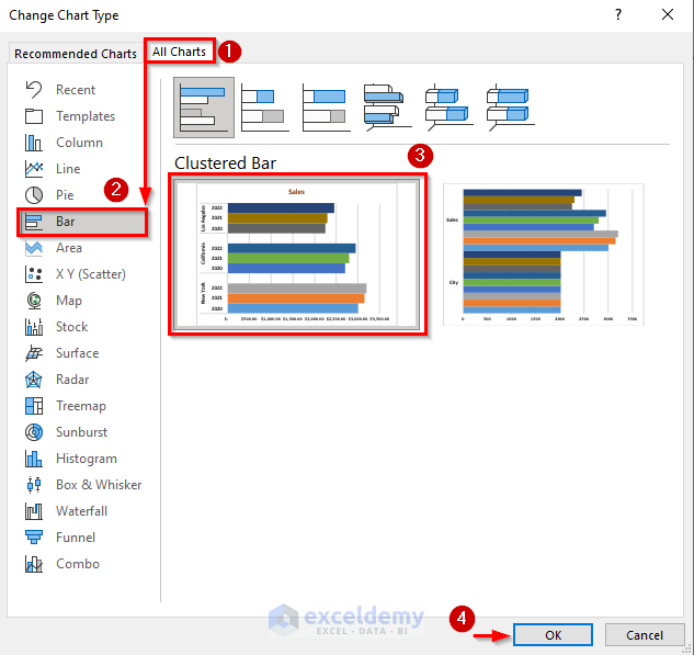
A dialogue box named ‘Change Chart Type’ will appear.
- Click the ‘All Charts’ tab.
- Select chart-type Bar.
- Select the ‘Clustered Bar’ option from the available chart types for Bar.
- Click OK.
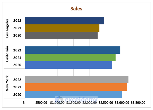
Our clustered column chart is converted into the following clustered bar chart:
Things to Remember
- Charts are the best way to analyze data since graphs portray data more precisely.
- Data must be arranged in a particular order to make a grouped bar chart.
- One can change the chart type after making a grouped bar chart.
- The effectiveness of the grouped bar chart depends on the arrangement of the data.
Download Practice Workbook
Related Articles
- How to Make a Bar Graph in Excel without Numbers
- How to Make a Diverging Stacked Bar Chart in Excel
- How to Make a 100 Percent Stacked Bar Chart in Excel
- Excel Chart Bar Width Too Thin
- How to Make a Double Bar Graph in Excel
<< Go Back to Excel Bar Chart | Excel Charts | Learn Excel
Get FREE Advanced Excel Exercises with Solutions!

what is missin gis the final step: giving all months the same colour within the various groups. Excell wont do that for you….
Hello Joost,
Hope you are doing well. Thank you for your feedback! Applying the same color to all bars in a group might not be ideal if they represent different years or categories. It’s better to use different colors or shades for clarity. This helps in distinguishing the data within the group more effectively. That’s why we avoided same color across the grouped bar chart.
But if it is helpful to you to visualize the bars then you can do it.
As Excel doesn’t automatically apply the same color across the grouped bar chart categories. You can manually adjust the colors by selecting each data series and applying the same color.
Follow the steps to do so:
1. Click on one of the bars you want to change.
2. Right-click and select Format Data Series.
3. Choose Fill and pick your desired color.
Repeat for each data series to maintain consistent coloring across all groups.
Regards
ExcelDemy
You have similar years across categories — these definitely should be the same color – otherwise, color is not doing anything to help decode the information and could be left out completely.
Hello PeterK,
Thank you for the feedback. I completely agree that consistent coloring can improve clarity. To elaborate, here’s a step-by-step guide on how to ensure the same color is applied to similar years across categories in a grouped bar chart in Excel:
Select a Data Series: Click on one of the bars representing a specific year.
Open the Format Pane: Right-click the selected bar and choose “Format Data Series” from the context menu.
Choose Fill Options: In the Format Data Series pane, navigate to the “Fill” section and select “Solid fill.”
Set the Color: Choose the specific color you want to use for that year.
Repeat for All Bars: Apply these steps to every bar representing that year across all categories, ensuring you use the same color each time.
Verify Consistency: Once completed, double-check that all bars corresponding to the same year have identical colors, which will help viewers easily decode the chart.
Using these steps, the color will serve as an effective visual cue, aiding in a quicker and more accurate interpretation of the data.
Regards
ExcelDemy