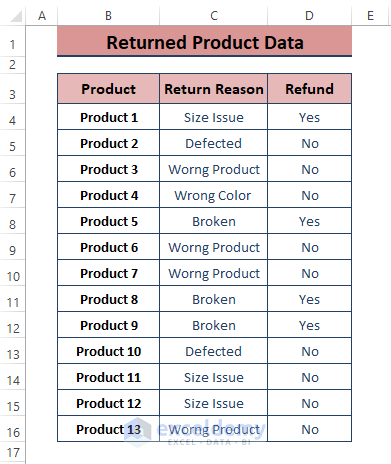
The dataset showcases products that were returned for different reasons and the Refund Status (set to Yes or No).
To create a Bar Graph using this data:
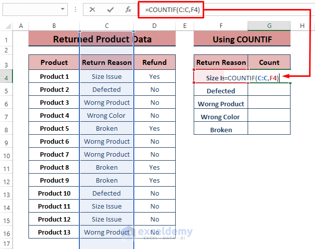
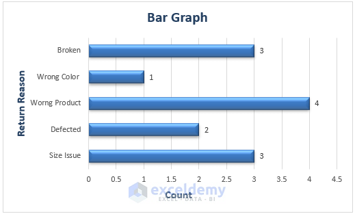
Method 1 – Applying the COUNTIF Function to create a Bar Graph without Numbers
Step 1:
- Enter the following formula in G4.
=COUNTIF(C:C,F4)In the formula, C:C is the range and F4 is the criteria.
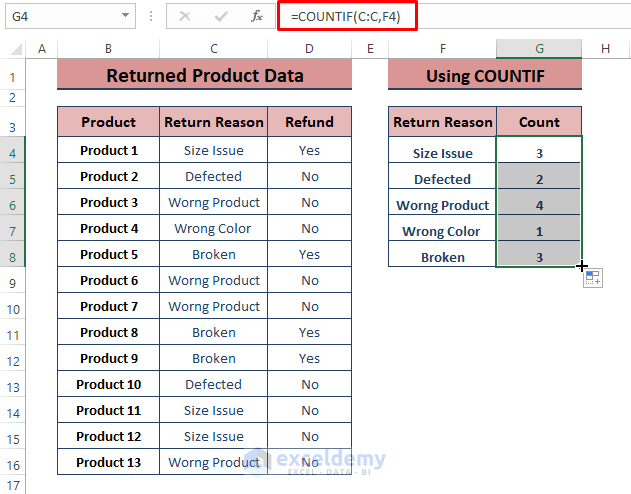
Step 2:
- Press ENTER and drag the Fill Handle to apply the formula to the other cells.
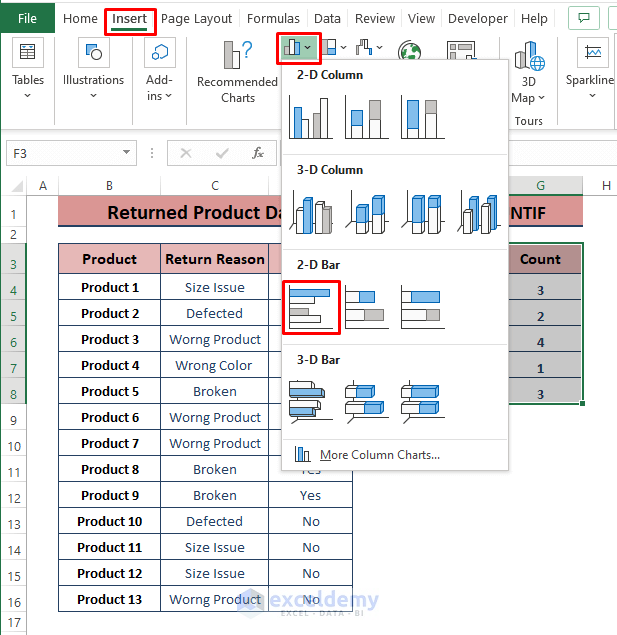
- Select the range, go to the Insert tab > Click Insert Column or Bar Chart (in Charts) > Click a Bar Chart type.
A Bar Chart is displayed. Format the Chart.
Read More: How to Make a Simple Bar Graph in Excel
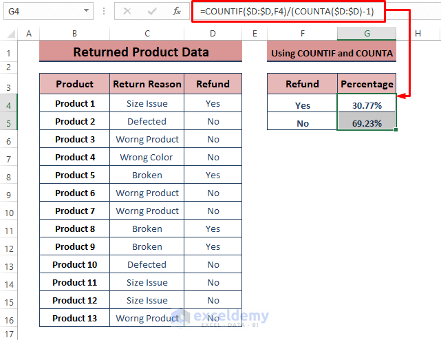
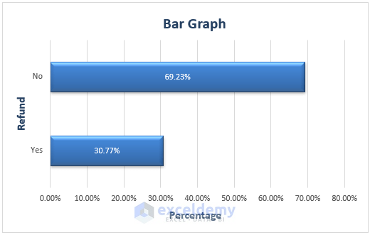
Method 2 – Combining Functions to Create a Bar Graph without Numbers
Find the Percentage of the Refund Status.
Step 1:
- Use the formula in G4. Drag down the Fill Handle to see the result in the rest of the cells.
=COUNTIF($D:$D,F4)/(COUNTA($D:$D)-1)the COUNTIF function returns the Refund Status occurrences and COUNTA the non-numeric entries, except the column header.
Step 2:
- Follow Step 3 in Method 1 to insert a bar chart.
Read More: How to Create a Bar Chart in Excel with Multiple Bars
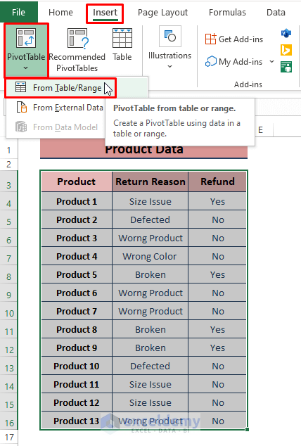
Method 3 – Using a PivotTable to Create a Bar Graph Using Non-numerical Data
Step 1:
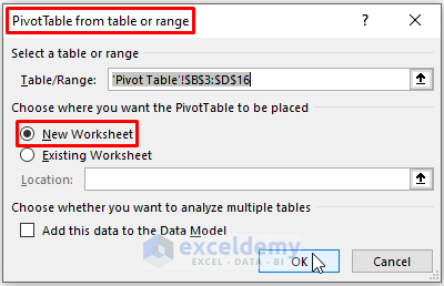
- Select the range and go to Insert > Click PivotTable (in Tables) > Click From Table/Range.
Step 2:
- In the PivotTable from table or range dialog box, check New Worksheet in Choose where you want the PivotTable to be placed > Click OK.
Step 3:
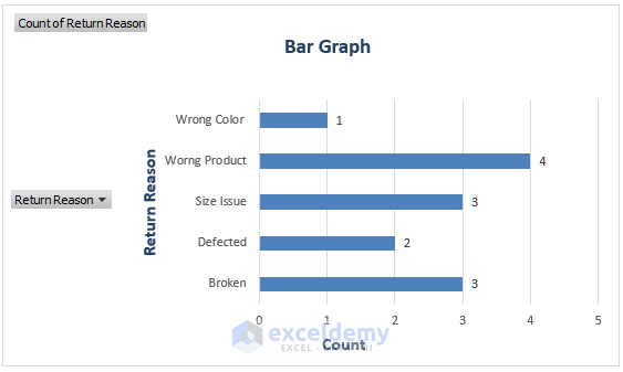
- In the PivotTable Fields window, check Refund Reason or Refund in Choose fields to add to report > Place the fields as shown in the below.
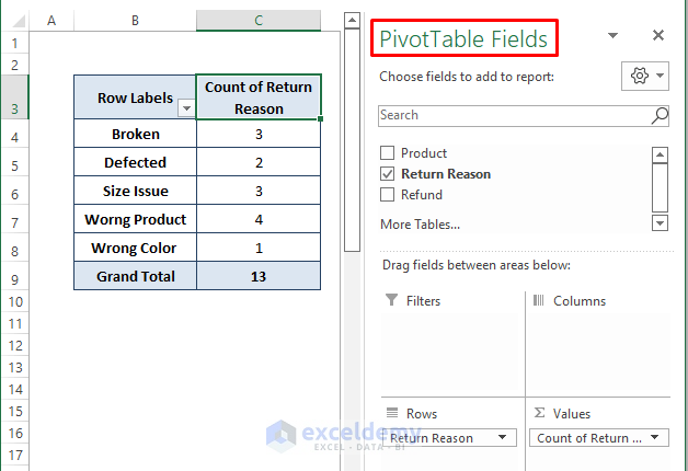
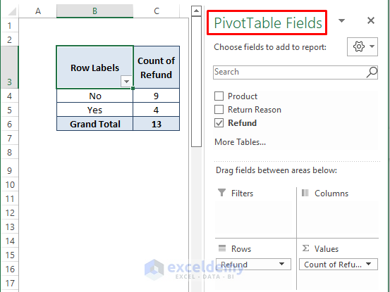
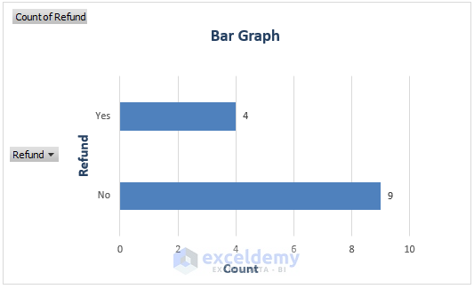
If you check Refund, the field placements are:
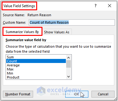
To display the Count:
Step 1:
- Click the Arrow Sign beside Values.
- Click Value Field Settings.
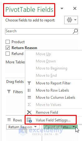
Step 2:
- Select Summarize Value By > choose Count > Click OK.
- Repeat Step 3 of Method 1.
The bar graph is displayed.
This is the bar graph of the refund status:
Read More: How to Make a Grouped Bar Chart in Excel
Download Excel Workbook
Related Articles
- How to Make a Diverging Stacked Bar Chart in Excel
- How to Make a 100 Percent Stacked Bar Chart in Excel
- How to Create Clustered Stacked Bar Chart in Excel
- Excel Chart Bar Width Too Thin
- How to Make a Double Bar Graph in Excel
<< Go Back to Excel Bar Chart | Excel Charts | Learn Excel
Get FREE Advanced Excel Exercises with Solutions!
