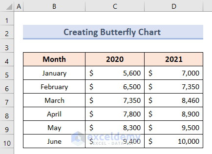
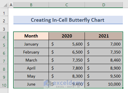
Dataset Overview
We’ll use the following dataset, representing the values of half-yearly sales in the years 2020 and 2021 of a company, to demonstrate these methods:
Method 1 – Using Padding Columns
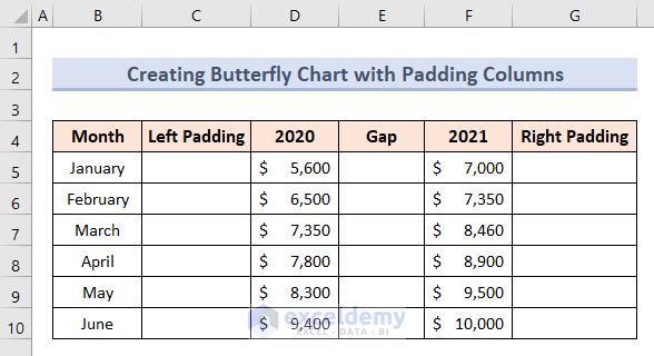
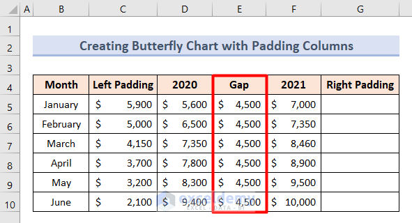
Step 1 – Insert Padding Columns from the Dataset
- Add three new columns next to the existing columns for Month, 2020, and 2021.
- Name these new columns as Left Padding, Gap, and Right Padding.
- In cell C5, enter the formula:
=11500-D5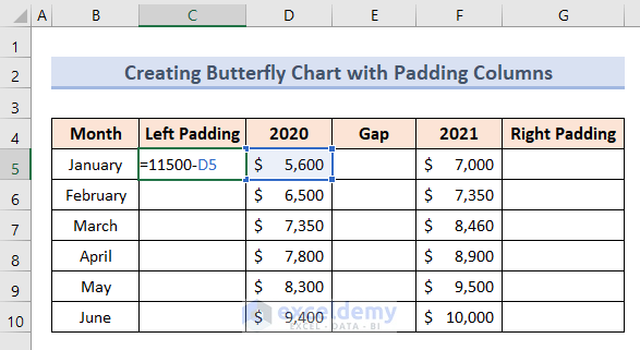
We are using the value of 11,500 because it is greater than the highest value of this dataset.
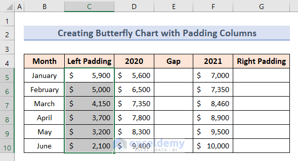
- Press Enter.
- Drag the formula down from cell C5 to fill the range C6:C10.
- In cell range E5:E10, input the value $4,500 as the Gap.
- In cell G5, insert the formula:
=11500-F5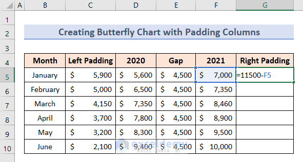
- Press Enter.
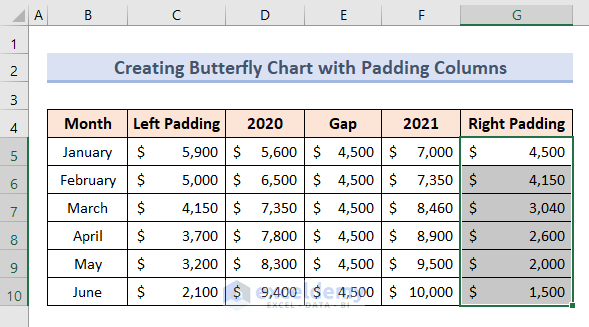
- Autofill the formula down in cell range G6:G10.
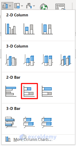
Step 2 – Create the Initial Bar Chart
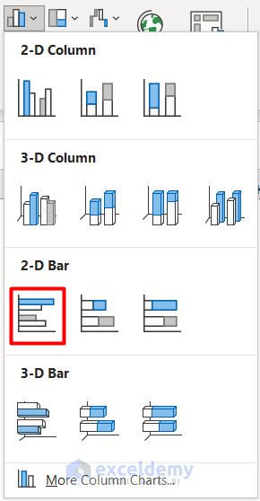
- Go to the Insert tab and select Bar Chart.
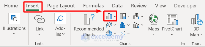
- Choose Stacked Bar from the drop-down menu to create the initial bar chart.
- The initial bar chart will be displayed.
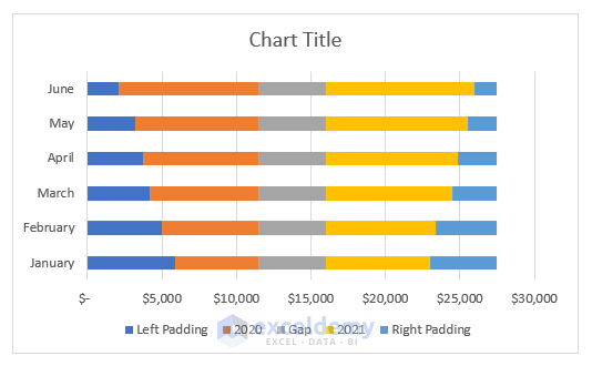
Step 3 – Format the Chart to Create the Butterfly Chart
- Right-click on the Left Padding bar and select No Fill.
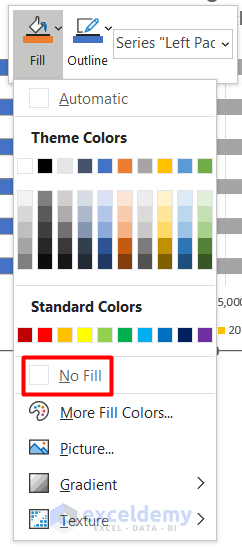
- Apply the same to the Gap and Right Padding bars.
- Remove the names of the padding columns from the legend.
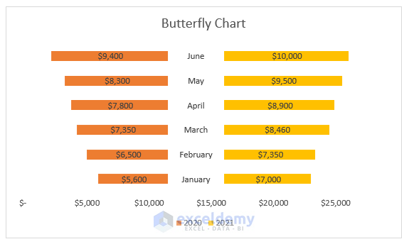
- The chart looks like this:
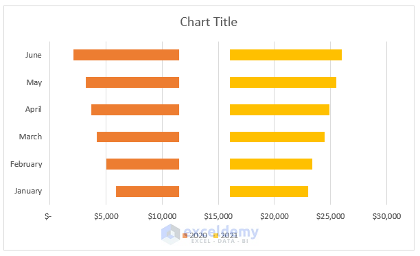
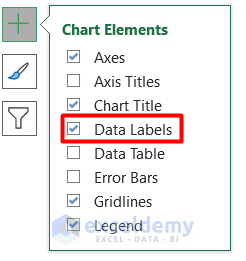
- Enable data labels in the Chart Elements section.
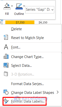
- Right-click on the middle bar and choose Format Data Labels.
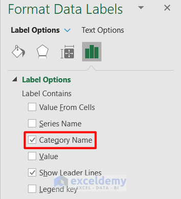
- Select Category Name and deselect Value from the Label Options.
- Remove the values from the left and right padding columns.
- Delete the vertical axis and format the horizontal axis.
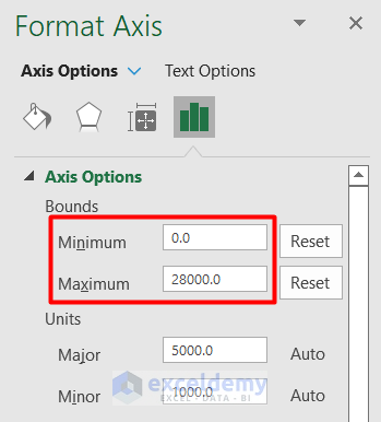
- Set the maximum value to 28,000 or an appropriate logical value based on your dataset.
- Now you have your butterfly chart ready based on the dataset.
Method 2 – Creating a Butterfly Chart by Formatting Axes in Excel
In this method, we will create a butterfly chart working on the axes. Let’s follow the steps below:
Step 1 – Insert Primary Bar Chart
- Select the cell range B4:D10.
- Go to the Insert tab and choose Bar Chart.

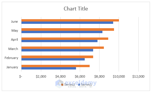
- Select Clustered Bar to create the initial bar chart.
- The initial bar chart looks like this:
Step 2 – Format Bar Chart Axes
Let’s format the axes of the chart we made.
- Right-click on the blue bars and select Format Data Series.
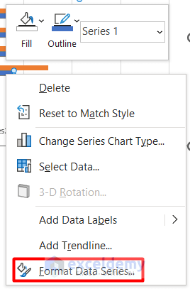
- Enable the Secondary Axis option.
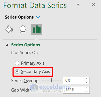
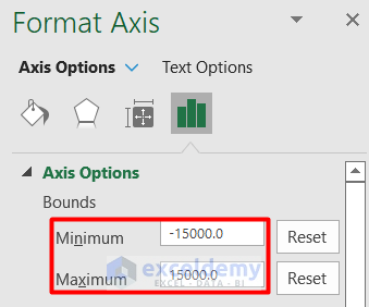
- Set the bounds value for the secondary axis based on your dataset.
- Check Values in reverse order.
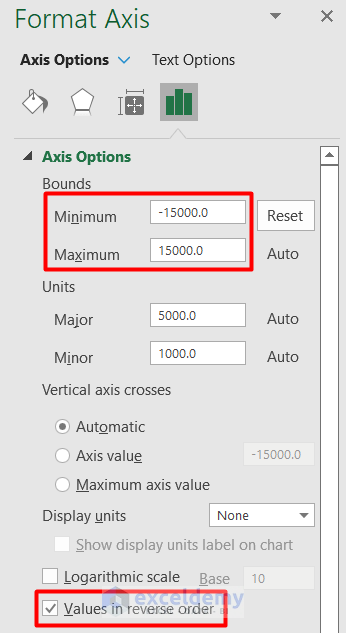
- Adjust the scale for the primary axis.
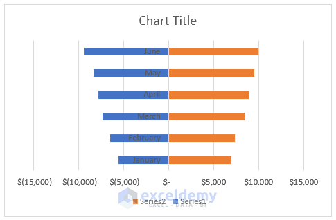
- Remove the secondary axis, resulting in the modified chart.
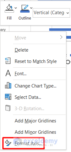
Step 3 – Edit Bars to Create the Butterfly Chart
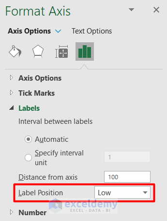
- Right-click on the vertical axis and choose Format Axis.
- Set the label position to Low.
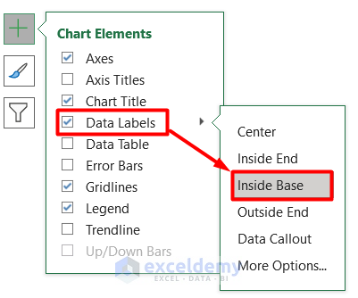
- Activate data labels and position them Inside Base.
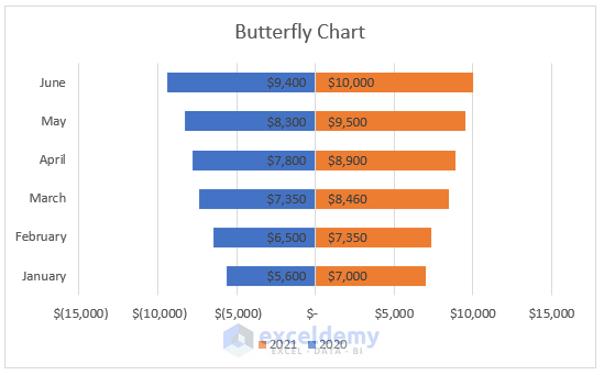
- You have your butterfly chart.
Read More: How to Create Overlapping Bar Chart in Excel
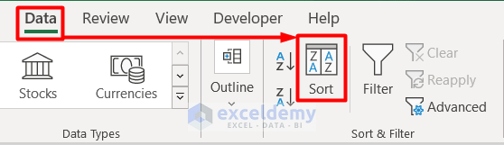
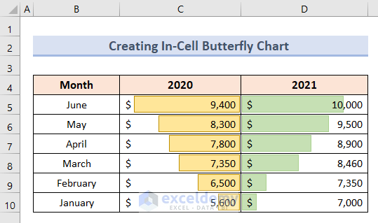
How to Create an In-Cell Butterfly Chart in Excel
If you want the butterfly chart within your dataset, follow these steps:
- Select cell range B4:D10.
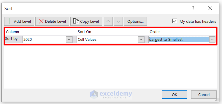
- Go to the Data tab and click Sort under the Sort & Filter group.
- Modify the column order as needed.
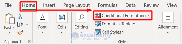
- Select cell range C5:C10.
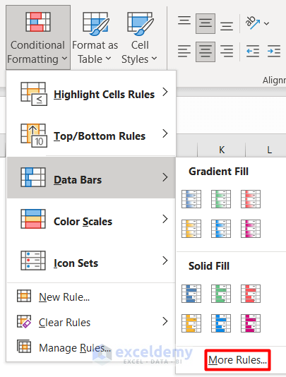
- Go to the Home tab and click on Conditional Formatting.
- Choose Data Bars and then More Rules.
- Adjust the type and value based on the selected cells.
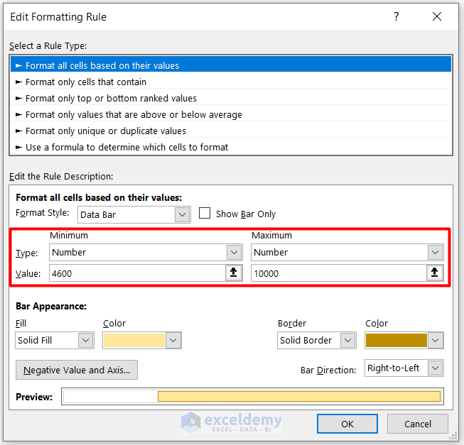
- Customize the bar appearance and set the direction to Right-to-Left.
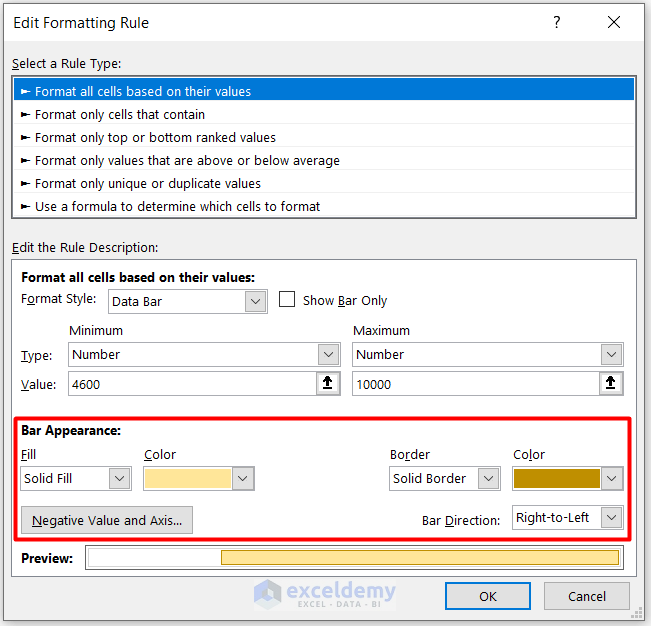
- You have your first set of bars in the dataset.
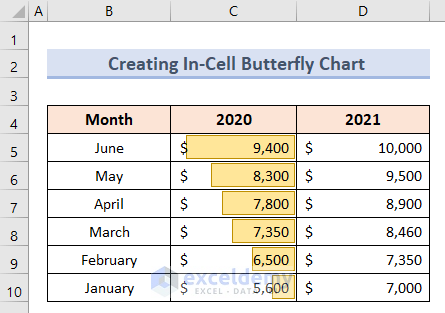
- Repeat for Cell Range D5:D10:
- Apply the same procedure but set the bar direction to Left-to-Right.
Read More: How to Create a Radial Bar Chart in Excel
Things to Remember
- Organize your dataset in descending order for the proper butterfly chart shape.
- Ensure consistent formatting for the values.
- A butterfly chart involves only two variables.
Download Practice Workbook
You can download the practice workbook from here:
Related Articles
- How to Show Variance in Excel Bar Chart
- How to Create a Bar Chart with Standard Deviation in Excel
- How to Flip Bar Chart in Excel
- How to Create Construction Bar Chart in Excel
- How to Create a 3D Bar Chart in Excel
<< Go Back to Excel Bar Chart | Excel Charts | Learn Excel
Get FREE Advanced Excel Exercises with Solutions!
