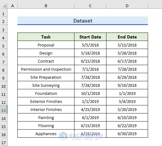
Step 1 – Prepare the Dataset
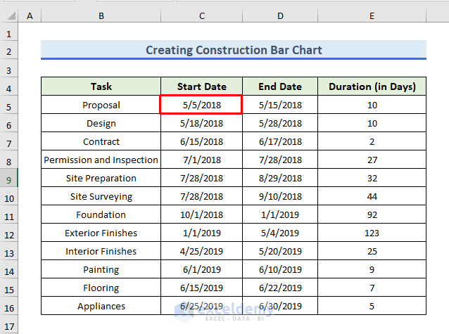
The dataset needs to contain the task schedule of a project.
- Column B contains the various tasks.
- Column C indicates the Start Date of each task.
- Column D carries the End Date of each task of the project.
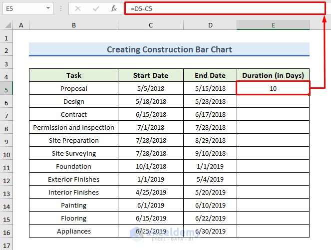
- Use column E to calculate the duration of each task.
- Insert the following formula in the E5 cell:
=D5-C5
- Click Enter to see the duration of the task.
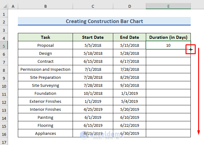
- Drag down the formula with the Fill Handle tool in the E6 to E16 range.
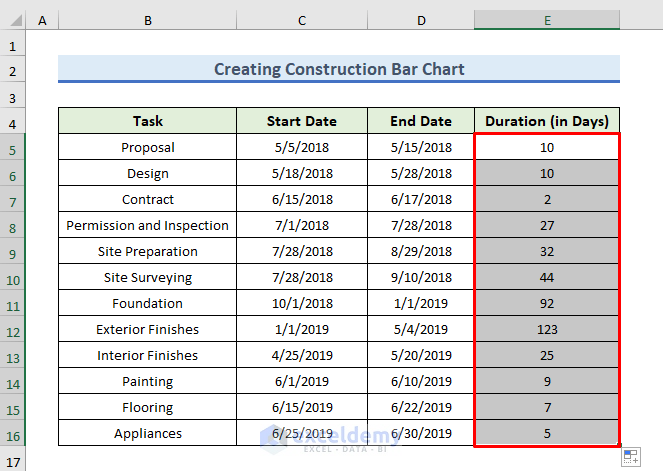
- Here are all task durations of this project.
Read More: How to Make a Simple Bar Graph in Excel
STEP 2 – Insert the Construction Bar Chart
Part 2.1 – Insert a Bar Chart
- Select the C4:C16 range.
- Go to the Insert tab.
- In the Charts group of the ribbon, go to the Insert Column or Bar Chart selection menu.
- Select the Stacked Bar icon (second option) in the 2-D Bar group.
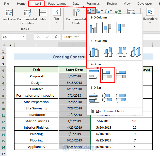
- This creates a stacked bar chart, but it’s not displaying the correct information.
Read More: How to Flip Bar Chart in Excel
Part 2.2 – Add Durations to the Bar Chart
- Right-click on the chart. A dialog box will pop up.
- Click on the Select Data option.
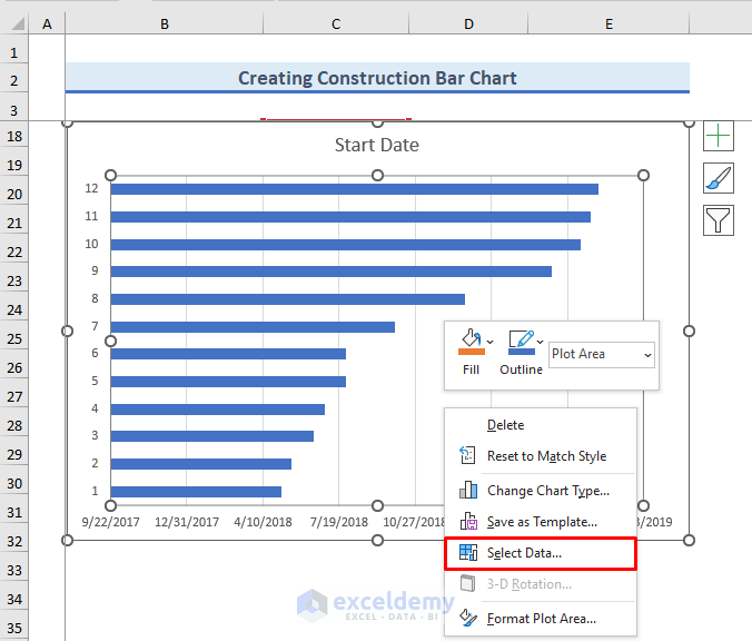
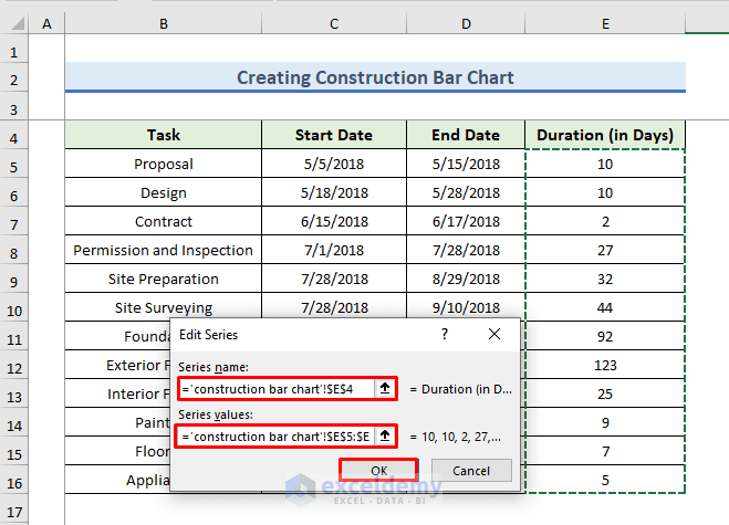
- The Select Data Source window will pop out. In the Legend Entries (Series) field, click on the Add button.
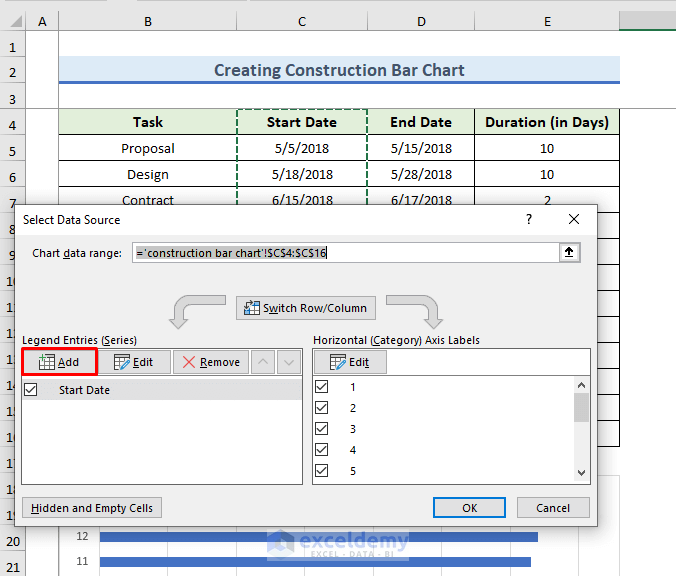
- In the Edit Series dialog, insert the header and then the data.
- In the Series Name field, click on the box and select the E4 cell.
- In the Series Values field, select E5:E16 after clicking in the box.
- Press OK.
Read More: How to Create a Bar Chart in Excel with Multiple Bars
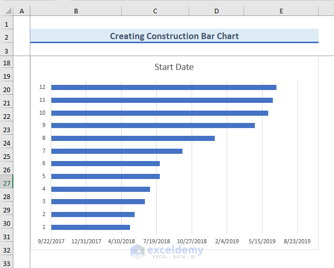
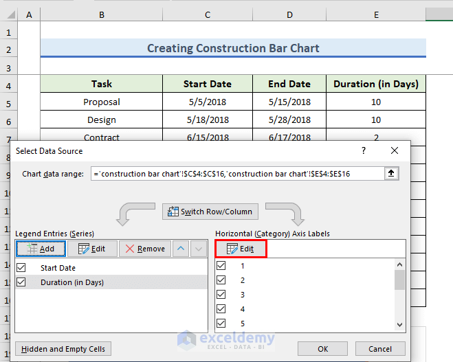
Part 2.3 – Put Axis Labels in Bar Chart
- Under the Horizontal(Category) Axis Labels field, click on the Edit button.
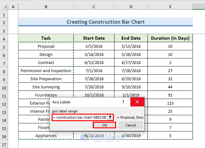
- The Axis Labels dialog box will appear. In the Axis Label Range field, insert =’construction bar chart’!$B$5:$B$16 or select the range in the B column.
- Press OK.
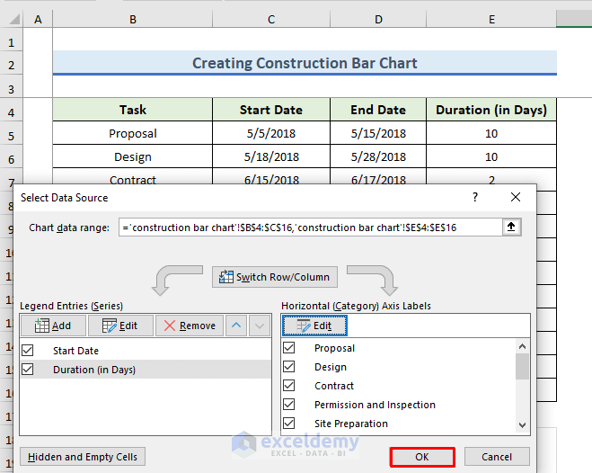
- Click on OK to apply the changes.
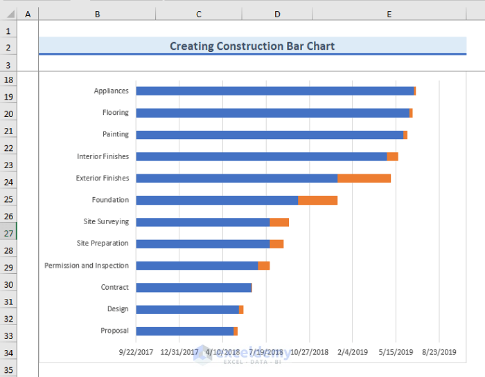
- Here’s how the chart looks with durations inserted.
Read More: How to Create a 3D Bar Chart in Excel
Part 2.4 – Convert the Bar Chart into a Construction Bar Chart
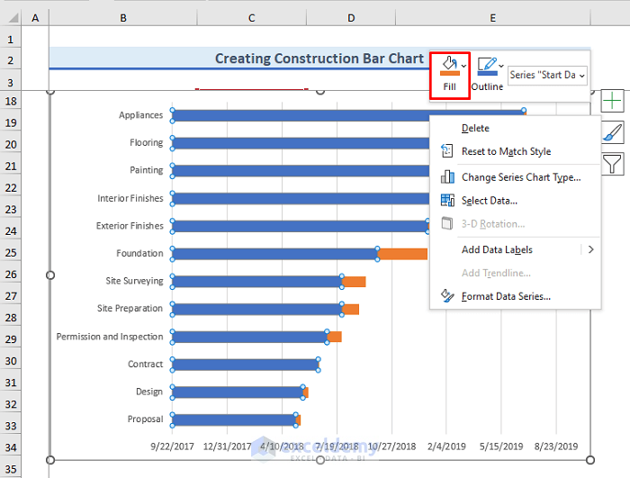
- Click on any of the blue bars of the chart.
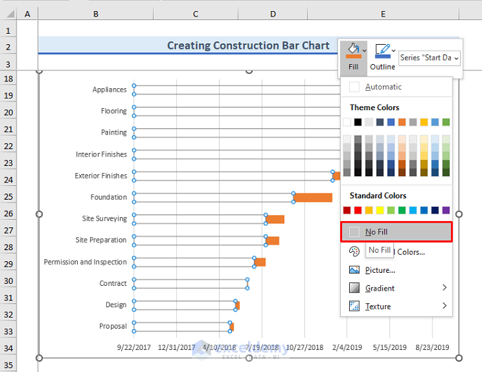
- Right-click and select the drop-down menu of the Fill option.
- Check the No Fill option.
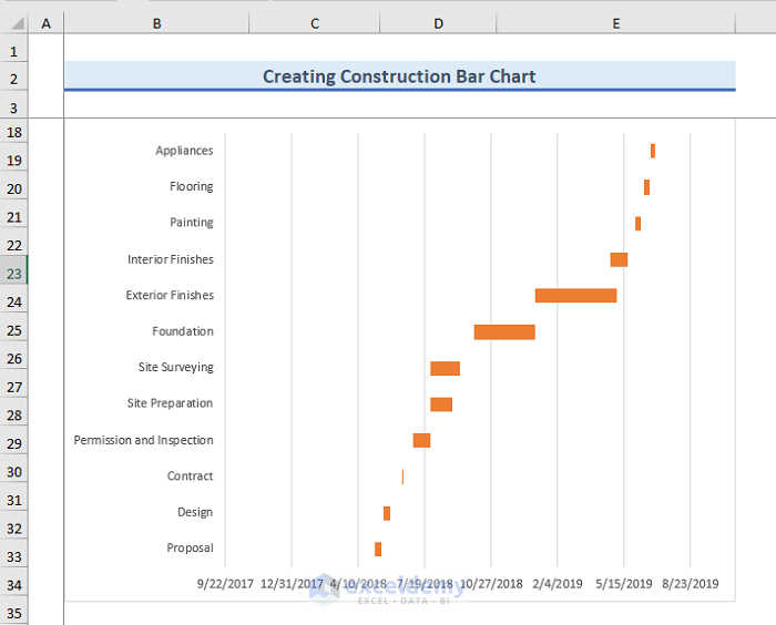
- Your Construction Bar Chart will look like this.
Read More: How to Create Overlapping Bar Chart in Excel
Step 3 – Format the Construction Bar Chart
Part 3.1 – Fix the Sequence
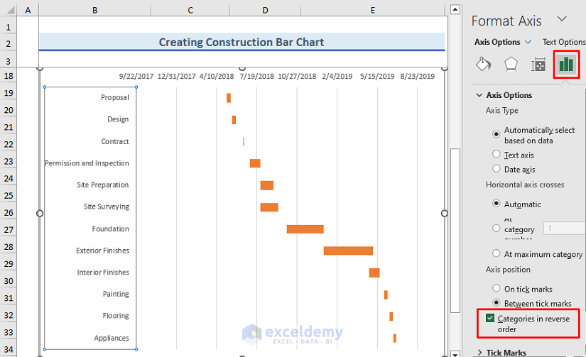
In the current Construction Bar Chart, tasks are listed in reverse. The last task is on top of the chart and the first task is at the bottom.
- Double-click on the vertical axis.
- On the right side of the Excel Sheet, the Format Axis window will open up.
- Select the Axis Options icon.
- Under the Axis Position header, check Categories in reverse order.
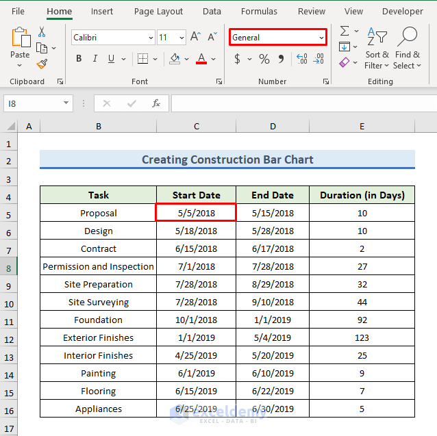
Part 3.2 – Format the Axis Label
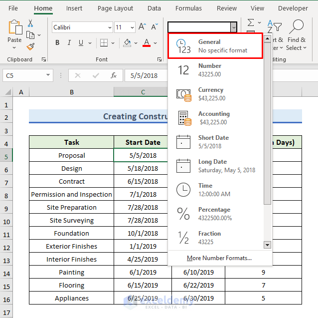
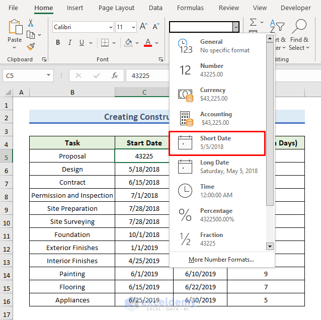
- Select the C5 cell and click on the drop-down menu of the Number Format in the Number group.
- Select General from the menu.
- The date format is converted to the number format. This is our minimum range of the horizontal axis.
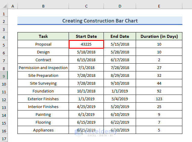
- We have remembered the lower range.
- Reconvert the number into the date format. Select the cell and click on the drop-down menu of the Number Format in the Number group. Select Short Date.
- Do the same for the C16 cell and remember the maximum range.
- Click on the horizontal axis and right-click on it.
- Select Format Axis from the context menu.
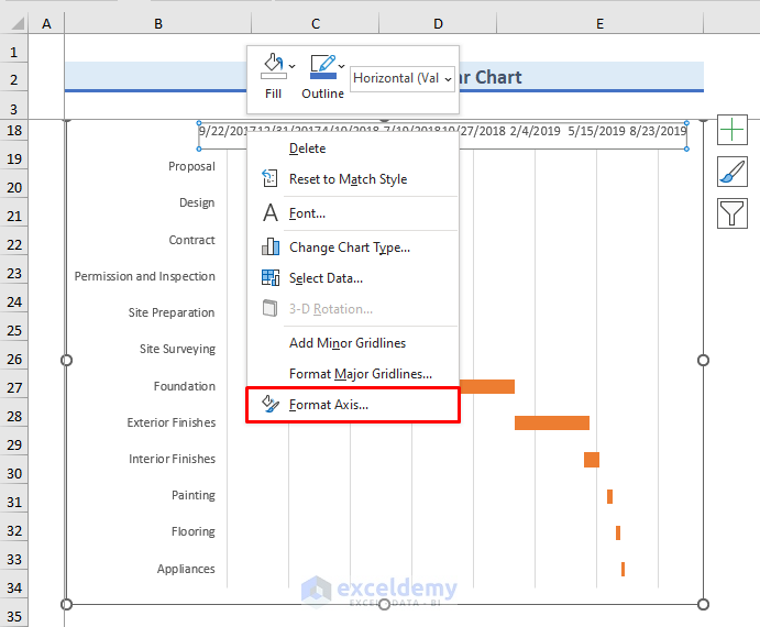
- The Format Axis window opens on the right of the Excel Sheet.
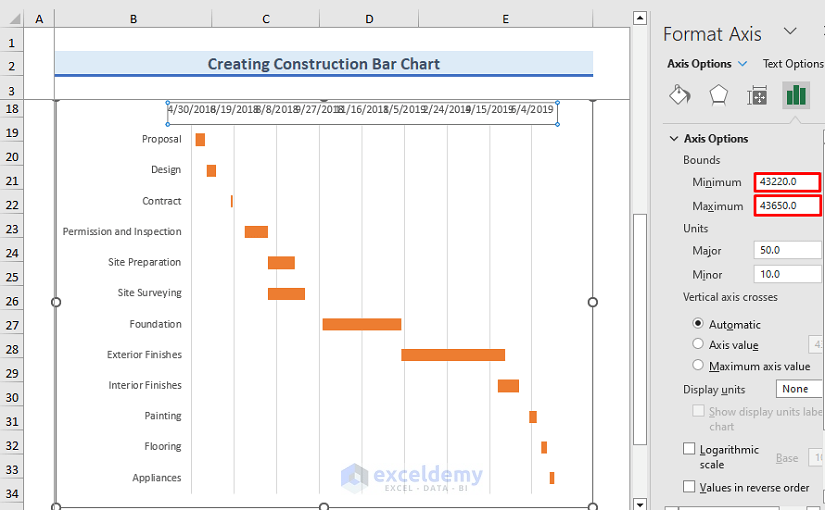
- Under the Axis Options header, you can see boxes for declaring the minimum and maximum bounds.
- We have set 43220 and 43650 as the minimum and maximum range, since those are the converted date values from the dataset.
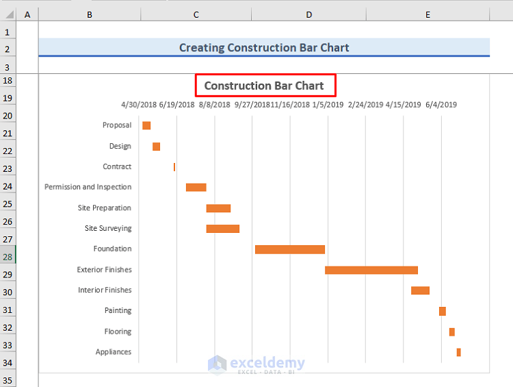
- Our chart will look like the following figure.
Read More: How to Create a Radial Bar Chart in Excel
Part 3.3 – Insert the Chart Title
- Click on the chart and press the (+) icon at the top right.
- Check Chart Title.
- A title will appear on the top.
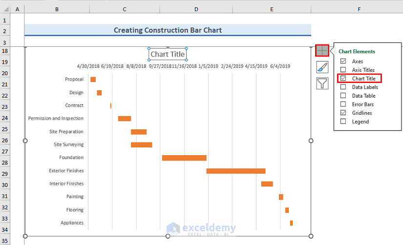
- Double-click on the Chart Title and type in a title. We have given our chart title Construction Bar Chart.
Read More: How to Create Butterfly Chart in Excel
Part 3.4 – Change the Chart Style
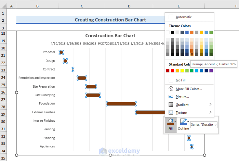
- To change the color, click on any bar of the chart.
- Right-click and select the drop-down menu of the Fill icon.
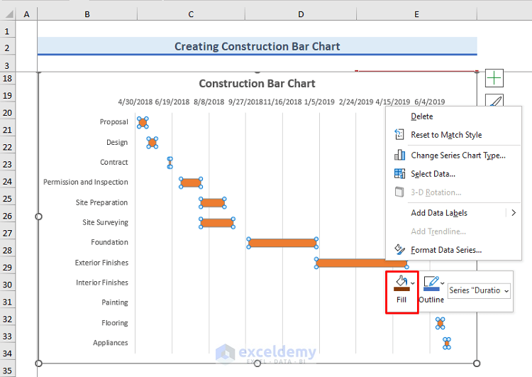
- You can select any color. We have selected a shade of brown (technically, dark orange).
Read More: How to Change Bar Chart Color Based on Category in Excel
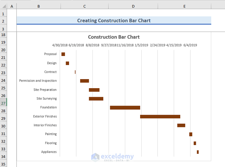
Final Output
- We have successfully created a Construction Bar Chart in Excel.
Download the Practice Workbook
Related Articles
<< Go Back to Excel Bar Chart | Excel Charts | Learn Excel
Get FREE Advanced Excel Exercises with Solutions!

Excellent Explanation. You should Keep your good work doing.
Hello Rajkapoor,
Thanks for your appreciation and you are most welcome.
Regards
ExcelDemy