Method 1 – Insertion of Chart Using Dataset to Make a Double Bar Graph
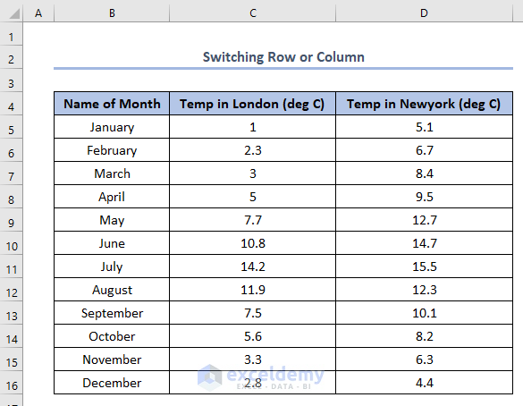
We need to make the double bar graph of the following dataset.
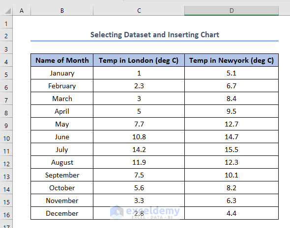
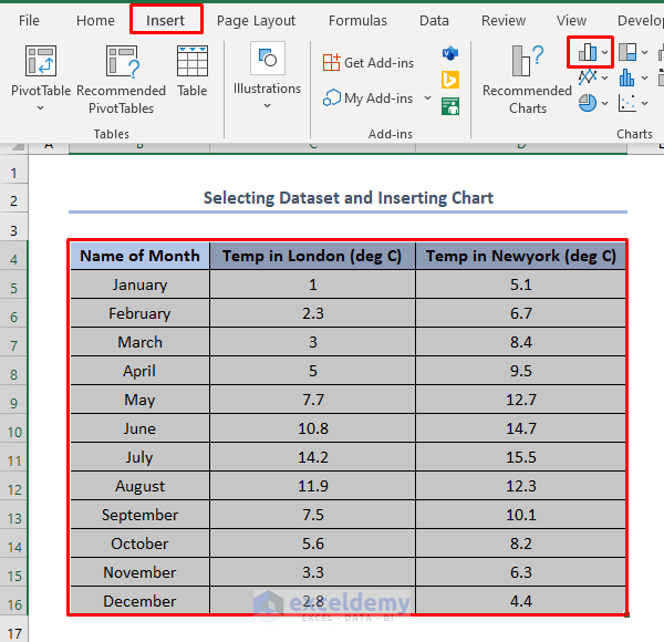
Select the whole dataset depending on which parts need to be included in the bar.
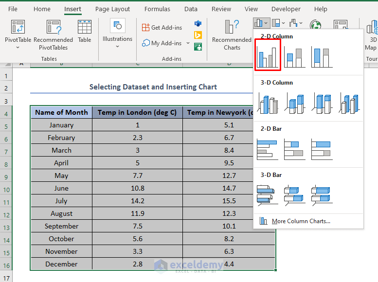
Go to the Insert tab > and choose Insert Column or Bar Chart from the Charts group.
Select the option 2-D Clustered Column shown in the picture below.
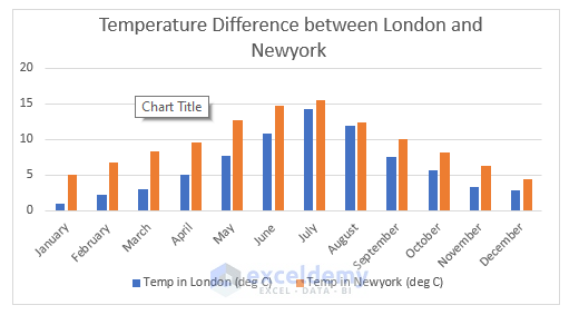
Get the double bar graph as output like this.
The orange color legend is Temp in New York ( deg C) and the blue color legend is Temp In London ( deg C).
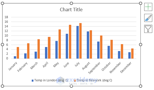
Change the chart title according to the requirement. There is a Temperature Difference between London and New York.
Method 2 – Switch Row/Column
We can also change the double bar column to show the two different temperature data differently but not stuck together. We need to apply that in the following dataset.
Select the chart > click on the Chart Design tab > choose the option Switch Row/Column.

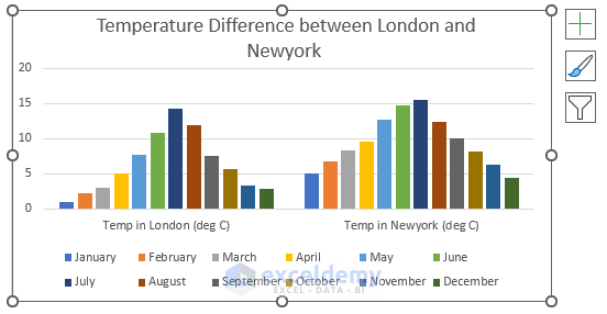
Get the double bar chart like this. Temp in London ( deg C) and Temp in Newyork ( deg C) are shown differently.
Legends are mainly the month’s name.
Things to Remember
When we need to compare data within the same type we need to switch row/column. Here, by switching row/column we have mainly made a bar graph where temperatures in different months in London or New York are compared individually.
Download Practice Workbook
Related Articles
- How to Make a Bar Graph in Excel without Numbers
- How to Make a Diverging Stacked Bar Chart in Excel
- How to Make a 100 Percent Stacked Bar Chart in Excel
- How to Create Clustered Stacked Bar Chart in Excel
- Excel Chart Bar Width Too Thin
- How to Create a Bar Chart in Excel with Multiple Bars
<< Go Back to Excel Bar Chart | Excel Charts | Learn Excel
Get FREE Advanced Excel Exercises with Solutions!
