Method 1 – Using the Insert Chart Feature to Create a Bar Chart with Multiple Bars
Step 1 – Inserting a 3-D Clustered Bar Chart
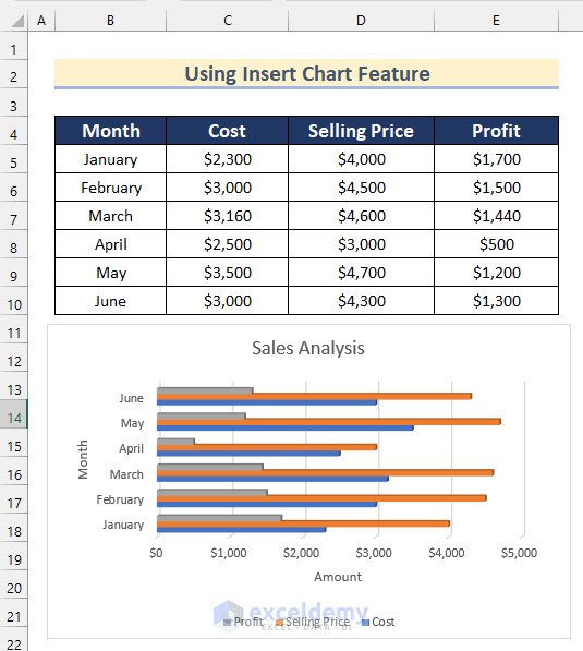
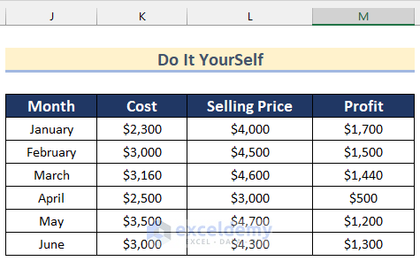
We have a dataset containing the Month, Cost, Selling Price, and Profit of a store.
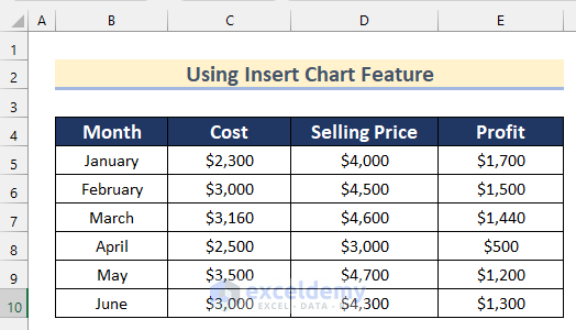
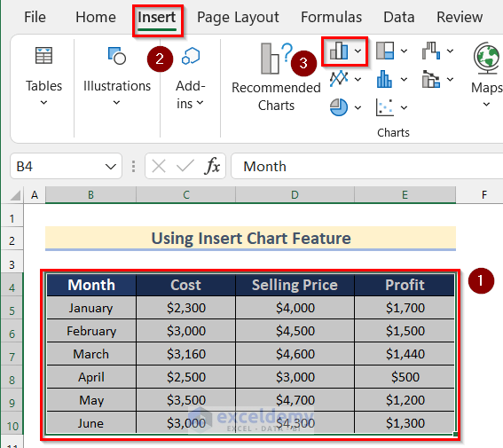
- Select the cell range B4:E10.
- Go to the Insert tab and click on Insert Bar Chart.
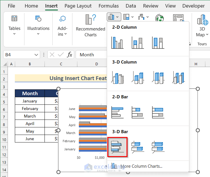
- Select 3-D Clustered Bar.
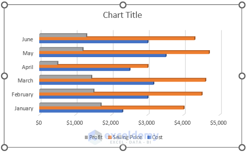
- You will get a Clustered Bar Chart.
Step 2 – Formatting the Bar Chart
- Click on the Chart Title box to change the chart title.
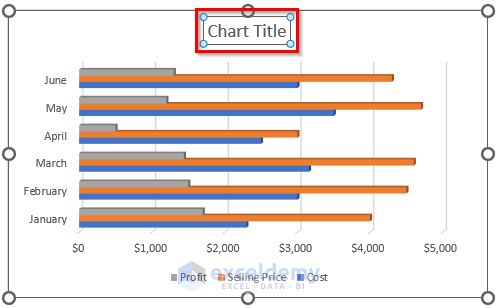
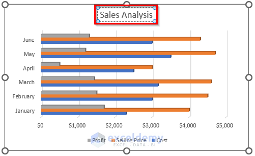
- Type Sales Analysis as the chart title.
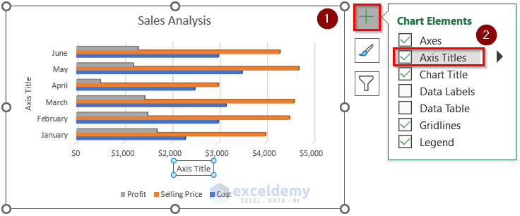
- Click on the “+” sign to open Chart Elements.
- Turn on Axis Titles.
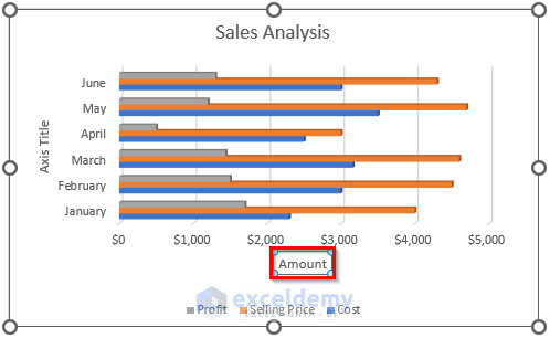
- Click on the x Axis Title to change it.

- Type Amount as Axis Title.
- Click on the y Axis Title to change it.
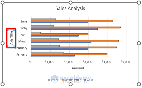
- Type Month as the Axis Title.
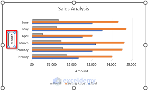
- You will get your desired bar chart with multiple bars in Excel using the Insert Chart Feature.
Read More: How to Make a Simple Bar Graph in Excel
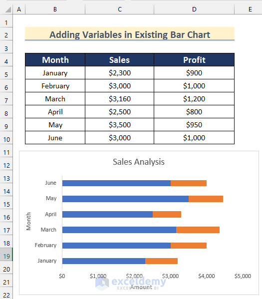
Method 2 – Adding Variables in an Existing Bar Chart in Excel
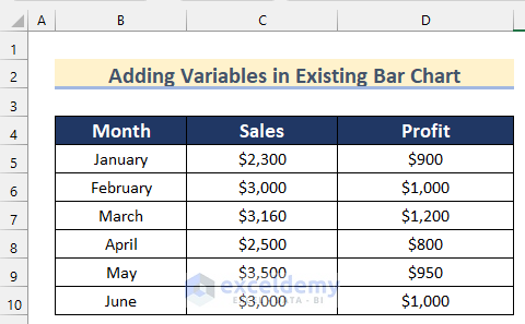
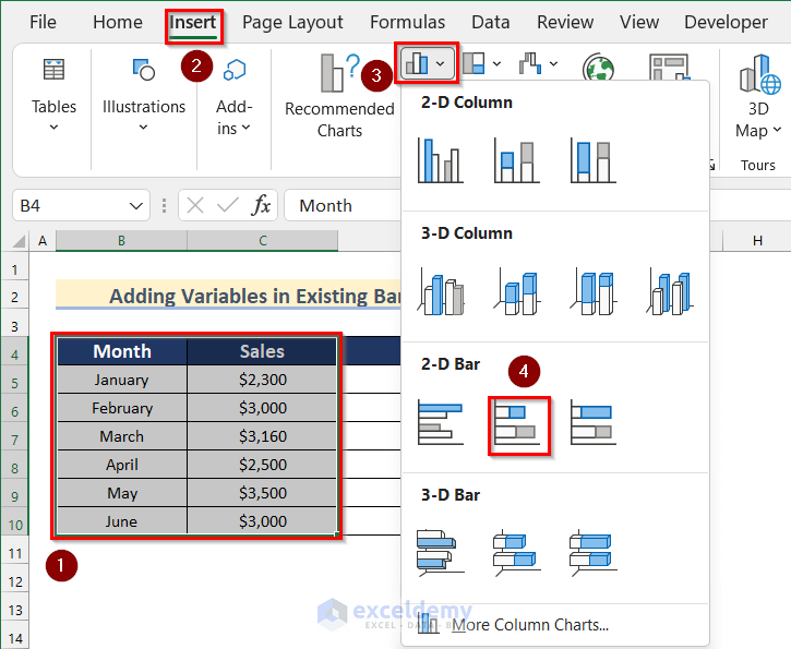
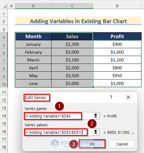
We have a dataset containing the Month, Sales, and Profit of a store.
Steps:
- Select the cell range B4:C10.
- Go to the Insert tab and click on Insert Bar Chart, then select 2-D Stacked Bar.
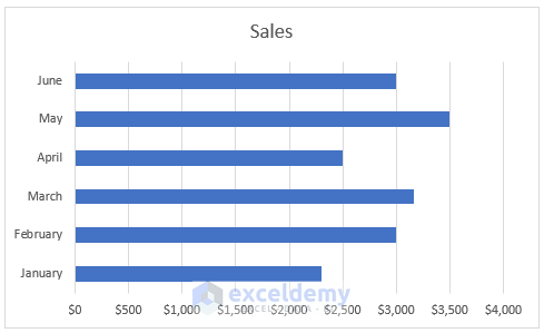
- You will get a Bar Chart like the image given below.
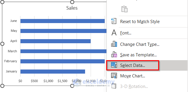
- Select the Bar Chart and Right-click.
- Click on Select Data.
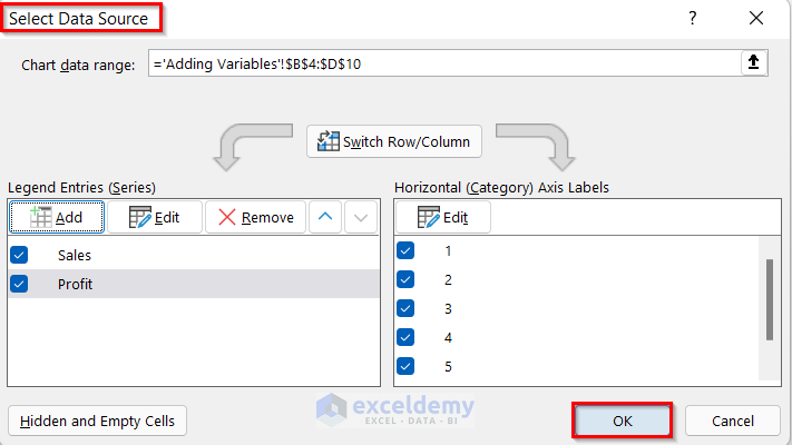
- The Select Data Source box will open.
- Click on Add.
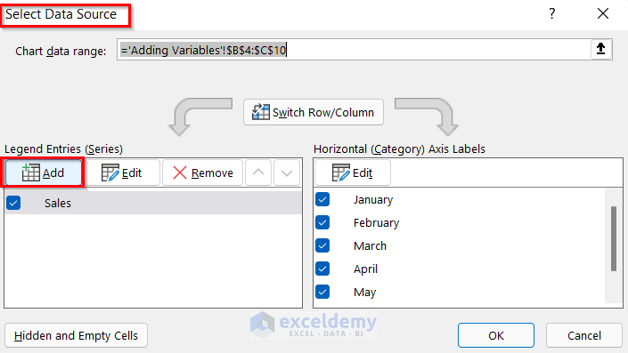
- The Edit Series box will appear.
- Select cell D4 as the Series name.
- Select the cell range D5:D10 as Series values.
- Press OK.
- The Select Data Source box will open.
- Press OK.
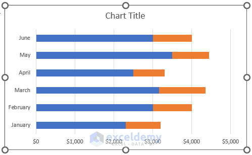
- You will get a bar chart containing multiple bars.
- Add the Chart Title and Axis Titles following the steps given in Method 1.
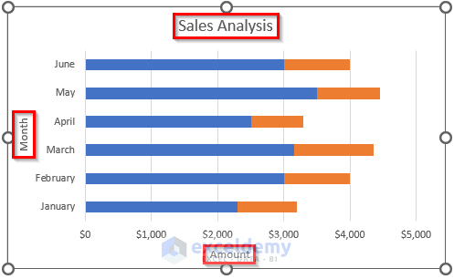
- Click on the “+” sign to open Chart Elements.
- Turn off Gridlines and turn on Legend.

- You will get your desired Bar Chart with multiple bars by adding variables to the existing bar chart in Excel.
Read More: How to Make a Double Bar Graph in Excel
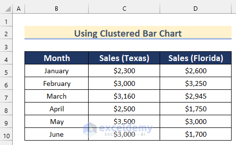
Method 3 – Converting a Clustered Column Chart to a Clustered Bar Chart with Multiple Bars in Excel
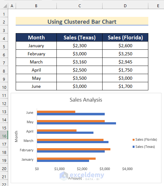
We have a dataset containing the Month and Sales of Texas and Florida of a company.
Steps:
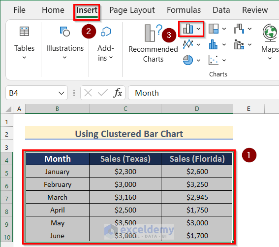
- Select the cell range B4:D10.
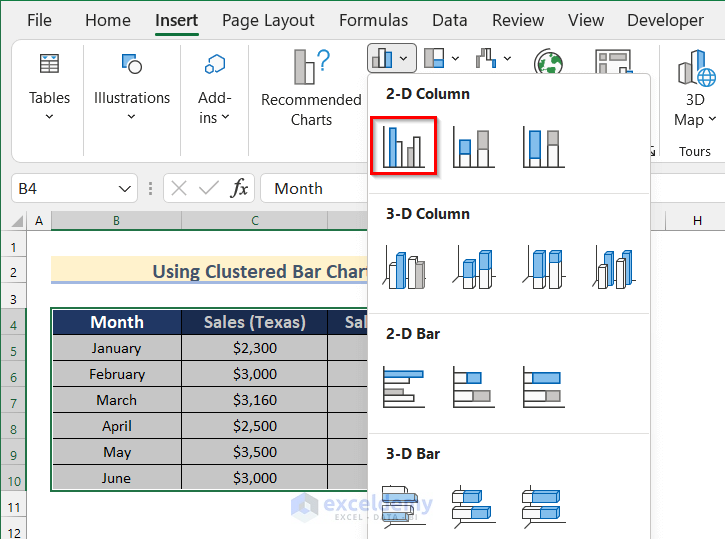
- Go to the Insert tab and click on Insert Bar Chart.
- Select the 2-D Clustered Column chart.
- Select the Chart and Right-click on it.
- Select Change Chart Type.
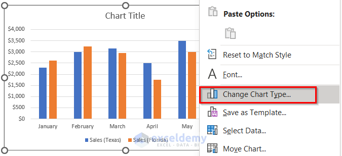
- The Change Chart Type box will open.
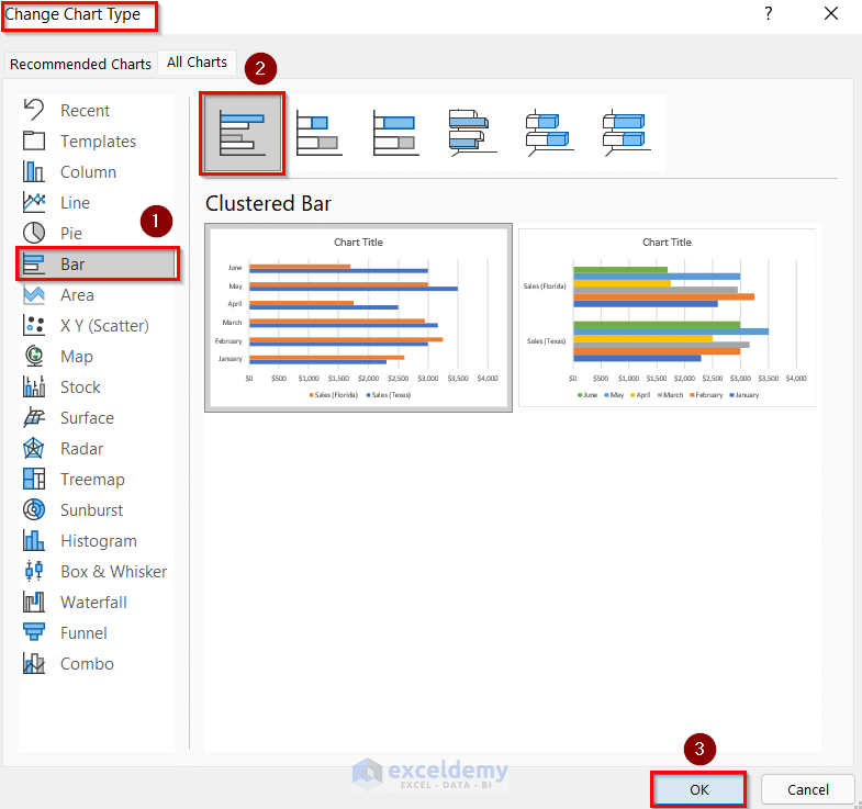
- Go to the Bar option and select Clustered Bar.
- Press OK.
- This converts a Clustered Column chart to a Clustered Bar Chart.

- Add a Chart Title and Axis Titles following the steps given in Method 1.
- Turn off Gridlines and turn on the Legend following the steps given in Method 2.
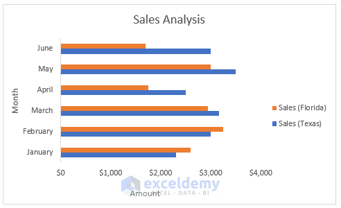
- You will get your desired Bar Chart with multiple bars by converting the Clustered Column Chart to the Clustered Bar Chart.
Read More: How to Create Clustered Stacked Bar Chart in Excel
Practice Section
We have included a practice section in the sample workbook.
Download the Practice Workbook
Related Articles
- How to Make a Bar Graph in Excel without Numbers
- How to Make a Diverging Stacked Bar Chart in Excel
- How to Make a 100 Percent Stacked Bar Chart in Excel
- Excel Chart Bar Width Too Thin
- How to Make a Grouped Bar Chart in Excel
<< Go Back to Excel Bar Chart | Excel Charts | Learn Excel
Get FREE Advanced Excel Exercises with Solutions!
