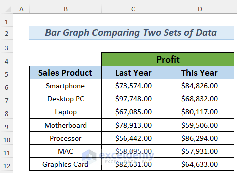
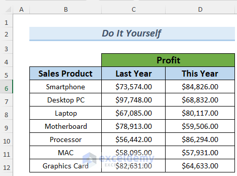
In the dataset, we have the profit amount of some products in the previous and current years.
Method 1 – Making a Simple Bar Graph with Two Sets of Data
- Select the data and go to Insert >> Insert Column or Bar Chart.
- You will see various types of Bar Charts. I selected the first option of the 2-D Bar

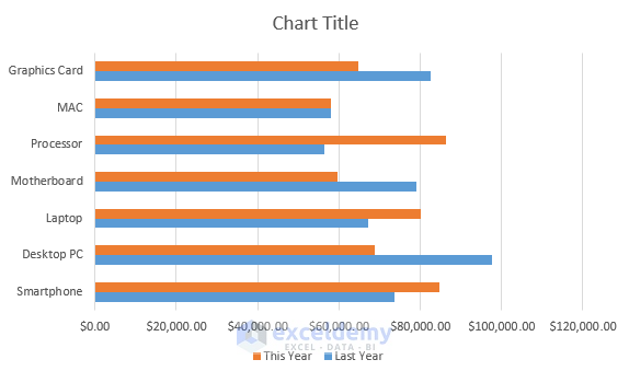
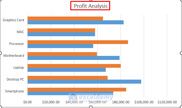
You will see the data in a 2-D Bar Graph. You can see the increase or decrease in profit from the Bar graph. With these data and the Bar graph, you can compare the profits of previous and current years.
- Format your Bar graph to look a bit nicer and cleaner. To do so,
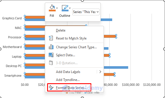
- Select a bar from the chart.
- Right-click on it, and choose Format Data Series…
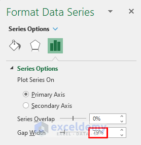
- Lessen the Gap Width to make these bars more visible.
You will better visualize the Bar graph in the Profit Analysis. Note that you can change the Chart Title if you want.
Read More: How to Make a Bar Graph in Excel with 2 Variables
Method 2 – Adding Data Labels to Compare Two Sets of Data
Steps:
- Follow Method 1 to make your Bar graph.
- Select the Bar graph and go to Chart Design >> Add Chart Element >> Data Labels >> Outside End.
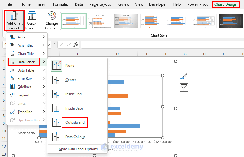
You will see the Profit Data beside the bars.

Read More: How to Make a Bar Graph in Excel with 3 Variables
Method 3 – Inserting Data Table to Compare Data in a Bar Graph
Steps:
- Follow the process of Method 1 to make the Bar graph.
- Select it, and go to Chart Design >> Add Chart Element >> Data Table >> No Legend Keys.
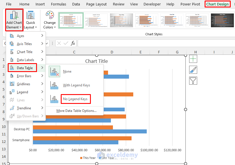
- You will see the Profit data for both the current and previous years in a table in the graph.

Read More: How to Make a Bar Graph in Excel with 4 Variables
Method – Showing Percentage Change to Compare Two Sets of Data
Steps:
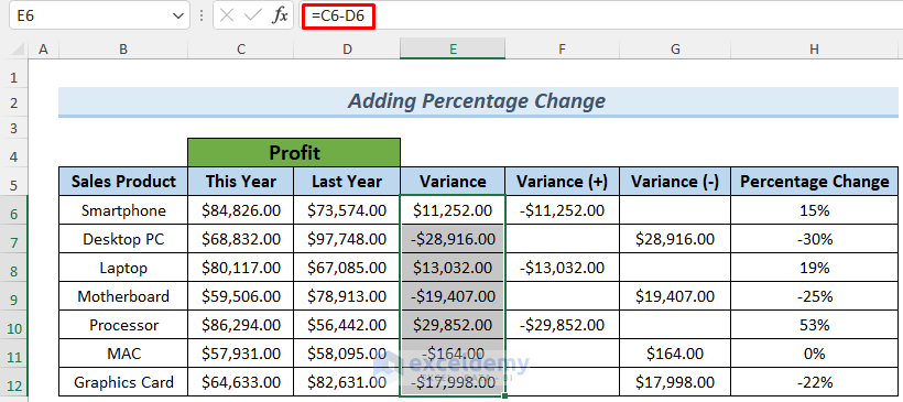
- Make columns for Variance in profit increase or decrease, Positive Variance, Negative Variance, and Percentage Change.
- Enter the following formula in cell E6:
=C6-D6
- Press ENTER, and use Fill Handle to AutoFill lower cells.
- Enter the following formula in cell F6 to determine the positive variances of the profits:
=IF(E6>0,-E6,"")

The IF Function stores the increase in profits in column F.
- Enter the following formula in G5:
=IF(E6<0,-E6,"")
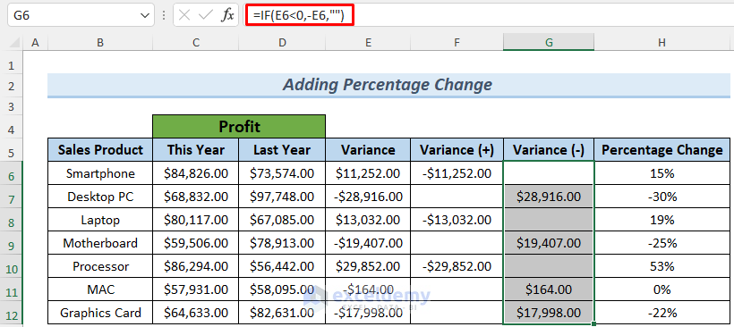
- Press ENTER, and use Fill Handle to AutoFill lower cells.
This time, the IF Function stores the profit decrease in Column G.
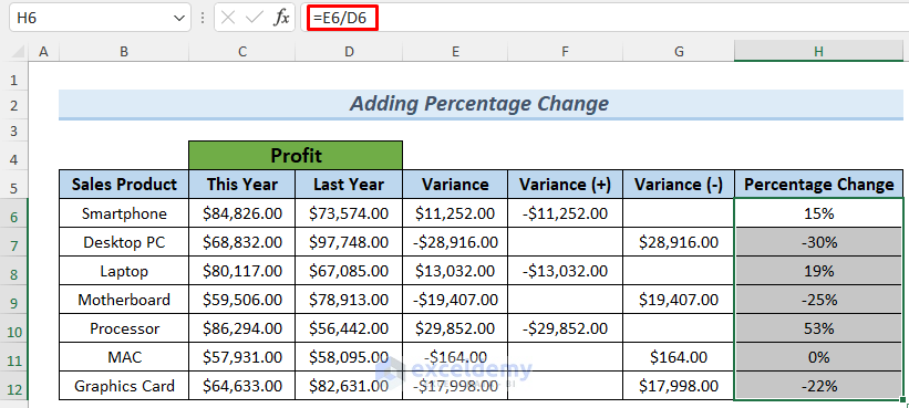
- Get the percentage values by using the following formula:
=E6/D6
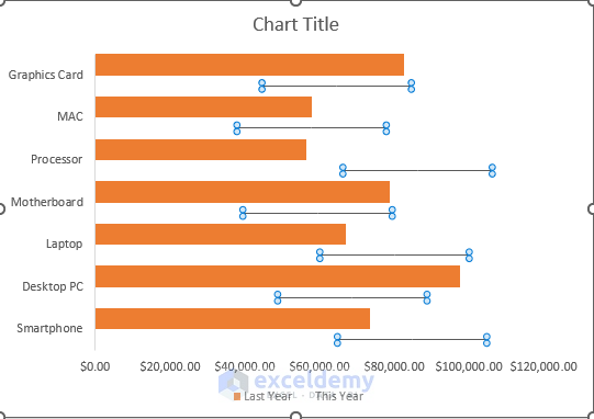
We are going to show this information in a Bar graph. Our main focus is on Percentage Change.
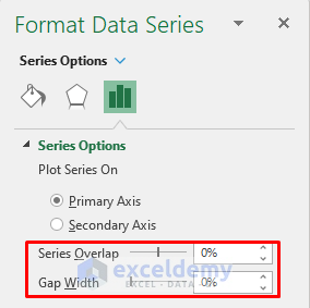
- Follow the steps of Method 1 to create the Bar Chart and open the Format Data Series
- Set both Series Overlap and Gap Width to 0%.
- Select any of the ‘This Year’ bars (Blue Colored Bar) and right-click on it.
- Select Fill >> No Fill.

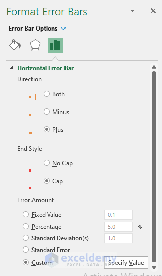
- Select the chart and click Add Chart Element >> Error Bars >> More Error Bars Options…
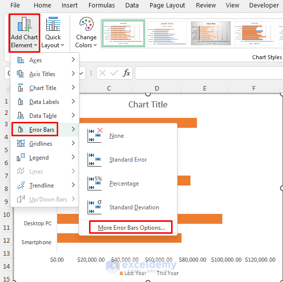
- A dialog box will appear. Our Error Bars will be based on this year’s profit.
- Select This Year and click OK.

- You will see the Profit for this year with the Error Bars.
- Select any of them.
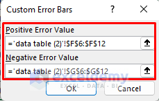
- In the Format Error Bars window, select Custom >> Specify Value from the Error Amount
- Select any option from the other sections of your choice.

- Insert the following ranges in the Custom Error Bars by selecting them. We selected the positive and negative variance values in the Positive Error Value and Negative Error Value
- Click OK.
- Select the chart and then go to Add Chart Element >> Data Labels >> More Data Label Options…
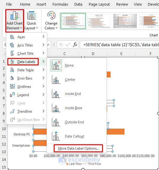
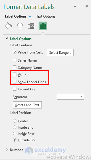
- The Format Data Labels window will appear.
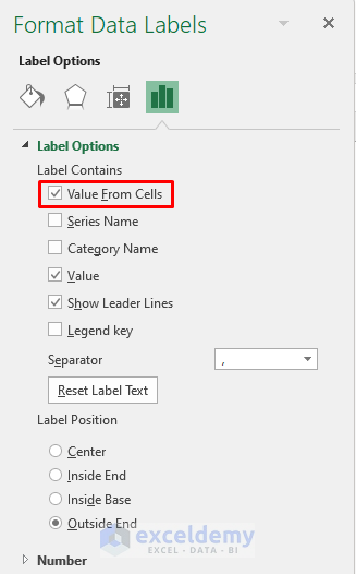
- Check Value From Cells.
- You will see a dialog box.
- Select the range H6:H12 (Percentage Column) for the Data Label Range and click OK.

- Uncheck Value and Show Leader Lines for convenient visualization of your chart.
You will see the increase and decrease in the profits of This Year in percentage in the chart.

- To make the Error Bars look more efficient, we can just keep the increased profit bars in the chart to compare these two sets of profit data. We selected Horizontal Error Bars >> Plus.
This will show increased profits with Error Bars. Corresponding percentage values will demonstrate a decrease in profits.

Read More: How to Make a Percentage Bar Graph in Excel
Practice Section
Here is the dataset of this article so that you can practice these methods on your own.
Related Articles
- How to Make a Bar Graph with Multiple Variables in Excel
- How to Show Number and Percentage in Excel Bar Chart
- How to Show Difference Between Two Series in Excel Bar Chart
- Excel Bar Chart Side by Side with Secondary Axis
- How to Sort Bar Chart Without Sorting Data in Excel
- How to Change Bar Chart Width Based on Data in Excel
<< Go Back to Excel Bar Chart | Excel Charts | Learn Excel
Get FREE Advanced Excel Exercises with Solutions!
