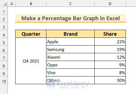
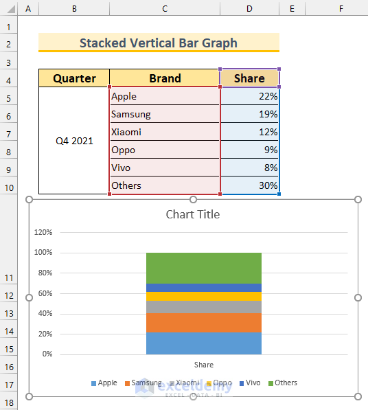
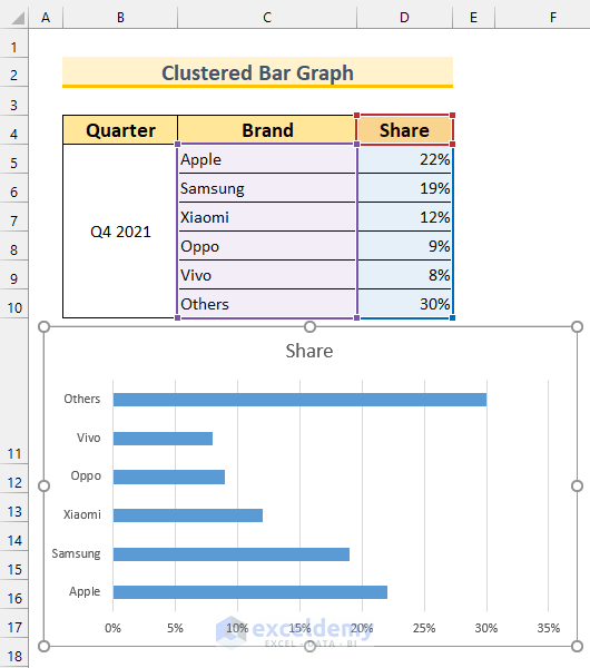
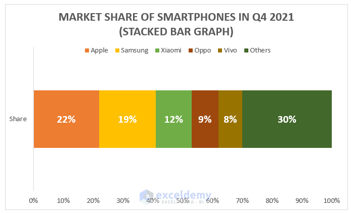
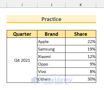
.This sample dataset contains 3 columns: Quarter, Brand, and Share, regarding the global shipment of smartphones in the last quarter of 2021.
Method 1 – Create a Percentage Vertical Bar Graph in Excel Using a Clustered Column
Steps:
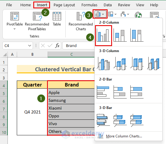
- Select the range C4:D10.
- In the Insert tab >>> Insert Column or Bar Chart >>> select Clustered Column.
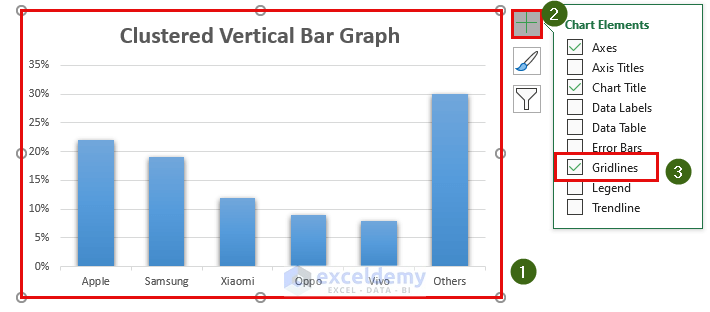
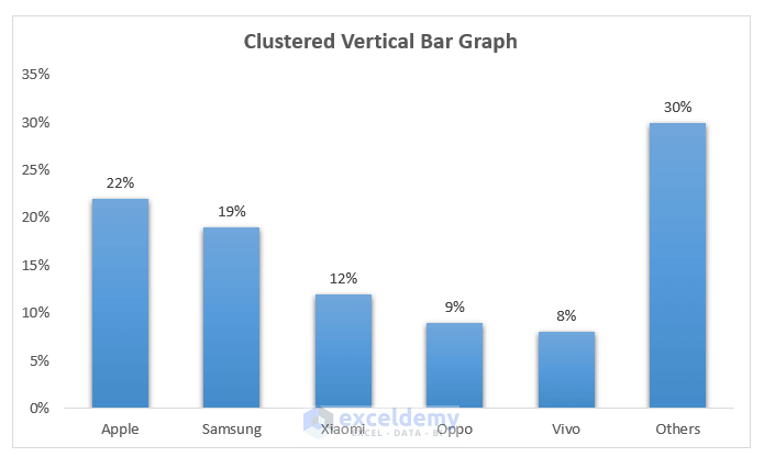
The Clustered Vertical Bar Graph is displayed.
To change the Graph style:
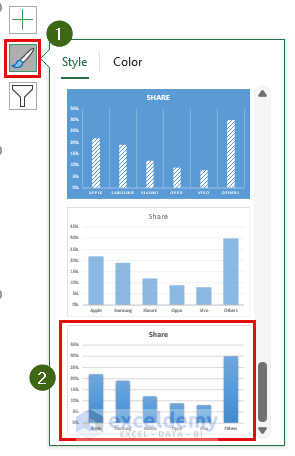
- Select the Graph.
- Choose Chart Styles >>> select Style 16.
- Double-Click the text Share to change the title of the Graph.
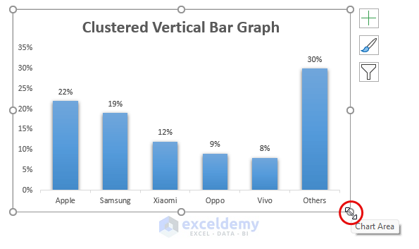
To hide the Gridlines:
- Select the Graph.
- In Chart Elements >>> unmark Gridlines.
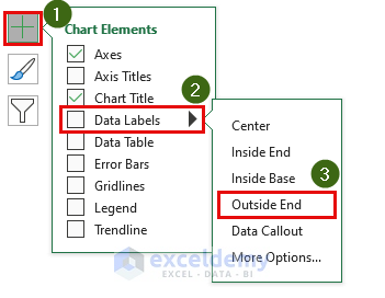
To show the Data Labels:
- Select the Graph.
- Open Chart Elements >>> Data Labels >>> Outside End.
To resize the Graph area:
- Place the cursor at any corner of the Graph.
- Drag it while holding SHIFT. This will keep the aspect ratio constant.
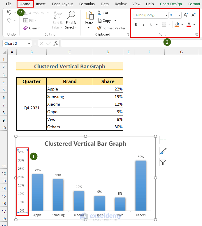
To change the label font sizes:
- Select the element you want resize. Here, vertical axis labels.
- In the Home tab >>> change the parameters in the Font section.
This is the final output.
Read More: How to Show Number and Percentage in Excel Bar Chart
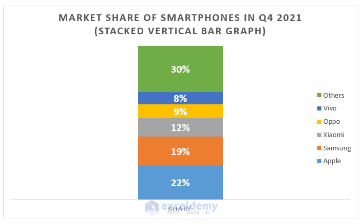
Method 2 – Applying a Stacked Column to Create a Percentage Vertical Bar Graph in Excel
- Select the range C4:D10.
- Go to the Insert tab >>> from Insert Column or Bar Chart >>> select “More Column Charts…”.
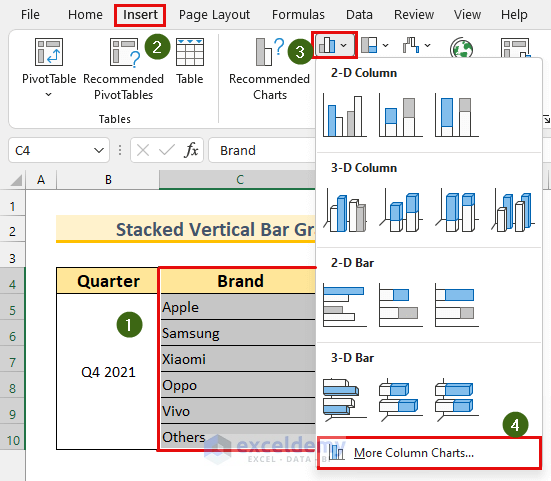
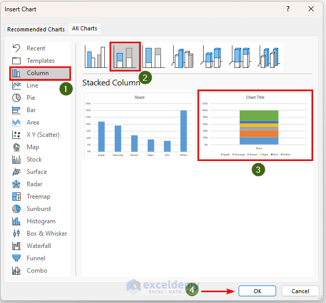
The Insert Chart dialog box will open.
- Choose Column >>> Stacked Column >>> select the 2nd Graph.
- Click OK.
The Vertical Bar Graph will be displayed.
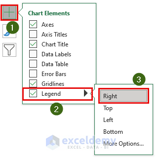
To move the Legend:
- Select the Graph.
- In Chart Elements >>> Legend >>> select Right.
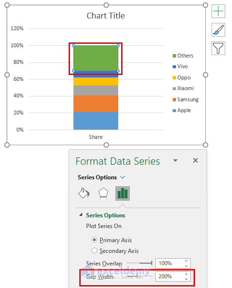
To change the width of the Stacked Column.
- Double-Click the Stacked Column.
- Change the Gap Width.
Follow the formatting from the first method to further enhance the Bar Graph.
Read More: How to Change Bar Chart Width Based on Data in Excel
Method 3 – Creating a Percentage Clustered Bar Graph
Steps:
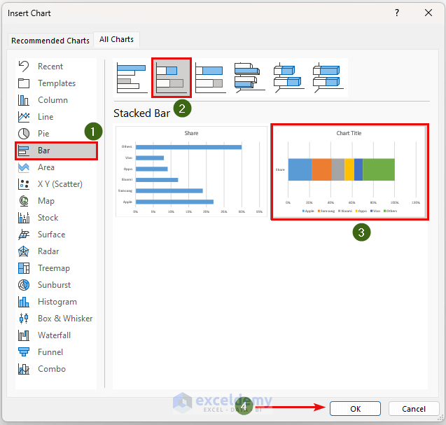
- Select the range C4:D10.
- The Insert chart dialog box will open as shown in method 2.
- From Bar >>> Clustered Bar >>> select the 1st Graph.
- Click OK.
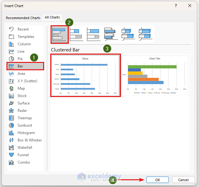
This will display the Clustered Bar Graph.
To format the Graph:
- Select the Bar Graph.
- Go to Chart Styles >>> select Style 12.
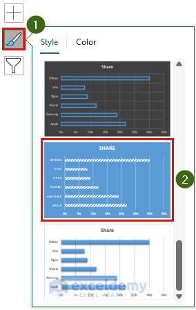
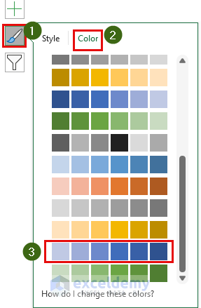
To change the color:
- From Chart Styles >>> Color >>> select “Monochromatic Palette 12”.
There are other formatting options as shown in method 1.
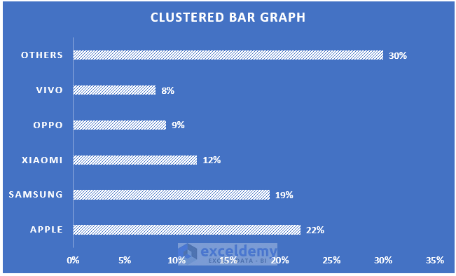
This is the final percentage Clustered Bar Graph.
Read More: How to Sort Bar Chart Without Sorting Data in Excel
Method 4 – Inserting a Stacked Bar to Create a Percentage Graph in Excel
Steps:
- Select the range C4:D10.
- The Insert chart dialog box will open as shown in method 2.
- From Bar >>> Stacked Bar >>> select the 2nd Graph.
- Click OK.
This will display our Stacked Bar Graph.
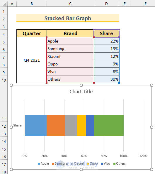
You can format the Graph as shown in method 1 and method 2.
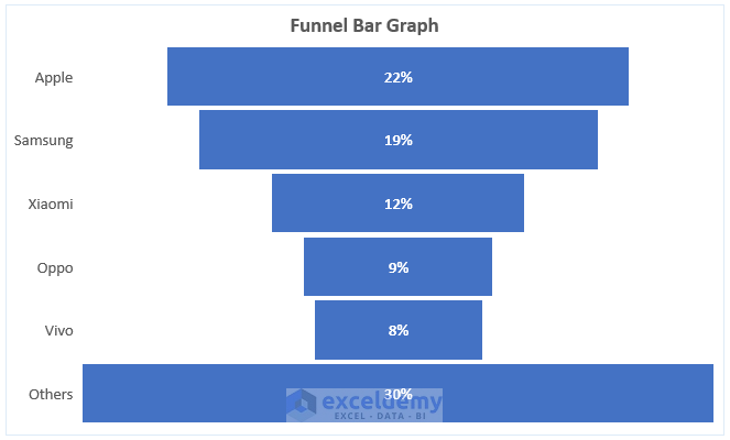
Method 5 – Using a Funnel Chart to Create a Percentage Bar Graph in Excel
Steps:
- Select therange C4:D10.
- The Insert chart dialog box will open as shown in method 2.
- Select Funnel.
- Click OK.
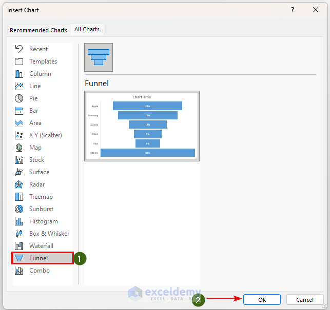
This will display the Funnel Bar Graph.
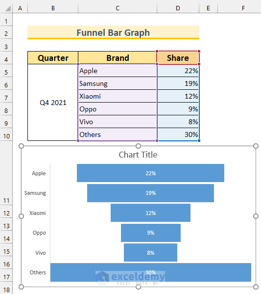
You can format the Graph as shown in method 1 and method 2.
Practice Section
Practice here.
Download Practice Workbook
Related Articles
- How to Make a Bar Graph with Multiple Variables in Excel
- How to Make a Bar Graph in Excel with 2 Variables
- How to Make a Bar Graph in Excel with 3 Variables
- How to Make a Bar Graph in Excel with 4 Variables
- How to Make a Bar Graph Comparing Two Sets of Data in Excel
- How to Show Difference Between Two Series in Excel Bar Chart
- Excel Bar Chart Side by Side with Secondary Axis
<< Go Back to | Excel Bar Chart | Excel Charts | Learn Excel
Get FREE Advanced Excel Exercises with Solutions!
