ExcelDemy | Excel Courses, Services,
Free Tutorials, Forum, & Templates
Unlock the power of Excel with our comprehensive courses, exclusive services, complimentary tutorials, collaborative forums, and meticulously crafted templates. Elevate your expertise with our comprehensive suite of resources, tailored for optimal spreadsheet proficiency.

Learn Excel with
Our Premium Courses
ExcelDemy’s online Excel training modules offer expertly led video courses designed to build your skills at your own pace. Step-by-step, we will guide you through Excel fundamentals like working with different functions and formulas or creating Charts and Graphs, as well as train you on more advanced concepts like Pivot Tables and Statistical Data Analysis Tools.


Premium Excel Services
and Expert Consultancy
We offer a range of Excel solutions and guides catered to the needs of users at every level and profession.
Our premium Excel Services Division provides on-demand Excel consultancy services with Excel Formulas, Templates, VBA Projects, and so on. Our team of experts is waiting to deliver!
Learn Excel by Browsing Popular Topics
Here are the most popular topics that you can start with:
- Basic Excel Features
- Formulas & Functions
- Formatting & Visualization
- Data Management
- Data Analysis
- Miscellaneous
Explore Our Latest Articles
Stay updated with the power of Microsoft Excel through our comprehensive articles and guides. Discover new tips, tricks, and features in our blog to optimize your Excel experience.

[Fixed!] Excel Default Font Is Not Changing (4 Quick Solutions)

How to Insert Picture in Excel Using Formula (2 Examples)

How to Arrange Numbers in Ascending Order in Excel Using Formula (3 Ways)
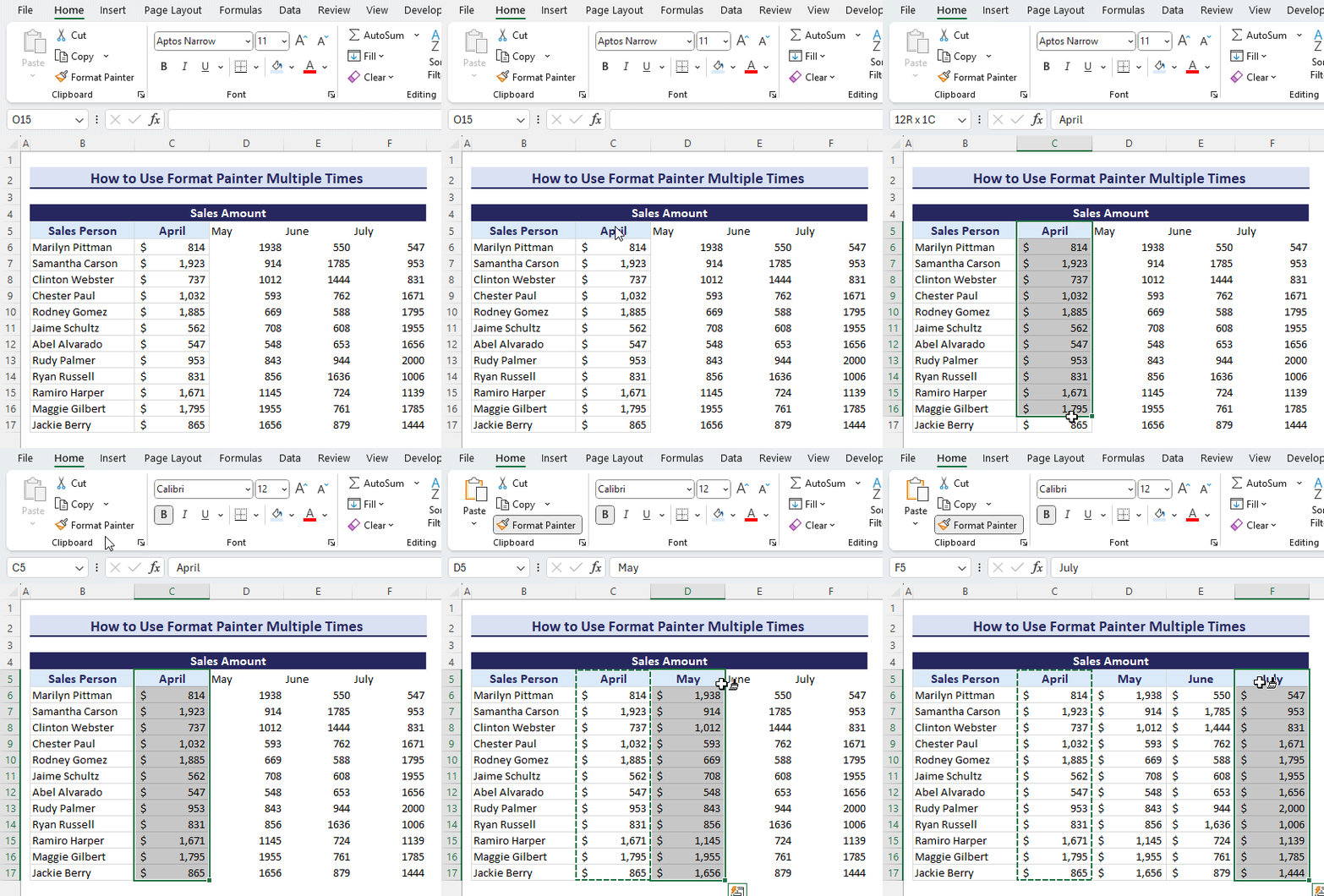
How to Use Format Painter Multiple Times in Excel

Learn Excel with Our
Free Video Tutorials
Immerse yourself in the world of Excel with our carefully selected YouTube playlists. Access free video tutorials covering essential Excel skills, helpful tips, and advanced techniques presented by expert creators.
Join Our Excel Forum for
Free Support
Connect with our vibrant community and find answers to your Excel queries from experienced users and enthusiasts. Our Excel Forum is your go-to place for free support and collaborative problem-solving.

Simplify Your Workflow with
Our Excel Templates
Effortlessly organize and analyze data using our Excel templates. From small business solutions to inventory and project management, these templates come with built-in formulas for tasks like budgeting and invoicing. Easily customizable to fit your needs, they save time and minimize errors.
What Our Clients Have to Say
Frequently Asked Questions [FAQs]
What is ExcelDemy?
ExcelDemy is a comprehensive platform dedicated to serving the diverse community of Excel users. It offers free Excel tutorials in article and video formats, premium courses, forums, cheat sheets, templates, and exclusive services. It aims to support users at different skill levels, from beginners to professionals.
How Does ExcelDemy Ensure the Accuracy of Its Content?
ExcelDemy upholds a meticulous editorial process, including peer reviews by industry professionals, hands-on Excel expertise, and cross-checking with official Microsoft documents. Our commitment to accuracy and transparency ensures reliable information for our users.
How Does ExcelDemy Support Excel Users?
Who Are the People Contributing to Exceldemy?
Can I Contribute Content to Exceldemy?
What is Exceldemy’s Privacy Policy?
ExcelDemy is a place where you can learn Excel, and get solutions to your Excel & Excel VBA-related problems, Data Analysis with Excel, etc. We provide tips, how to guide, provide online training, and also provide Excel solutions to your business problems.
Contact | Privacy Policy | TOS
