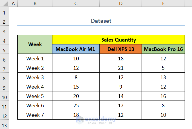
The dataset below showcases the Sales Quantity of three different laptop models over different weeks.
To compare Sales Quantity, use a Bar Chart:
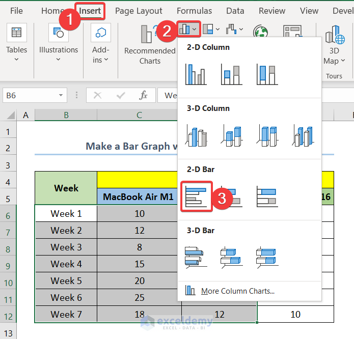
Step 1- Inserting a Bar Graph with Multiple Variables in Excel
Compare MacBook Air M1 and Dell XPS 13.
- Select B6:D12.
B6 is the first cell of the column Week and D12 is the last cell of the column Dell XPS 13.
- Go to the Insert tab.
- Select Insert Column or Bar Chart.
- Click Clustered Bar to insert a Bar Graph.
Read More: How to Make a Percentage Bar Graph in Excel
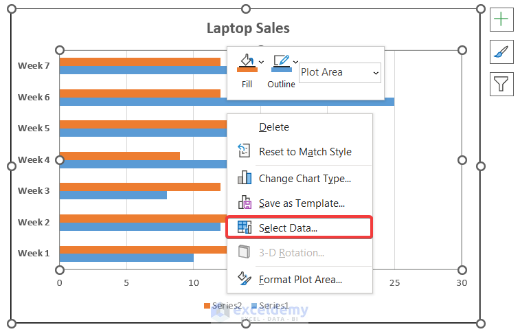
Step 2 -Editing Legends in the Bar Graph
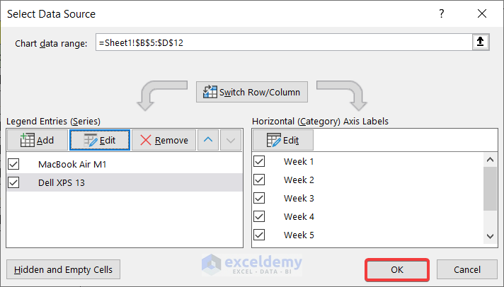
- Right-click the chart.
- Click Select Data.
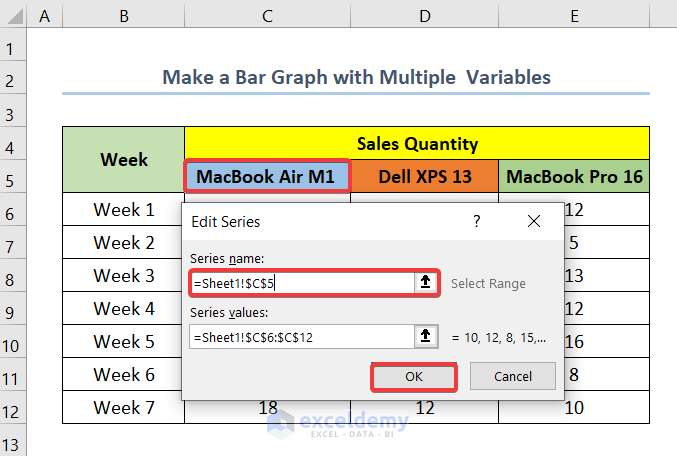
- In the Select Data Source box, select Series 1 in Legend Entries (Series).
- Click Edit.
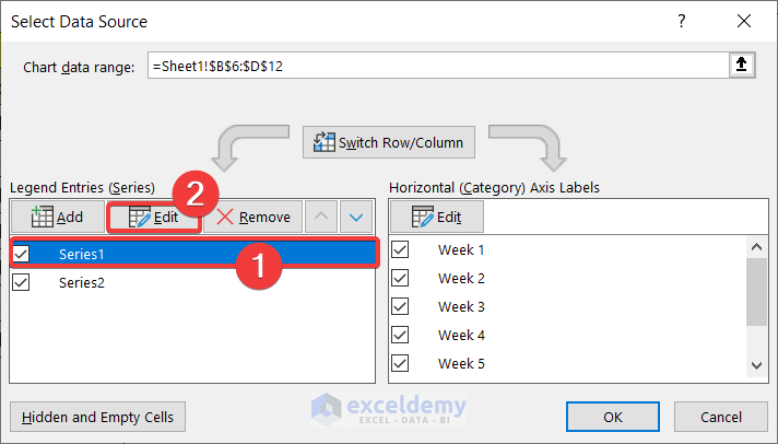
- In Series name enter C5 (MacBook Air M1).
- Click OK.
- Change Series 2 to Dell XPS 13.
- Click OK.
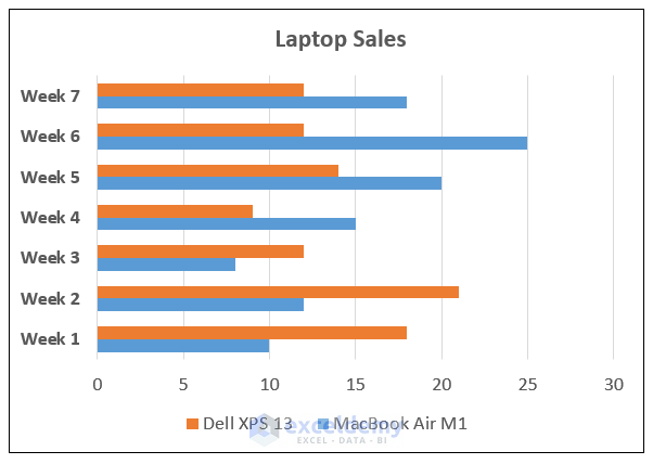
- This is the output.
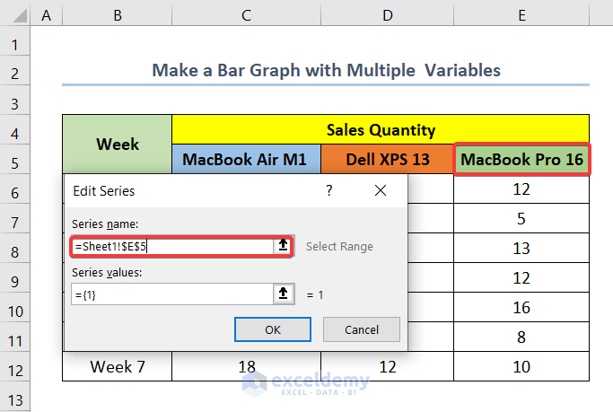
Step 3 – Adding Another Variable in the Bar Graph with Multiple Variables
Add one more variable: MacBook Pro 16.
- Right-click the chart to open Select Data Source.
- Click Add in Legend Entries (Series).
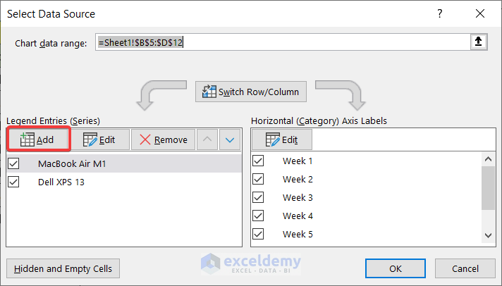
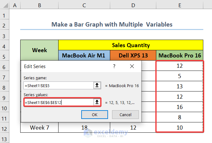
- In Series name enter E5 (Macbook Pro 16).
- In Series Value enter E6:E12.
E6 and E12 are the first and last cells of the MacBook Pro 16 column.
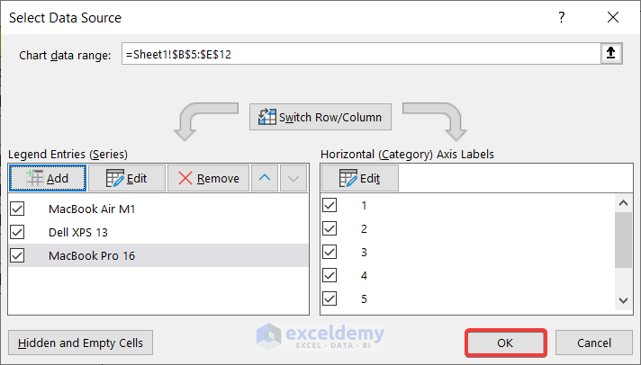
- Click OK.
- Click OK.
Read More: How to Make a Bar Graph in Excel with 2 Variables
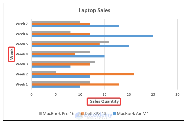
Step 4 – Adding and Editing the Axis Titles
- Select the chart.
- Click Chart Elements.
- Check Axis Titles.
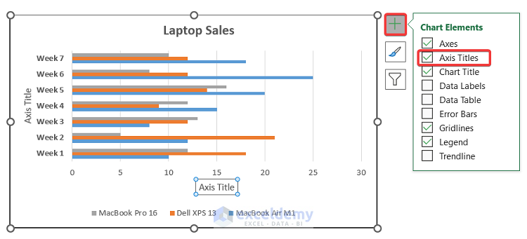
- Double-click the Axis Titles to edit the text.
- Change the X-axis title to Sales Quantity and the Y-axis title to Week.
Read More: How to Make a Bar Graph in Excel with 3 Variables
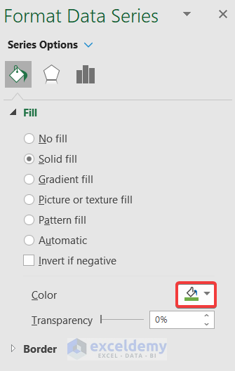
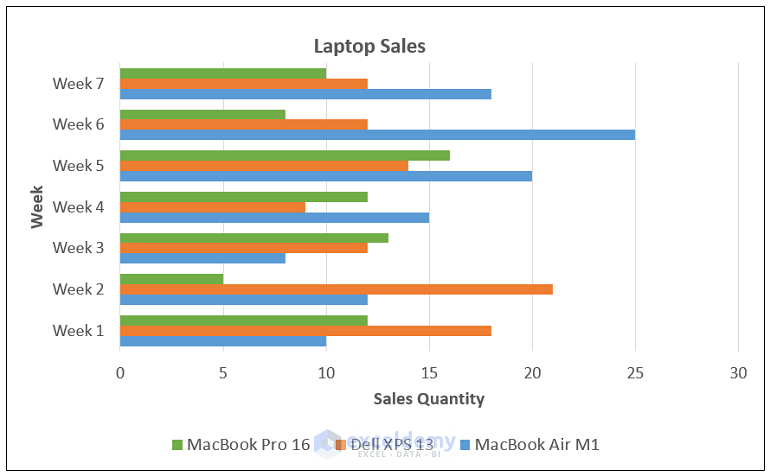
Step 5 – Formatting the Data Series in the Excel Bar Graph
- Double-click the bar MacBook Pro 16.
- In the Format Data Series, select Fill.
- Select Green in Color.
This is the output.
Read More: How to Make a Bar Graph in Excel with 4 Variables
Download Practice Workbook
Download the practice workbook here.
Related Articles
- How to Make a Bar Graph Comparing Two Sets of Data in Excel
- How to Show Number and Percentage in Excel Bar Chart
- How to Show Difference Between Two Series in Excel Bar Chart
- Excel Bar Chart Side by Side with Secondary Axis
- How to Sort Bar Chart Without Sorting Data in Excel
- How to Change Bar Chart Width Based on Data in Excel
<< Go Back to Excel Bar Chart | Excel Charts | Learn Excel
Get FREE Advanced Excel Exercises with Solutions!
