Latest Posts From Sowmik Chowdhury

Let’s assume you have a Bank Statement and a Cash Book as shown below. Here, we can see that the closing balances don’t match. So, you want to do Bank ...

Method 1 - Inserting VLOOKUP Function to Do Data Mapping in Excel Let’s assume a dataset with the Sales Quantity for three different models of laptops ...

A Bank Ledger is the bank account balance computed by a bank for each account every business day. It includes all kinds of deposits and withdrawals. In this ...

There may be some instances where you need to remove gridlines from tables. In Microsoft Excel, you can do this type of task within seconds. This article ...

In many cases, you might find that the unhide columns option is not working in Excel. Sometimes, the solutions to this problem are very easy but hard to find. ...
![[Fixed!] Why Is My Excel Not Opening Files?](https://www.exceldemy.com/wp-content/uploads/2022/07/Why-is-my-excel-not-opening-files-excel-corrupted-4.png?v=1697109804)
There may be some instances where your Excel will not respond to opening files. Sometimes, the solutions are very easy but hard to find. This article ...
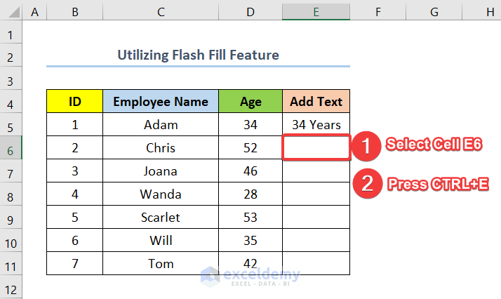
Method 1 - Utilizing Flash Fill to Add Text to the End of Cell We have a dataset with a list of employees and their respective ages. We want to add “Years” to ...

In Microsoft Excel, we generally work in a datasheet view. This type of view helps us perform many actions in Excel. Also, it helps us understand a large set ...

In many cases, we may need to add or change the worksheet tab color in Excel. This helps you identify any worksheet very easily. Also, adding or changing ...
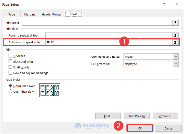
Example 1 - Setting Column Titles to Repeat in Excel The sample dataset contains data up to Week 47 which will come to more than one page when printed (in the ...

The title is a very important element in an Excel Graph. It tells us what the graph is about and makes the chart or graph more understandable to other people. ...

This is the sample dataset. Method 1 - Using the Flash Fill Feature Steps: Add a new column. Enter the three first numbers from the Age ...

In many cases, you might need to align cells to the left in Excel. It is very easy to choose or change alignment in Microsoft Excel. Also, you can do this kind ...

How to Make a Price Comparison Chart in Excel: 3 Examples This is the sample dataset, containing product prices for different months and brands. ...

What Is a Gantt Chart? A Gantt Chart is a graph that generally shows the relationship between tasks or milestones and time. It is a very useful tool to keep ...
See Our Reviews at

