How to Make a Price Comparison Chart in Excel: 3 Examples
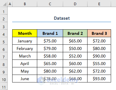
This is the sample dataset, containing product prices for different months and brands.
Example 1 – Using a Clustered Column Chart to Make a Price Comparison Chart in Excel
Steps:
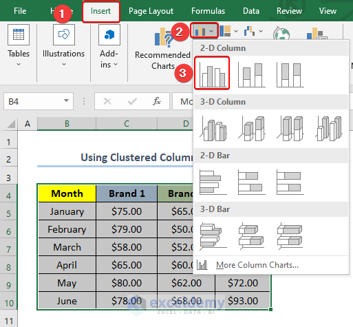
- Select the whole dataset. Here, the range B4:E10.
B4 is the column heading of Month and E10 is the last cell of the column Brand 3.
- Go to the Insert tab.
- Select Insert Column or Bar Chart.
- Click Clustered Column to insert a Clustered Column Chart.
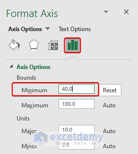
- Double-click the Vertical Axis to open the Format Axis options.
- In Bounds, change the Minimum value to the minimum value in your dataset. Here, 40.
- You can also change the Maximum value.
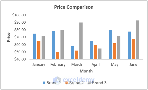
- Add axis titles.
- Your Price Comparison Chart will be displayed.
Read More: How to Make a Comparison Chart in Excel
2. Utilizing a Line with Markers Chart in Excel
Steps:
- Select the whole dataset. Here, B4:E10.
- Go to the Insert tab.
- Select Insert Line or Area Chart.
- Click Line with Markers to insert a Line with Markers Chart.
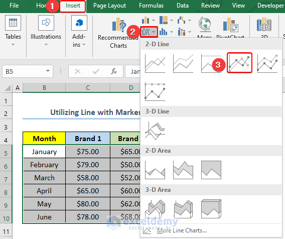
- Choose format the vertical axis.
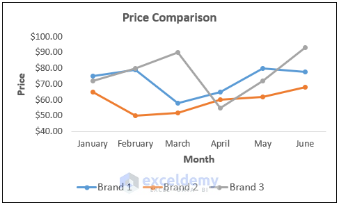
- This is the output.
 .
.
Read More: How to Compare 3 Sets of Data in Excel Chart
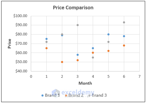
3. Applying a Scatter Chart to Make a Price Comparison Chart in Excel
Steps:
- Select the whole dataset. Here, B4:E10.
- Go to the Insert tab.
- Select Insert Scatter (X, Y) or Bubble Chart.
- Click Scatter to insert a Scatter Chart.

- Choose format the vertical axis.
- This is the output.
Read More: How to Compare Two Sets of Data in Excel Chart
Download Practice Workbook
You can download the practice workbook from the link below.
Related Articles
- How to Make Sales Comparison Chart in Excel
- How to Make a Salary Comparison Chart in Excel
- How to Create a Budget vs Actual Chart in Excel
<< Go Back to Comparison Chart in Excel | Excel Charts | Learn Excel
Get FREE Advanced Excel Exercises with Solutions!
