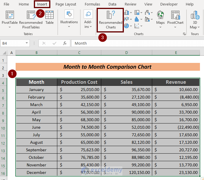
Step 1 – Create an Organized Dataset
Steps:
- Create a dataset based on month-to-month data. Here, monthly cost in production and gain in sales.
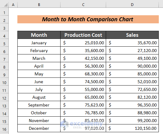
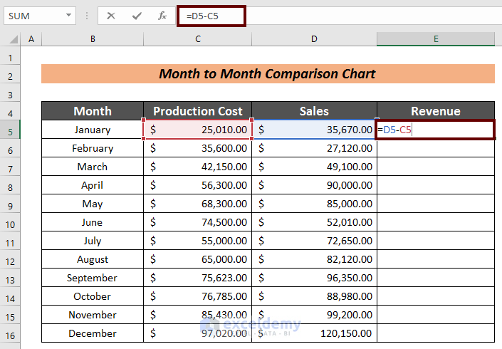
- Create a new column to compare the profit or loss. Here, Revenue.
- Use the following formula:
=D5-C5Here,
D5 = Sales Amount
C5 = Production Cost
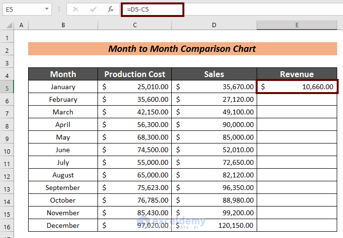
- Press ENTER to see the revenue.
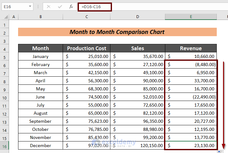
- Use Fill Handle to AutoFill the rest of the cells.
Read More: How to Use Comparison Bar Chart in Excel
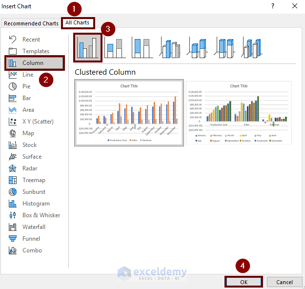
Step 2 – Create a Month-to-month Chart
Steps:
- Select the entire table.
- Go to Insert
- Click Recommended Charts.
The Insert Chart wizard will open:
- Click All Charts.
- Click Column.
- Select a chart type. Here, Clustered Column.
- Click OK.
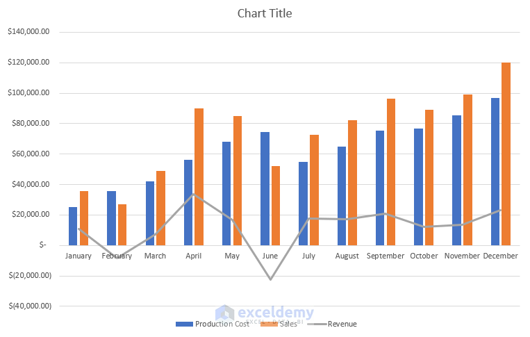
The month-to-month comparison chart is created.
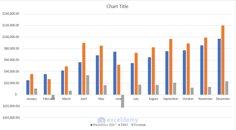
Production Cost is in the Blue column, Sales in the Orange column, and Revenue in the Ash column. The Revenue column facing upwards is the Profit and the downwards the Loss.
Step 3 – Change the Type of Month-to-Month Excel Chart
Steps:
- Follow the same procedure to open the Insert Chart wizard.
- Select the All Charts.
- Click Combo.
- Select Revenue as Line in Chart Type.
- Click OK.
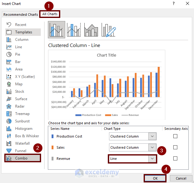
Revenue is shown in line and the other factors in columns.
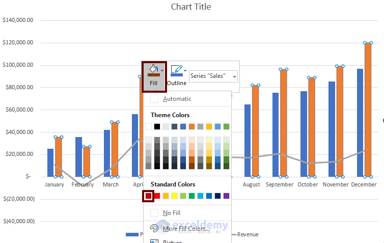
 You can edit the column colors, and add a chart title.
- Right-Click the column.
- Click Fill.
- Choose a color.
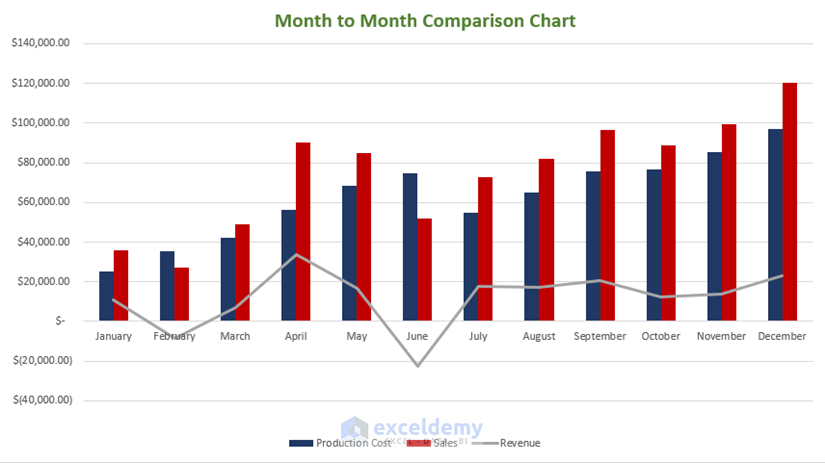
This is the output.
Read More: Year Over Year Comparison Chart in Excel
Related Articles
<< Go Back to Comparison Chart in Excel | Excel Charts | Learn Excel
Get FREE Advanced Excel Exercises with Solutions!
