Example 1 – Year-over-Year Comparison with a Bar Chart
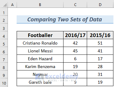
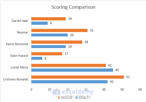
We have the data for goals scored by famous footballers in the 2016/17 and 2015/16 seasons. Let’s compare their scores between the years.
Steps:
- Select the entire range (B4:D10) and go to Insert, then select Chart and choose 2-D Bar Chart.
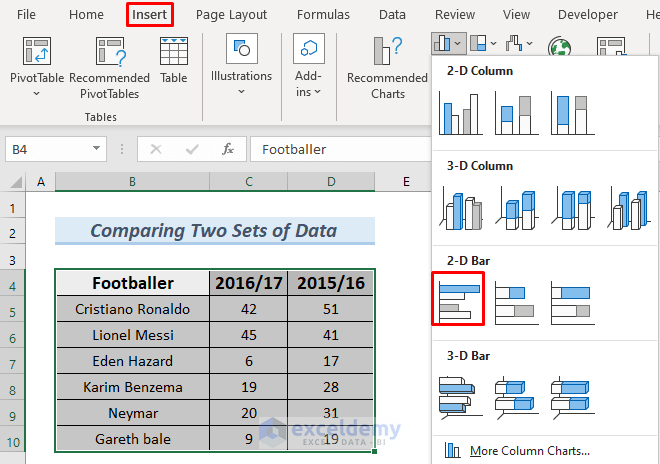
- You will see the Bar Chart that represents the data from our Excel sheet. Name the Bar Chart.
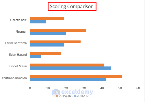
- We can see a comparison but there is no data labeling. Click on the Plus Icon beside the Bar Chart.
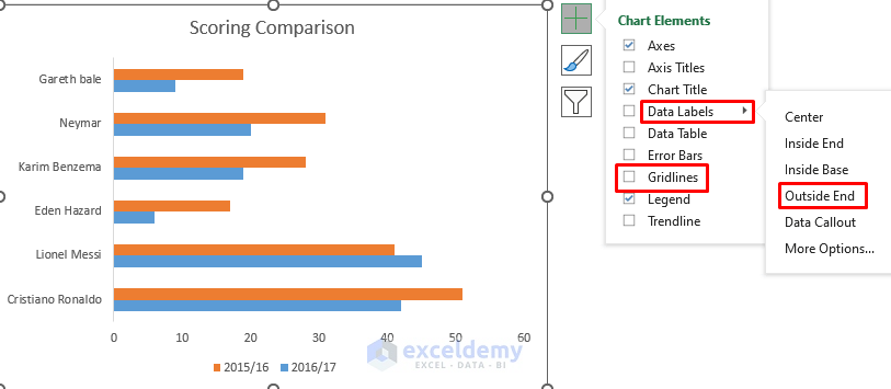
- Uncheck the Gridlines.
- Select Data Labels and choose Outside End.
- To create a gap between adjacent bars, right-click on any of the bars and select Format Data Series…
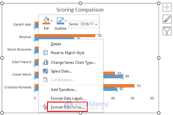
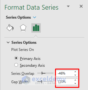
- Change the Series Overlap and Gap Width.
- The comparison Bar Chart looks nicer and cleaner.
Read More: Year Over Year Comparison Chart in Excel
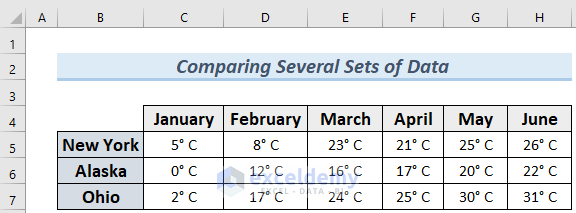
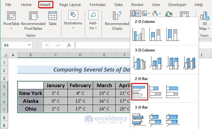
Example 2 – Comparing Several Sets of Data
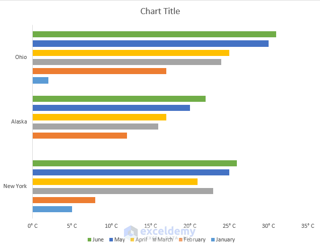
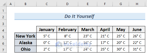
The dataset contains the average temperatures for New York, Alaska, and Ohio for the first six months of the year.
Steps:
- Select the entire dataset (B4:H7) and Insert a 2-D Bar Chart.
- This chart needs some improvements.
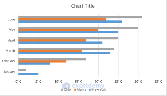
- Change the Series Overlap and Gap Width like in Example 1.
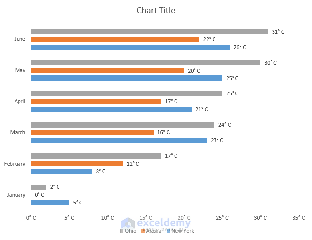
- Right-click on the chart and pick Select Data.
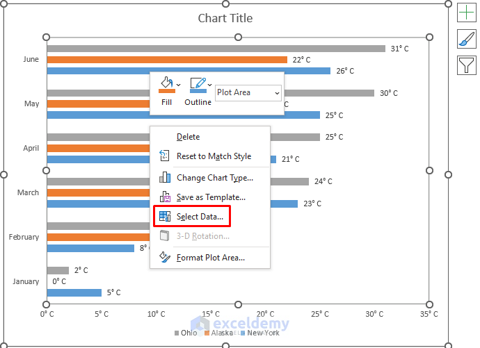
- Select Switch Row/Column in the Select Data Source window and click OK.
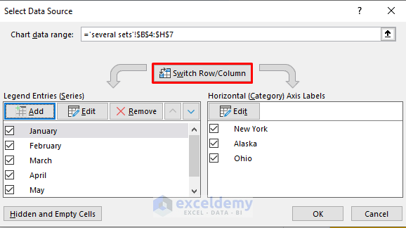
- You can see the comparison between months by city.
Practice Section
Use the download file to practice creating a comparison bar chart in the dedicated section.
Download the Practice Workbook
Related Articles
- How to Create Weekly Comparison Chart in Excel
- How to Create Month to Month Comparison Chart in Excel
- How to Create Quarterly Comparison Chart in Excel
<< Go Back to Comparison Chart in Excel | Excel Charts | Learn Excel
Get FREE Advanced Excel Exercises with Solutions!
