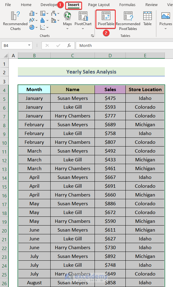
Method 1 – Using the INDEX Function to Create a Sales Comparison Chart in Excel
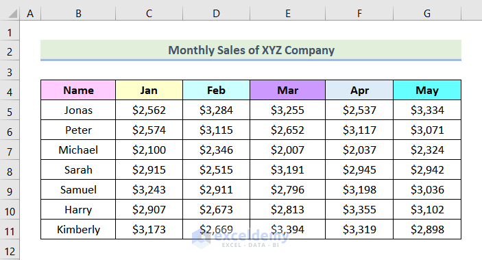
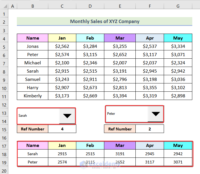
The following dataset showcases Monthly Sales of a Company.
To create a sales comparison chart for company employees throughout different Months:
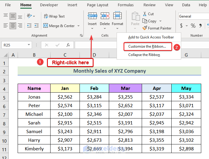
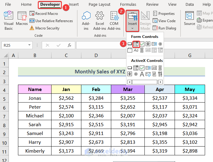
Step 1: Enabling the Developer Tab
- Go to the ribbon and right-click.
- Select Customize the Ribbon.
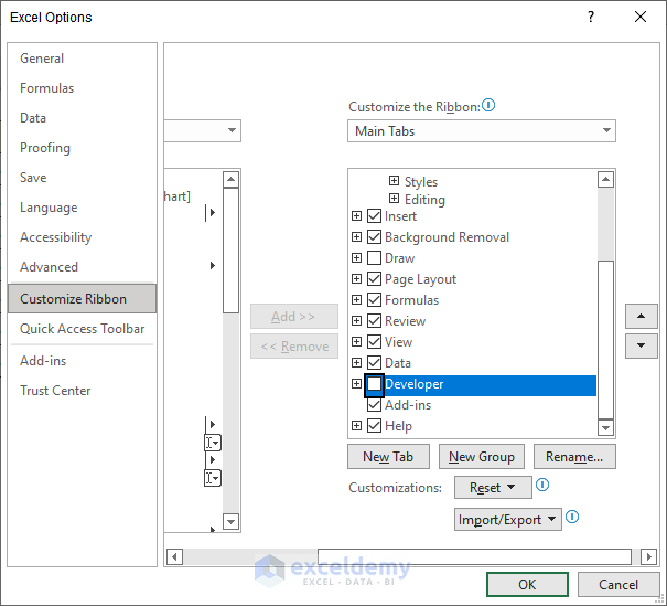
The following image will be displayed.
- Check Developer >> click Ok.
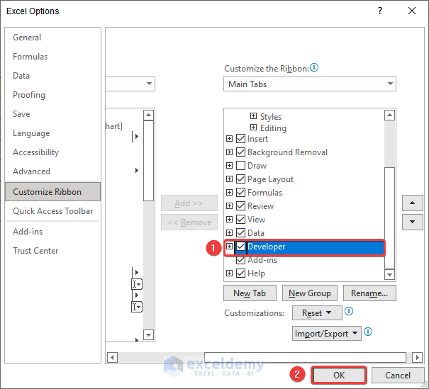
The Developer tab will be visible on the ribbon.
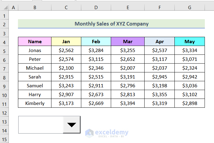
Step 2: Adding a Combo Box
- Go to the Developer tab >> Insert >> Combo Box (Form Control).
- Create the drop-down box as shown below by clicking, holding and dragging the mouse.
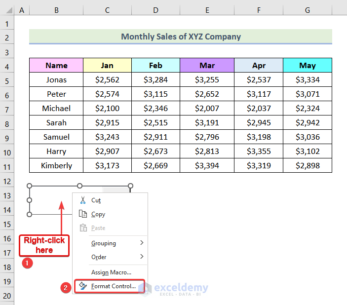
Step 3: Editing the Combo Box
- Right-click as shown below.
- Select Format Control.
The Format Control dialog box will be displayed.
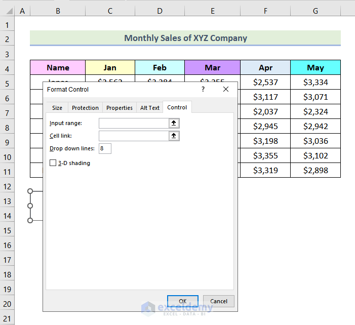
- In the Format Object dialog box, click inside the Input range box in Control.
- Select the Name column.
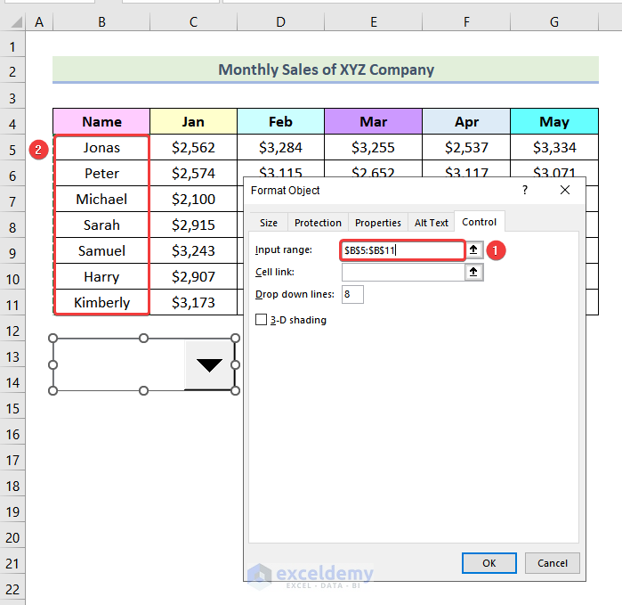
- Click inside Cell link.
- Choose a blank cell. Here, C16.
- Click OK.
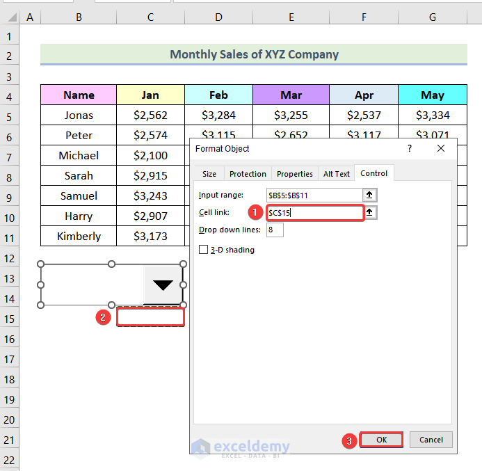
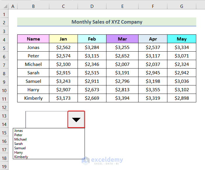
All names are added to the drop-down list.
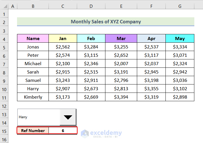
Note: The cell that you have selected, will display the serial number of the name.
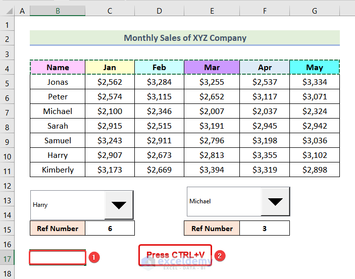
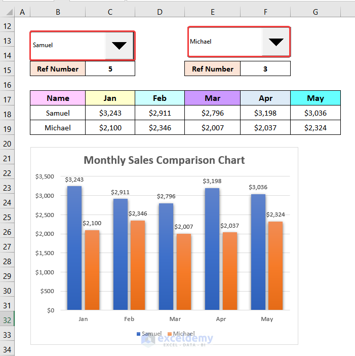
- Name the cell as Ref Number.
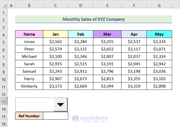
- Click any name in the drop-down of Combo Box. Here, Harry.
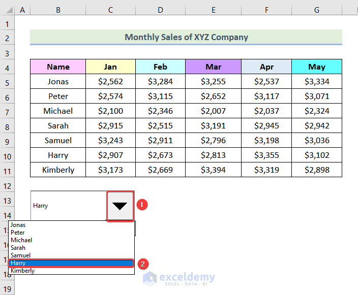
As Harry is 6th from the top, the Ref Number cell displays 6.
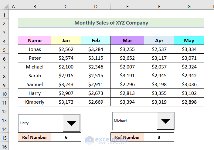
- Follow the same steps to add another Combo Box. This is the output.
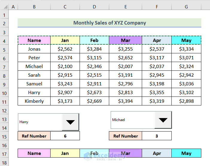
Step 4: Creating a Table for the Comparison Chart
- Select all headers and press CTRL+C.
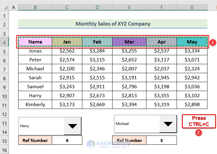
- Select B17 and press CTRL+V.
A new row of headers will be added.
Step 5: Applying the INDEX Function
- Use the following formula in B18 to extract a row from the dataset.
=INDEX(B5:G11,C16,{1,2,3,4,5,6})B5:G11 indicates the data range, C16 represents the row number, and {1,2,3,4,5,6} are the column numbers.
- Press ENTER.
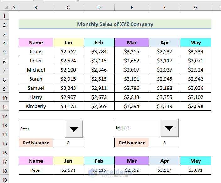
- Use the following formula in B19 to extract another row.
=INDEX(B5:G11,F15,{1,2,3,4,5,6})F15 represents the row to extract.
- Press ENTER.
This is the output.
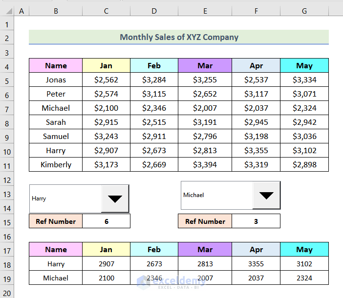
You can select any name in the Combo Box drop-downs and the row will be displayed.
Step 6: Inserting a Comparison Chart
- Select the table as shown below.
- Go to the Insert tab >> Insert Column or Bar Chart >> Clustered Column.
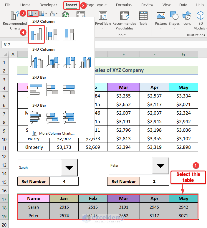
A clustered column chart will be added.
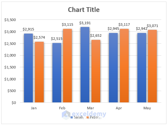
This is the sales comparison chart:
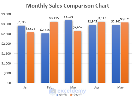
You can use different combinations of names in the Combo Box drop-down, and the comparison chart will be updated.
Read More: How to Make a Comparison Chart in Excel
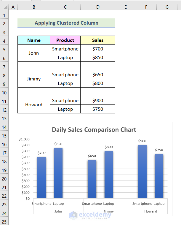
Method 2 – Applying a Clustered Column Chart to Create a Sales Comparison Chart in Excel
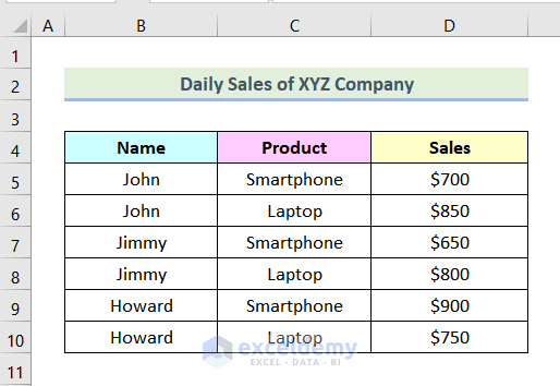
The dataset showcases the daily sales data of 2 products. Create a Clustered Column Chart to compare the sales of 3 salespersons.
Steps:
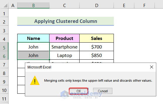
- Select B5 and B6.
- Go to the Home tab >> Merge & Center.
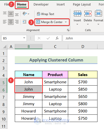
- In the dialog box, click Ok.
The following image will be displayed.
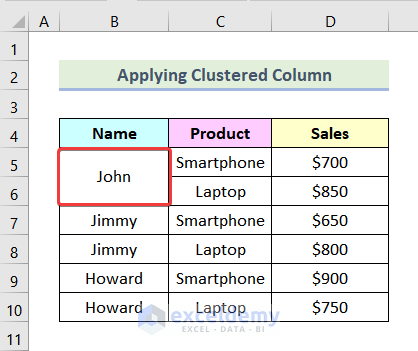
- Follow the same steps to merge cells:
- Select C7. Here, Products sold by Jimmy.
- Go to the Home tab >> Insert >> Insert Sheet Rows.
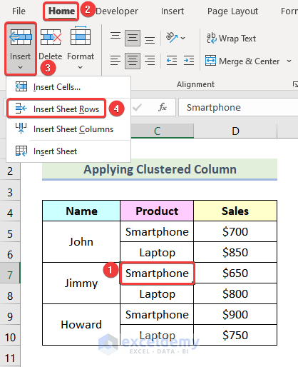
- Add a new row before C7:
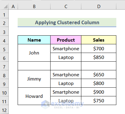
- Add a new row before C10. Here, Products sold by Howard.
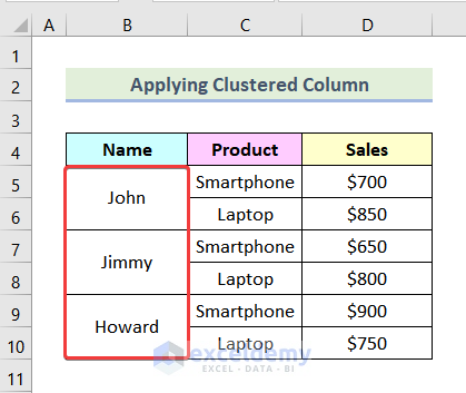
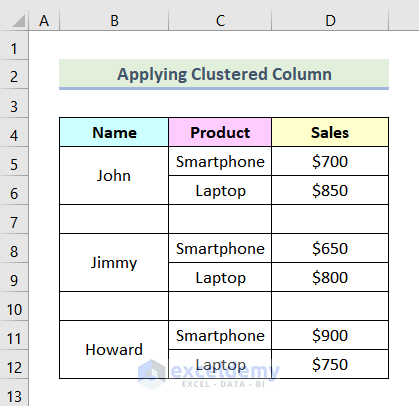
This is the output.
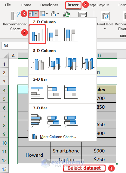
- Select the entire dataset.
- Go to the Insert tab >> Insert Column or Bar Chart>> Clustered Column.
The following chart is displayed.
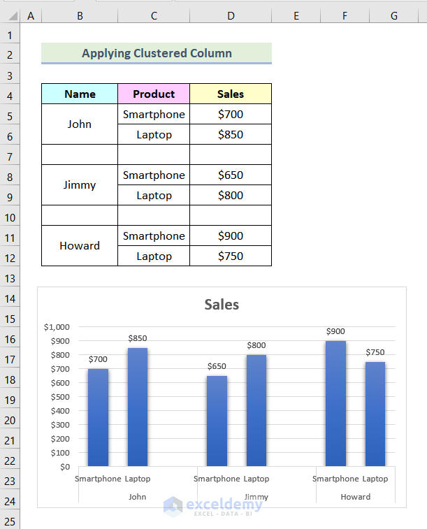
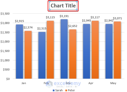
- Follow the previously mentioned steps to add the chart title. Here, Daily Sales Comparison Chart.
This is the output.
Read More: How to Compare 3 Sets of Data in Excel Chart
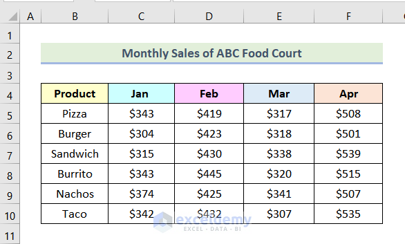
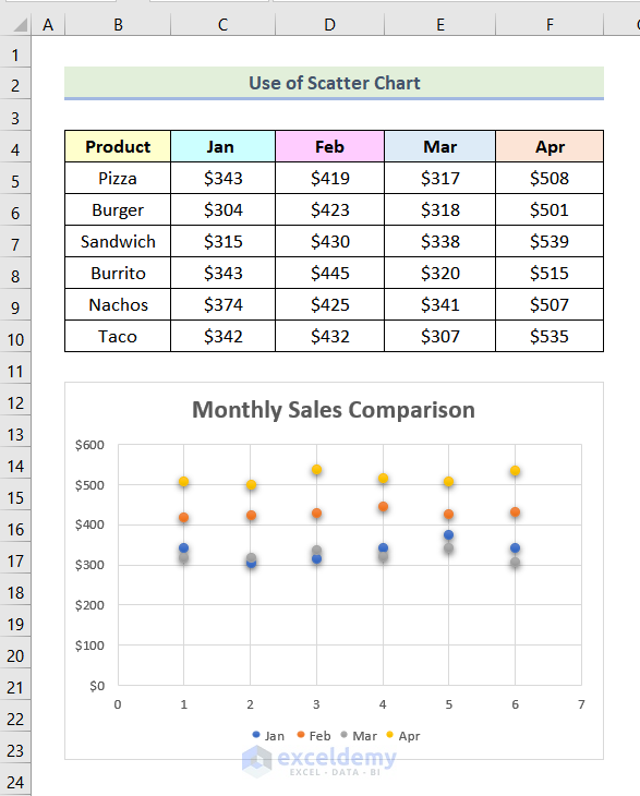
Method 3 – Using a Scatter Chart to Create a Sales Comparison Chart
The following dataset contains the Monthly Sales of ABC Food Court.
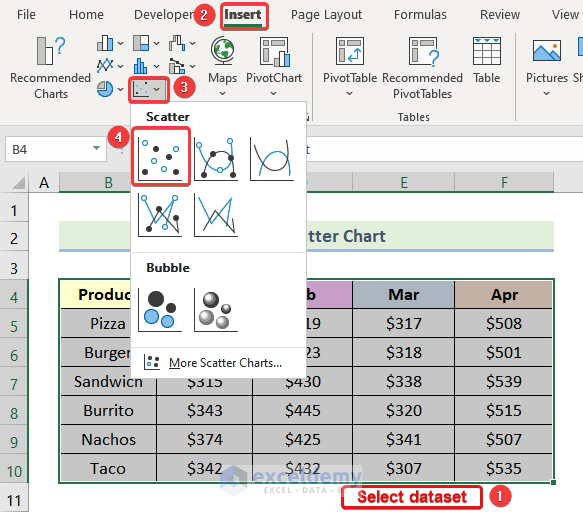
- Select the entire data set.
- Go to the Insert tab >> Insert Scatter (X, Y) or Bubble Chart >> Scatter.
A scatter chart will be displayed.
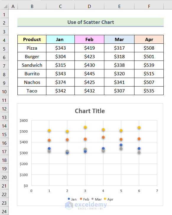
- Follow the previously mentioned steps to add the chart title. Here, Monthly Sales Comparison.
This is the output.
Read More: How to Make a Salary Comparison Chart in Excel
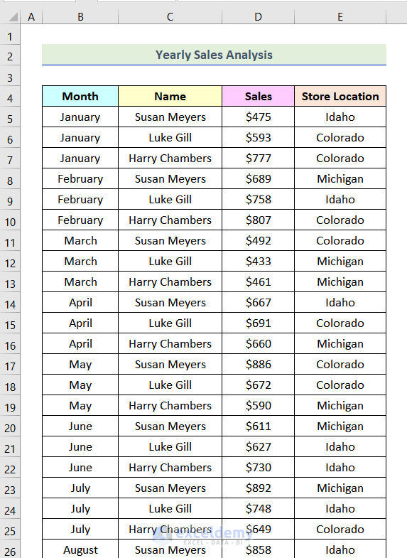
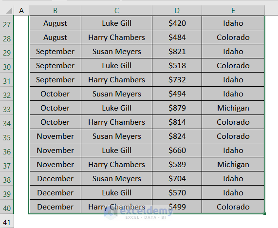
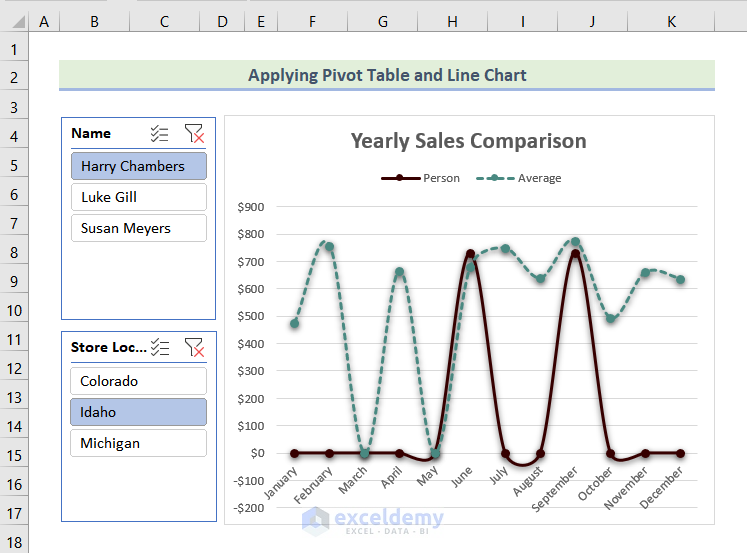
Method 4 – Using a Pivot Table and a Line Chart to Create a Sales Comparison Chart
The dataset showcases sales data of 3 employees of a company in different locations.
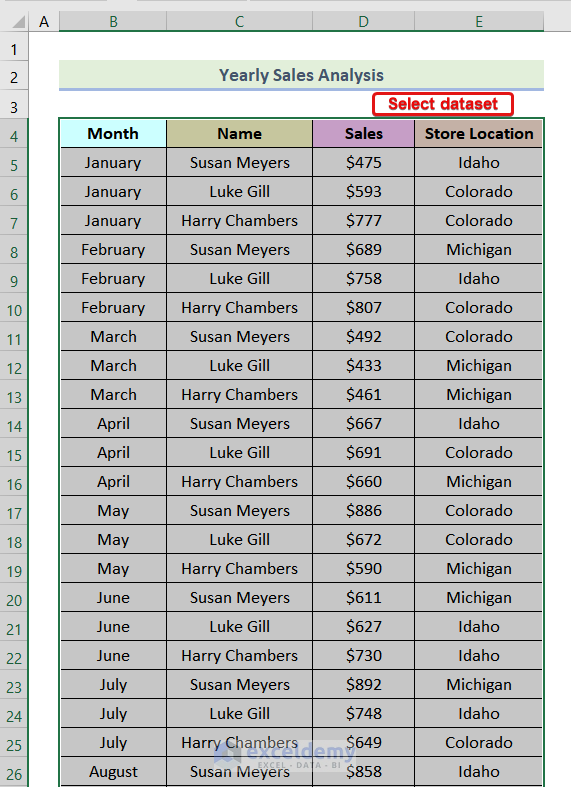
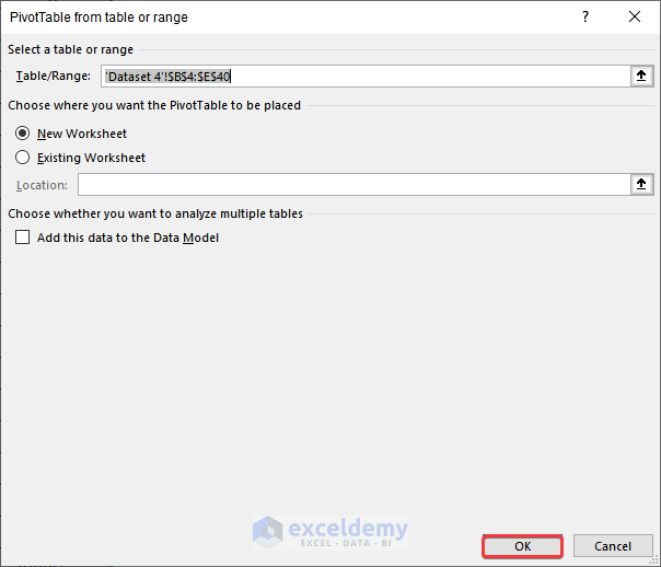
Step 1: Inserting a Pivot Table
- Select the entire data set.
Note: As the data set is quite large (40 rows), it is shown in the following 2 images.
- Go to the Insert tab >> Pivot Table.
A dialog box will be displayed.
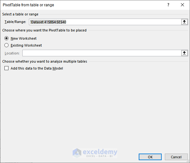
- Click Ok.
Another dialogue box will be displayed.
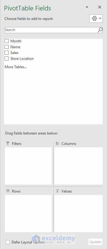
- Drag Month to Rows, Sales to Values, and Name to Filters.
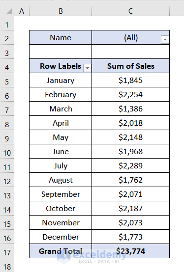
The following image will be displayed.
Step 2: Editing the Pivot Table
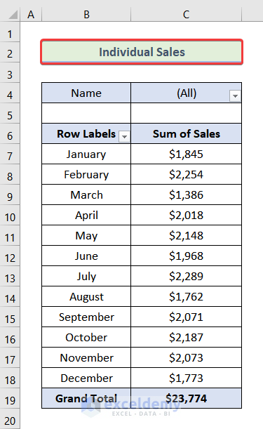
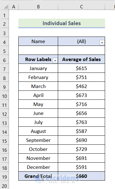
- Set a header for the Pivot Table. Here, Individual Sales.
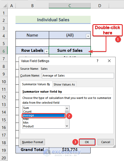
- Double-click Sum of Sales.
- In the dialog box, select Average.
- Click Ok.
This is the output.
Step 3: Creating a Pivot Table Without a Name Filter
- Select the pivot table created in the previous step.
- Press CTRL+C.
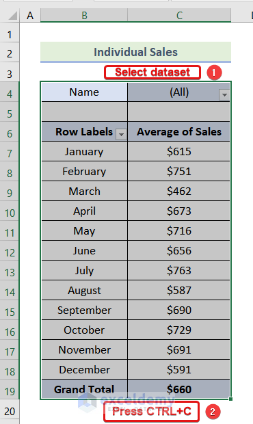
- Paste it into F4.
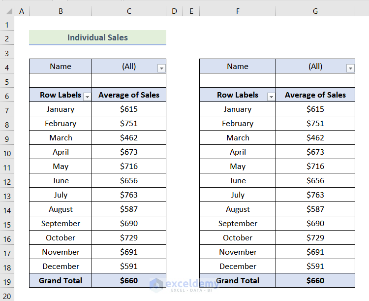
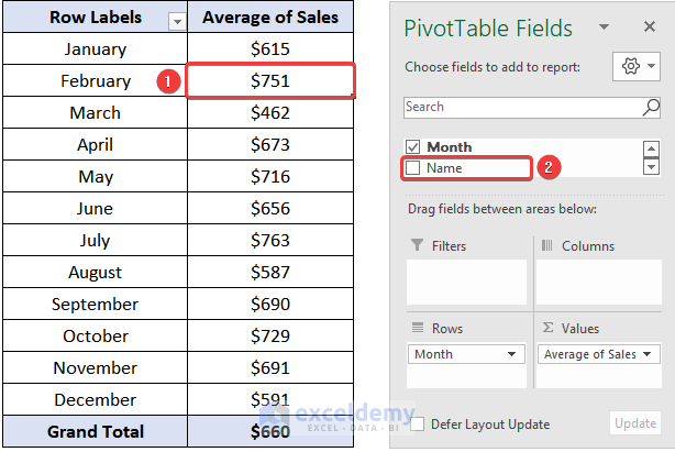
- Select any cell in the new pivot table.
- In the Pivot Table Fields dialog box, uncheck Name.
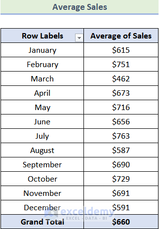
This is the output.
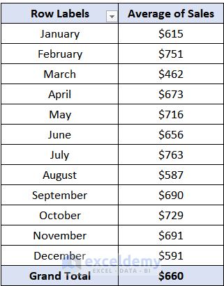
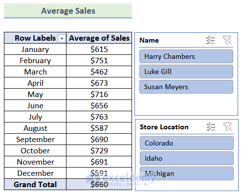
- Choose a header for this pivot table. Here, Average Sales.
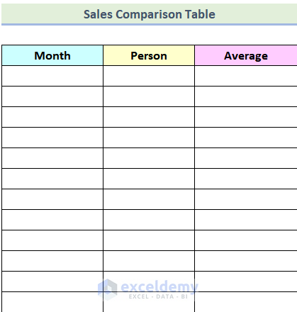
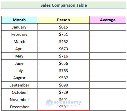
Step 4: Creating a Table for a Comparison Chart
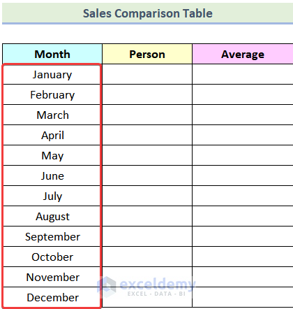
- Create a table with 3 columns: Month, Person, and Average.
- Enter January in the first cell in the Month column.
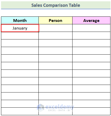
- Drag down the Fill Handle to the end of the table.
Months will be displayed.
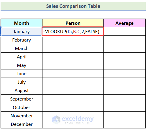
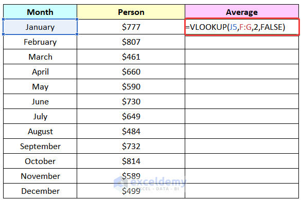
Step 5: Using the VLOOKUP Function
- Enter the following formula in K5 to extract the values of Individual Sales.
=VLOOKUP(J5,B:C,2,FALSE)J5 is the Month of January, which is the lookup_value of the VLOOKUP function, B:C is the table_array, 2 is the column_index_number, and FALSE is used for an exact match.
- Press ENTER.
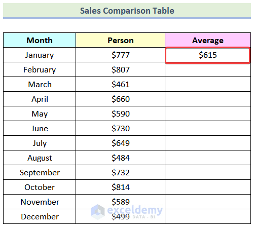
The VLOOKUP function will return $615.
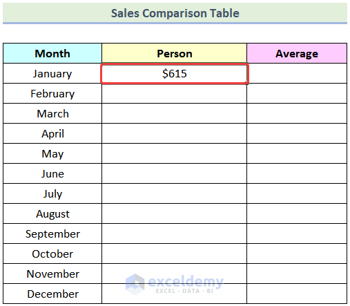
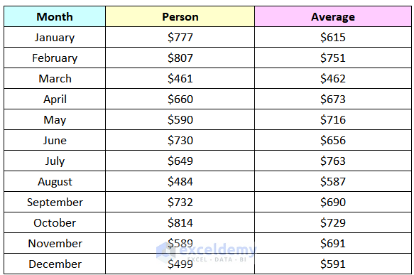
- Drag down the Fill Handle to see the result in the rest of the cells.
- Use the following formula in L5 to extract the values of Average Sales.
F:G is the table_array for the VLOOKUP function.
- Press ENTER.
This is the output.
- Drag down the Fill Handle to see the result in the rest of the cells.
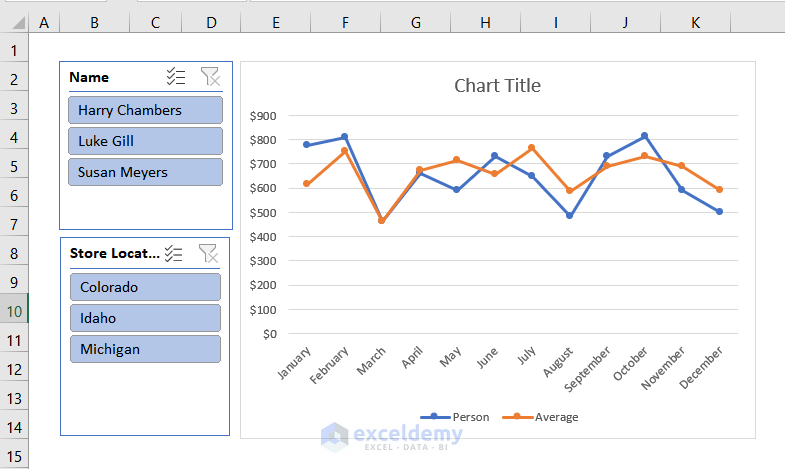
Step 6: Inserting a Slicer
- Click any cell in the Average Sales pivot table.
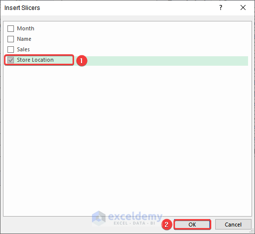
- Go to the PivotTable Analyze tab >> Insert Slicer.
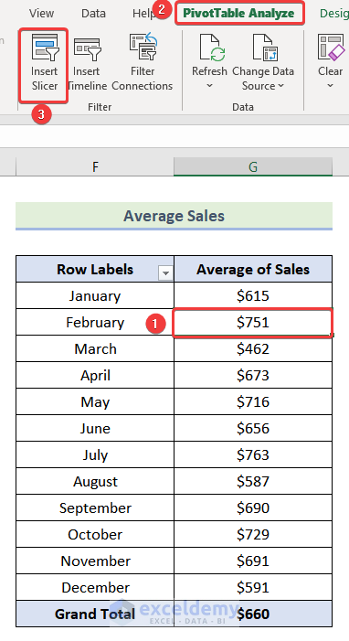
The Insert Slicer dialog box will open.
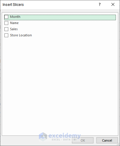
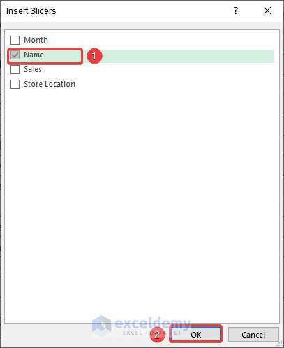
- Check Name.
- Click OK.
A slicer will be added.
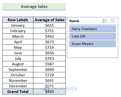
- Add another slicer by following the same steps. Check Store Location and click OK.
Two slicers will be added.
Step 7: Adding a Line Chart
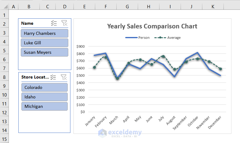
- Select the entire Sales Comparison Table.
- Go to the Insert tab >> Insert Line or Area Chart >> Line with Markers.
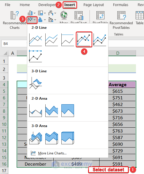
A line chart will be added.
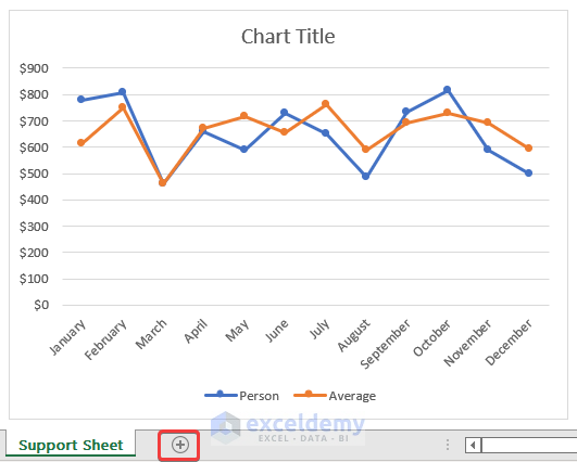
Step 8: Creating a New Worksheet
- Create a new worksheet by clicking the plus icon as shown below.
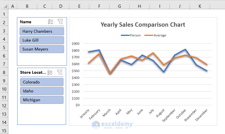
Step 9: Adding Slicers and a Line Chart to the New Worksheet
- Go to the Support Sheet.
- Press CTRL and select the 2 slicers.
- Press CTRL+X.
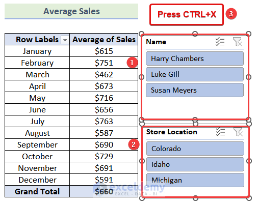
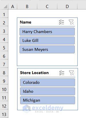
- Go to the new worksheet and paste the slicers in B2.
- Go to the Support Sheet and select the Line Chart.
- Press CTRL+X.
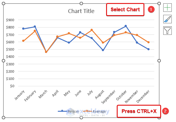
- Go to the new worksheet and paste it in E2.
Step 10: Formatting the Line Chart
- Click the paintbrush icon.
- Choose a style.
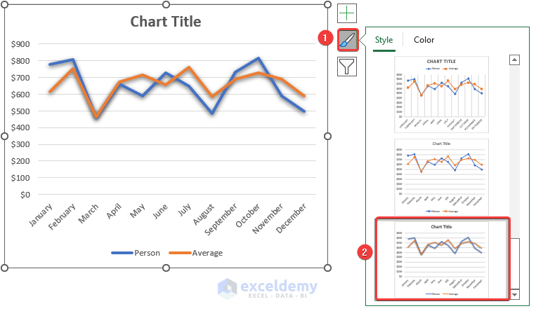
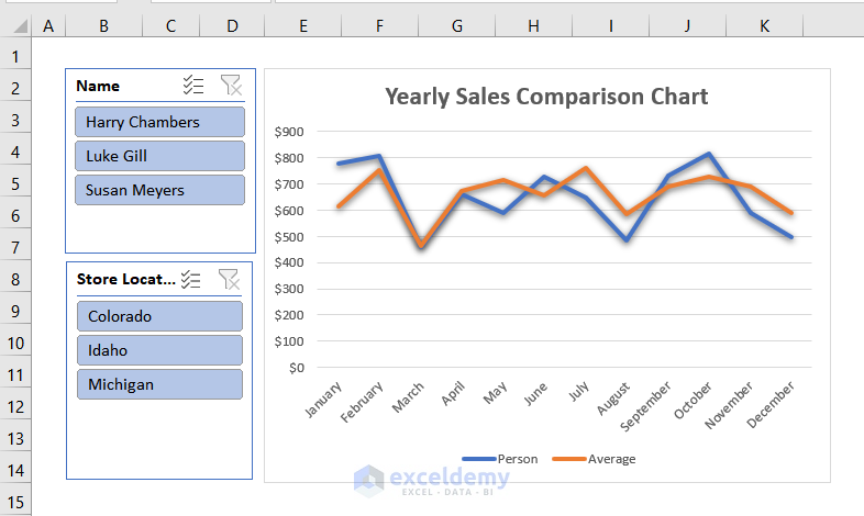
- Follow the previously mentioned steps tol add the chart title. Here, Yearly Sales Comparison.
- Right-click the marked portion shown below.
- Select Format Legend.
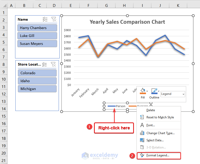
The Format Legend dialog box will open.
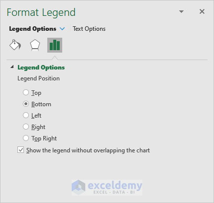
- Go to Legend Options >> Top.
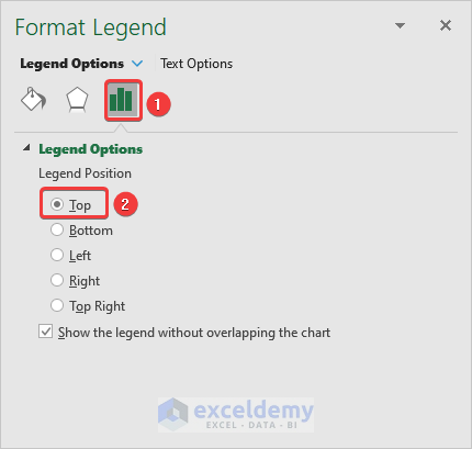
The legends moved to the top of the line chart.
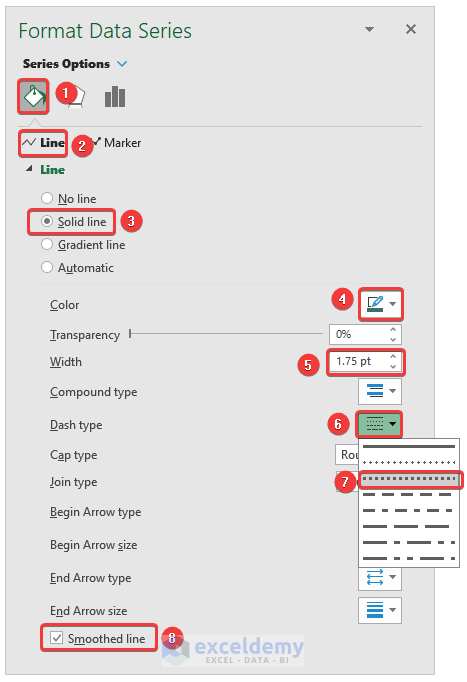
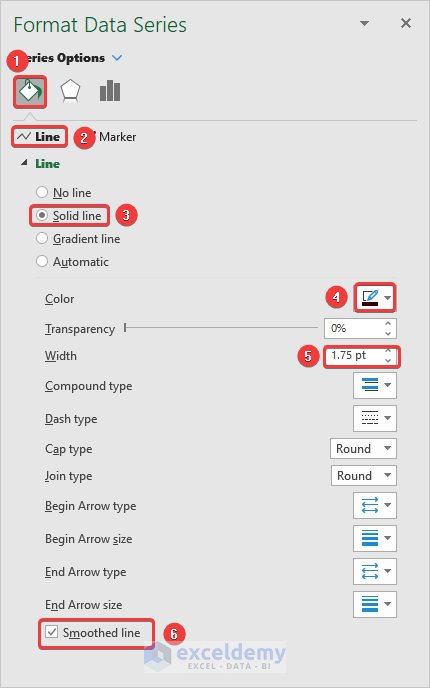
- Right-click any point in the orange line and select Format Data Series.
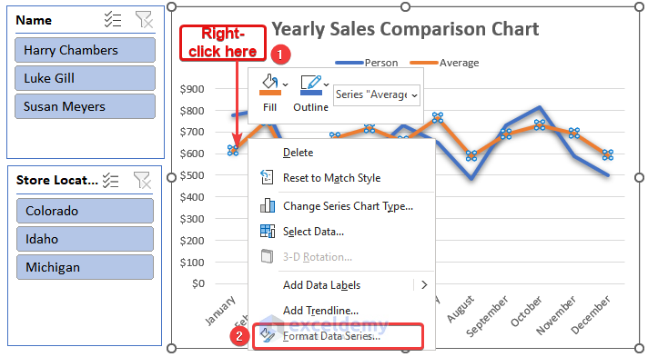
The Format Data Series dialog box will open.
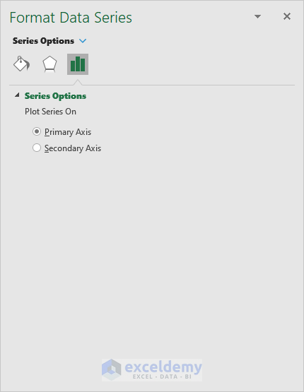
- Select Fill & Line.
- Click Line and select the following options:
Line → Solid Line
Color →Teal
Width → 1.75 pt
Dash Type → 3rd option
- Check Smoothed line.
This is the output.
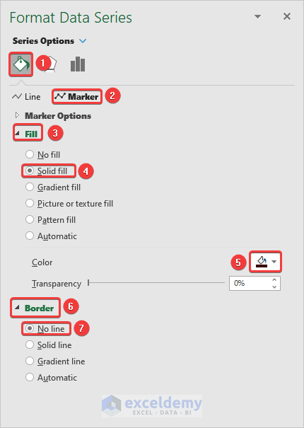
- Select Markers in Format Data Series.
- Choose Solid Fill in Fill option and choose the color used in the previous step.
- Click Border and select No line.
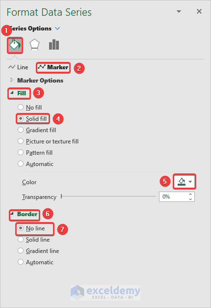
Markers will be added to the dashed line.
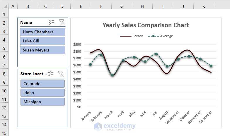
- Go to the Format Data Series dialog box to format the blue line by following the steps mentioned before.
- Click Fill & Line and choose Line. Select the following options:
Line → Solid Line
Color → Maroon
Width → 1.75 pt
- Check Smoothed line.
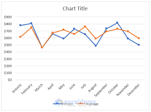
This is the output.
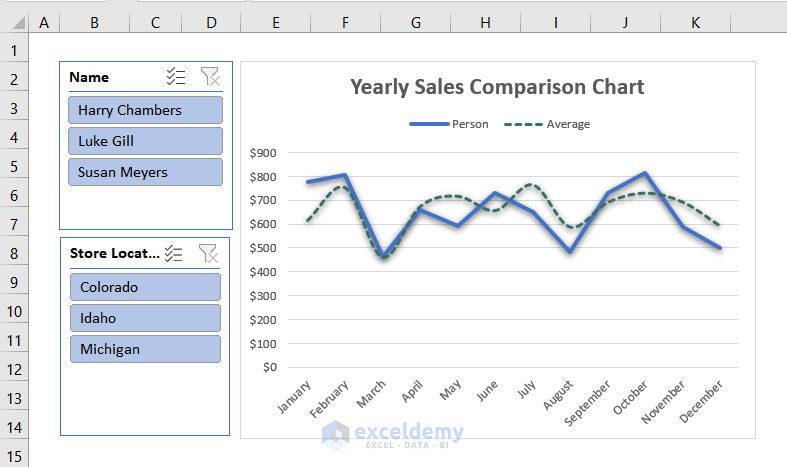
- Follow the same steps mentioned before to edit the markers. Make sure the color of the marker and the line is the same.
This is the output.
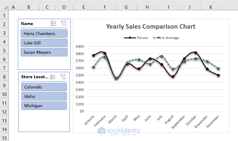
Step 11: Removing Gaps from the Line Chart
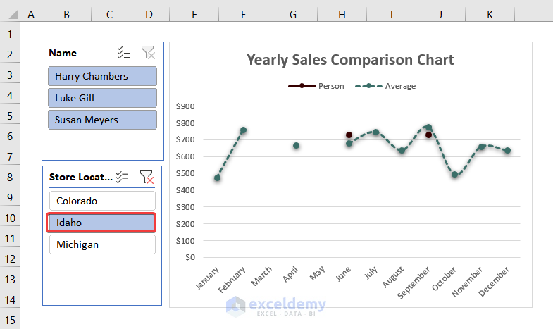
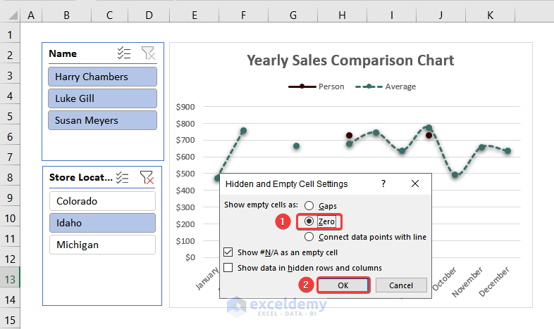
Select any location in the slicer. The line of individual sales is broken: some employees did not have any sales in that particular area at that time of the year.
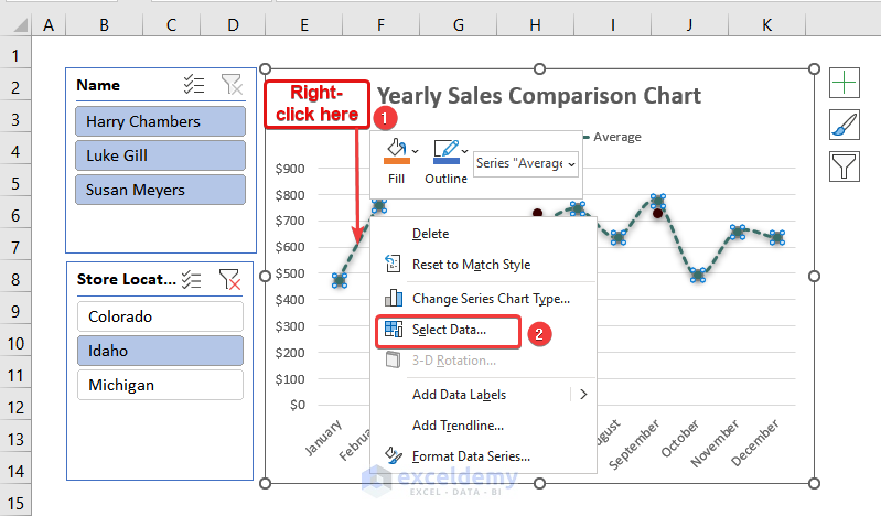
- Right-click the marked portion shown below.
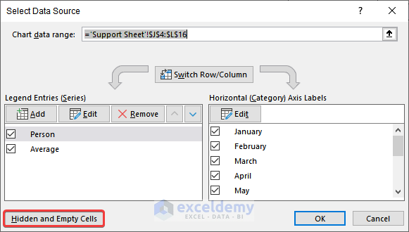
- Choose Select Data.
The Select Data Source dialog box will be displayed.
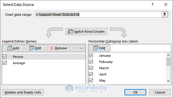
- Click Hidden and Empty Cells.
- In the next dialog box, select Zero.
- Click Ok.
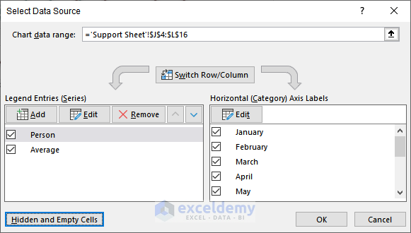
You will be redirected to the Select DataSource dialog box.
- Click Ok.
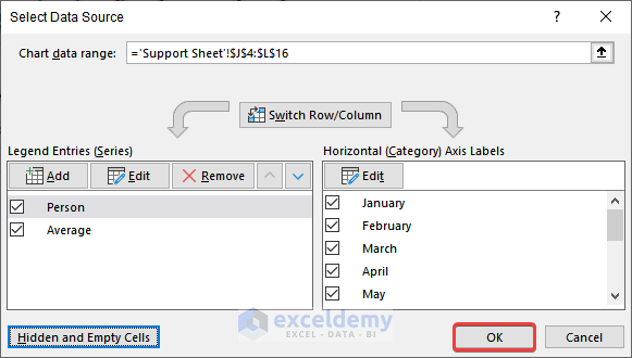
The gaps are no longer displayed in the comparison chart.
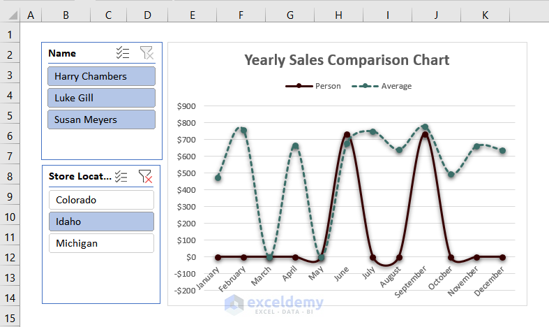
This is the final output.
Read More: How to Compare Two Sets of Data in Excel Chart
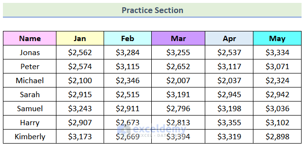
Practice Section
Practice here.
Download Practice Workbook
Related Articles
<< Go Back to Comparison Chart in Excel | Excel Charts | Learn Excel
Get FREE Advanced Excel Exercises with Solutions!

Hi!
A very interesting and good educational page, and hopefully it will work out fine for me after you explain something that is not working for me.
In step 5 when completing the steps my drop-down list is not align horizontal but vertical!? I have tried numerous solutions and really looked if I wrote something wrong but elass can´t find anything other than what you do.
I have windows 365, Swedish edition, which differs a bit from the english version, but that I think is under control. Everything works fine except the alignment. The date I have set brackets around, otherwise Excel converts it to a number.
Hello MATS WIKMAN
Thanks for your nice word. Your appreciation means a lot to us. I am sharing my findings regarding your issues as follows:
Hopefully, the suggestion will help you in reaching your goal. If you still have doubts, you can share your issues with precise details within the ExcelDemy Forum. Good luck!
Regards
Lutfor Rahman Shimanto
ExcelDemy