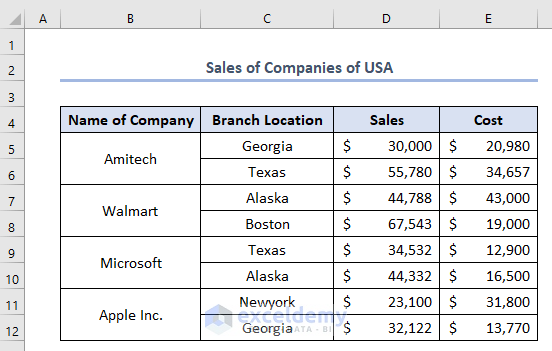
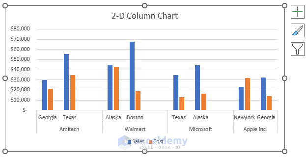
The sample dataset showcases Name of Company, Branch Location, Sales, and Cost.
Example 1 – Using a 2-D Column Chart to Compare Two Sets of Data
Compare the Sales and Cost data of different branches of different companies:
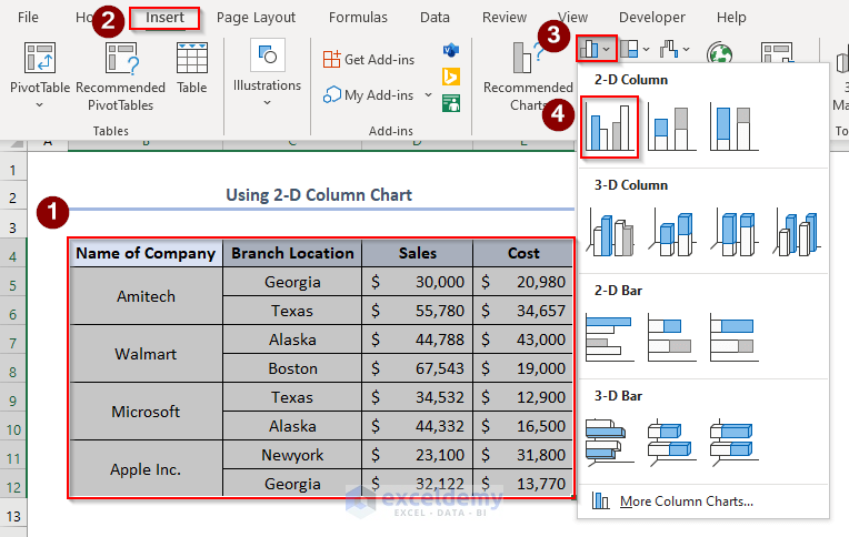
- Select the whole dataset > go to Insert tab > Insert Column or Bar Chart> select 2-D Column chart.
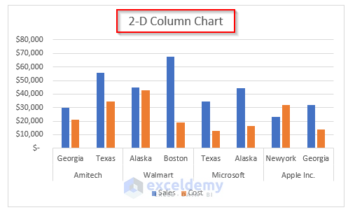
A 2-D Column chart will be displayed.
This is the output.
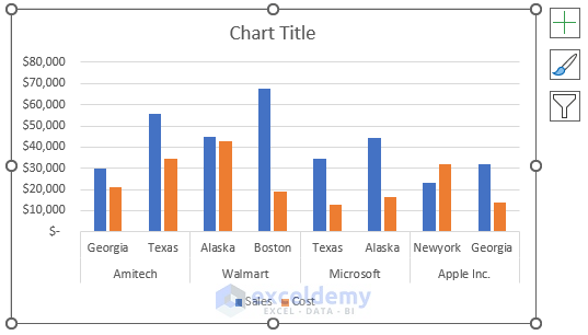
- Change the Chart Title to 2-D Column Chart.
- Right-click the joining point of 7th and 8th Row and select Insert.
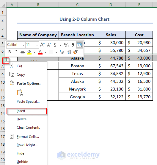
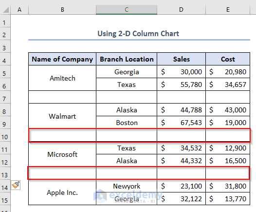
A blank row will be added.
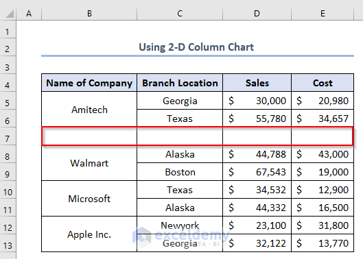
- Repeat the process twice:
There will be extra spaces in the chart.
Read More: How to Make a Comparison Chart in Excel
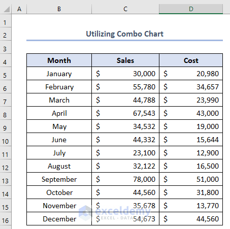
Example 2 – Utilizing a Combo Chart to Compare Two Sets of Data
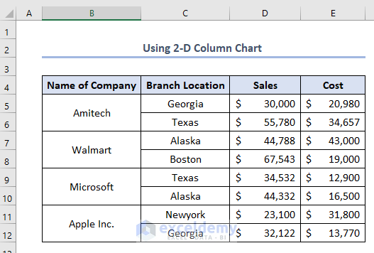
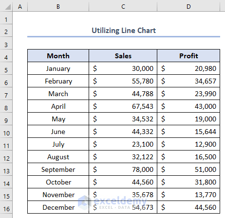
This is the sample dataset.
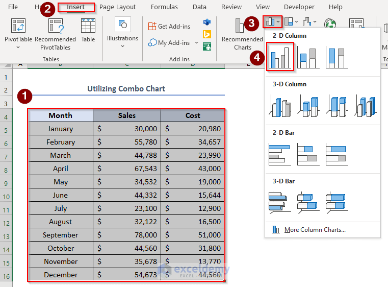
- Select the whole dataset > go to Insert > Insert Column or Bar Chart > select 2-D Column.
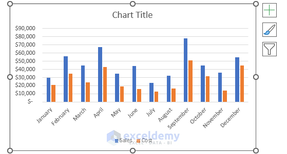
The following chart will be displayed.
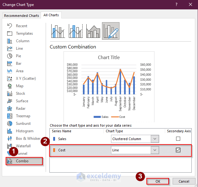
- Select the chart > go to Chart Design > select Change Chart Type.
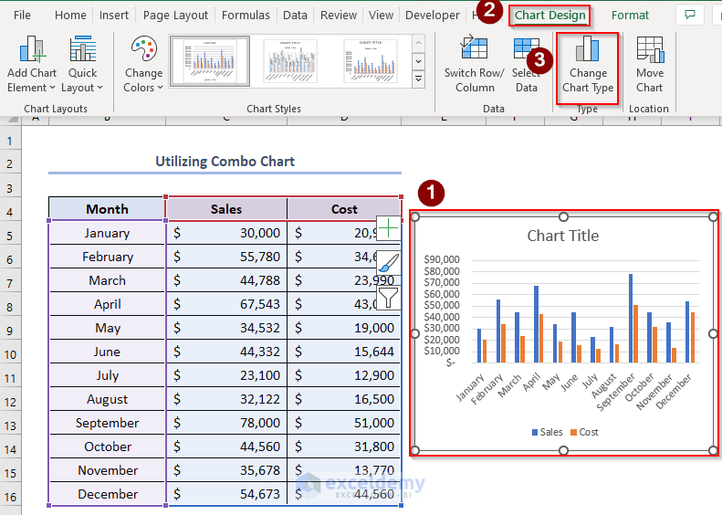
- Go to Combo > set Chart Type as Line for Cost and add a Secondary Axis.
This is the chart. Change the Chart Title to Combo Chart.
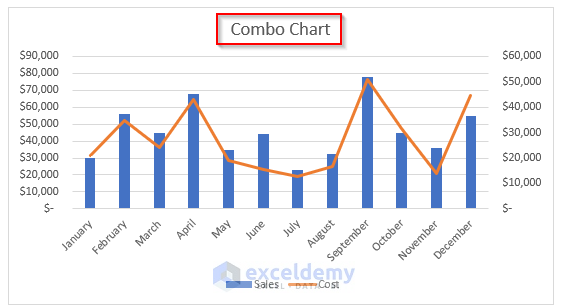
Sales is represented by a 2-D Column chart, and Cost is represented by a Line chart with a secondary axis on the right.
Read More: How to Make a Salary Comparison Chart in Excel
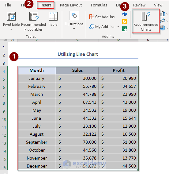
Example 3 – Using a Line Chart
Compare two sets of data:
- Select the whole dataset > go to Insert > select Recommended Charts.
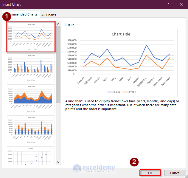
- Select the chart type shown below.
- Click OK.
The Line chart will be displayed.
- Change the Chart Title to Line Chart.
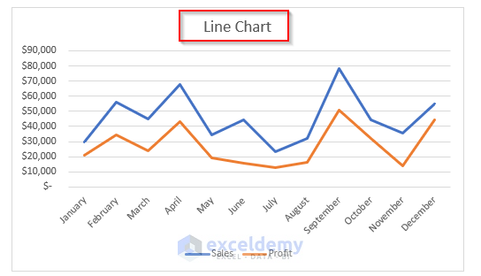
This is the output.
Read More: How to Make Sales Comparison Chart in Excel
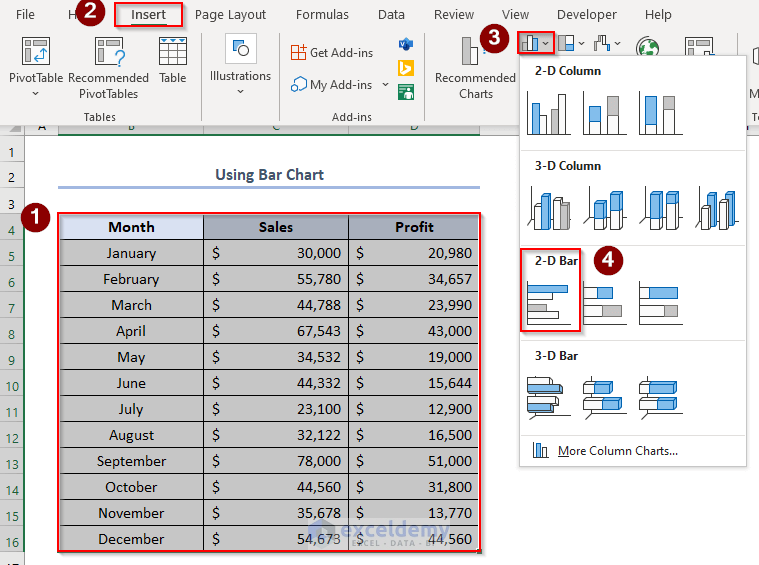
Example 4 – Using a Bar Chart
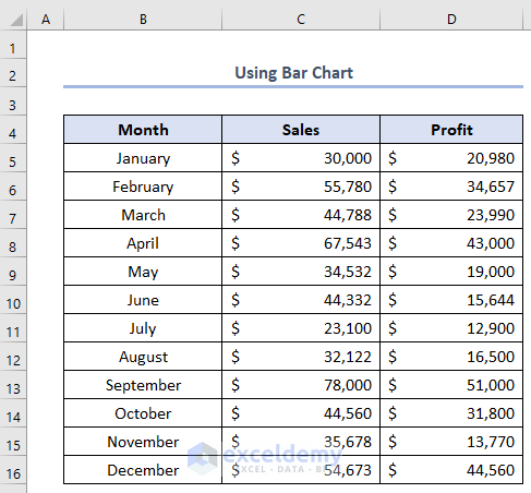
- Select the whole dataset > go to Insert > Insert Column or Bar Chart > select 2-D Bar.
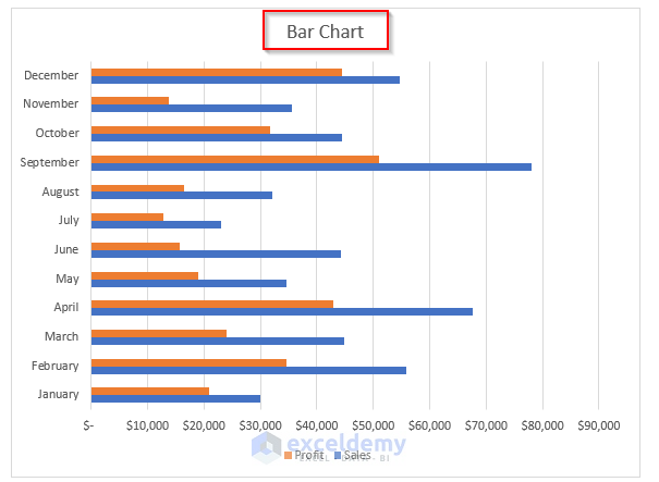
This is the output.
- Change the Chart Title to Bar Chart.
Read More: How to Make a Price Comparison Chart in Excel
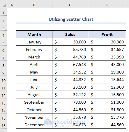
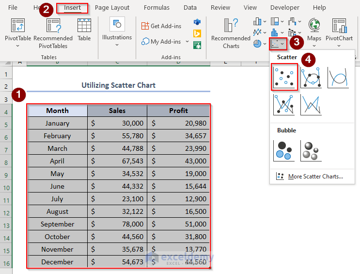
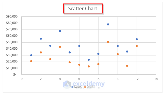
Example 5 – Utilizing the Scatter Chart
- Select the whole dataset > go to Insert > Insert Column or Bar Chart> select Scatter.
The chart will be displayed.
- Change the Chart Title to Scatter Chart.
Read More: How to Compare 3 Sets of Data in Excel Chart
Things to Remember
- The difference between the Bar Chart and Column Chart is the change in axis. In the Bar Chart, we can see the values on the horizontal axis and names on the vertical axis. In the 2-D Column Chart, the axis reverses.
Download Practice Workbook
Related Articles
<< Go Back to Comparison Chart in Excel | Excel Charts | Learn Excel
Get FREE Advanced Excel Exercises with Solutions!
