Method 1 – Use Pie Chart for One Set of Quarterly Data Comparison
Steps:
- Select the range B4:C8.
- Go to the Insert
- Choose a pie- chart.
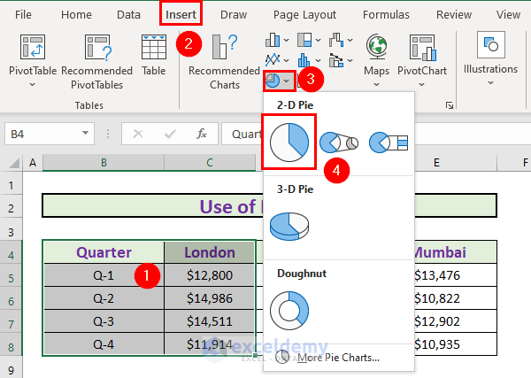
- Excel will create a pie chart.
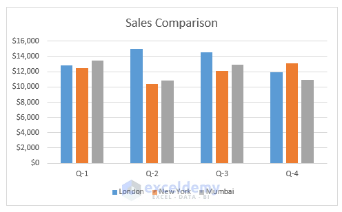
Method 2 – Create Stacked Column Chart for Quarterly Comparison
Steps:
- Select B4:E8.
- Go to the Insert
- Select the stacked column chart.
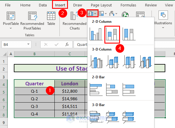
- Excel will create a stacked column chart.
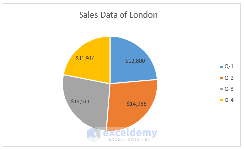
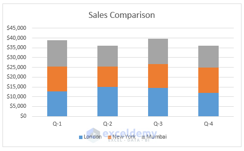
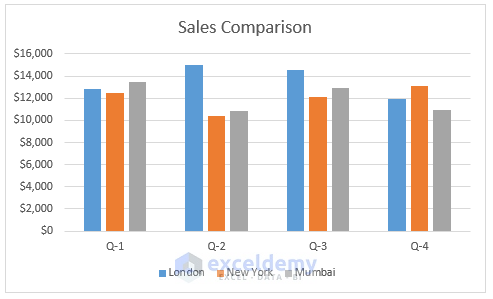
- We renamed the chart as Sales Comparison.
Method 3 – Use Clustered Column Chart for Quarterly Comparison
Steps:
- Select B4:E8.
- Go to the Insert
- Select the clustered column chart.
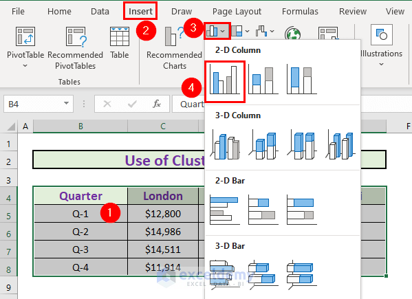
- Excel will create a chart.
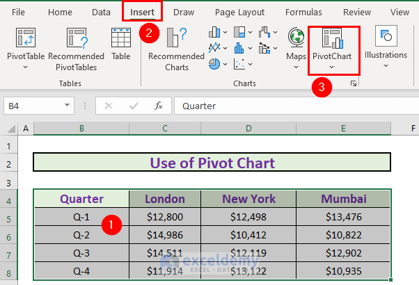
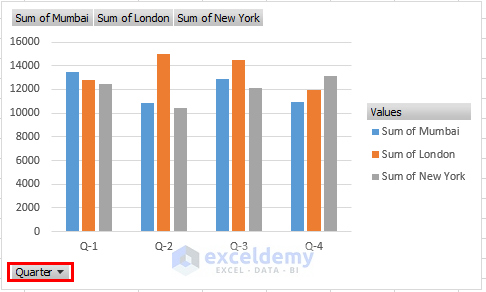
Method 4 – Create Pivot Chart for Quarterly Comparison
Steps:
- Select B4:E8.
- Go to the Insert
- Select PivotChart.
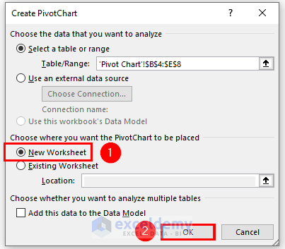
- Choosing New Worksheet as the destination.
- Click OK.
- Drag the Quarter to the Axis
- Drag the other columns to the Values
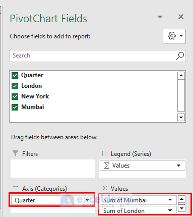
- Excel will create the pivot chart.
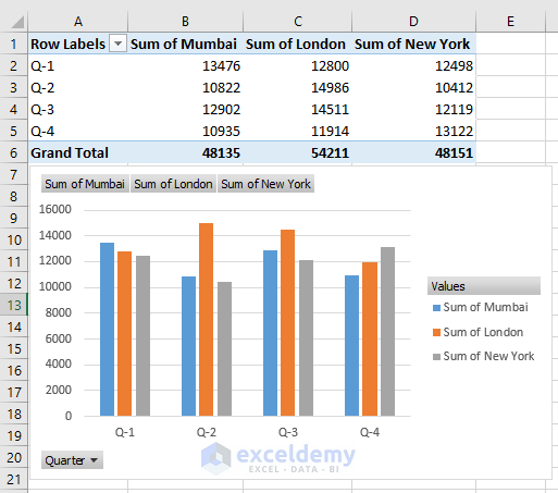
- The biggest advantage of a pivot chart is you can filter the data to modify the chart.
Method 5 – Use Recommended Charts Option for Quarterly Comparison
Steps:
- Select B4:E8.
- Go to the Insert
- Select the Recommended Charts.
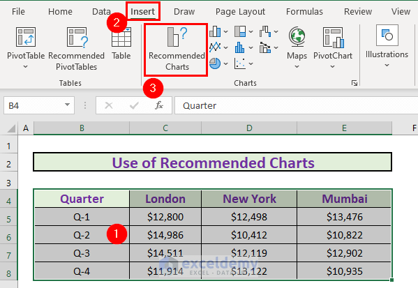
- Excel will show a list of recommended charts.
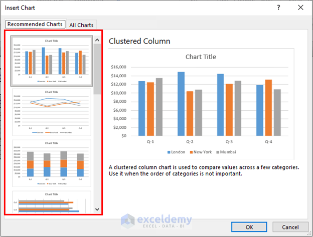
- Choose the one you find suitable. Excel will create that chart.
Things to Remember
- You can create charts from the Recommended Charts
- Pivot Charts can help filter your data.
Download Practice Workbook
Download this workbook and practice while going through the article.
<< Go Back to Comparison Chart in Excel | Excel Charts | Learn Excel
Get FREE Advanced Excel Exercises with Solutions!
