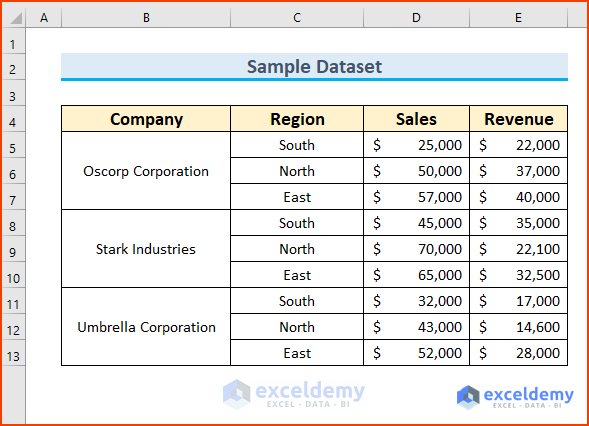
This is the sample dataset.
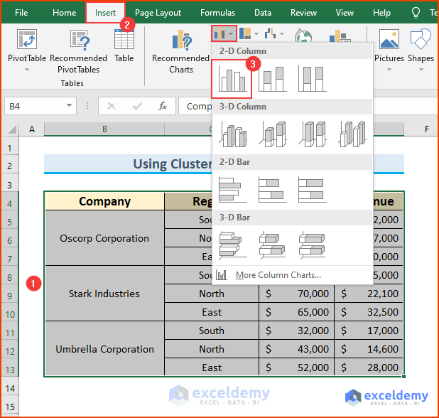
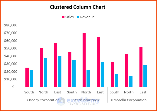
Example 1 – Using a Clustered Column Chart
Steps:
- Select B4:E13.
- Go to the Insert tab ➤ Insert Column or Bar Chart ➤ select Clustered Column.
A chart is displayed.
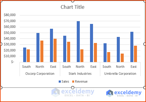
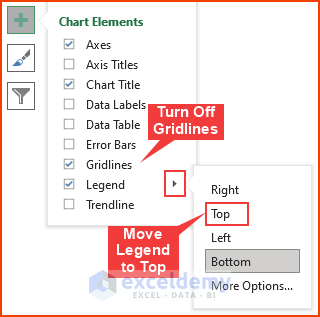
- You can hide the Gridlines and move the Legend using the Chart Elements feature.
- You can also change the shape colors and increase font sizes.
Read More: How to Create a Budget vs Actual Chart in Excel
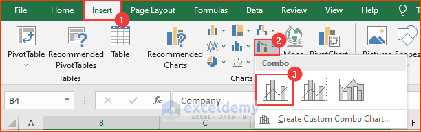
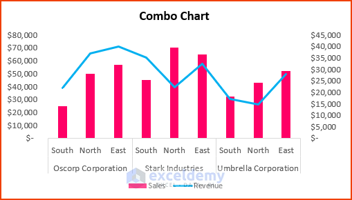
Example 2 – Using a Combo Chart
Steps:
- Select the dataset.
- Go to the Insert tab ➤ Insert Combo Chart ➤ select Clustered Column – Line.
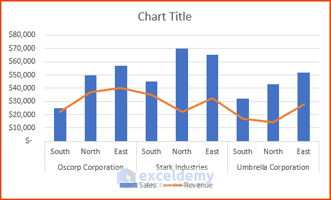
A default combo chart is displayed.
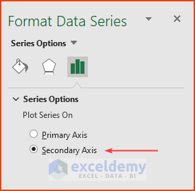
- Double-click the revenue line graph.
- In Format Data Series, select Secondary Axis.
- Modify the chart: font size, shape colors, chart title.
Read More: How to Compare Two Sets of Data in Excel Chart
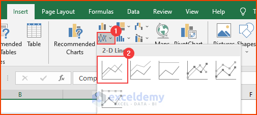
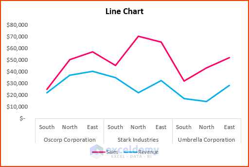
Example 3 – Using a Line Graph
Steps:
- Select the dataset.
- Go to the Insert tab ➤ Insert Chart or Area Chart ➤ select Line.
A line graph will be displayed.
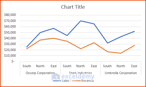
- Modify the chart:
Read More: How to Make a Salary Comparison Chart in Excel
Example 4 – Using a Bar Chart
Steps:
- Select the dataset.
- Go to the Insert tab ➤ Insert Column or Bar Chart ➤ select Clustered Bar.
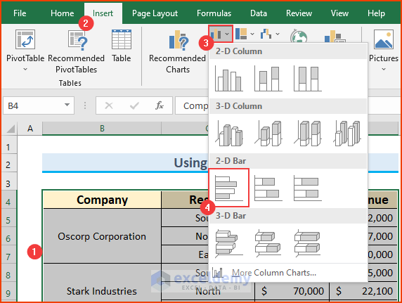
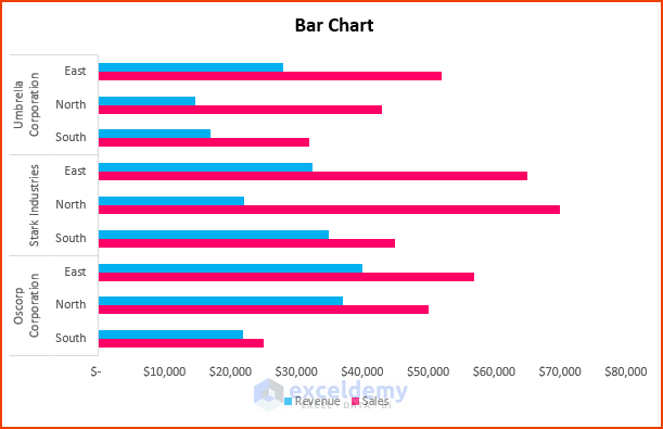
The chart is displayed.
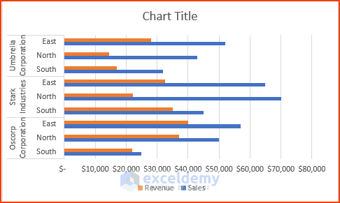
- Modify the chart:
Read More: How to Make a Price Comparison Chart in Excel
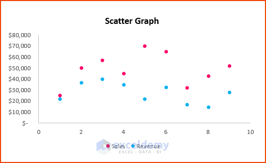
Example 5 – Using a Scatter Plot
Steps:
- Select B4:E13.
- Go to the Insert tab ➤ Insert Scatter (X,Y) or Bubble Chart ➤ select Clustered Column.
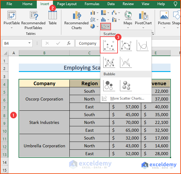
The chart is displayed.
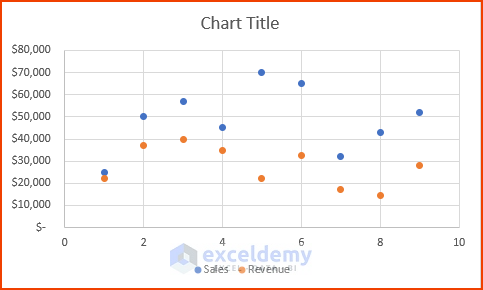
- Modify the chart:
Read More: How to Make a Comparison Chart in Excel
Download Practice Workbook
Download the Excel file.
Related Articles
<< Go Back to Comparison Chart in Excel | Excel Charts | Learn Excel
Get FREE Advanced Excel Exercises with Solutions!
