Here’s an overview of a comparison chart with a Pivot Table.
Read More: How to Compare Two Sets of Data in Excel Chart
Method 1 – Applying a Clustered Column Chart to Make a Comparison Chart in Excel
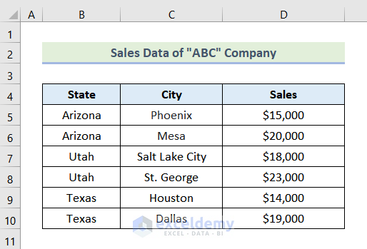
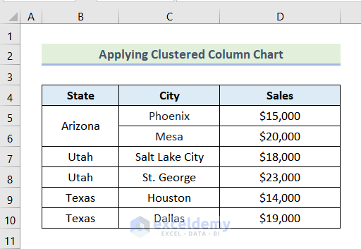
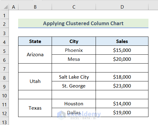
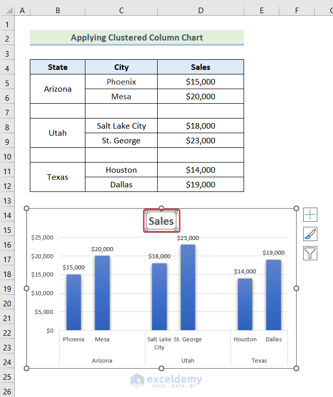
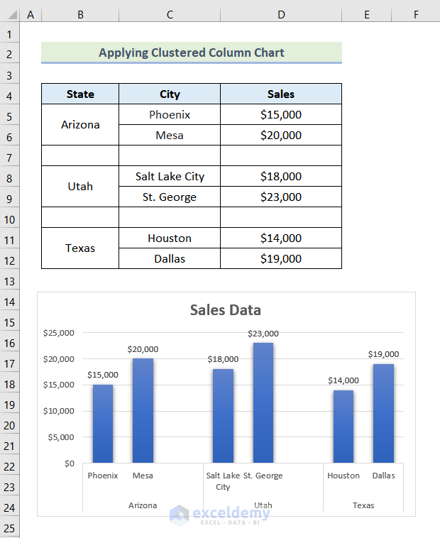
We have sales data for different states and cities. We will make a Comparison Chart of Sales for different States.
Steps:
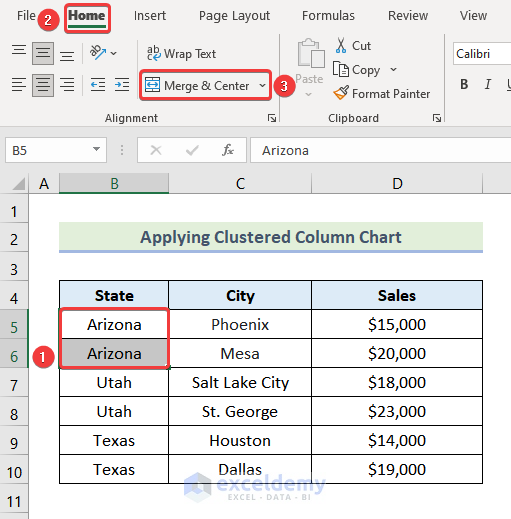
- There are a total of 3 states in 6 rows. We’ve sorted the table by this column.
- Select the two cells that contain Arizona.
- Go to the Home tab.
- From the Alignment group, choose Merge & Center.
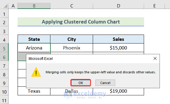
- Press OK on the warning message.
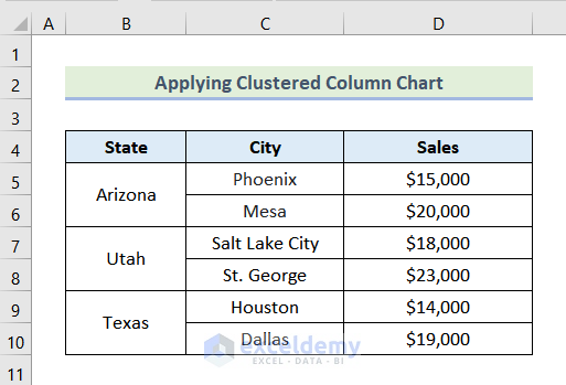
- The two cells are merged together.
- Repeat to merge other unique values in the column.
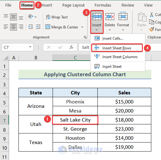
- Click on cell C7, which lists the Salt Lake City in the state of Utah.
- Go to the Home tab and select Insert, then choose Insert Sheet Rows.
- You will get a blank row above.
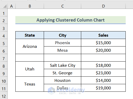
- Add another blank row above Houston.
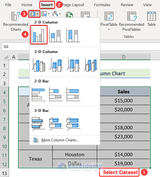
- Select the whole dataset.
- Go to the Insert tab and select Insert Column or Bar Chart, then choose Clustered 2-D Column.
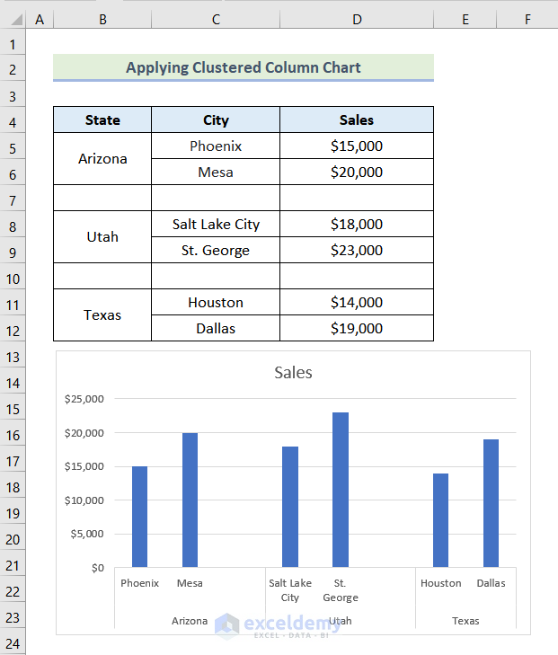
- A Clustered Column Chart should be inserted in the sheet.
- Click on the sheet and then click the paintbrush icon on the top-right.
- Choose your preferred style.
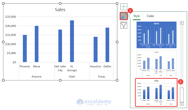
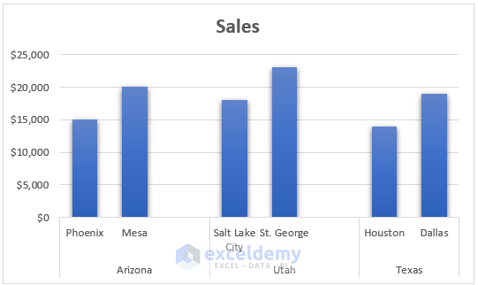
- Here’s a sample style.
- Click on Chart Elements (the Plus icon).
- Check the box for Data Labels.
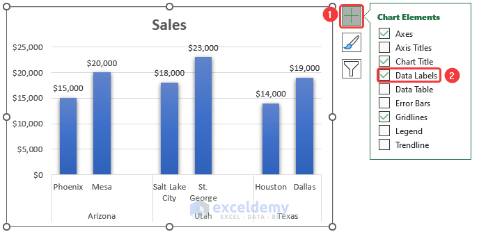
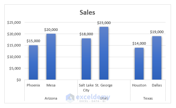
- Data Labels will be added to the chart.
- Click on the Chart Title.
- Type your preferred chart title.
Read More: How to Use Comparison Bar Chart in Excel
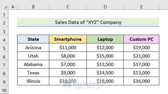
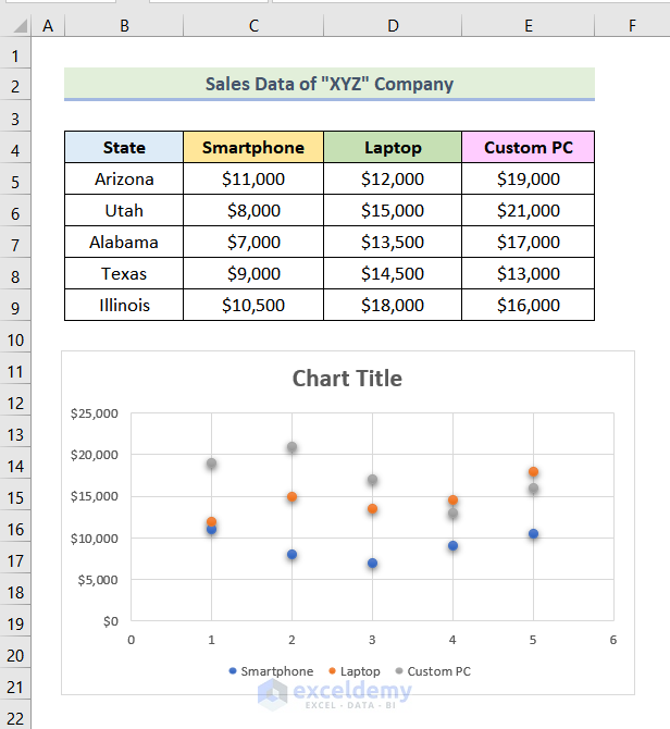
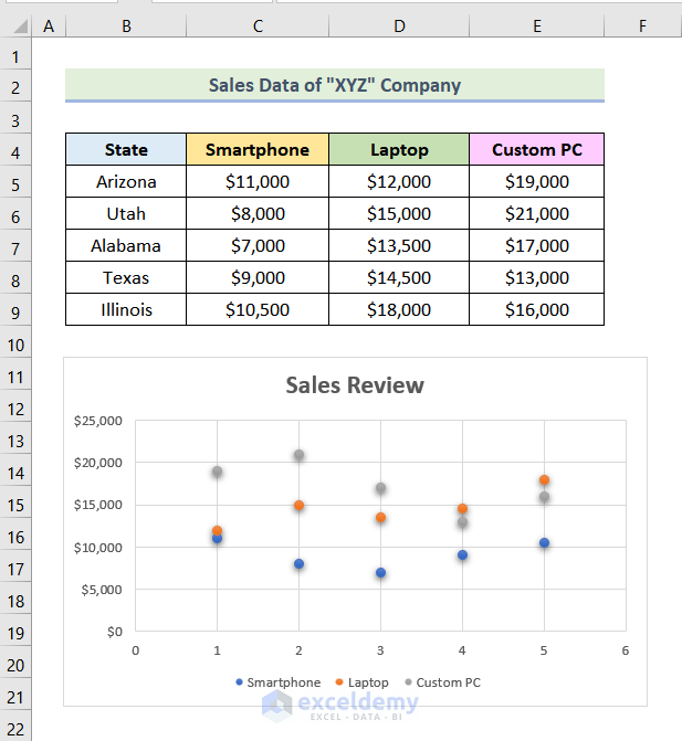
Method 2 – Using a Scatter Chart to Create a Comparison Chart
We have the sales data various States.
Steps:
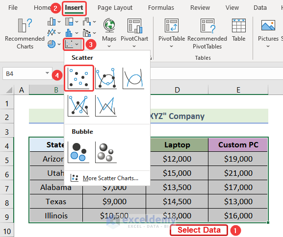
- Select the entire dataset.
- Go to the Insert tab.
- Select Insert Scatter (X, Y) or Bubble Chart.
- Choose Scatter from the drop-down.
- A Scatter Chart for the selected dataset will be inserted.
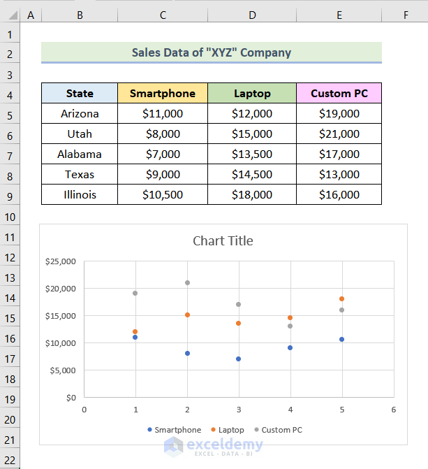
- Select your preferred style of the chart by following the same steps mentioned before.
- Edit the chart title by following the previously mentioned steps. In this case, we are using Sales Review as our chart title.
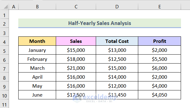
Method 3 – Using a Combo Chart as a Comparison Chart in Excel
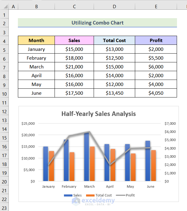
We have half-yearly sales data of a company. We will create a Comparison Chart for the dataset for different months.
Steps:
- Select the entire dataset.
- Go to the Insert tab.
- Click on Insert Combo Chart.
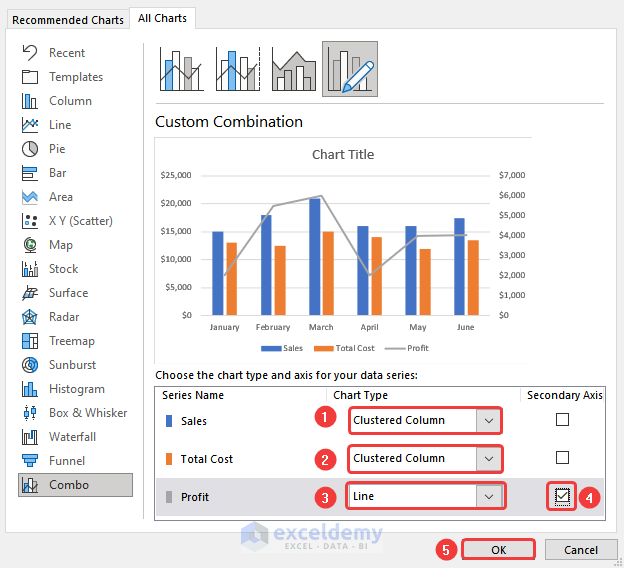
- Select Create Custom Combo Chart from the drop-down.
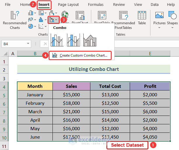
- A dialog box will pop up. Select Clustered Column for Sales and Total Cost.
- Select Line for Profit.
- Check the Secondary Axis box for Line.
- Press OK.
- Your chart should be inserted.
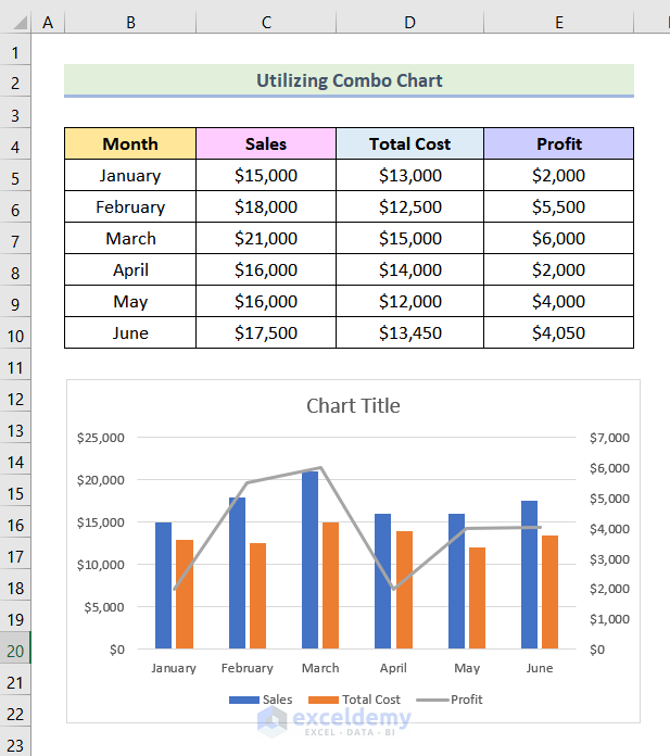
- Choose your preferred style and edit the chart title.
Method 4 – Applying a Pivot Table and a Line Chart to Create a Comparison Chart
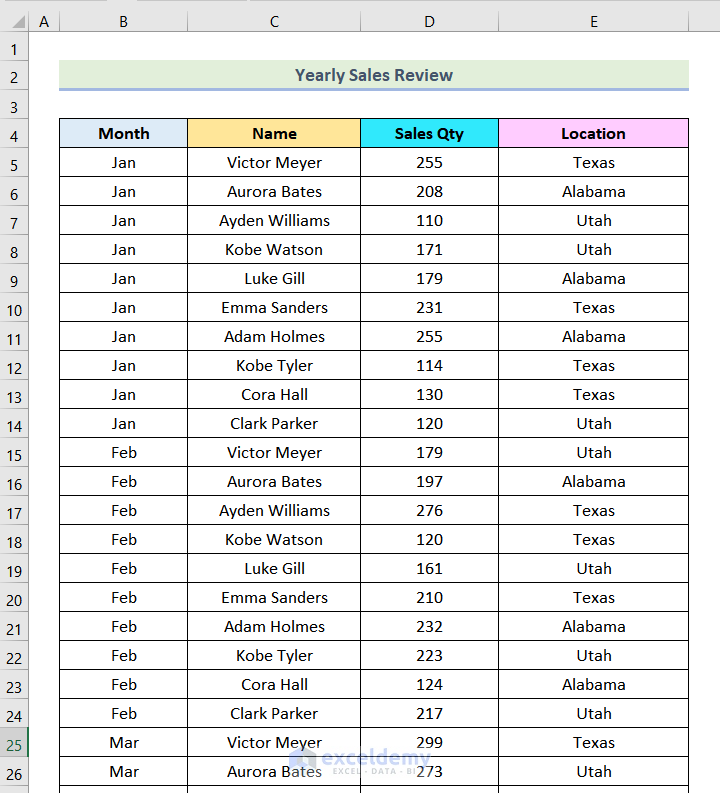
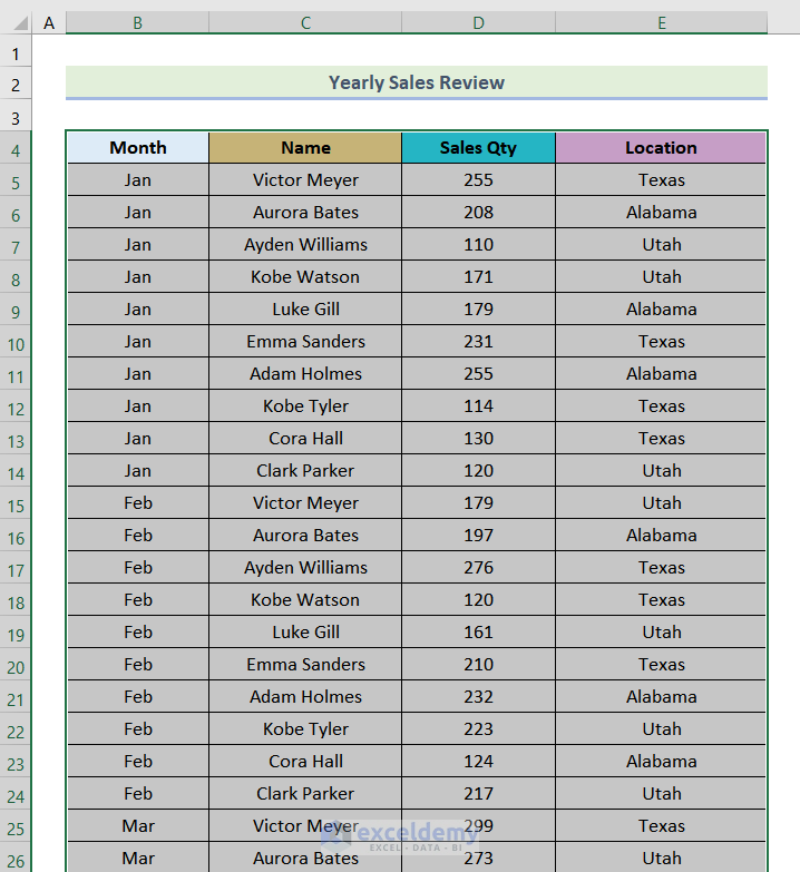
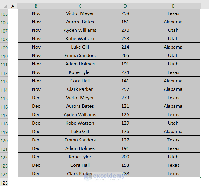
We have yearly sales data of a company for various states.
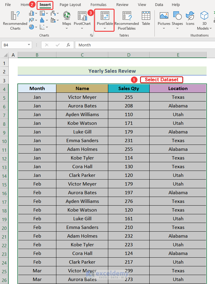
Step 1 – Inserting Pivot Table
- Select the entire dataset.
- Go to the Insert tab.
- Click on PivotTable from the Tables group.
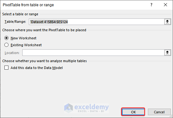
- A dialog box will pop up. Select OK.
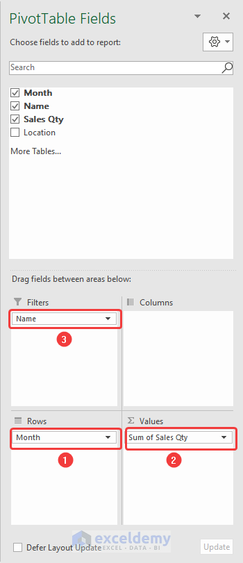
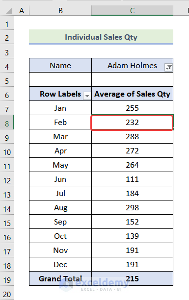
- Another box will be visible on your screen named Pivot Table Fields.
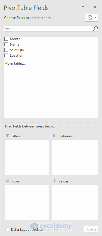
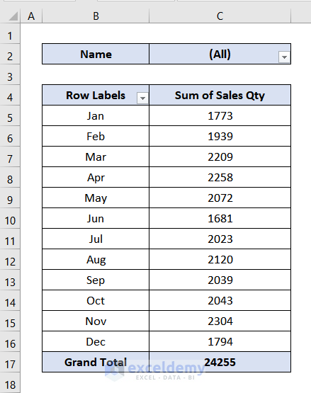
- Drag Month to the Rows section, Sales Qty to the Values section, and Name to the Filter section.
- You will get the following Pivot Table on your screen.
Step 2 – Editing the Pivot Table
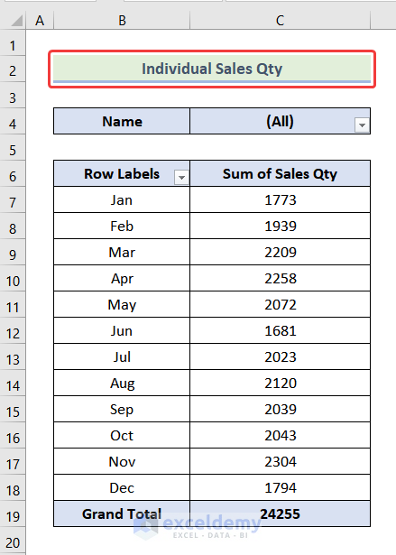
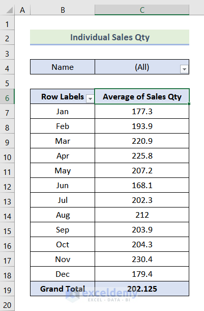
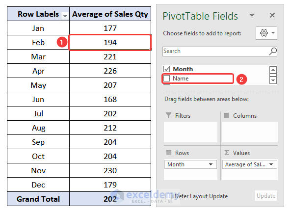
- Insert a row for the heading and name it as Individual Sales Qty.
- Double-click on the Sum of Sales Qty.
- Select Average from the dialog box.
- Press OK.
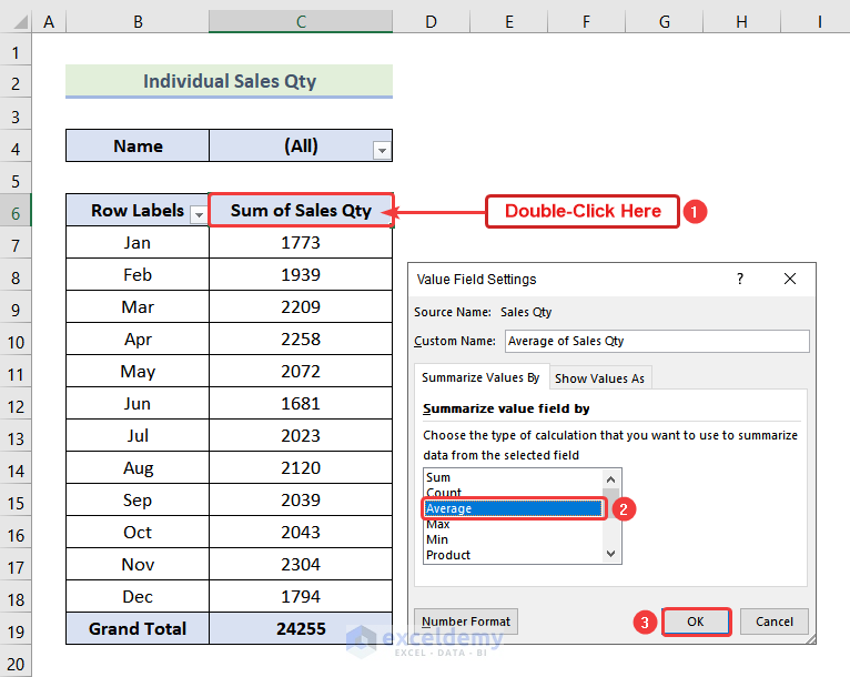
- Here’s the result.
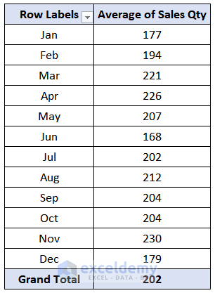
- Select the data of the Average of Sales Qty column.
- Go to the Home tab and click on the Decrease Decimal option once.
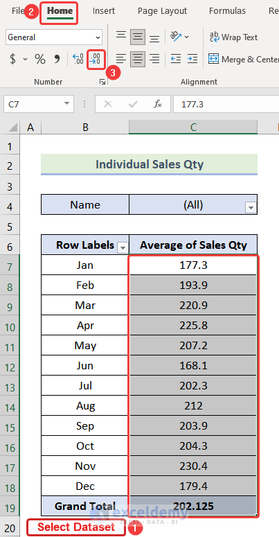
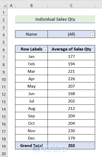
- The decimal points on the pivot table should be gone like the following image.
Step 3 – Creating Pivot Table Without the Name Filter
- Select the entire table.
- Press Ctrl + C to copy the table.
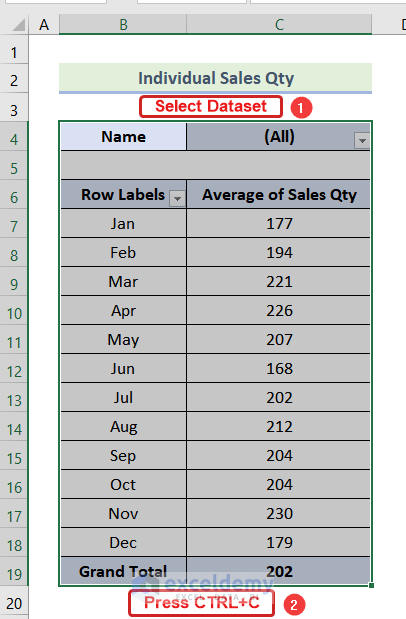
- Press Ctrl + V to paste the copied table in cell G4.
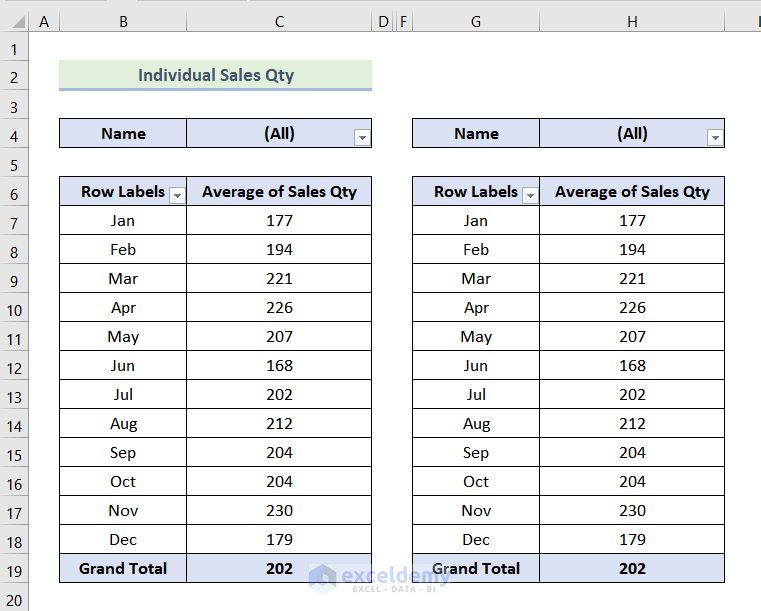
- Click on any cell of the new Pivot Table.
- From the Pivot Table Fields dialog box, uncheck the Name box.
- The Name filter from your new Pivot Table should be removed.
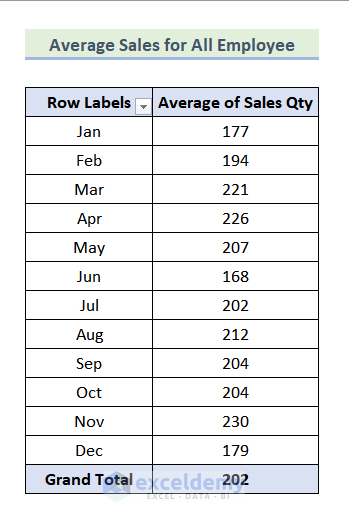
- Give a heading to the table. We have used Average Sales of All Employee as the heading.
Step 4 – Constructing a Table for the Comparison Chart
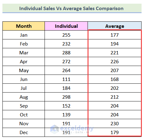
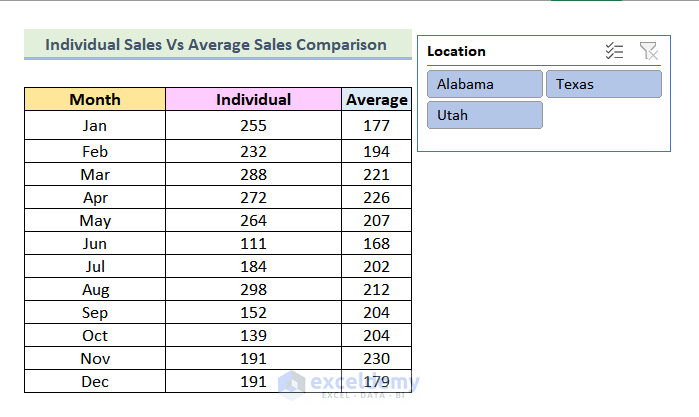
- Create a table consisting of 3 columns named Month, Individual, and Average.
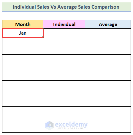
- Type Jan (abbreviation of January) in the first cell under the Month column.
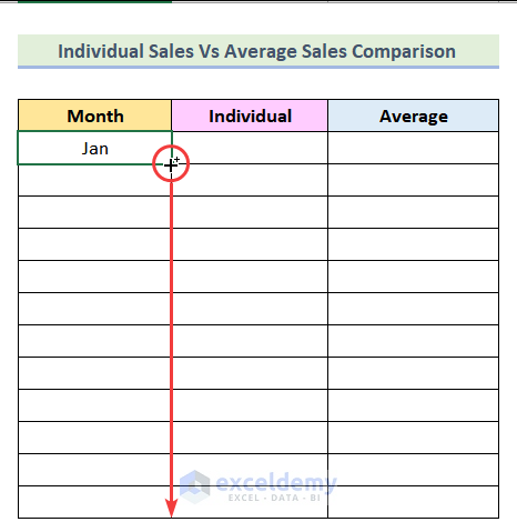
- Drag the Fill Handle down to the end of the table.
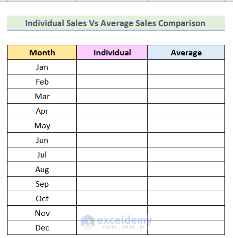
- You will be able to see all months.
Step 5 – Using the VLOOKUP Function
- Use the following formula in cell M5 to extract values from the Average of Sales Qty column of the Individual Sales Qty Pivot Table.
=VLOOKUP(L5,B:C,2,0)5 is the Month of Jan that is our lookup_value for the VLOOKUP function, and B: C is the table_array where will search for the lookup value, 2 is the column_index_number, and 0 means we are looking for an exact match.
- Hit Enter.
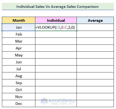
- The VLOOKUP function should return 255.
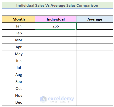
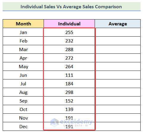
- Use the AutoFill Feature to complete the rest of the cell of the column and you will get the following output.
- Use the following formula in cell N5.
=VLOOKUP(L5,G:H,2,0)G:H is the changed table_array.
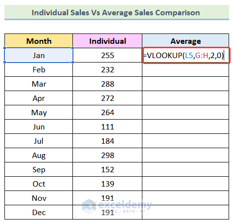
- Use the AutoFill option to get the rest of the data.
- Your table should look like the image given below.
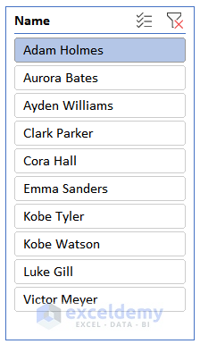
Step 6 – Inserting a Name Slicer
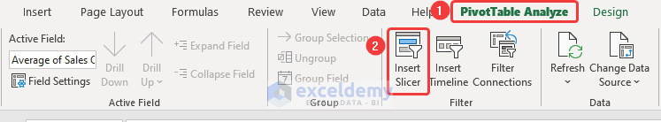
- Click on any cell of the Individual Sales Qty Pivot Table.
- Go to PivotTable Analyze.
- Select Insert Slicer from the Filter group.
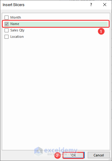
- An Insert Slicer dialog box will open. Check the box for Name.
- Press Ok.
- A slicer should be added to your worksheet like the following image.
Step 7 – Adding a Line Chart
- Select the entire dataset.
- Go to the Insert tab and select Insert Line or Area Chart, then choose Line with Markers.
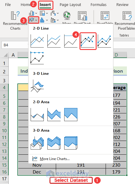
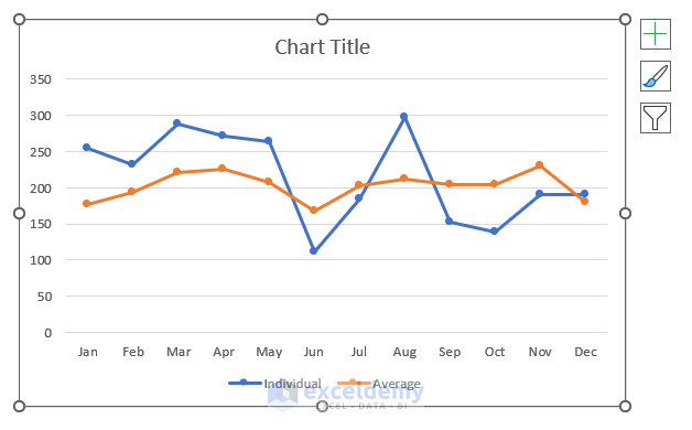
- The line chart will be added to your worksheet.
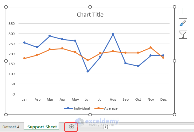
Step 8 – Creating a New Worksheet
- Create a new worksheet by pressing the Plus sign in the marked portion of the following image.
Step 9 – Adding the Slicer and the Line Chart to the New Worksheet
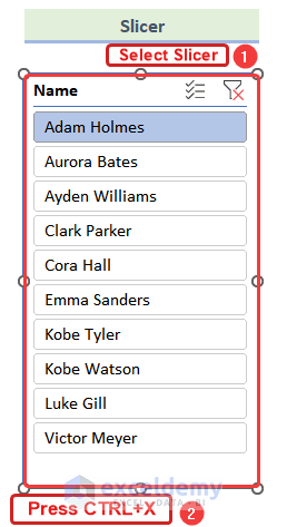
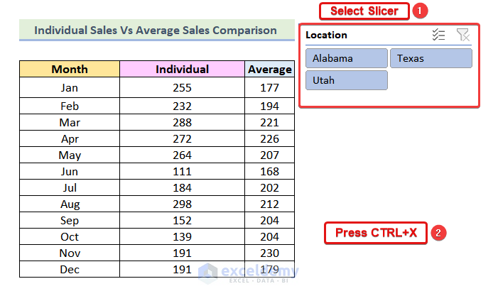
- Select the Slicer from the Support Sheet worksheet.
- Press Ctrl + X.
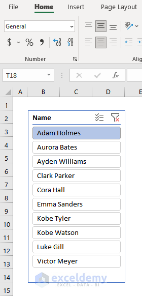
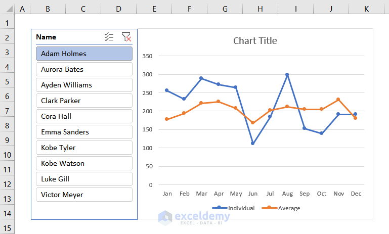
- Go to the newly created worksheet and paste it on cell B2 by pressing Ctrl + V.
- Select the line chart from the Support Sheet worksheet and then press Ctrl + X.
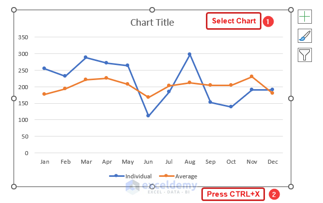
- Paste it into cell E2 of the new worksheet.
Step 10 – Formatting the Chart
- Edit the chart title.
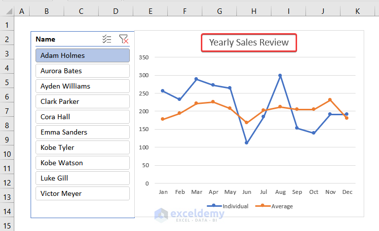
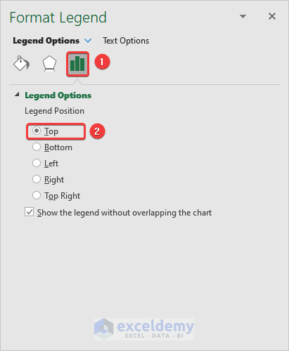
- Right-click on the Legend of the chart and select the Format Legend option.
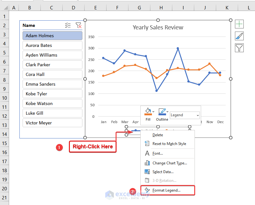
- Select Legend Options.
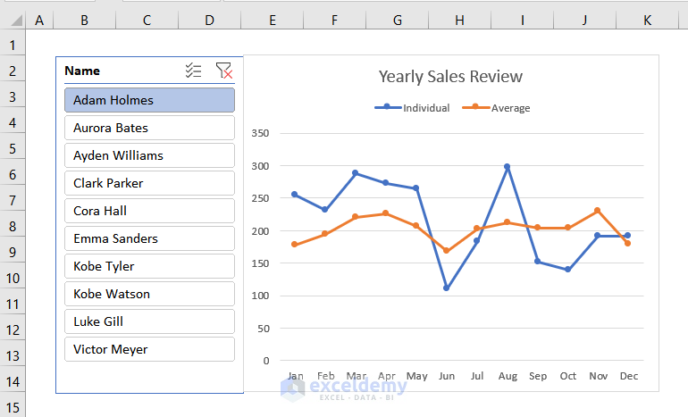
- Choose Top as the Legend Position.
- The Legend should be moved to the top of the chart like the following image.
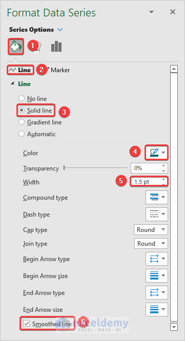
- Right-click on any point on the orange line and click on the Format Data Series option.
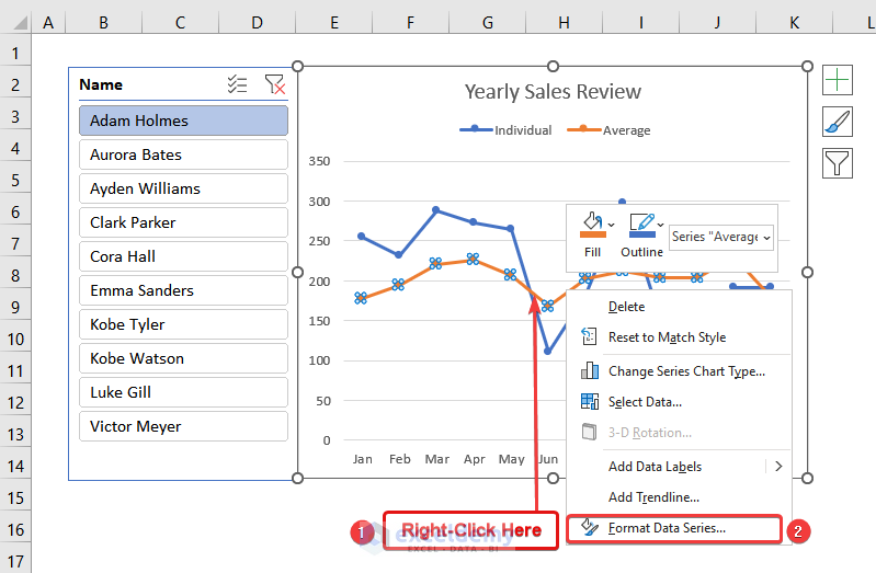
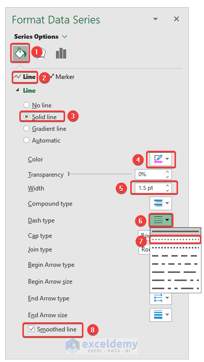
- The Format Data Series dialog box will open. Select Fill & Line.
- Click on Line and select the following options.
Line → Solid Line
Color → Pink (or whatever you want)
Width → 1.5 pt
Dash Type → Second option
- Check the box Smoothed line.
- Here’s the result.

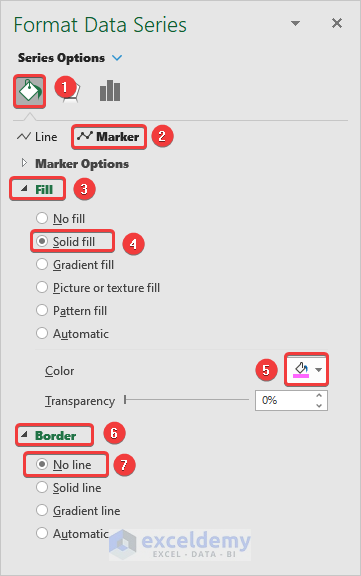
- Click on Markers in the Format Data Series dialog box.
- Select Solid Fill from the Fill option and add the same color that you chose in the previous step.
- Click on Border and select No line.
- Your chart should look like the following image.
- Go to the Format Data Series dialog box for the other line by following the steps mentioned before.
- Click on the Fill & Line tab and select Line, then choose the following:
Line → Solid Line
Color → Green (or any other color different from the previous one)
Width → 1.5 pt
- Check the box Smoothed line.
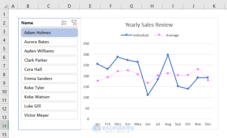
- You will get the second smoothed line.
- By following the same steps mentioned before, edit the markers. Make sure that the color of the marker and the line are the same.
- The dashed line is the average sales of all employees and the solid line is the line for sales of the individual employee.
Step 11 – Inserting a Location Slicer
- Open the Insert Slicers dialogue box.
- Check the box for Location and then hit Ok.
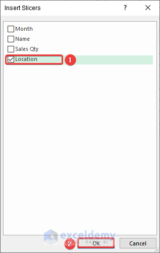
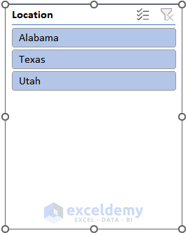
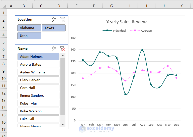
- A Location Slicer will be added to the worksheet.
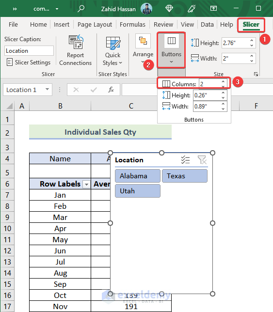
- Select the Slicer tab.
- Click on Buttons.
- Select Columns and increase it to 2 from the drop-down.
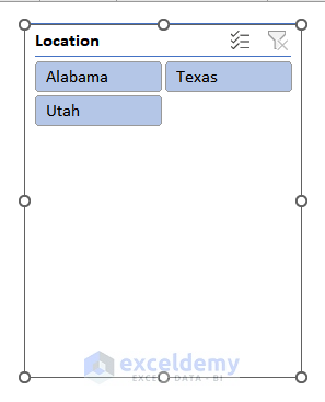
- The slicer will be in 2 columns like in the following picture.
- Resize the slicer by dragging the edges.
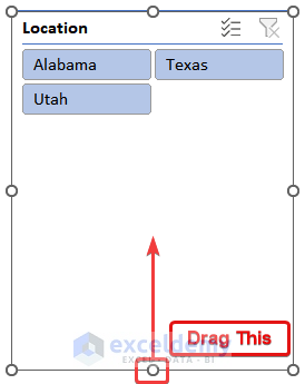
- Here’s what we did.
Step 12 – Adding the Location Slicer to the Chart
- Select the slicer from the Support Sheet worksheet.
- Press Ctrl + X.
- Paste the slicer into the new worksheet that is created in Step 8.
- Your chart should be looking like the image given below.
Step 13 – Editing the Location Slicer
- Right-click on the location slicer.
- Select Report Connections.
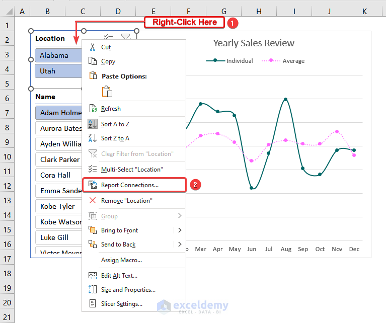
- The Report Connections (Location) dialog box will open like the following picture.
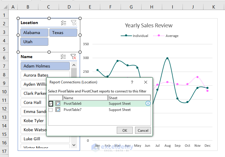
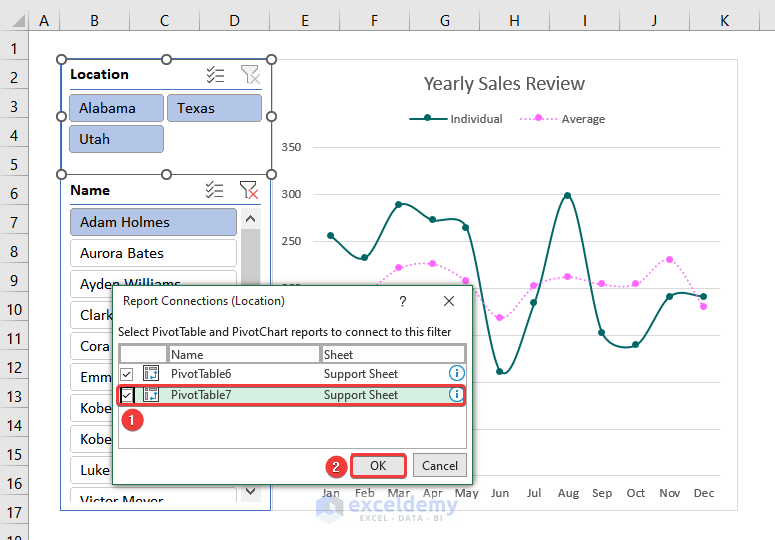
- Check the box Pivot Table 7.
- Hit Ok.
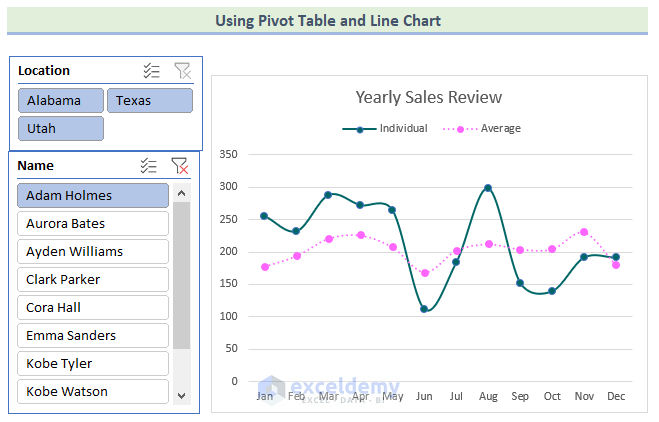
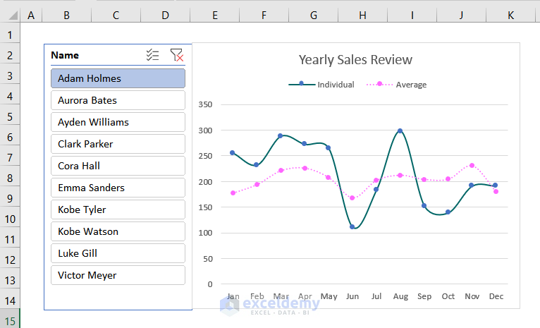
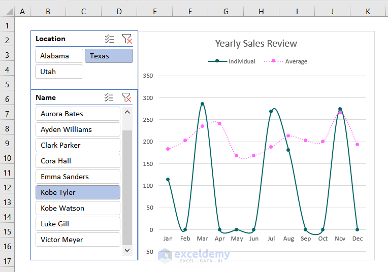
- Click on any location and name. We have selected Alabama and Adam Holmes.
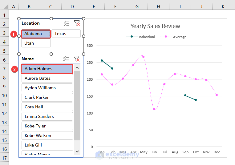
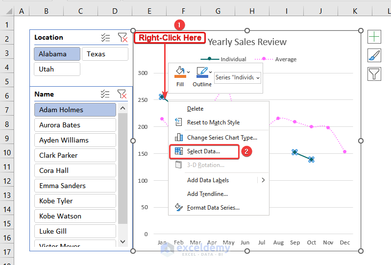
- The line of individual sales is not continuous. Some employees didn’t have any sales in that particular location at a particular time of the year.
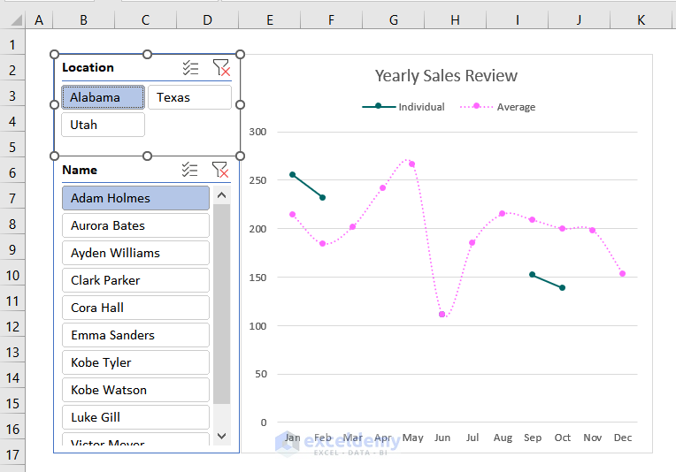
- Right-click on the data series that has broken lines.
- Click on Select Data.
- The Select Data Source dialog box will open. Click on Hidden and Empty Cells.
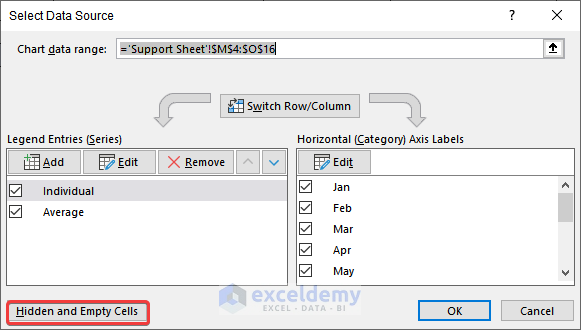
- You’ll get a new dialog box.
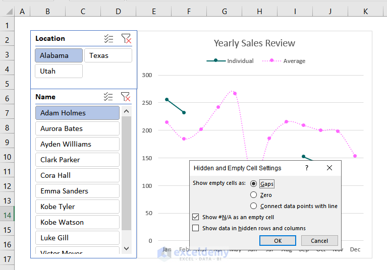
- Select Zero.
- Press OK.
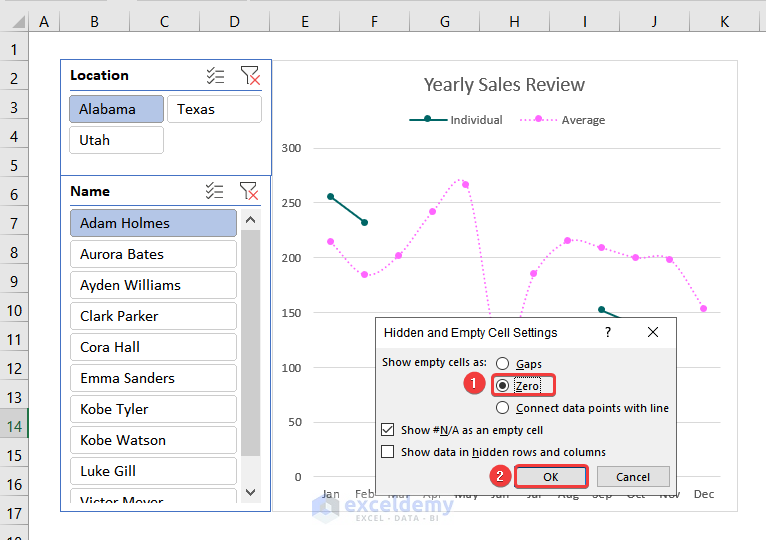
- You will be redirected to the Select Data Source dialog box like the image given below.
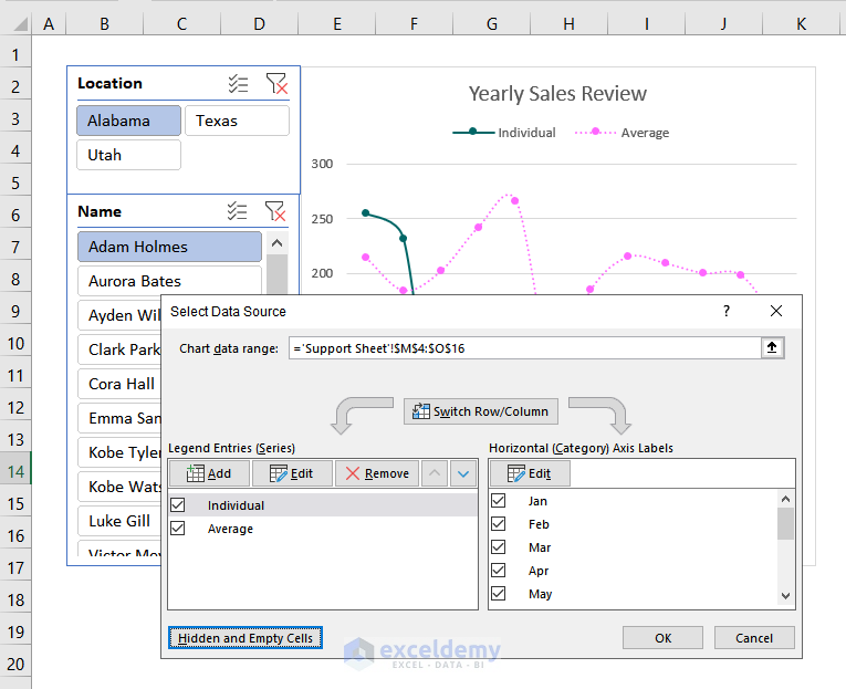
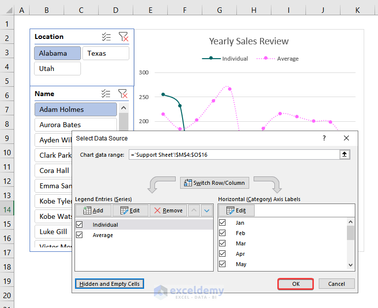
- Hit OK again.
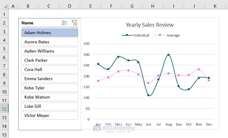
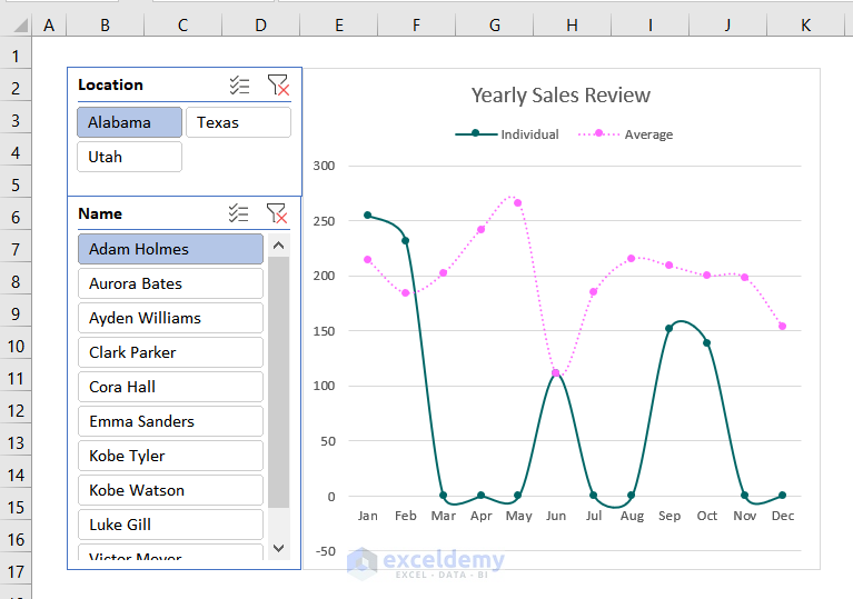
- You’ll get a continuous curved line that looks a bit odd since it dips into negative values between months.
Step 14 – Checking If the Comparison Chart Is Working
- Click on any of the locations or names. The chart will automatically change.
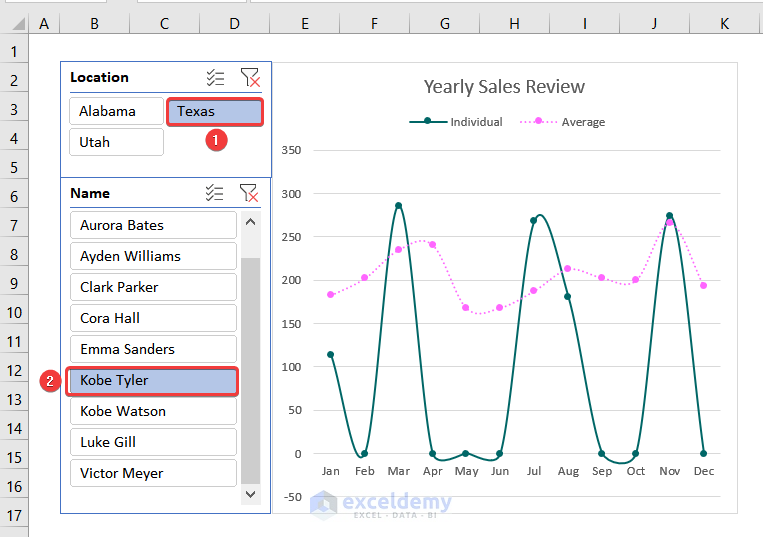
After selecting the location and name, your Comparison Chart should be changed like the following image.
Practice Section
We have provided practice sections in each sheet from the download document.
Things to Remember
- Do not forget to label the horizontal and vertical axes of the chart.
- Use appropriate scales to understand the chart clearly.
Download the Practice Workbook
Frequently Asked Questions
Can I create a comparison chart with a combination of different chart types?
Yes, you can create combination charts where you can use different chart types within the same chart in Excel.
Can I update my comparison chart automatically when the data changes?
Yes, you can update your chart automatically if it is based on a dynamic range or source. This is especially helpful when you have linked the chart to a table or a range using Excel formulas or named ranges.
Can I copy and paste my comparison chart from Excel to other documents or presentations?
Yes, you can copy and paste your comparison chart from Excel to other documents or presentations. First, create the chart in Excel, simply select it, press Ctrl + C to copy and Ctrl + V to paste it into another presentation.
Comparison Chart in Excel: Knowledge Hub
<< Go Back to Excel Charts | Learn Excel
Get FREE Advanced Excel Exercises with Solutions!
